Databricks HealthCheck App
Overview
The Databricks Healthcheck App helps organizations monitor, optimize, and report on Databricks usage and costs. It provides visibility into cost drivers, resource efficiency, and optimization opportunities.
Key features
View jobs with available optimization recommendations. Includes insights such as rightsizing, configuration tuning, and performance improvements.
Track where the Auto-Fix feature is applied, monitor success rates, and identify jobs automatically optimized for cost and performance.
Visualize the rate at which recommendations are applied. Identify patterns in adoption across teams, periods, and job types.
Analyze trends in cost savings over time. Detect spikes, regressions, and opportunities for further optimization.
View actual cost savings achieved by applying recommended fixes. Compare realized savings with untapped opportunities.
Identify jobs with the highest potential for cost and performance improvements. Use this information to prioritize optimization efforts.
Discover workspaces with the most significant opportunities for improvement. Focus optimization initiatives on high-impact areas.
Architecture
The HealthCheck agent includes two main components:
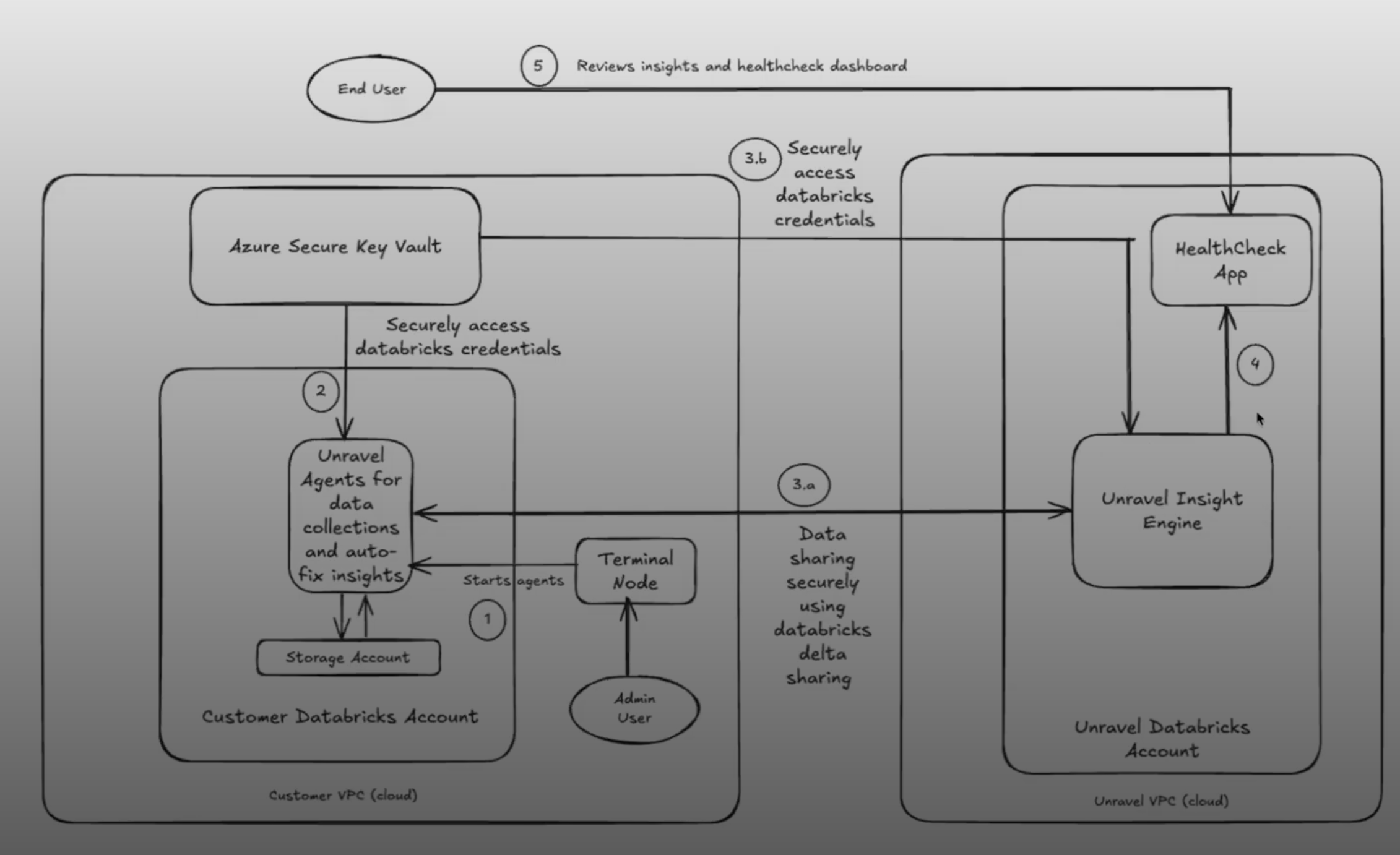
Data Collection Scripts: Deployed in the customer’s Databricks environment, these scripts extract metadata from audit logs, cost export files, and system APIs. They do not access job logs, query data, or user code.
Unravel Insights Engine: After collection, the data is processed by Unravel’s analysis engine. It generates insights based on usage patterns, configurations, performance history, and cost trends and displays them in a centralized, interactive dashboard.
Databricks Healthcheck App: End-to-End Use Case Example
Persona
Priya, a Cloud Data Platform Lead at a large retail company, is responsible for ensuring her organization’s Databricks environment is cost-efficient, well-governed, and high-performing. She collaborates with FinOps, engineering, and data governance teams.
User Story
As a Cloud Data Platform Lead, I want to use the Databricks Healthcheck App to monitor, optimize, and report on Databricks usage and costs across my organization, so that I can drive accountability, maximize savings, and ensure efficient resource utilization.
Workflow Across Tabs
Priya starts her monthly review by opening the Chargeback tab. She filters by the last 30 days and selects all business units. The summary metrics show total Databricks spend, instantly realizable savings, and projected savings. She notices that the “CRR-8” business unit is the top spender and has significant untapped savings. The usage charts reveal a spike in DBU usage last week, which she correlates with a major marketing campaign.
Priya exports the BU-level cost and savings data to share with finance, ensuring each business unit is accountable for its Databricks consumption.
Next, Priya examines the Cost tab to see which compute types are driving expenses. She finds that Interactive Clusters account for over 99% of costs, with several hundred dollars in untapped savings. The daily DBU usage chart shows a pattern of heavy weekday usage and idle weekends.
She flags Interactive Clusters for further investigation and shares insights with the DevOps team to prioritize optimization efforts.
Priya uses the Accountability tab to drill down into user and workspace efficiency. She identifies several users with “Poor” ratings who are responsible for high-cost jobs. The scatter plot highlights a few users with high costs but low efficiency.
She schedules a meeting with these users to review their job patterns and provides targeted training on best practices.
Switching to the Config Insights tab, Priya filters for jobs with the highest untapped savings and “Auto-Fix = Yes.” She finds several jobs with over-provisioned clusters and idle resources.
She applies auto-fix recommendations to rightsize clusters and eliminate unnecessary features, immediately realizing cost savings.
Priya reviews the Code Insights tab to identify inefficient notebook cells. She spots a notebook with a cell causing significant CPU spikes due to a poorly optimized join. The app provides a code snippet and highlights the root cause.
She assigns the notebook to an engineer for refactoring and tracks the improvement in subsequent runs.
In the Data Insights tab, Priya identifies several large tables that haven’t been accessed in over 90 days. These cold tables are consuming expensive storage.
She coordinates with data owners to archive or delete obsolete tables, reducing storage costs and improving data hygiene.
Finally, Priya reviews the Realized Value tab to measure the impact of her team’s optimization efforts. She sees a clear trend of increasing realized savings month-over-month, with a growing number of jobs benefiting from auto-fix.
She generates a report for executive stakeholders, highlighting the financial impact and continuous improvement in Databricks cost efficiency.
Tab | Key Action/Insight | Outcome/Value |
|---|---|---|
Chargeback | Attribute costs, monitor usage, and identify savings | Accountability, transparency, BU optimization |
Cost | Analyze spend by compute type | Focus optimization where it matters most |
Accountability | Rate users/workspaces, spot inefficiencies | Targeted training, user-level optimization |
Config Insights | Detect config issues, apply auto-fix | Quick wins, reduced manual effort |
Code Insights | Find inefficient code cells and debug performance | Improved job performance, lower costs |
Data Insights | Identify cold tables, optimize storage | Lower storage costs, better data governance |
Realized Value | Track actual savings, report impact | Demonstrate ROI, drive continuous improvement |
By leveraging all seven tabs of the Databricks Healthcheck App, Priya and her teams achieve full visibility into costs, drive accountability, and systematically optimize their Databricks environment. This holistic approach ensures ongoing cost savings, operational efficiency, and data-driven decision-making across the organization.
Using the app
Applying filters
To tailor the data to your specific needs, use the filters available in the left sidebar. You can filter by time range, business unit, tier, workspace, user, or tag values. After selecting your desired criteria, click Apply Filters to refresh the page. This ensures that all summary metrics, tables, and charts reflect only the data relevant to your selected parameters.
Summary
The summary section at the top of the page provides a high-level snapshot of your Databricks environment for the selected period. This section displays key metrics such as total cost for the selected period, the number of available optimization recommendations, instantly realizable savings, projected savings if all recommendations are implemented, and estimated productivity savings. These figures provide a quick snapshot of your current spend and highlight potential opportunities for cost optimization and efficiency improvements.
The Chargeback tab provides a comprehensive overview of Databricks cloud costs and usage across your organization. It is designed to help you track spending, monitor resource consumption, and identify opportunities for optimization and accountability.
Summary Metrics: High-level cost and savings data.
BU Breakdown: Cost, DBU usage, and savings by business unit.
Usage Charts: Visualize SKU consumption and daily trends.
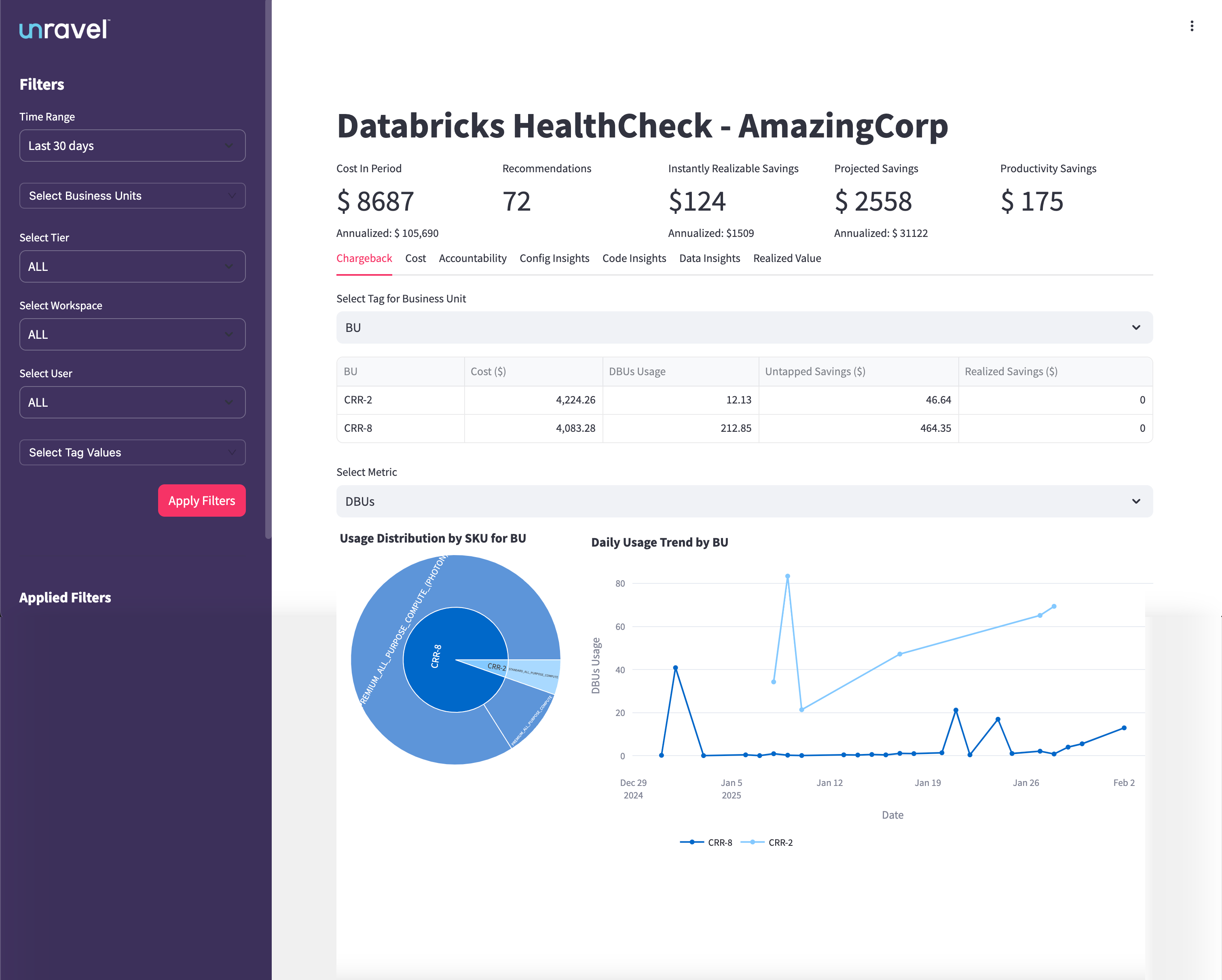
The table in the Chargeback tab breaks down Databricks costs and usage by business unit (BU) or other selected groupings. From this table, you can understand:
Resource Consumption: See how much each BU is using Databricks resources, measured in Databricks Units (DBUs).
Cost Allocation: View the total spend attributed to each BU for the selected time period.
Savings Opportunities: Identify untapped savings (potential cost reductions not yet realized) and realized savings (cost reductions already achieved).
Efficiency Assessment: Compare BUs to determine which are using resources efficiently and which may need optimization support.
Accountability: Attribute costs and usage to the correct teams, supporting internal chargeback or showback processes.
The Chargeback tab provides interactive visualizations that help you analyze Databricks usage and costs from multiple perspectives. You can use the Select Metric dropdown to switch between different usage metrics such as DBUs, Cost, and Clusters. The charts update dynamically based on your selection, offering the following insights:
Usage Distribution by SKU for BU
This chart shows how Databricks resource consumption (and associated costs) are distributed across different business units (BUs) and SKUs.
You can quickly identify which BU is the dominant consumer of Databricks resources and see a breakdown by compute type or SKU.
Hovering over each segment gives you detailed usage and cost information for each SKU within a BU. This helps pinpoint which BUs or compute types are driving the majority of costs, supporting targeted optimization and accountability efforts.
Daily Usage Trend by BU
This line chart visualizes daily Databricks Unit (DBU) usage for each BU over the selected date range.
Each line represents a different BU, allowing you to spot usage spikes, dips, or consistent patterns over time.
You can correlate usage changes with project timelines, deployments, or optimization efforts, and validate whether savings actions have the intended effect.
This chart is valuable for identifying sudden increases in compute usage, monitoring trends, and ensuring fair resource distribution across teams.
The Cost tab provides a detailed analysis of Databricks cloud spending across different compute types within your organization. It is designed to help you understand where your Databricks budget is going, identify high-cost areas, uncover untapped savings, and support ongoing cost governance and optimization initiatives.
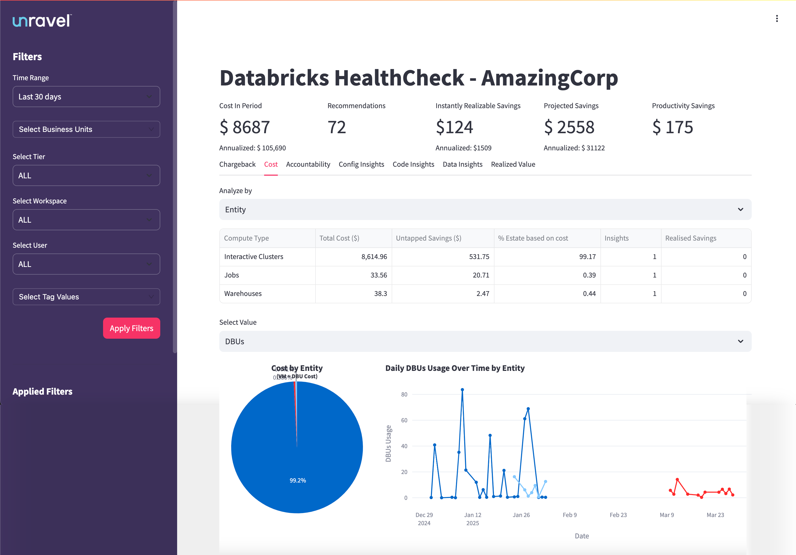
The Cost Breakdown Table provides a detailed view of costs and savings for each compute type, such as Interactive Clusters, Jobs, and Warehouses. It displays total cost, untapped savings, realized savings, percentage of total spend, and the number of insights generated for each compute type. This table helps you understand where your Databricks budget is allocated and where savings opportunities exist.
Identify which compute types are responsible for the majority of Databricks costs.
Quantify both untapped and realized savings for each compute type.
Assess the proportion of total spend represented by each compute type.
Focus optimization efforts where they will have the most financial impact.
This chart visualizes how total Databricks costs are distributed across different compute types, such as Interactive Clusters, Jobs, and Warehouses, for the selected period. Each segment of the pie represents a compute type, with the size proportional to its share of the total cost. Hovering over a segment reveals detailed cost information for that compute type, allowing you to see exact figures and percentages.
Insights you can derive:
Instantly identify which compute types are the primary drivers of your Databricks spending.
Quickly spot budget hotspots and areas that require optimization attention.
Support cost allocation and governance by visualizing how costs are split among compute types.
This line chart presents daily Databricks Unit (DBU) usage for each compute type over the selected date range. Each line represents a different compute type, allowing you to track and compare usage patterns over time. The X-axis shows the dates, while the Y-axis represents DBU usage. You can hover over any point to view the exact DBU usage for a specific date and compute type.
Insights you can derive:
Observe usage trends, peaks, and troughs for each compute type over time.
Correlate spikes in DBU usage with increased costs or specific events, such as project launches or workflow changes.
Identify periods of inefficiency or over-provisioning, supporting better capacity planning and optimization efforts.
Validate whether savings actions or optimizations have led to sustained reductions in compute usage.
The Accountability tab provides a detailed overview of user behavior, workspace usage, and cost efficiency within your Databricks environment. It is designed to help you identify areas for improvement, understand how costs are distributed across users, and take informed actions to optimize resource consumption and reduce waste.
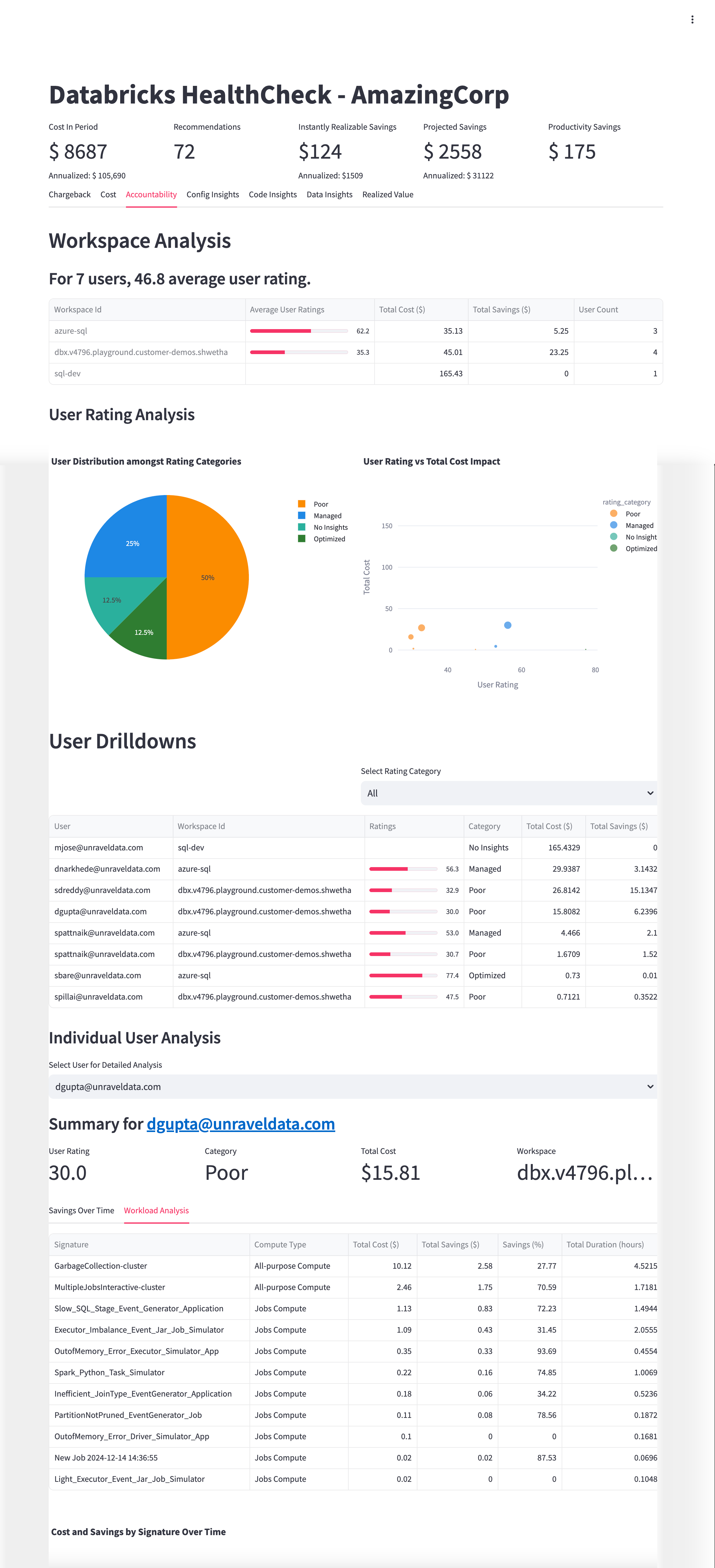
The Accountability tab features multiple tables that offer granular visibility into workspace and user-level performance:
Workspace Analysis Table:
Displays aggregated insights for all monitored workspaces, including workspace ID, average user rating, total cost attributed to users, total savings from optimization opportunities, and user count. User ratings reflect efficiency and optimization performance within each workspace.
User Drilldowns Table:
Provides detailed user-level data across all workspaces. Columns include user email, workspace ID, numerical rating (0–100), rating category (Poor, Managed, No Insights, Optimized), total cost generated by the user’s jobs, and total savings opportunity available. Use filters to focus on specific rating categories for targeted analysis.
Workload Analysis Table:
Breaks down inefficiency patterns or job types by signature, compute type, total cost, potential savings, savings percentage, and total duration. This helps pinpoint costly, low-efficiency workloads for remediation.
From these tables, you can:
From these tables, you can:
Quantify savings opportunities at both workspace and user levels.
Focus optimization efforts on users and workloads with the greatest potential impact
This chart shows the proportion of users segmented into efficiency categories: Poor, Managed, No Insights, and Optimized. Each segment represents the share of users falling into that category, providing a snapshot of overall user efficiency.
Insights you can derive:
Quickly assess the distribution of user efficiency across your organization.
Identify the percentage of users who may require targeted training or support.
Monitor shifts in user efficiency over time to evaluate the impact of optimization initiatives.
This scatter plot maps individual users’ efficiency ratings against the total costs they generate. Each point represents a user, allowing you to visualize the relationship between cost and efficiency.
Insights you can derive:
Identify high-cost users with low efficiency ratings who present prime opportunities for cost recovery.
Spot users who are efficient but incur high costs, potentially due to legitimate workload demands.
Prioritize optimization and coaching efforts based on cost-impact profiles.
This chart visualizes trends in user-level cost and savings over time, enabling you to track the effectiveness of optimization actions and behavioral changes.
Insights you can derive:
Monitor improvements or regressions in cost efficiency following interventions.
Validate whether savings recommendations are translating into real cost reductions.
Support ongoing governance by tracking cost and savings trends at the user level.
Investigate users with high costs but low efficiency ratings to uncover quick wins for cost recovery.
Review workspaces with a high concentration of ‘Poor’ rated users and prioritize targeted training or optimization efforts.
Leverage signature-level workload analysis to identify systemic inefficiencies and address recurring job patterns.
Use the Accountability tab’s insights to drive behavioral change, improve cost governance, and enhance overall resource efficiency.
The Config Insights tab helps you identify cost inefficiencies caused by suboptimal job configurations, such as over-provisioned clusters or unnecessary features. Use these insights to uncover opportunities for rightsizing and auto-fix recommendations that improve resource utilization and lower costs.
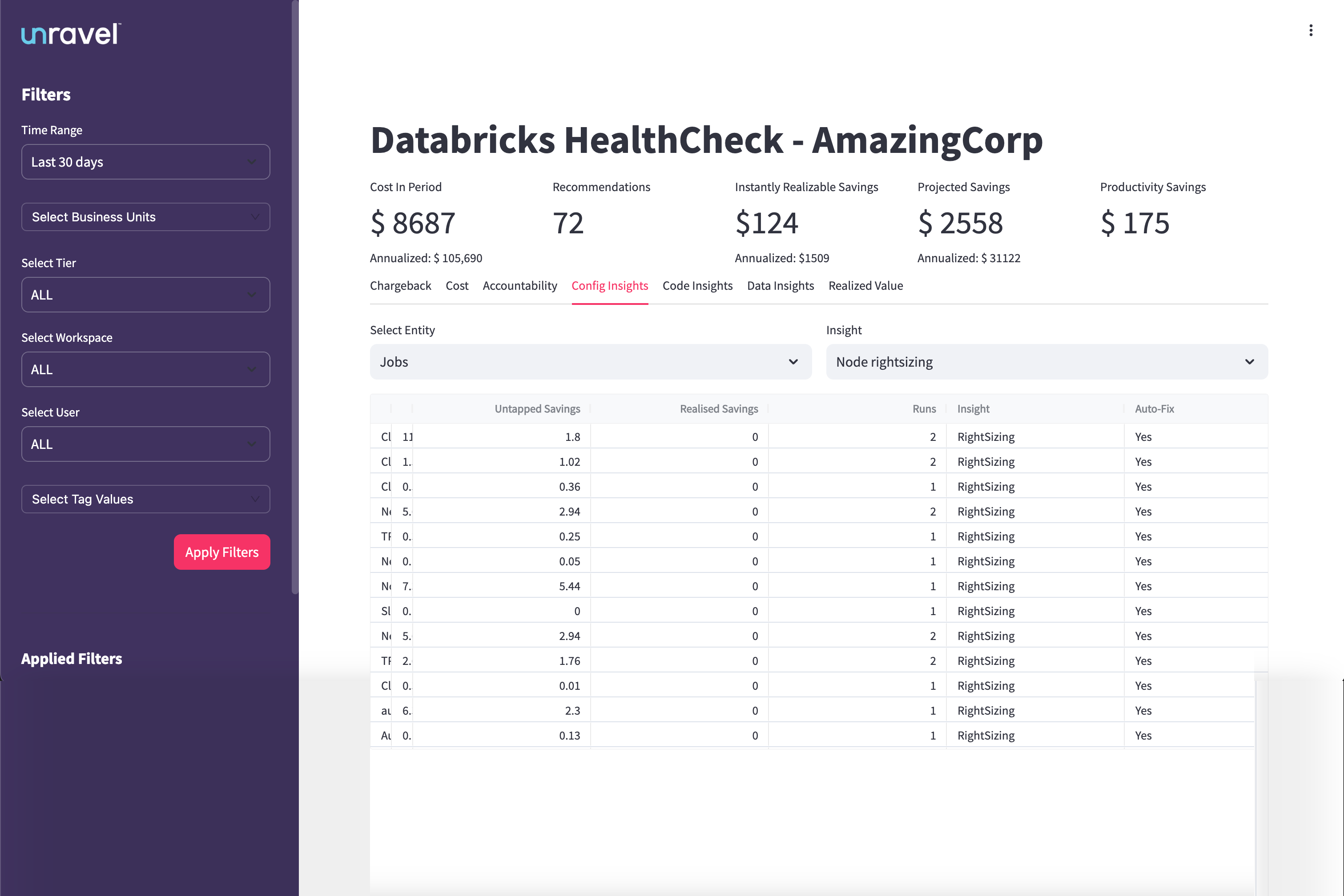
The Insights Table provides a detailed breakdown of configuration issues and savings opportunities for each entity, such as jobs or clusters. It displays columns for entity name or ID, untapped savings, realized savings, number of inefficient runs, the type of configuration issue identified, and whether the issue supports auto-fix.
Identify which jobs or clusters have the highest untapped savings potential.
Quantify the realized savings achieved from recent optimizations.
Prioritize workloads with recurring inefficient runs for targeted improvements.
Focus on entries with Auto-Fix enabled to quickly resolve issues with minimal manual intervention.
This chart compares the total potential savings (untapped) against the savings already realized through configuration optimizations. Each bar represents a specific entity type or configuration insight, providing a clear view of where further action can yield the most benefit.
Insights you can derive:
Instantly see where the largest remaining savings opportunities exist.
Track progress over time as realized savings increase.
Support prioritization of optimization efforts based on potential impact.
This chart offers a detailed breakdown of configuration issues by entity, such as jobs, clusters, or warehouses. It highlights the frequency and cost impact of issues like node sizing errors, idle clusters, or misconfigured auto-scaling.
Insights you can derive:
Pinpoint which entities or configuration patterns are driving inefficiencies.
Identify recurring issues that may benefit from automated fixes.
Guide targeted actions for rightsizing and configuration improvements.
Regularly review this tab after deployments to monitor ongoing improvements.
Schedule periodic reviews with stakeholders to evaluate and implement auto-fix opportunities.
Monitor high-run workloads with recurring inefficiencies to maximize cost savings and resource efficiency.
The Code Insights tab highlights inefficient notebook cells that may be causing performance bottlenecks or resource waste. By analyzing code-level metrics such as skew, execution time, and CPU usage, this tab helps engineering teams improve application performance and reduce costs.
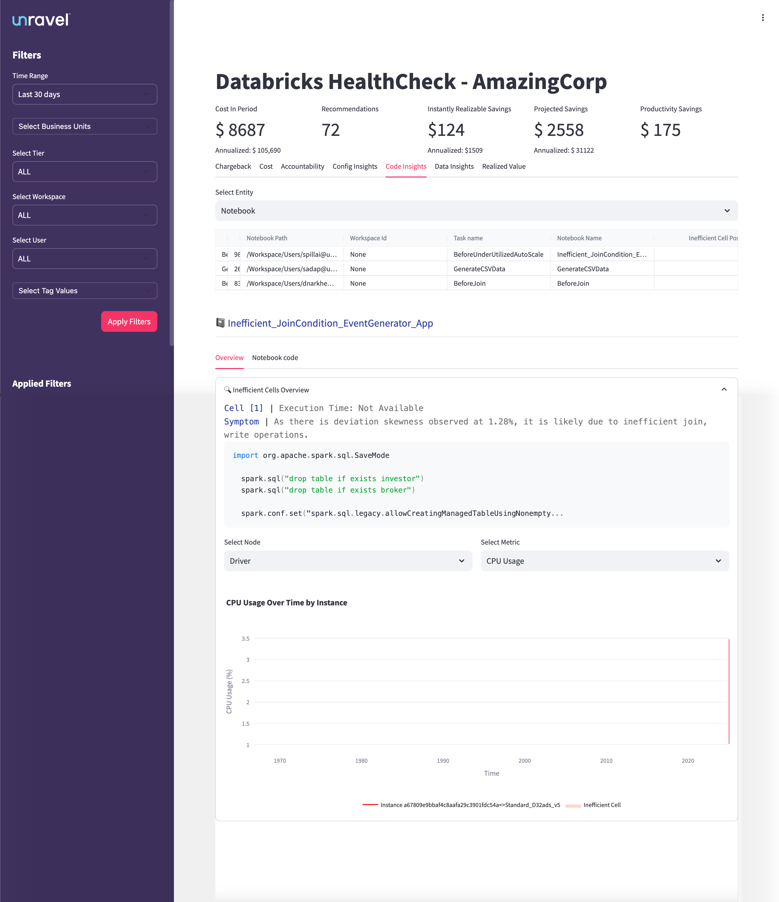
The Insights Table provides a detailed list of inefficient code patterns detected at the notebook cell level. It displays the notebook path, workspace ID, associated job task, notebook name, and the specific inefficient cell point (e.g., Inefficient_JoinCondition_EventGenerator_App). Clicking on an insight allows you to drill down into cell-level analysis, revealing the cell number, execution time, root cause summary, and the actual code snippet involved.
Detect inefficient code patterns across notebooks and jobs.
Identify the exact cell and code responsible for performance issues.
Quantify the potential cost and productivity savings from code optimizations.
Prioritize notebooks and cells with the highest impact on performance and cost.
CPU Usage Over Time (Time-Series Chart)
This time-series chart visualizes CPU usage for the selected notebook cell and instance. The Y-axis represents CPU usage percentage, while the X-axis shows the timeline for the selected period. The legend differentiates between instance IDs and cell types, such as inefficient cells.
Insights you can derive:
Correlate inefficient code cells with spikes in CPU usage.
Identify periods of high resource consumption linked to specific code patterns.
Support debugging and optimization by visualizing how code changes affect resource usage over time.
Guide cluster and executor tuning based on observed compute trends.
Review notebooks with recurring inefficient cells on a weekly basis.
Prioritize high-cost notebooks and cells for immediate tuning.
Use CPU and memory usage trends to fine-tune cluster sizing and executor configuration.
Collaborate with developers to refactor or rewrite problematic code cells for sustained performance improvements.
The Data Insights tab helps you identify cold or rarely accessed tables that are consuming storage without delivering value. Use this tab to optimize storage usage, archive stale data, and reduce unnecessary costs.
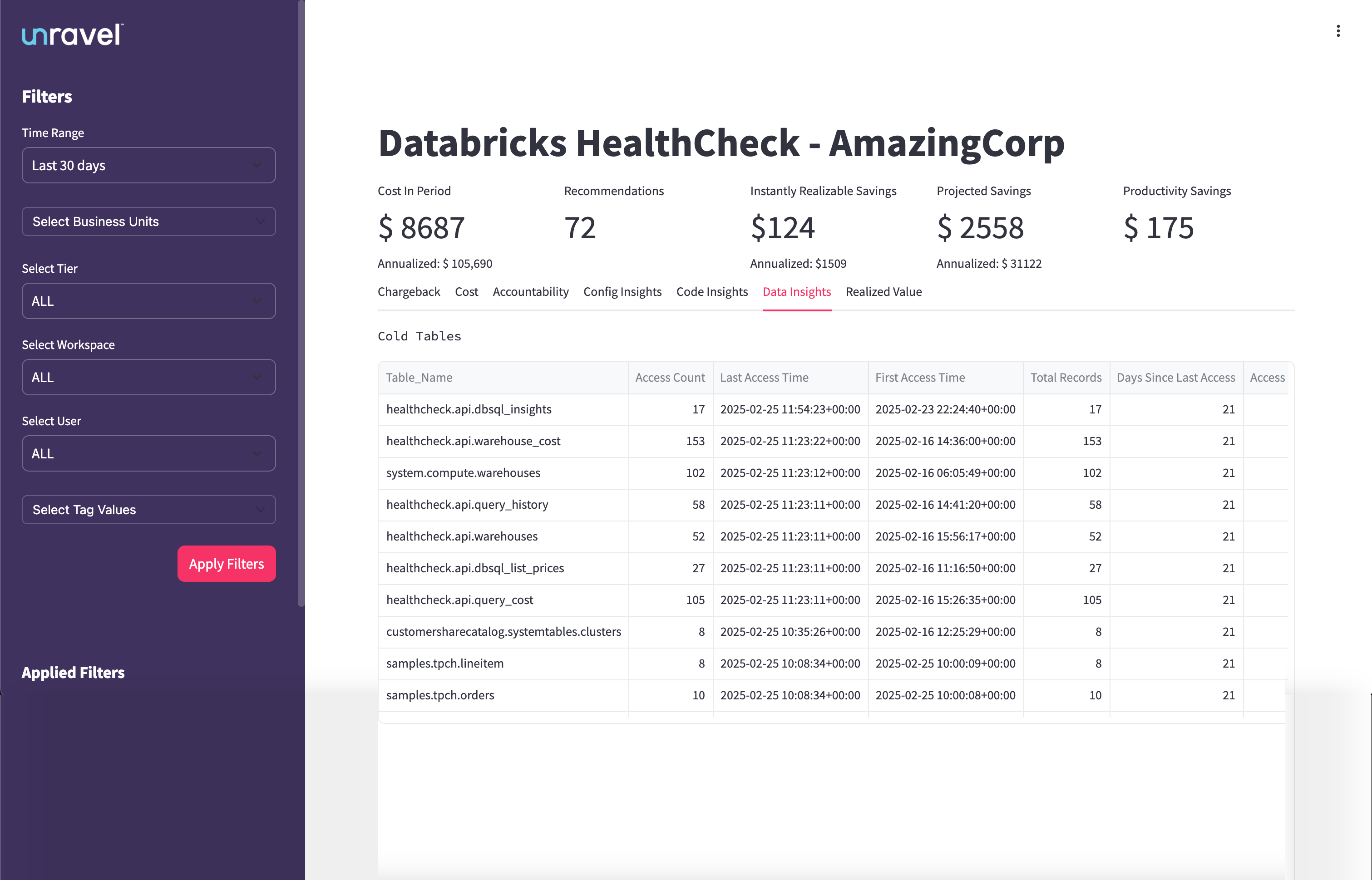
The Cold Tables section lists tables that have not been accessed recently but still occupy storage. Columns include:
Table_Name: Fully qualified name of the table (e.g., healthcheck.api.dbsql_insights)
Access Count: Number of times the table was accessed within the selected period
Last Access Time: Timestamp of the most recent access
First Access Time: Timestamp of the first recorded access
Total Records: Number of records in the table
Days Since Last Access: Time elapsed since the table was last used
Access: Number of user access events during the selected period
Use the table list to:
Sort by Days Since Last Access to find the stalest tables
Filter by Access Count to surface underutilized data assets
Click column headers to reorder data for faster prioritization
Archive cold tables to cost-effective storage tiers
Delete obsolete data that is no longer required
Tag cold data for lifecycle tracking
Review cold table ownership and retention policies
Run the Data Insights tab review weekly or monthly
Align cold table clean-up with your data lifecycle policies
Collaborate with stakeholders before deprecating shared datasets
The Realized Value tab helps you measure the actual cost savings achieved by implementing Unravel’s recommendations, such as rightsizing jobs. It complements the projected and instantly realizable savings metrics by tracking where savings have already occurred due to user action or automation.
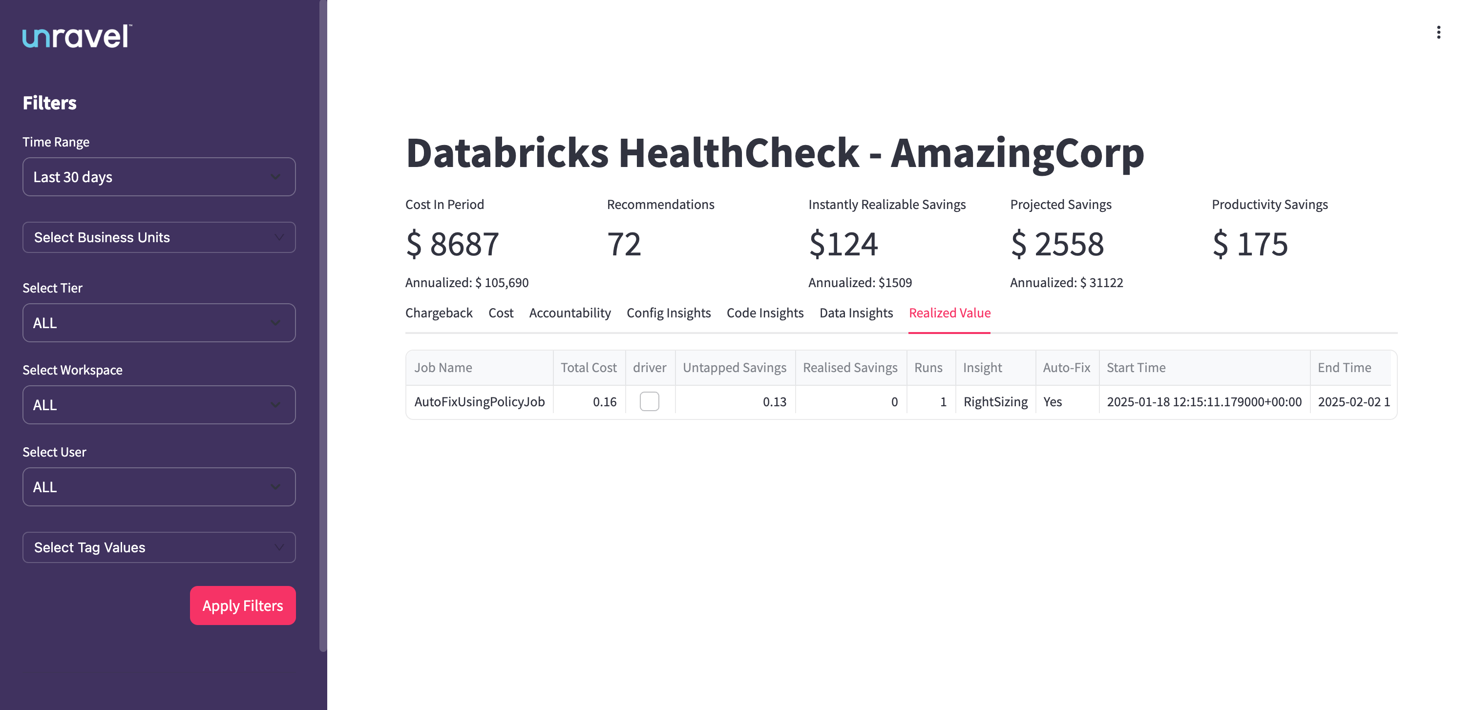
The Realized Value Table provides job-level details on where recommendations have been applied and savings have been realized. Columns include:
Job Name: Name of the Databricks job
Total Cost: Total cost incurred by the job during the selected period
Driver: Indicates if a driver node was involved
Untapped Savings: Savings identified but not yet realized
Realized Savings: Cost savings achieved due to applied recommendations
Runs: Number of job executions in the selected period
Insight: Type of recommendation applied (for example, Rightsizing)
Auto-Fix: Indicates whether an auto-fix was applied
Start Time: Timestamp of when the job started during this evaluation period
End Time: Timestamp of when the job ended
Use the table to:
Identify jobs where recommendations were applied and track actual savings.
Compare untapped vs. realized savings at the job level.
Monitor auto-fix usage and effectiveness.
Analyze job execution patterns and optimization trends over time.
Review jobs with high untapped savings for further optimization.
Enable Auto-Fix for eligible jobs to increase realized savings.
Analyze Start/End Time to detect when optimizations are most effective.
Track Realized Savings as a KPI to measure the impact of Unravel’s recommendations.
Monitor this tab monthly to track the financial impact of optimizations.
Correlate auto-fix status with improvements in job performance and cost savings.
Use realized vs. untapped savings data to drive and prioritize ongoing optimization efforts.