Databricks User Accountability Dashboard
Overview
The Databricks User Accountability Dashboard enables you to monitor user behavior, workspace efficiency, and cost allocation across your Databricks environment. This dashboard enables you to monitor user efficiency, analyze workspace costs, attribute costs accurately, drill into user behavior, and manage cost centers and business units. By leveraging these capabilities, you can identify optimization candidates, target high-cost or low-efficiency workspaces, ensure fair chargeback and showback, pinpoint inefficiencies, track progress, and achieve accurate cost attribution and governance.
Key features
The User Accountability Dashboard includes the following capabilities:
User Performance Ratings: Categorize users by efficiency levels (Poor, Managed, Uncontrolled, Optimized)
Cost Attribution: Track spending by user, workspace, and business unit
Workspace Analysis: Monitor usage patterns and optimization opportunities across workspaces
Workload Insights: Analyze job signatures and performance trends over time
Business Unit Management: Create and assign cost centers for chargeback and showback reporting
Example Use Case: Driving Accountability and Cost Efficiency with the User Accountability Dashboard
This example demonstrates how an organization can use the Databricks User Accountability Dashboard to monitor user ratings, analyze workspace costs, and drive accountability across teams and business units.
A large enterprise with multiple data teams and business units uses Databricks for analytics and data engineering. Leadership wants to ensure that resources are being used efficiently, costs are allocated fairly, and optimization opportunities are not missed.
The operations team accesses the User Accountability Dashboard to review the overall health of Databricks usage.
On the User Rating Analysis tab, they view the distribution of users across rating categories (Poor, Uncontrolled, Managed, No Insights) and identify trends in user efficiency.
The scatter plot of User Rating vs Total Cost Impact highlights users who generate high costs but have low efficiency ratings, signaling candidates for targeted optimization or training.
The team examines the Workspace Analysis table to understand which workspaces have the highest costs and lowest average user ratings.
They identify specific workspaces where cost savings are possible and where user efficiency is lagging.
The Business Unit & Cost Center Analysis section provides insight into how costs are distributed across organizational units, supporting chargeback and showback processes.
Using the filter panel, the operations team drills down by business unit, cost center, or tag to focus on specific teams or departments.
The User Drilldowns tab allows them to select individual users for detailed analysis, including cost trends and workload patterns.
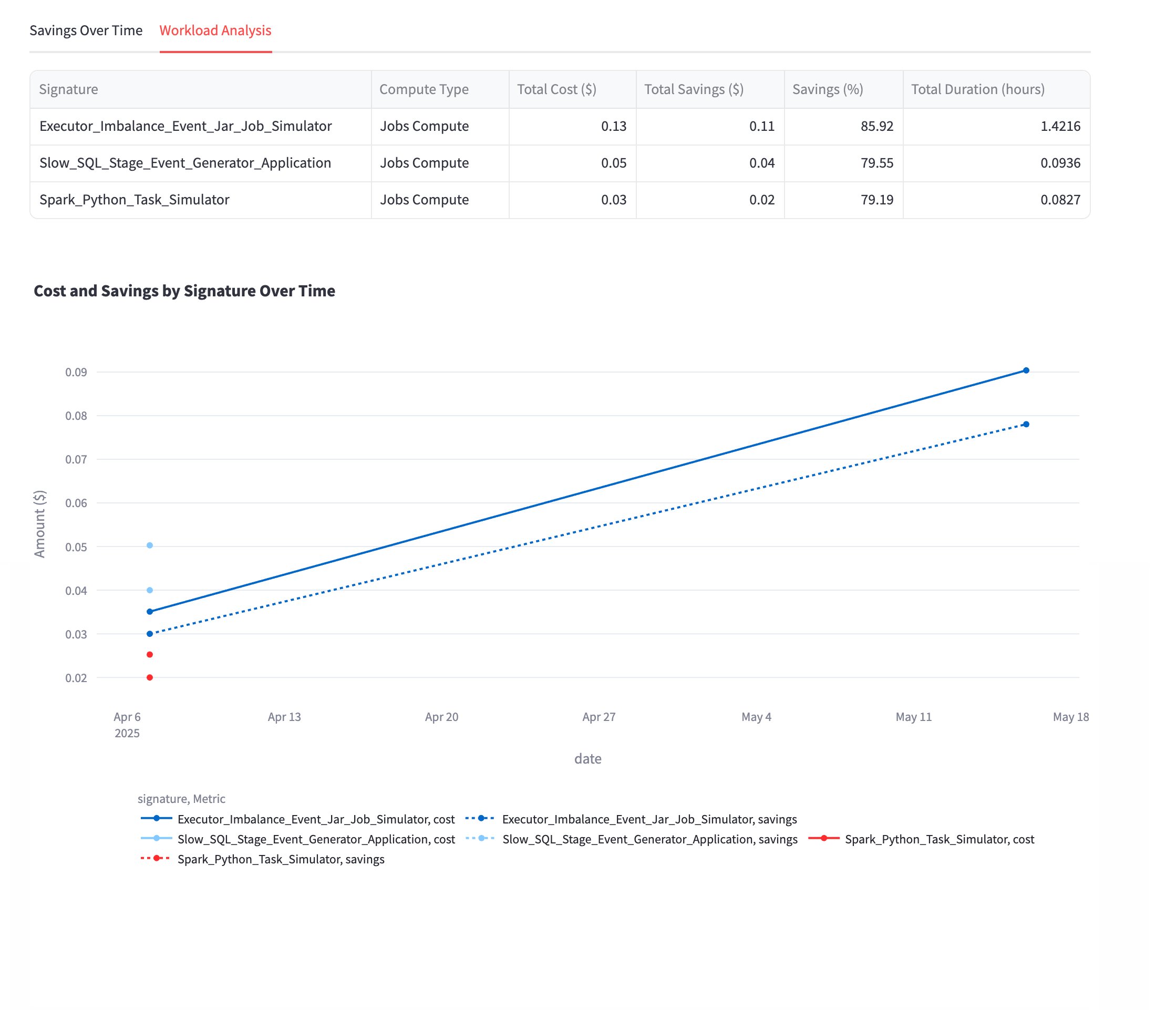
For users with Poor or Uncontrolled ratings, the team reviews the Savings Over Time and Workload Analysis sections to pinpoint inefficiencies and track the effectiveness of remediation actions over time.
This use case illustrates how the User Accountability Dashboard empowers organizations to continuously monitor, analyze, and optimize Databricks usage, supporting both operational excellence and financial governance.
The organization achieves greater transparency in Databricks usage and cost allocation.
Teams and business units are held accountable for their resource consumption.
Targeted optimizations and user training lead to measurable cost savings and improved user efficiency across the enterprise.
Accessing the App
Refer to Installing and accessing the apps.
Filters
Use the filter panel on the left side to customize your view and focus on specific data subsets.
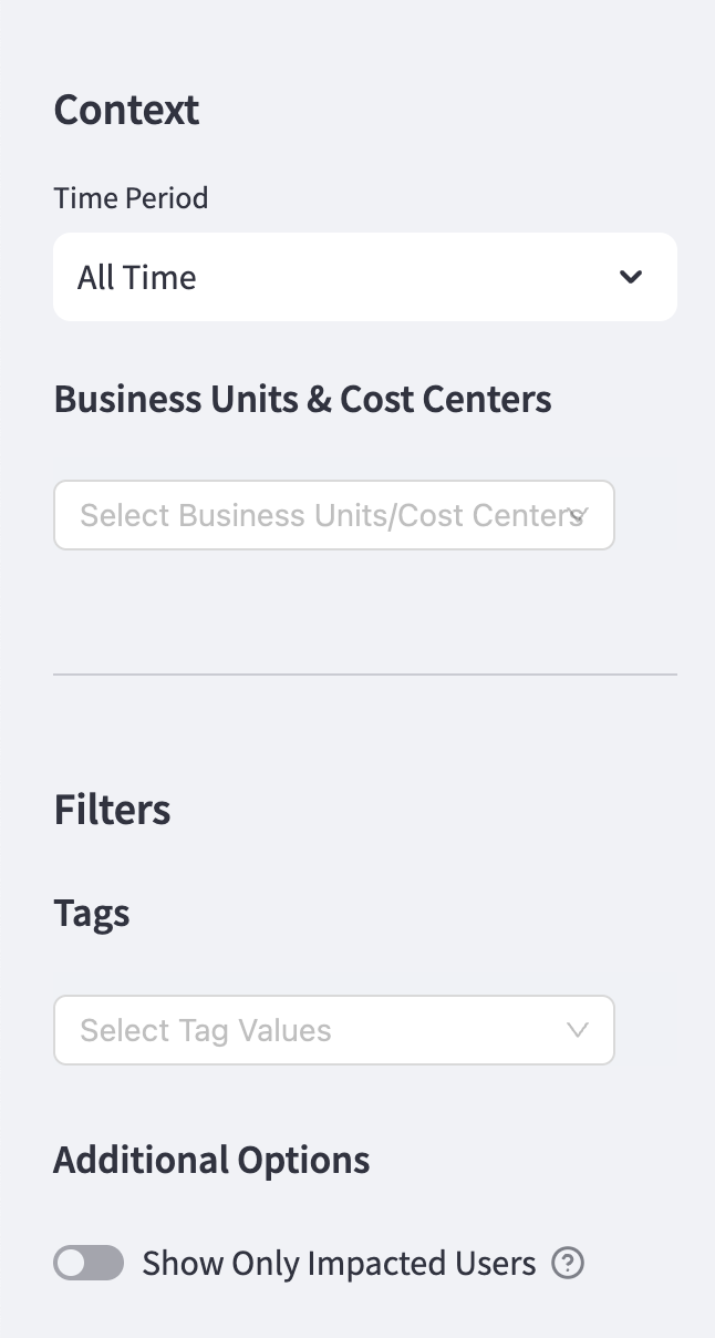
Available filters
Time Period: Select predefined ranges from the following:
Last 7 days
Last 14 days
Last 30 days
Last 90 days
Business Units & Cost Centers: Filter by organizational units for targeted analysis.
Tags: Apply tag-based filters for custom categorization.
Additional Options: Toggle Show Only Impacted Users to focus on users with optimization opportunities.
Managing Business Units and Cost Centers
Organizations are typically structured into different divisions to manage costs and operations efficiently. Companies group their resources into Business Units (BUs) and Cost Centers (CCs) to track expenses effectively. These classifications help finance teams monitor spending, allocate budgets, and analyze costs across departments, teams, or specific use cases. For more details on understanding what a business unit or cost center is and how to structure the organization for better tracking, see here.
Create and manage cost centers
To create and manage cost centers:
The Business Units and Cost Centers are now created. You can select the Edit tab to edit a cost center or business unit.
Click the Manage Business Units and Cost Centers tab in the top right corner of the dashboard.
Select the Business Units tab.
Enter a name for the business unit.
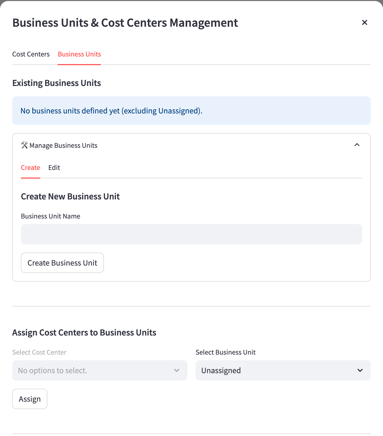
Click Create Business Unit.
Select the Cost Centers tab.
Enter the Cost Center name.
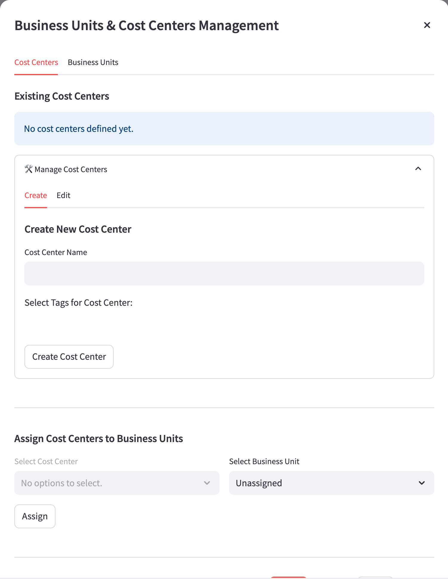
Select tags for the cost center.
Click Create Cost Center.
Under Assign Cost Centers to Business Units, select the required Business Unit and Cost Center and click Assign.
Using the app
Use the Databricks User Accountability Dashboard to review summary metrics, drill down into individual user activity, analyze workspace performance, and track savings over time. This section provides step-by-step guidance to help you navigate each feature, interpret key data, and make informed decisions to optimize Databricks usage across your organization.
The summary information at the top of the Databricks User Accountability Dashboard provides a concise overview of key metrics that set the context for your analysis and monitoring activities. This section displays the following information:
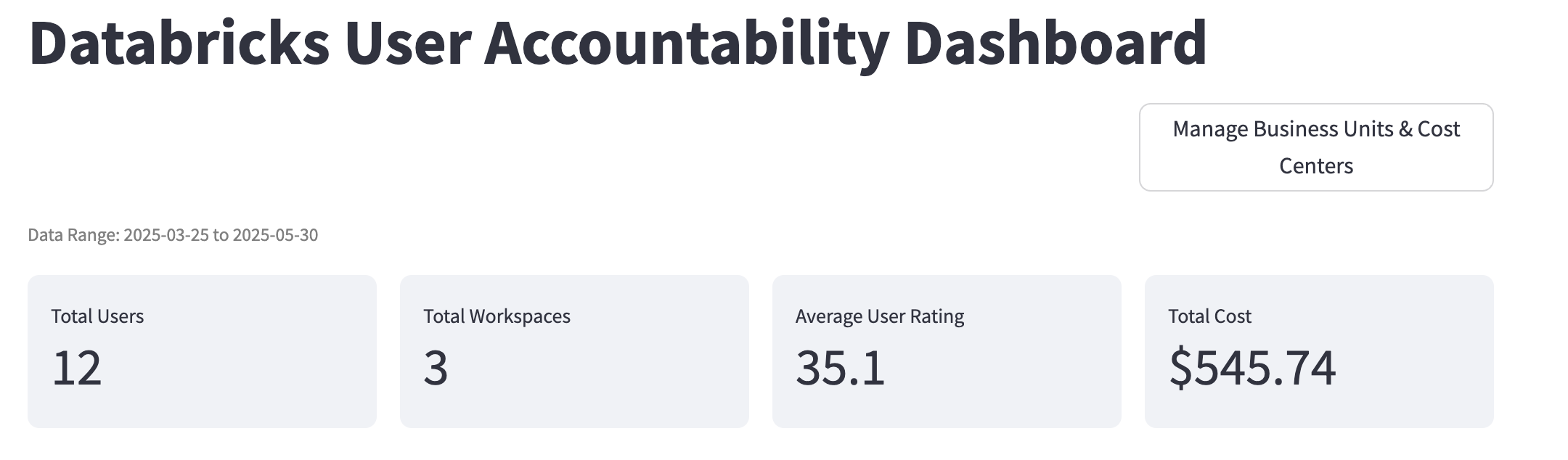
Total Users: Shows the number of unique users whose activities and costs are being tracked within the selected data range. This helps you understand the breadth of user engagement across your Databricks environment.
Total Workspaces: Indicates how many distinct Databricks workspaces are included in the current view, giving insight into the scale and distribution of your organization's usage.
Average User Rating: Presents the mean efficiency score for all users, enabling you to quickly gauge overall user performance and identify whether there are widespread optimization opportunities.
Total Cost: Summarizes the total Databricks compute cost incurred over the selected period, providing immediate visibility into your organization's expenditure.
User Rating Analysis
The User Rating Analysis section enables you to monitor user efficiency across your Databricks environment and quickly identify optimization candidates. This view provides a visual breakdown of users by efficiency rating categories, such as Poor, Uncontrolled, Managed, and No Insights, through a pie chart, helping you assess the overall distribution of user performance. The accompanying scatter plot, User Rating vs Total Cost Impact, highlights users who generate high costs but have low efficiency ratings, allowing you to focus optimization efforts where they will have the greatest impact. By leveraging these insights, you can prioritize support and training for users who present the most significant opportunities for improvement.
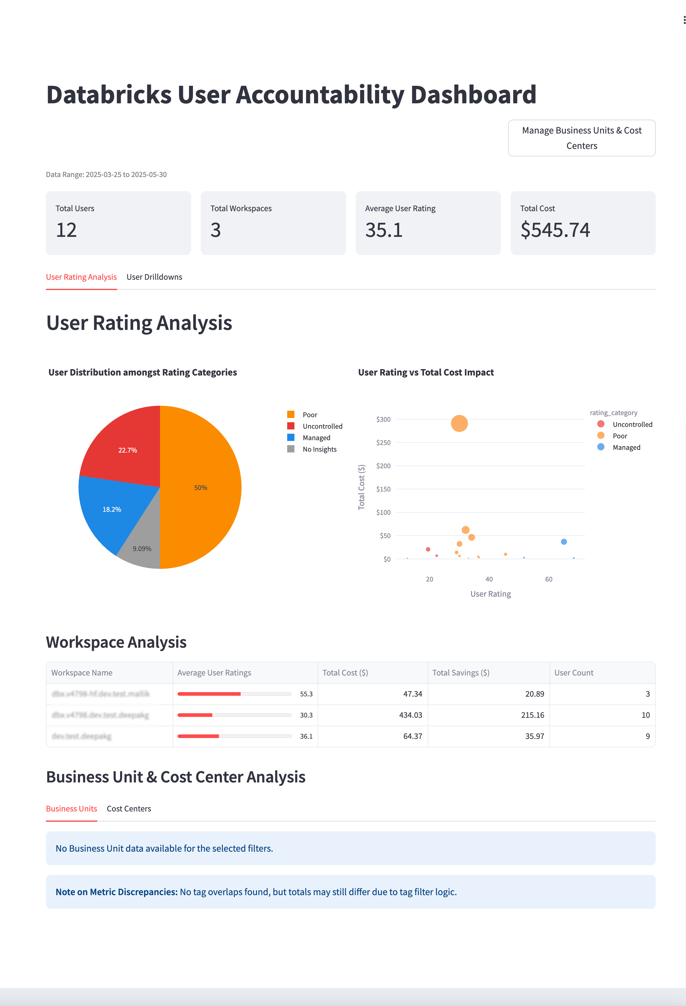
The Workspace Analysis section allows you to analyze workspace costs and target high-cost or low-efficiency workspaces. This table summarizes key metrics for each workspace, including average user ratings, total cost, total savings, and user count. By comparing these metrics, you can identify which workspaces contribute most to organizational costs and where efficiency improvements are needed. This targeted approach ensures that optimization initiatives are directed toward environments with the greatest financial impact, supporting both operational excellence and cost management.
User Drilldowns
The User Drilldowns section provides the ability to drill into user behavior, pinpoint inefficiencies, and track progress over time. Here, you can filter users by workspace or rating category and review individual metrics such as ratings, categories, total costs, and potential savings. This granular analysis helps you identify users who may require intervention and allows you to monitor the effectiveness of optimization strategies at the user level. By focusing on users with Poor or Uncontrolled ratings, you can address inefficiencies and drive continuous improvement across your teams.
Individual User Analysis offers a detailed view of a selected user's performance and cost contribution. This summary includes the user’s rating, category, total cost, and primary workspace, providing a clear snapshot of their impact within the organization. By examining these metrics, you can quickly assess whether a user is operating efficiently or if targeted support is needed. This focused analysis supports data-driven decision-making and helps ensure accountability at the individual level.
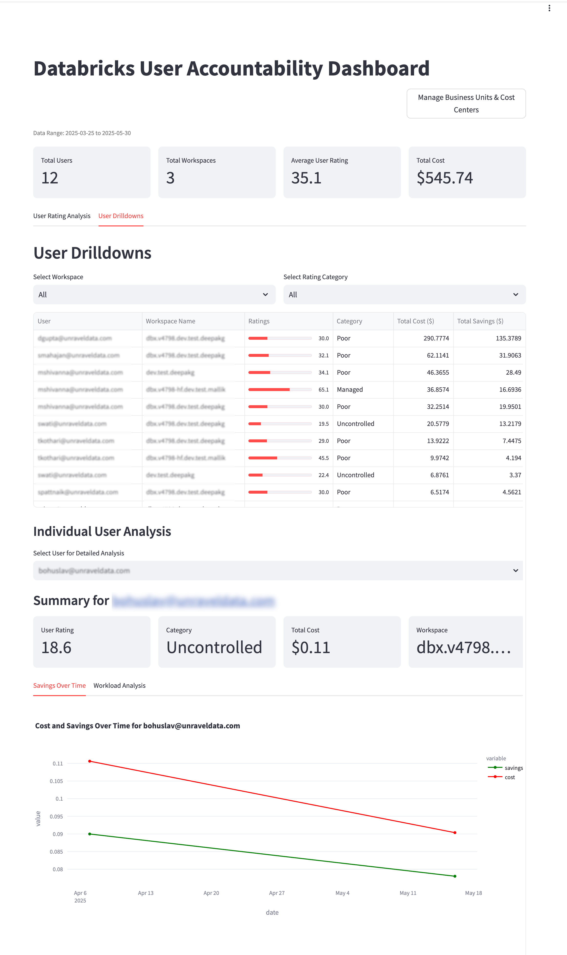
The Savings Over Time section visualizes the cost and savings trends for a selected user. This chart displays how both cost and realized savings evolve over the chosen time period, allowing you to validate the effectiveness of optimization efforts and monitor ongoing performance. By tracking these trends, you can ensure that improvements are sustained and that interventions are delivering measurable results.
The Workload Analysis section provides insights into workload patterns for the selected user. The table details job signatures, compute types, total cost, total savings, savings percentage, and total duration, enabling you to pinpoint which workloads are driving costs. The accompanying chart, Cost and Savings by Signature Over Time, visualizes these trends for specific job types, helping you track progress and identify persistent inefficiencies. This comprehensive analysis ensures that you can take targeted action to optimize resource usage and improve overall efficiency.