Overview
Unravel provides a comprehensive view of a selected cluster, for the selected time period, with various KPIs and graphs from the Overview tab. The aggregated details of the selected cluster are shown in the following sections:
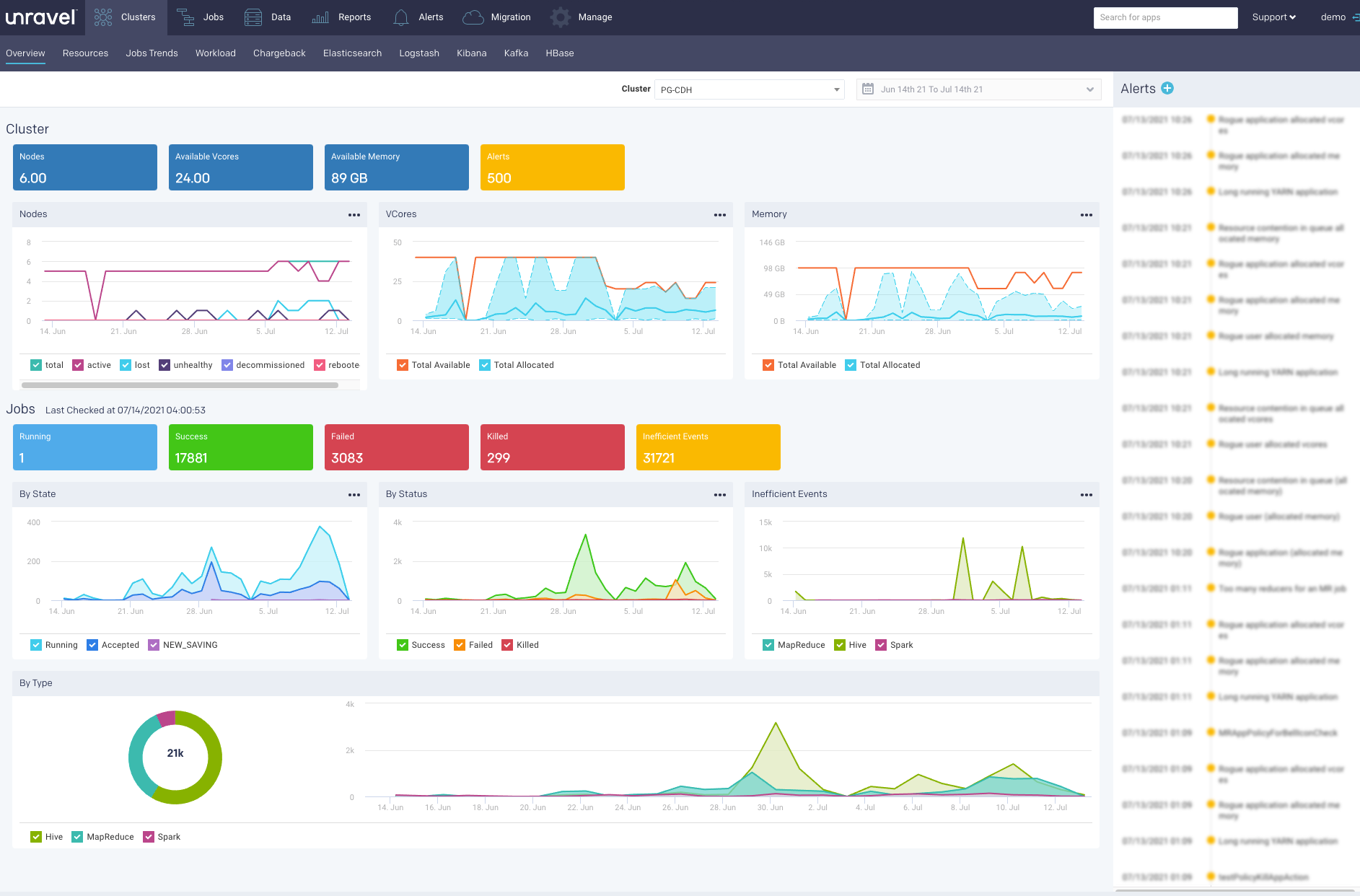
The graphs plot the KPIs and other metrics for a cluster, over the selected time range. Using checkboxes, you can hide or show the multiple items that are plotted in a graph. You can also download graphs in formats of your choice.
Cluster
The KPIs in the Cluster section shows the current value and changes based on the selected time range. The following KPIs and graphs are shown in this section:
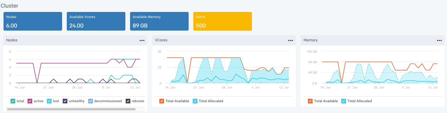
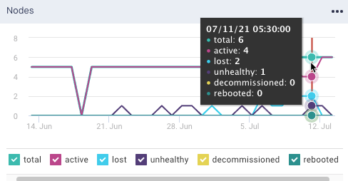
Nodes: This shows the total count of the current number of active nodes plus the number of bad nodes (lost, unhealthy, decommissioned, and rebooted) in the selected clusters.
Note
Only the data nodes are represented and shown in Cluster > Nodes KPI.
From the Nodes graph, you can plot the active and bad nodes in a cluster, over a specified period.
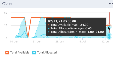
Available Vcores: This shows the current number of available VCores in the selected clusters.
From the VCores graph, you can plot the available VCores and the allocated VCores in a cluster, over a specified period.
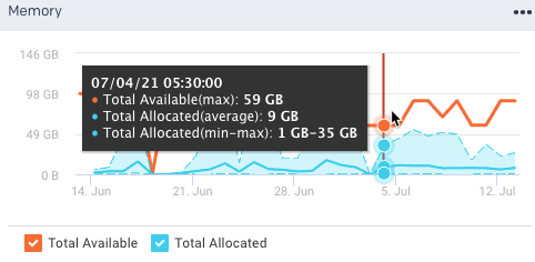
Available Memory: This shows the current amount of the available memory in the selected cluster.
From the Memory graph, you can plot the available memory and allocated memory in a cluster, over a specified period.
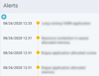
Alerts: This shows the count of alert notifications. The list of alert notifications is displayed in the right panel.
Note
Alerts KPI is displayed only if the count is more than zero.
Jobs
This section displays the KPIs pertaining to the jobs run by various application types in the selected cluster, over a period of time.
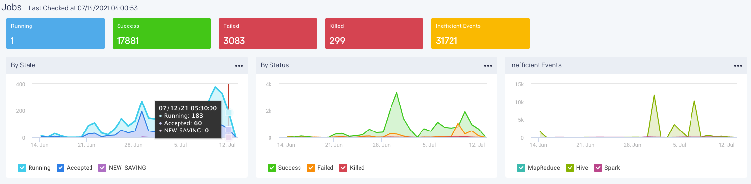
The following KPIs and graphs are shown in this section.
Running: The current number of running jobs (apps).
Pending: The current number of pending jobs.
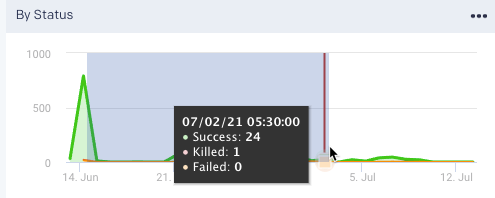
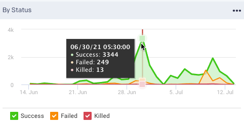
Success/Failed/Killed: Displays the number of successful, failed, or killed jobs for the selected period.
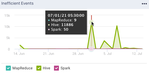
Inefficient Events: This shows the number of events that have occurred, in a cluster, due to some inefficiencies in the job run, during the specified period.
The following charts graphically display the information about jobs running in the cluster. You can zoom and drill down into each of these graphs. Fix the mouse pointer at a location in the graph and drag to zoom in.
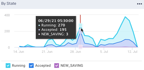
By State graph plots the new applications that are just created, the saved applications, the running applications, and the applications that are accepted by the scheduler in a cluster over the selected period.
By Status graph plots the number of successful, failed, or killed jobs for the selected period.
Inefficient Events graph plots the number of events that have occurred, in a cluster, due to some inefficiencies in the job run, during the specified period. Check Jobs > Inefficient Apps for the list of jobs (apps) experiencing these events.
Note
Jobs can experience multiple events; therefore, the number of jobs listed in the Jobs > Inefficient Apps tab is typically less than the number of events.
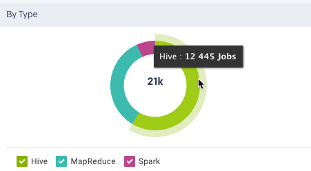
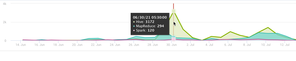
By Type: Display the count of jobs run in the specified time period by various application types. This is shown in pie chart segments as well as plotted in a graph
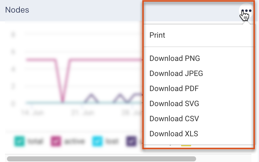
Download graph information
You can download the information displayed on a Cluster or Job graph in PNG, JPEG, PDF, SVG, CSV, and XLS formats. Click  on the top-right of any graph and select the format of your choice. The downloaded graph can be saved to a directory and printed.
Alerts
Lists all the alerts and events triggered by jobs for the selected time range. Click  to create a new AutoAction.