Workload
This report presents the workload of your cluster's YARN and Impala apps, in the selected cluster, for the specified date range, in the following views:
Month - by date, for example, October 10.
Hour - by hour, regardless of date, for example, 10.00 - 11.00.
Day - by weekday, regardless of date, for example, Tuesday.
Hour/Day - by hour for a given weekday, for example, 10.00 -11.00 on Tuesday.
You can filter each view by Jobs, vCores Hour, and Memory Hour.
See Drilling Down in a Workload view for information on how to retrieve the detailed information within each view.
Note
To measure the vCores or Memory Hour usage is straightforward; at any given point, the Memory or vCore is being used or not.
The App Count isn't a count of unique app instances because apps can span boundaries, i.e., begin and end in different hours/days.
Jobs reflect the apps that were running within that interval up to and including the boundary, i.e., date, hour, day. Therefore, an app can be counted multiple times in a time slice.
On multiple dates, for example, October 11 and 12.
In multiple hours, for example, 10 PM, 11 PM, and 12 AM.
On multiple days, Thursday and Friday.
In multiple hour/day slots.
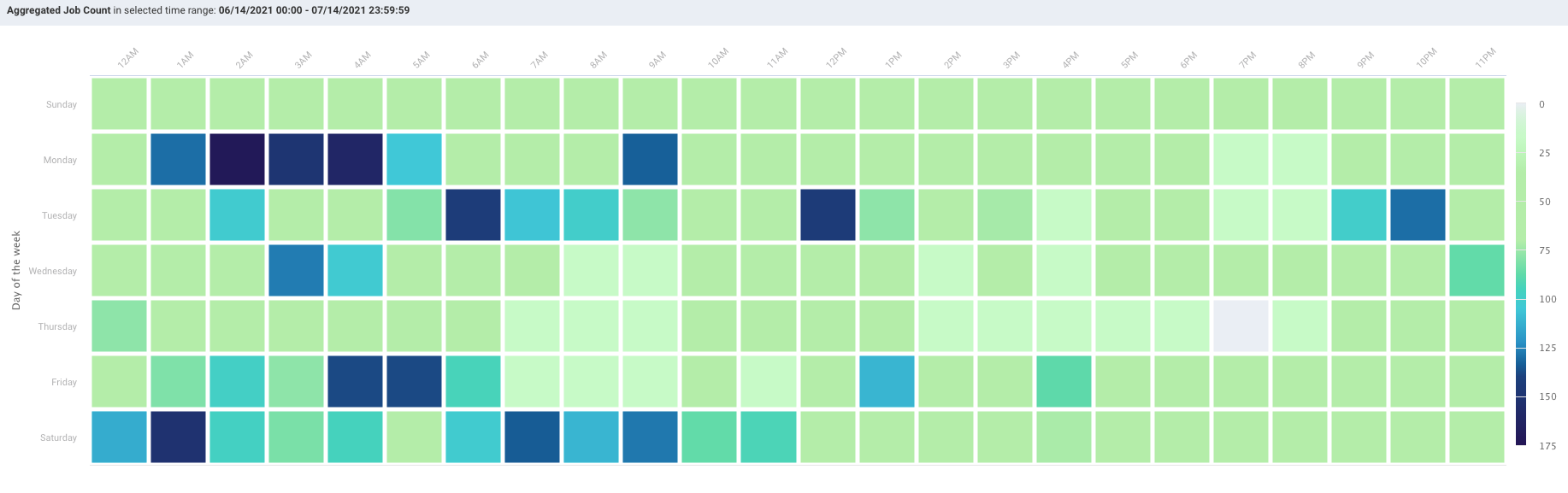
This results in anomalies where the Sum(24 hours in Hour/Day App Count) > Sum(App Counts for dates representing the day). For instance, in the below example:
App Count for Wednesdays (October 10, 17, and 24) = 2492, and
App Count across Hour/Day intervals for Wednesday = 2526.
This is pointed out only to inform you about the existence of such variations.
The tab opens in the Month view filtered on App Count for the past 24 hours.
Viewing the workload for a cluster
Go to the Clusters > Workload tab.
From the Workload Type drop-down, select either Yarn or Impala.
From the Cluster drop-down, select a cluster.
Select the period range from the date picker drop-down. You can also provide a custom period range. It is recommended to use a short range, as the longer the range the more processing time is consumed.
Note
The maximum date range that you can select is 60 days. It can vary in Day, Hour, Hour/Day view based on the cluster load.
From the View By drop-down, select one of the following options:
Month
Day
Hour
Hour/Day
From the Group-by drop-down, select any one option from Jobs, vCore Hour, Memory Hour to change the display metric. The metric you select is used for all subsequent views until changed.
Month view
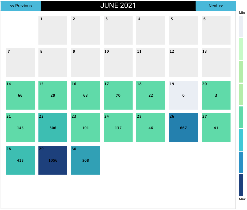
Displays the monthly view that is run for a specific period range. The color indicates how the day's workload is in comparison with the other days within the selected date range. The day with the least jobs/hours is  , while the days with the highest load are
  . The color legend is provided on the right side of the view for reference. Use Previous and Next in the month's title bar to navigate between months.
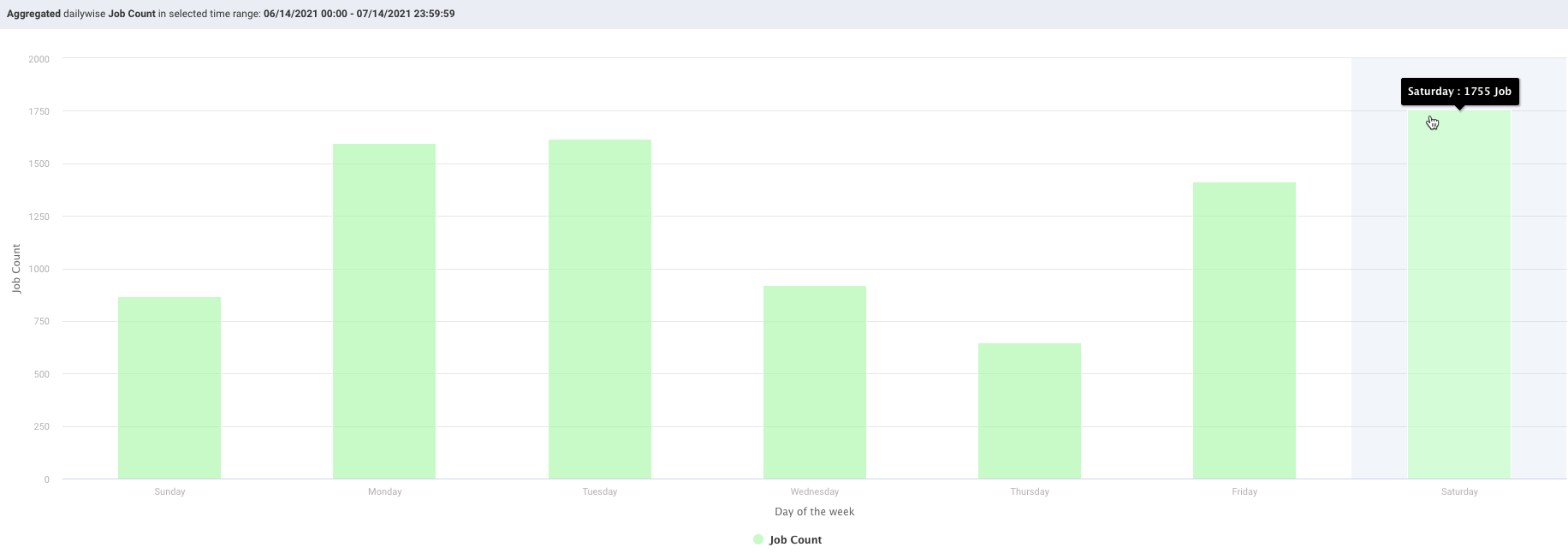
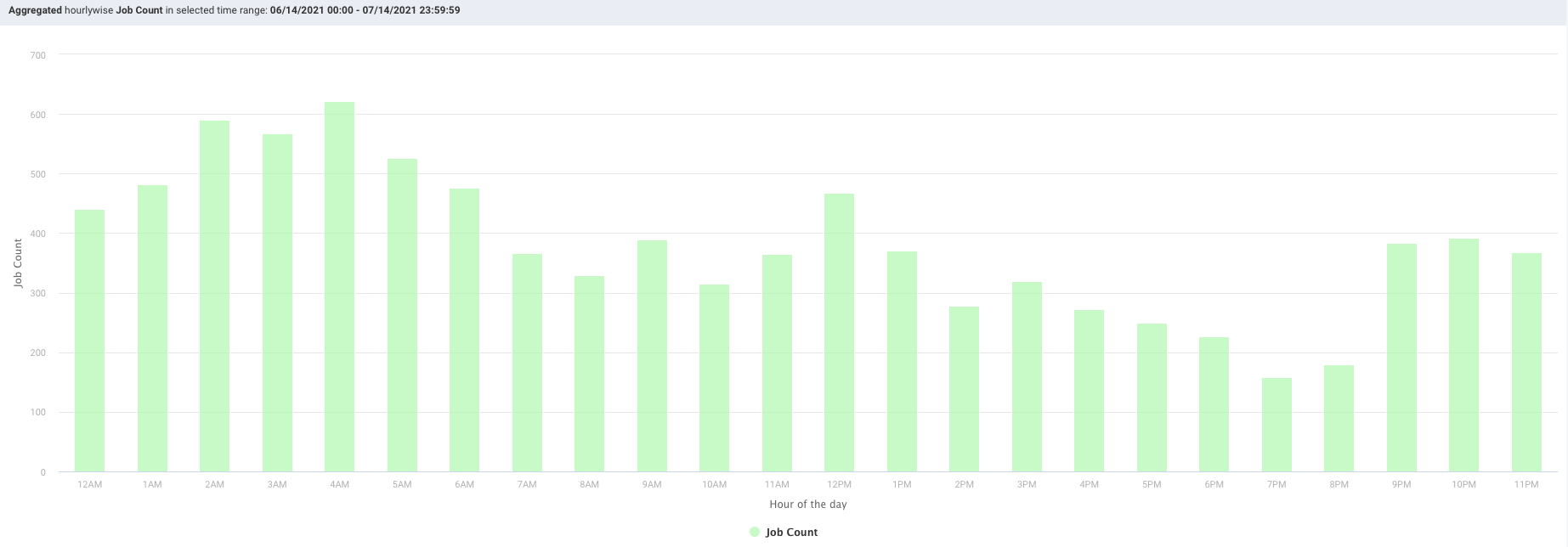
Hour, day, and hour/day view
These graphs do not link jobs to any specific date at the graph level. For instance, the Hour graph shows that 856 jobs ran at 2 AM (between 2 AM and 3 AM); the Day graph that 2,492 jobs ran on Wednesday, and the Hour/Day that 68 jobs ran at 2 am on a Wednesday. But none of these graphs directly indicate the date these jobs ran on. Only the Month view visually links job counts to a specific date.
Each view opens using the metric selected for the prior view. For instance, if vCores Hour is used to display Month and you switch to Day it is filtered using vCores Hour.
When the DATE RANGE spans multiple days, you have the choice to display the data as either the:
Sum - aggregated sum of job count, vCore, or memory hour during the time range (default view).
Average - Sum / (# of Days in Date Range).
Day view
Displays the jobs run on a specific weekday. Hover over an interval for its details. Click the interval to drill down into it.
Hour view
Plots the information by hour. The interval label indicates the start, i.e., 2 AM is 2 AM - 3 AM. Hover over an interval for its details. Click the interval to drill down into it.
Hour/Day view
This view shows the intersection of Hour and Day graphs. The Hour graph showed 856 jobs ran between at 2 AM - 3 AM while the Day graph (immediately above) that 2,492 jobs ran on Wednesday. Below we see that 68 of Wednesday's jobs (2.7%) were running between 2 AM - 3 AM.
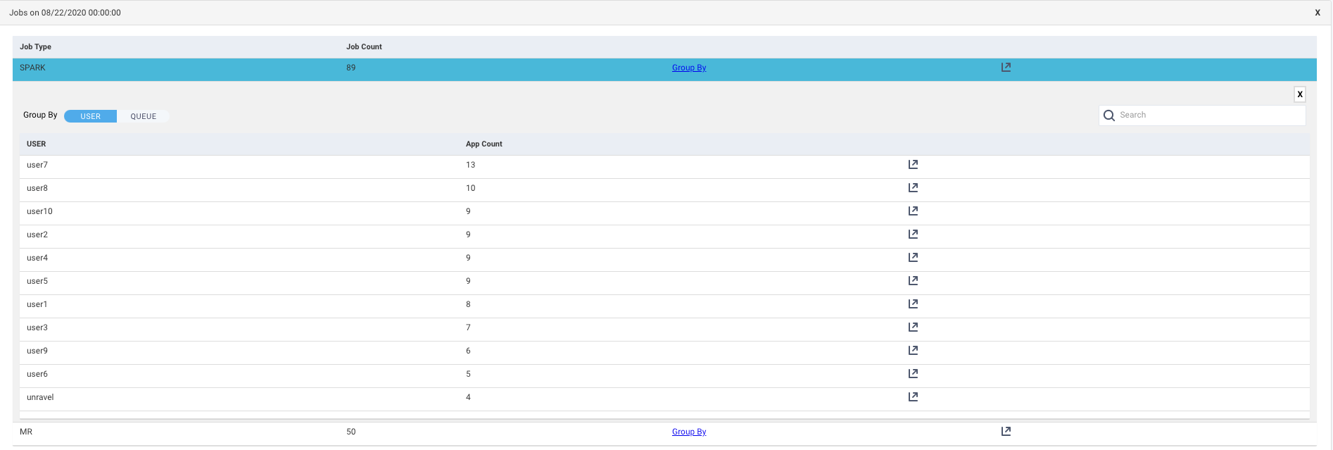
Drilling down in a workload view
In the charts, click on a date, day, or hour. The Jobs list for that specific date, day, or hour is displayed. The table provides the following details:

Job Type: The type of job that was run on the selected date, day, or hour.
Job Count: The number of jobs that were run on the selected date, day, or hour.
Group By: Click the link to view the details of the jobs based on any one of the following group by options:
User
Queue
Get Jobs
 : Click this icon to view the list of Jobs based on the application types. Refer Jobs > Applications. Click this icon in the Group by list corresponding to a user or a queue, the list of jobs run is shown based on the application type and specifically sorted for the selected user or queue.
Click
 on the upper-right of a table to export the table data as a CSV file.