Databricks cost anomaly detection app
This app detects and notifies you about cost anomalies, which are abnormal rise or fall in the cost. These anomalies are showcased in trend graphs, from where you can view more insights into the cost anomaly such as the cost breakdown based on user, workspace, or tag.
You can set the app to view the trends on a daily basis or on a weekly basis. You can also set the notification channels to receive alerts when a cost anomaly is detected.
Installing and opening Databricks cost anomaly detection app
Refer to App installation and launch to install Databricks cost anomaly detection app.
Refer to App installation and launch to open Databricks cost anomaly detection app.
Setting the Databricks cost anomaly detection app
After installing, you can open the Databricks cost anomaly detection app and add the following settings:
Add daily/weekly intervals to view the trend graphs.
Add notification channels to receive alerts for cost anomalies.
Choose whether to suppress negative anomalies and specify tolerance values to suppress negative anomalies. Negative anomalies indicate points where the cost is abnormally low.
On the Unravel UI, from the upper-right corner, click
 . The App Store page is displayed.
 Click the Dbx Cost Anomaly image to open the app and then click the Setting tab.
In the Trend intervals section, select either the Daily or Weekly option. Accordingly, the trend graphs will display the data on a daily or weekly basis.
Click Save. You can view the corresponding changed settings from the Analysis tab.
Daily and Weekly time series
On the Unravel UI, from the upper-right corner, click
. The App Store page is displayed. Click the Dbx Cost Anomaly image to open the app and then click the Setting tab.
In the Notifications settings section, select the channels where you want to send alerts when a cost anomaly is detected. The notifications that were created earlier are available for selection.
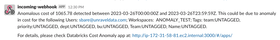
Click Save. Alerts are sent to the specified notification channels whenever a cost anomaly is detected. Following is a notification of the cost anomaly detection sent to a slack channel.
Negative anomalies indicate points where the cost is abnormally low. By default, the option to suppress negative anomalies is selected. You can specify the tolerance level for suppressing the negative cost anomalies.
On the Unravel UI, from the upper-right corner, click
. The App Store page is displayed. Click the Dbx Cost Anomaly image to open the app and then click the Setting tab.
In the Anomaly settings section, do the following:
Check Suppress negative anomalies option, if it is not checked already.
Use the Tolerance slider to adjust the tolerance level to suppress negative anomalies. This can be a value between 0 to 1.
0.95 is the recommended value.
Click Save.
Generating trends graphs for Databricks Cost Anomaly Detection
On the Unravel UI, from the upper-right corner, click
. The App Store page is displayed. Click the Dbx Cost Anomaly image to open the app and then click the Analysis tab.
From the Date Range calendars, select a period. Click on any two dates to select the range.
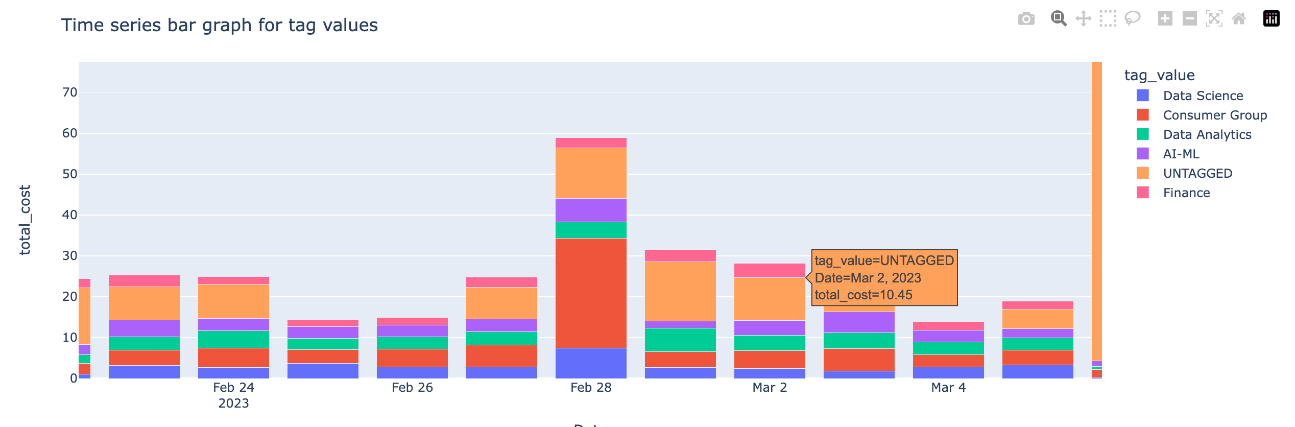
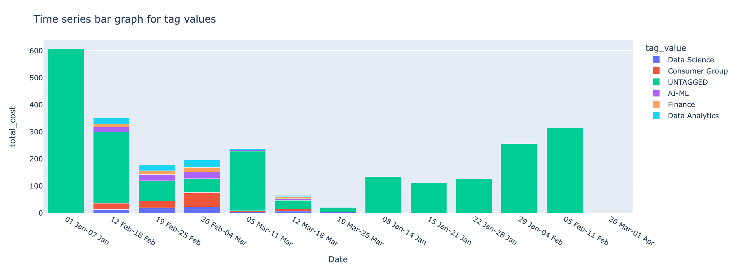
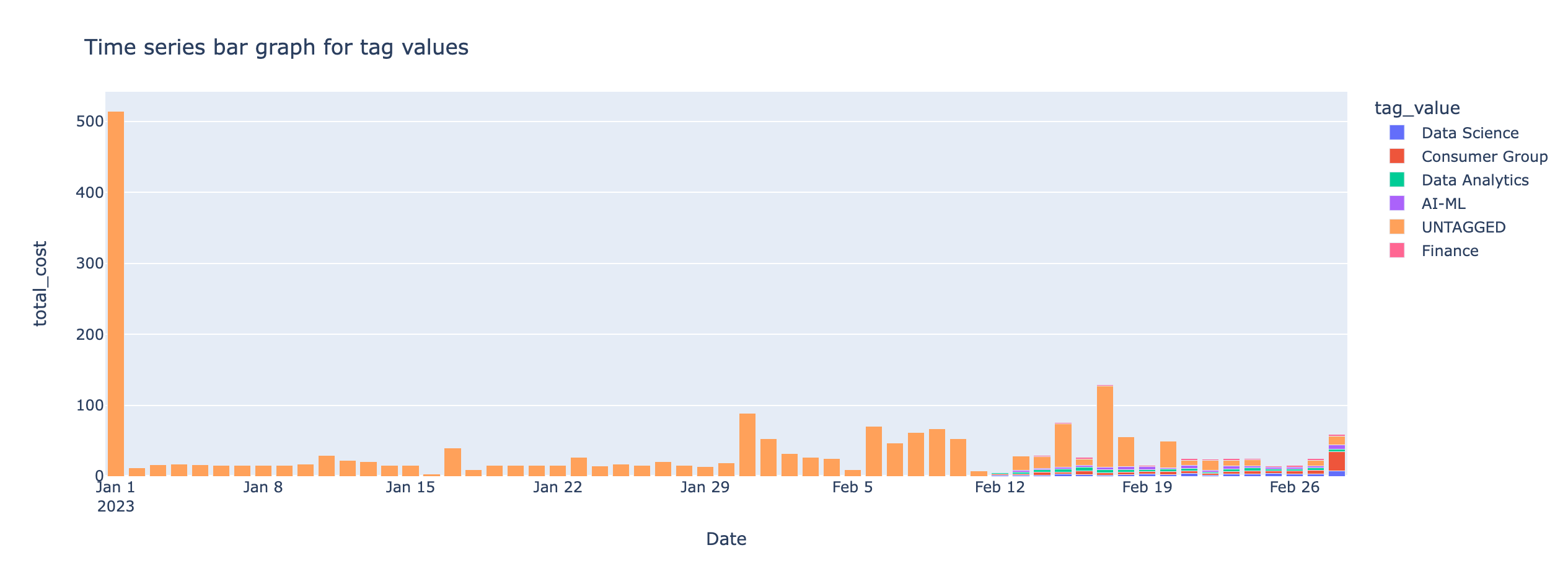
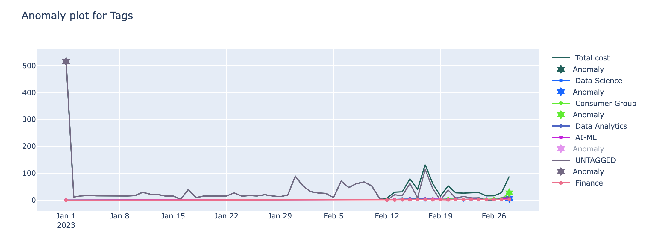
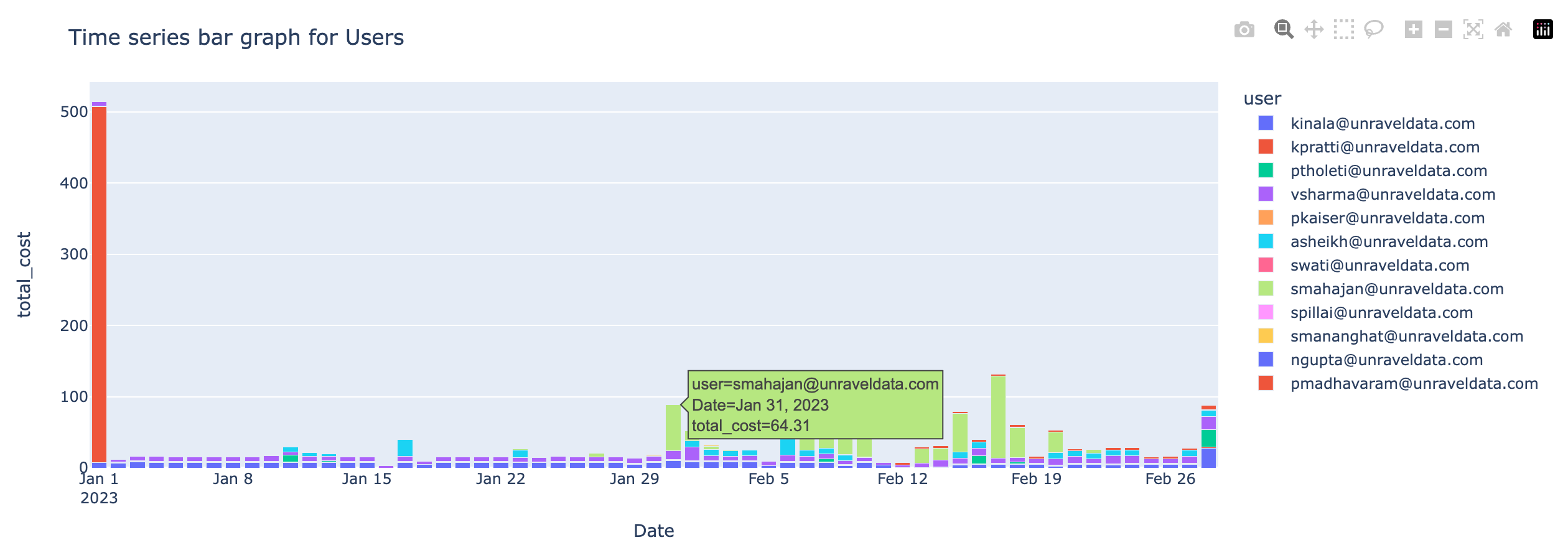
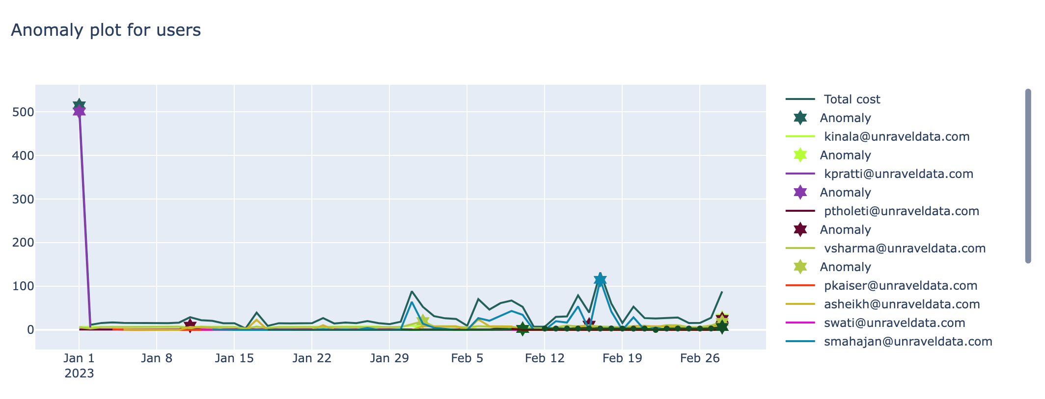
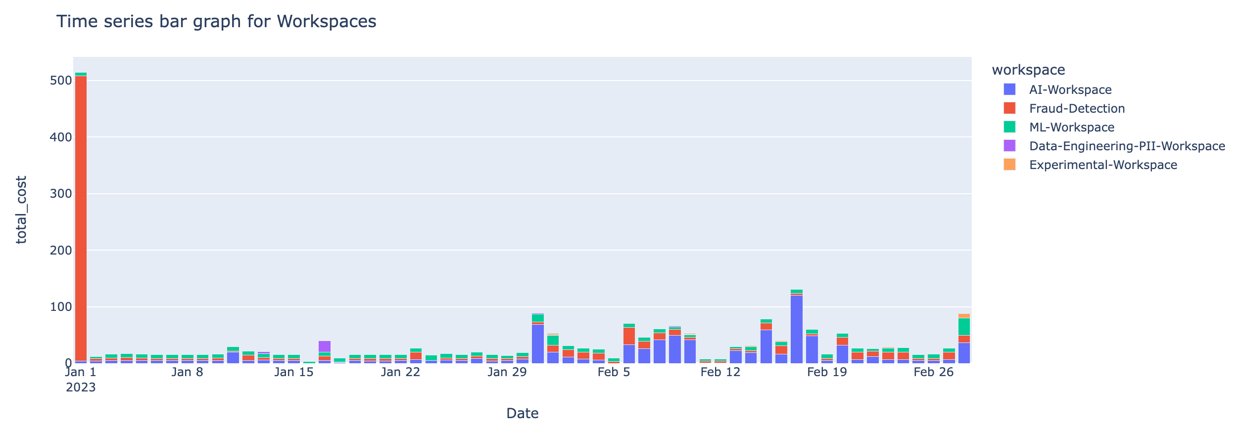
From the Group by tag, select a tag to view the breakdown in the time series charts. The following cost and anomaly charts are shown along with the Anomaly insight.
Anomaly insight

Time series bar graph with the cost incurred by the selected tag values
Time series line graph of the cost anomaly detected for the selected tags
Time series bar graph with the cost incurred by users
ime series line graph of the cost anomaly detected for the users
Time series bar graph with the cost incurred by workspaces
Time series line graph of the cost anomaly detected for the workspaces