Operational Insights
Chargeback Yarn - generates chargeback Yarn jobs.
Chargeback Impala - generates chargeback reports for Impala jobs.
Cluster Summary - generates summary reports for cluster usages.
Cluster Compare - generates reports comparing cluster activity between two time periods.
Cluster Optimization - analyzes the cluster performance and provides fine-tuning insights/recommendations.
Queue Analysis - generates a report of active queues for time frame. The report analyzes queue activity by apps, vCores and memory.
Cluster Workload - shows the aggregated workload for all clusters.
Top X - generates a report for the top X number of applications.
When you specify a date range, a pull down menu appears on the right-hand side of the Operational Insights title bar. By default, OPERATIONAL INSIGHTS opens showing CHARGEBACK tab grouped by Application Type, for all clusters over the last 24 hours displayed hourly.
Note
Click here for common features used throughout Unravel's UI.
Chargeback Yarn/Impala
The Chargeback Yarn and Impala tabs are identical except that the reports are limited to Yarn and Impala jobs respectively.
You can generate chargeback reports for multi-tenant cluster usage costs associated by the GROUP BY options: Application Type, User, Queue, and Tags. The default is Application Type; see above where only one (1) application type, Tez, was running. The window is divided into three (3) sections:
Donut graphs showing the top results for the GROUP BY selection,
Chargeback report showing costs, sorted by the GROUP BY choice(s), and
List of Yarn applications running.
Generate Chargeback Report
You can set the date range and the cluster(s) to use for the report in the OPERATIONAL INSIGHTS title bar. Use the GROUP BY filters to generate/display the information in a categorical fashion. If two GROUP BY options are selected, the sort priority is noted. In the example below the report is sorted on User than on the tag dept. Clicking the GROUP BY selection toggles it and might change the sort priority. Using the below example, if you deselect User, the tag dept becomes first sort with the selection becoming the second. You can specify the vCore/Hour and Memory MB/Hour base costs (1) fractionally by entering them directly. Click UPDATE REPORT (2) to generate the report. Click DOWNLOAD CSV to download the report as a .CSV file (3). Hover over the chart to see the information textually.
A new chargeback report is generated each time you change the GROUP BY filters. If you change the base costs, you must click Update Report to apply them to the report. The example below is of the CHARGEBACK YARN tab.
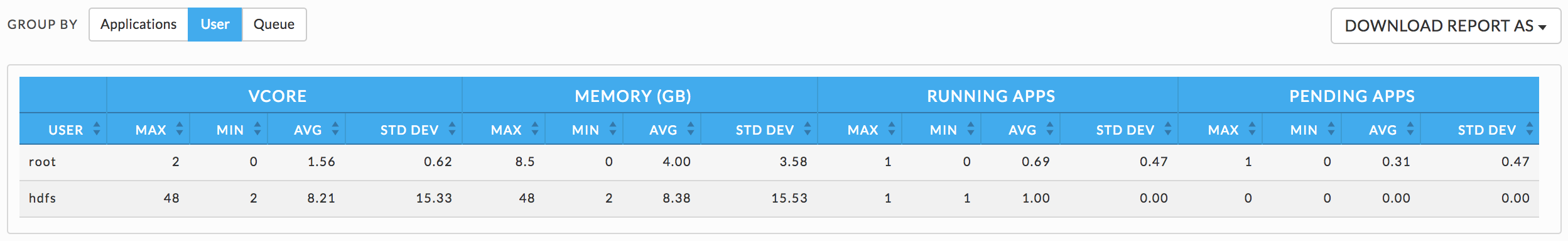
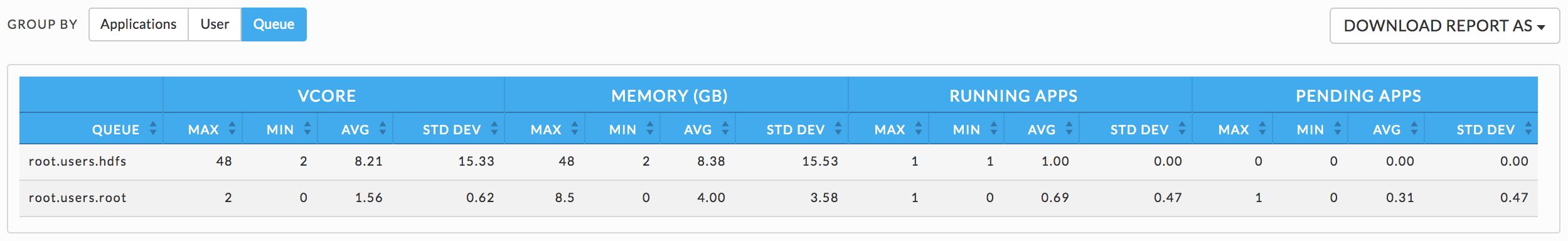
Cluster Summary
The CLUSTER SUMMARY can be grouped by Applications, User or Queue. You can choose the date range in the Operational Insights title bar. By default, Cluster Summary opens displaying the User information. To download the current report, click DOWNLOAD REPORT AS and chose either JSON or CSV format
Applications
You can sort applications on vCore or Memory seconds.
User
Queue
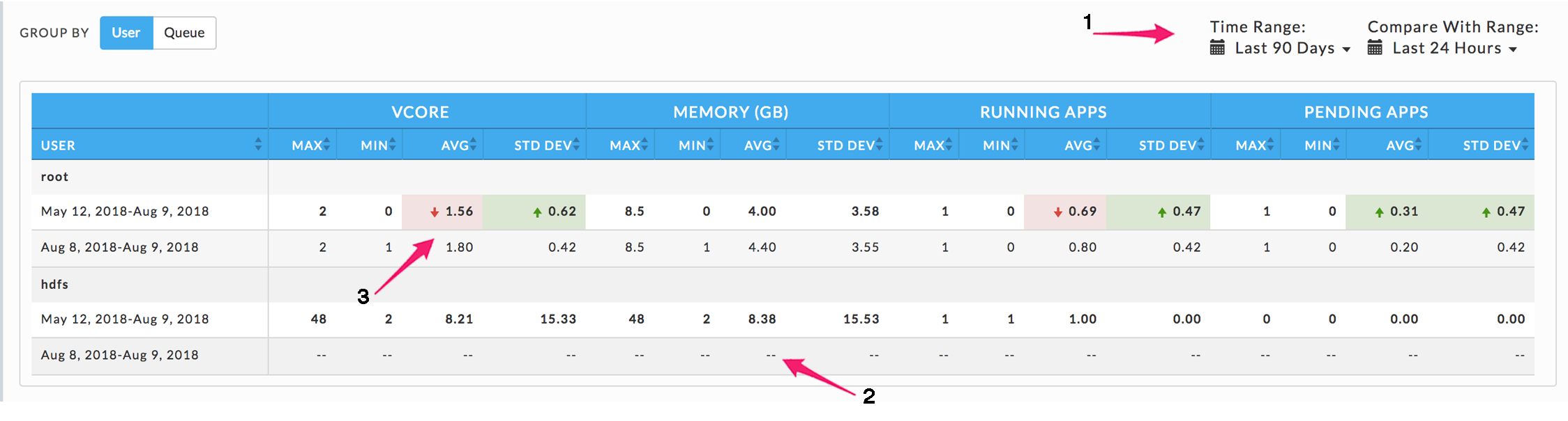
Cluster Compare
This tab opens displays the cluster group by User with the Time Range and Compare with Range both set to the Last 7 Days, i.e., no comparison is displayed.
Use GROUP BY to generate the report by User or Queue. Use the Time Range and Compare With Range pull-down menus to specify the time ranges.
Any deviation in metrics across the time ranges is highlighted (3). A green highlight with an upward arrow indicates am increase, while red with a down arrow denotes a decrease. If the Time or Compare With range is invalid for the GROUP BY choice the range row is dashed (2).
Cluster Optimization
Note
The OnDemand package must be installed to use this report.
This report analyzes your cluster workload over a specified period. It provides insights and configuration recommendations to optimize your cluster throughput, resources, and performance. Currently, this feature only supports Hive on MapReduce.
You can use these reports to:
Fine tune your cluster to maximize its performance and minimize your costs, and
Compare your cluster's performance between two (2) time periods.
Reports are generated on an ad hoc or scheduled basis. All reports are archived and can be accessed via the Reports Archive tab. The tab opens displaying the last report, if any, generated.
Download or Generate a Report
Click Download JSON to download the displayed report in JSON. To download a prior report go to Reports Archive.
 |
Click GENERATE NEW REPORT to create new report; enter the Date Range and click RUN. RUNNING replaces RUN and a countdown is displayed until Unravel starts collecting the data. GENERATE NEW REPORT pulsates blue until the report is completed. When the report is successfully generated, a light green bar is displayed.

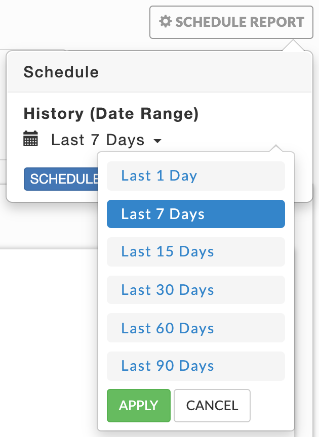
Click SCHEDULE to run the report at some future date and time. You can schedule your report to run once or on a regular basis. All reports (successful or failed attempts) are in the Reports Archive.
Optimization Report
The Report has three (3) sections.
Header Contains the basic report information author, time run, and dates used to generate the report.

KPIs
Number of Jobs: per day average
Number of vCore Hours: per day average
Number of MapReduce Containers
Percent used for Map
Percent used for Reduce
Amount of Memory from of MapReduce Containers
Percent from Map containers
Percent from Reduce
containers
The KPIs are a per-day average for the number of days in the report. In this case we generated a report for a two (2) day period. All the insights/recommendations are based upon the analysis of all jobs, in this case 113.

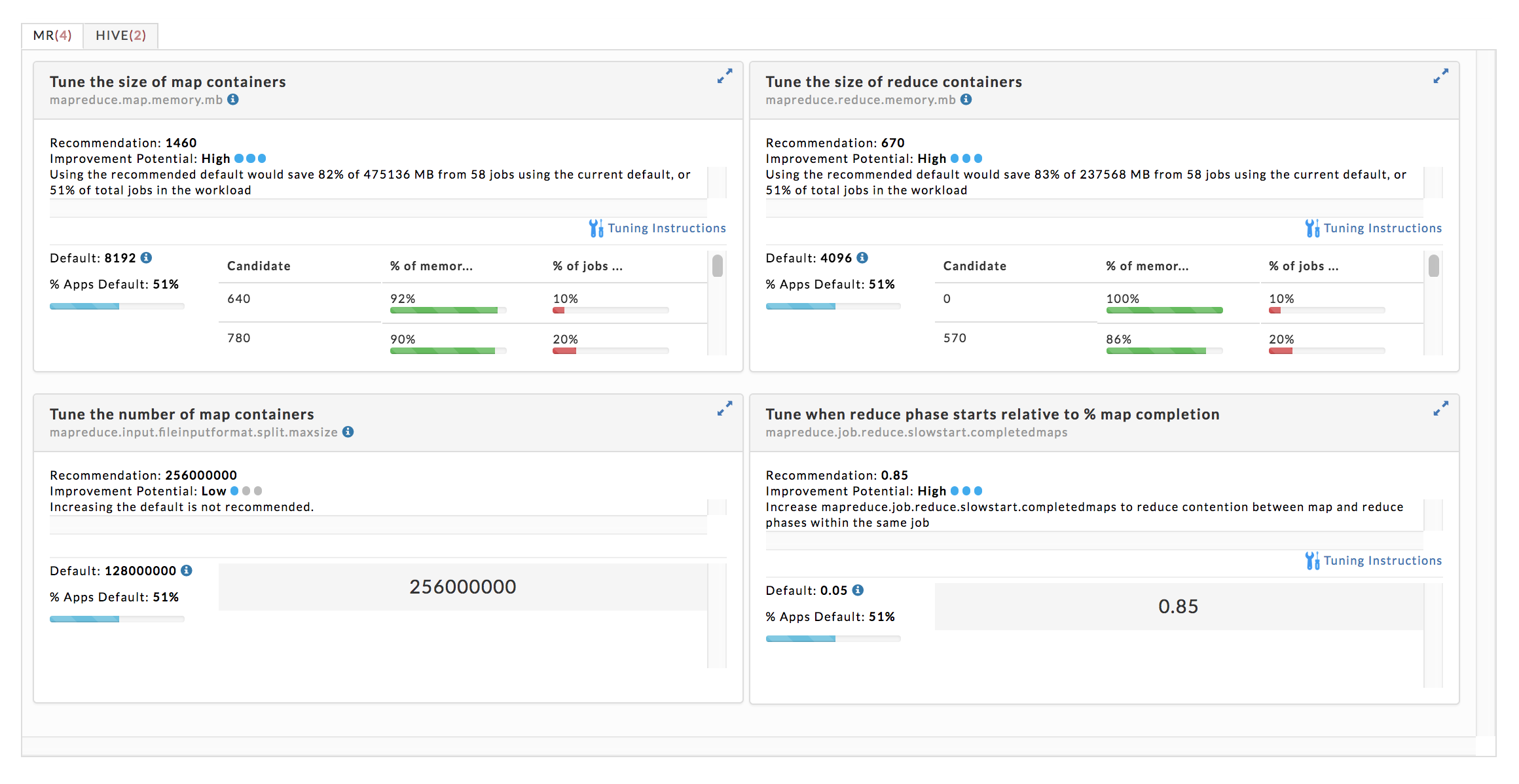
Insights/Recommendations
This section contains a tab for each app type with the relevant properties under consideration for tuning. These are cluster wide properties, and they are the defaults for all applications. However, you can override these properties on an application by application basis.
MapReduce:
mapreduce.map.memory.mb
mapreduce.reduce.memory.mb
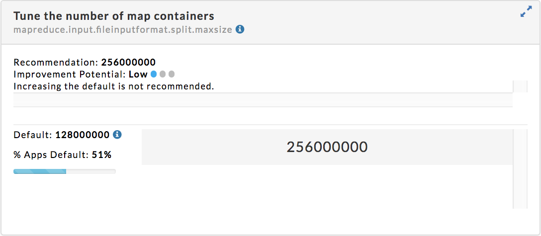
mapreduce.input.fileinputformat.split.maxsize
mapreduce.job.reduce.slowstart.completedmaps
Hive:
hive.exec.reducers.bytes.per.reducer
hive.exec.parallel
You can expand the insight tile to the full width of the window. Further, below we go into greater detail for two of the insights.
Insight/Recommendations Tile Details
Tune the size of the map containers
Each tile is entitled with the property being tuned. Below is the expanded view of the first tile.
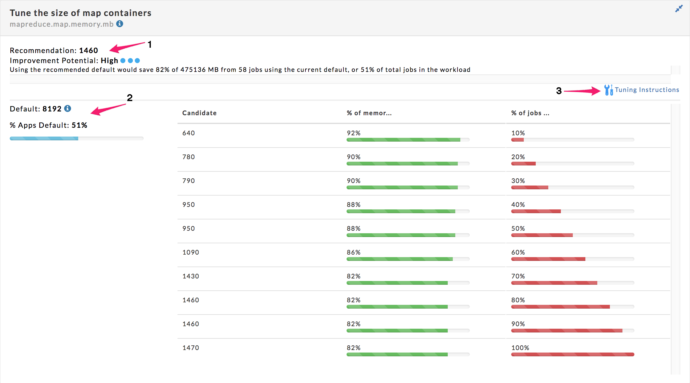
Immediately below the title is the property name, in this case mapreduce.map.memory.mb. Click on the
 to bring up related properties.
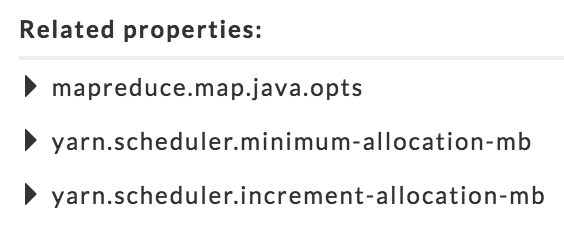
Next (1) is the tuning suggestion (1460), the projected impact (High) and the effect on the current jobs. In this case the recommendation effects 51% of the total jobs. The final section has the analysis information. The default (2) is the current property value (8192) and the percent of the applications that are currently using that value (51%). Click on the
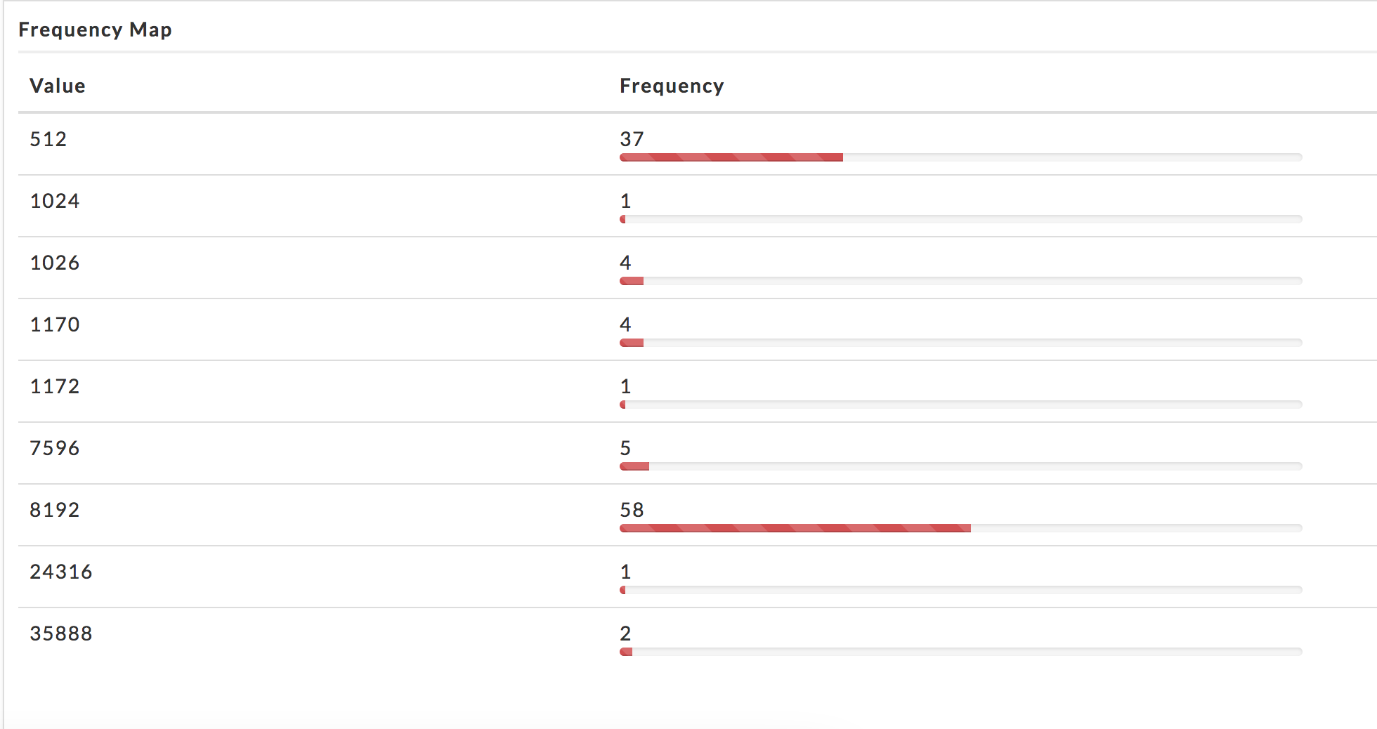
to see the frequency map showing the job distribution by memory usage.As expected 51% of the jobs (58) used the default, while 33% (37) used 512 MB with the remaining jobs distributed across the remaining values.
The graph shows Unravel's analysis of the property potential values. It shows each candidate (proposed value) and the effect it had on the % of memory saved for the input workload and the % of jobs from the workload that would still run with the candidate. In this case we want to maximize the ability to run jobs while minimizing the memory allocation.
When there are tuning instructions it is noted above the graph (3). Click on
 to display the instructions explaining where and how to set the property and any additional information you should take into consideration. You'll notice that all the "related" properties and their relationship to what we're tuning are discussed here.
Tune the number of the map containers
Tune the number of reduce containers in Hive queries
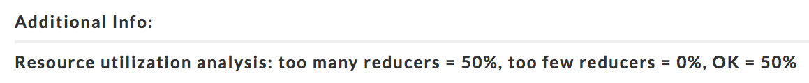
This analysis a tuning suggestion, instructions and additional information. Click Additional Info to see it's contents.
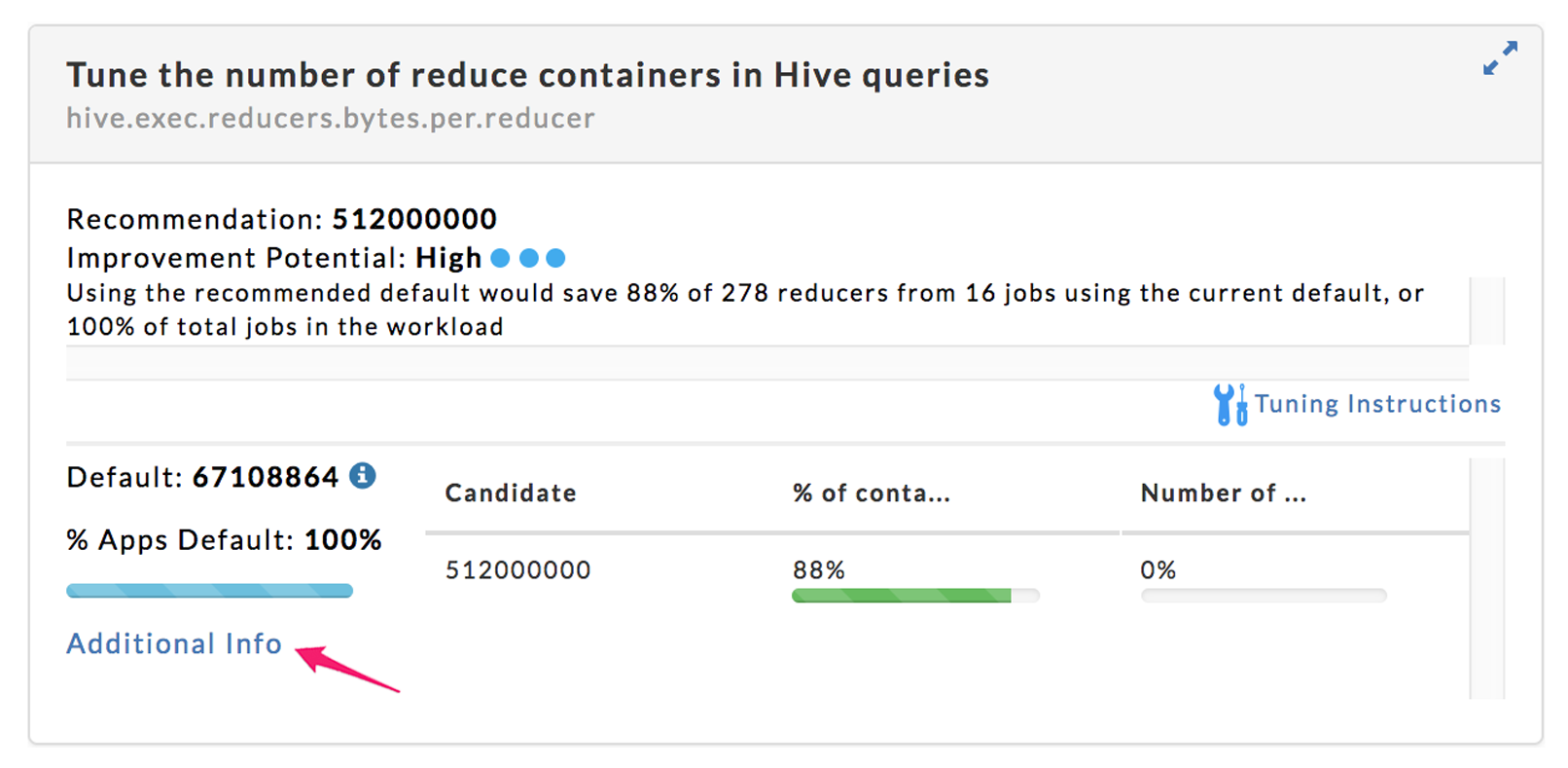
In this case, the information was simply informative. There can be cases where tuning suggestions for specific apps are offered.
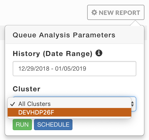
Queue Analysis
Note
The OnDemand package must be installed to use this report.
You can generate a report of active queues for all your clusters or a particular cluster. The report analyzes queue activity by applications, vCores, memory, and disk. As with all reports, it can be generated on an ad hoc or scheduled basis. The tab opens displaying the last report, if any, generated. Reports are archived and can be accessed via the Reports Archive tab.
Generate a Report
Click NEW REPORT to create new report. Enter the History (Date Range), the default range is 1 week. Use the Cluster pull down menu to select from your available clusters. Click RUN. RUNNING replaces RUN and a countdown is displayed until Unravel starts collecting the data. A green banner bar is briefly displayed noting that "Queue Analysis Started" and NEW REPORT pulsates blue while the report is being generated. If Unravel is unable to start the report or failed to produce one, a red banner bar is displayed noting report wasn't started along with any error messages. The time to generate a report varies based upon the time range selected and number of active queues on the cluster.
Click SCHEDULE to run the report at some future date and time. You can schedule your report to run once or on a regular basis. All (successful or failed attempts) are stored in the Reports Archive.
 |
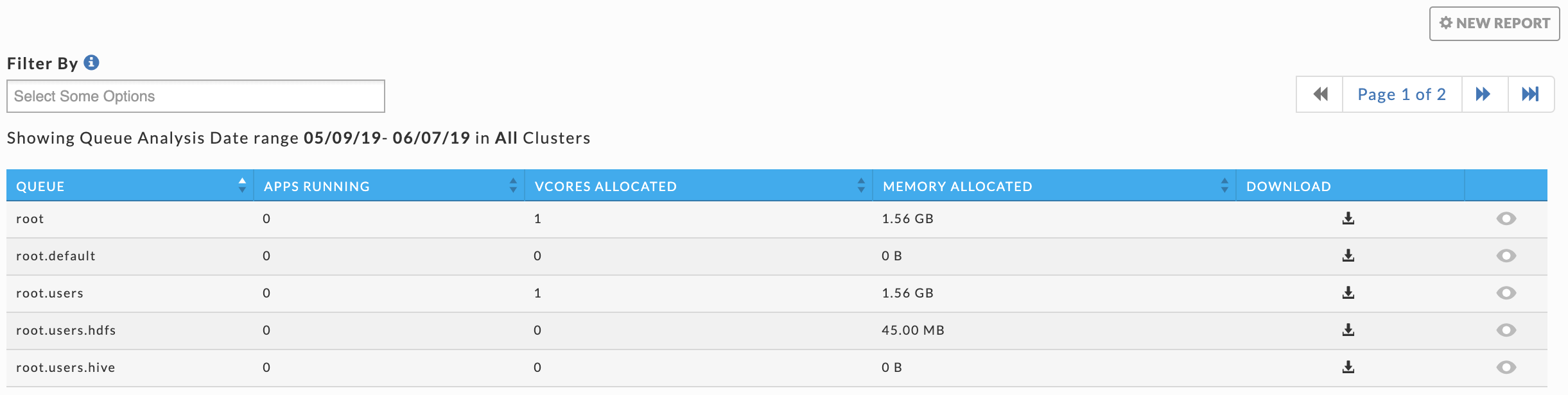
If the report was successfully generated a light green bar appears and a table listing all the queues existing during the time range is displayed. The table lists each queue with its KPIs average (APPS RUNNING, vCoreS ALLOCATED, and MEMORY ALLOCATED). You can sort the queues on any column; by default the queues are sorted by name in ascending order. Sorting the list by average KPIs allows you to identify the most or least active queue and focus on them instead of scrolling though the complete list of queues. Click in the Filter By box for the queue list and to select the queues to filter on. Click  in a queue's row to download the report.
Click  in a queue's row to see three graphs displaying the queue's Applications, vCore Usage, and Memory Usage. When monitoring a MapR Cluster a fourth graph, Disk Usage, is displayed. Click in the selection box to chose from the available metrics to graph. You can select up to two (2) metrics for each graph. Clicking within a graph brings up a cluster view Operations > Usage Details > Infrastructure for that point in time. Hovering over a point in graph brings up a pop-up in all graphs displaying metrics and values along with the averages for the metric for that point in time.
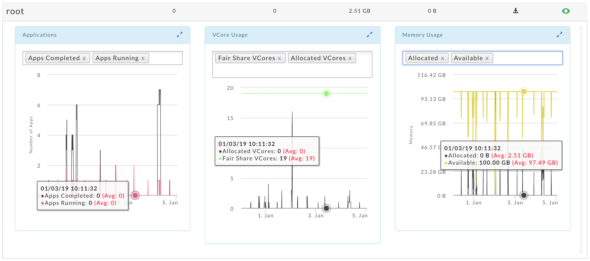
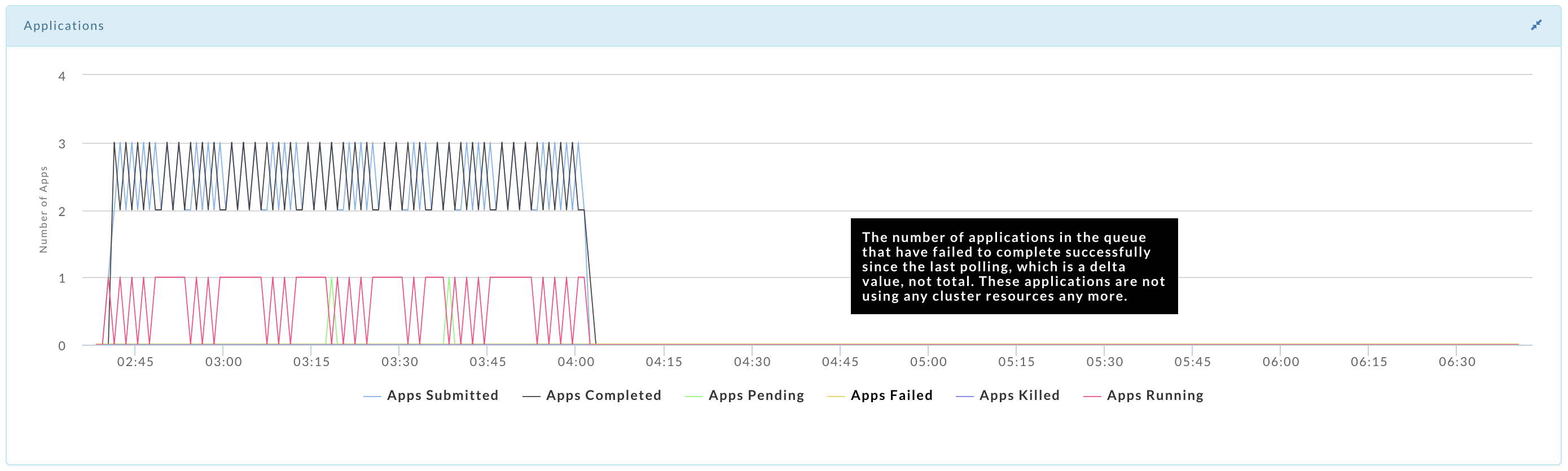
Click  to expand the graphs to window width. The relationship between the graphs still exist, hovering over one bring ups the data for that point in time for all the graphs. The expanded graph has its metric legend beneath it. Hover over a metric to see its full definition and the current impact of the metric on the cluster. Below we have expanded the applications graph. Click to return the graph to its original size.
Cluster Workload
Displays your cluster(s) yarn applications' workload across a date range using the following views:
Month - by date, e.g., October 10.
Hour - by hour regardless of date, e.g., 10.00 - 11.00.
Day - by weekday regardless of date, e.g., Tuesday.
Hour/Day - by hour for a given weekday, e.g.,10.00 -11.00 on Tuesday.
You can filter each view by App Count, vCores Hour, and Memory Hour.
Note
To measure the vCores or Memory Hour usage is straightforward; at any given point the memory or vCore is being used or not.
The App Count is not a count of unique app instances because apps can span boundaries, i.e., begin and end in different hours/days.
The App Count reflects the apps that were running within that interval up to and including the boundary, i.e., date, hour, day. Therefore, an app can be counted multiple times in time slice.
On multiple dates, e.g., October 11 and 12.
In multiple hours, e.g., 10pm, 11pm & 12am.
On multiple days, Thursday & Friday.
In multiple hour/day slots.
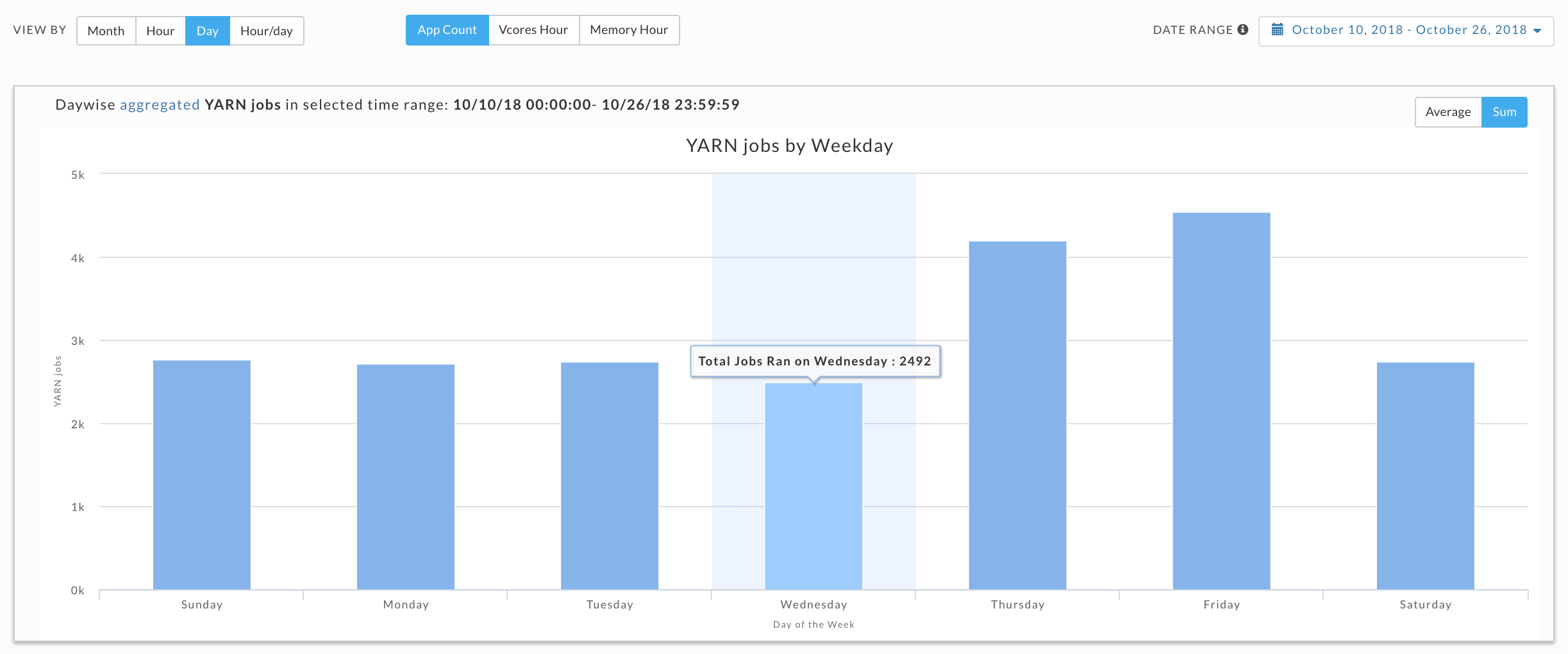
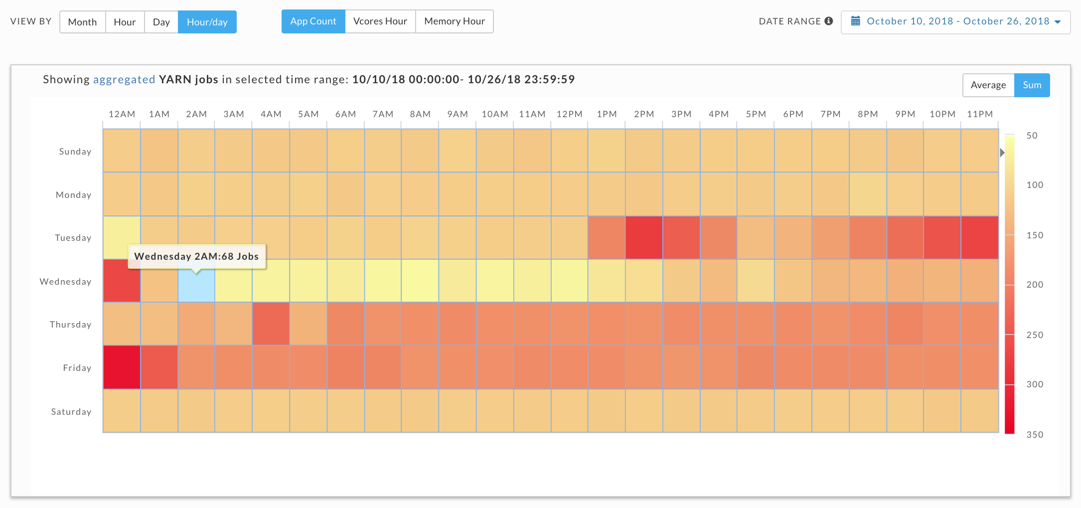
This results in anomalies where the Sum(24 hours in Hour/Day App Count) > Sum(App Counts for dates representing the day). For instance, in the below example:
App Count for Wednesdays (10, 17 & 24 October) = 2492, and
App Count across Hour/Day intervals for Wednesday = 2526.
We point this out not because it necessarily has a significant impact in how you can use the data, but to inform you such variations exist.
By default the tab opens in the Month view filtered on App Count for the past 24 hours. Use the Date Range date picker to change the range. We suggest using a short range as the longer the range the more processing time consumed. Click App Count, vCores Hour, and Memory Hour to change the display metric. The metric you select is used for all subsequent views until changed. Click on the View By buttons to change between views. Immediately above the graph it textually notes the metric being used for the time range. When the date range is greater than one day the Hour, Day, and Hour/Day views allow you to display the data by either as an Average or Sum.
See Drilling Down below for information on how to retrieve the detailed information within each view.
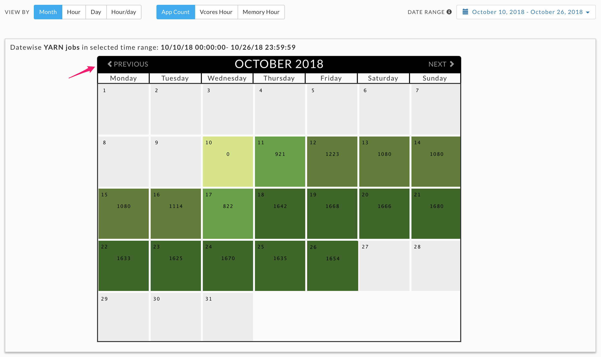
Month
Displays the jobs run on the particular date. The color indicates how the day's load compares with the other days within the date range. The day with the least jobs/hours is  , while the days with the highest load are
  . Therefore, the color of any particular day varies in context to the other days being displayed, e.g., when only one day is displayed it is colored . Use Previous and Next in the month's title bar to navigate between months.
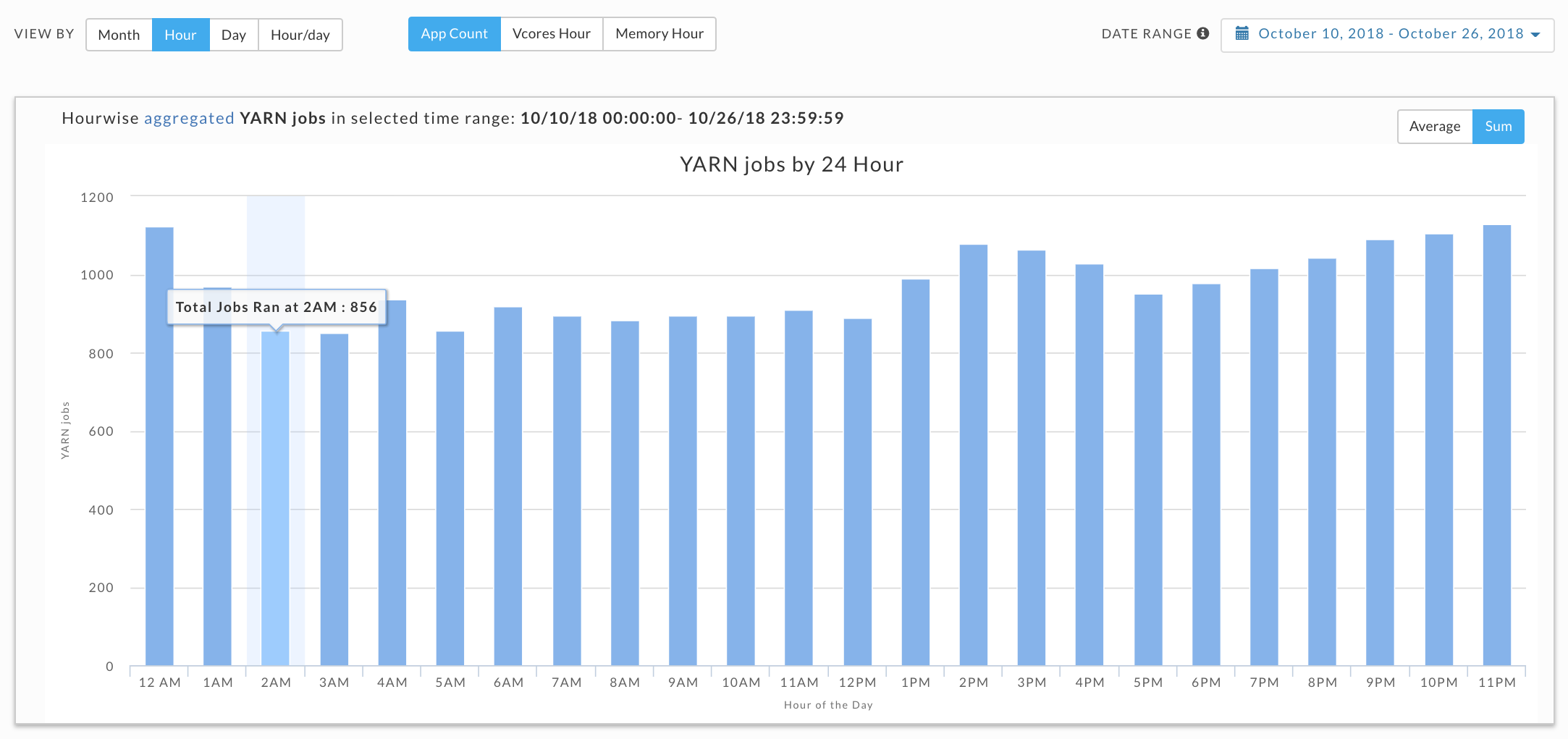
Hour, Day and Hour/Day
These graphs do not link jobs to any specific date at the graph level. For instance, the Hour graph shows that 856 jobs ran at 2 am (between 2am and 3am); the Day graph that 2,492 jobs ran on Wednesday, and the Hour/Day that 68 jobs ran at 2 am on a Wednesday. But none of these graphs directly indicate the date these jobs ran on. Only the Month view visually links job counts to a specific date; above we see 10 October had an app count of 822.
By default each view opens using the metric selected for the prior view. For instance, if vCores Hour is used to display Month and you switch to Day it is filtered using vCores Hour.
When the DATE RANGE spans multiple days, you have the choice to display the data as either the:
Sum - aggregated sum of job count, vCore or memory hour during the time range (default view).
Average - Sum / (# of Days in Date Range).
Hour
Breaks out information by hour. The interval label indicates the start, i.e., 2AM is 2-3AM. Hover over an interval for its details. Click on the interval to drill down into it.
Day
Displays the jobs run on a specific weekday. Hover over an interval for its details. Click on the interval to drill down into it.
Hour/Day
This view shows the intersection of Hour and Day graphs. The Hour graph showed 856 jobs ran between at 2-3 am while the Day graph (immediately above) that 2,492 jobs ran on Wednesday. Below we see that 68 of Wednesday's jobs (2.7%) were running between 2-3 am.
Drilling Down in a Workload View
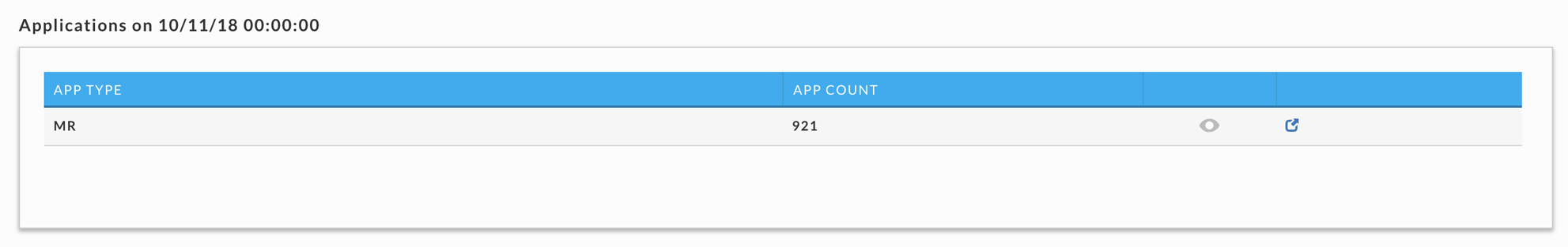
Click on an interval to bring up its information. In our example, we selected 11 October in the Month view which was filtered on App Count (921 apps). A list breaking out the jobs by app type is displayed. Below we see all 921 were MR jobs.
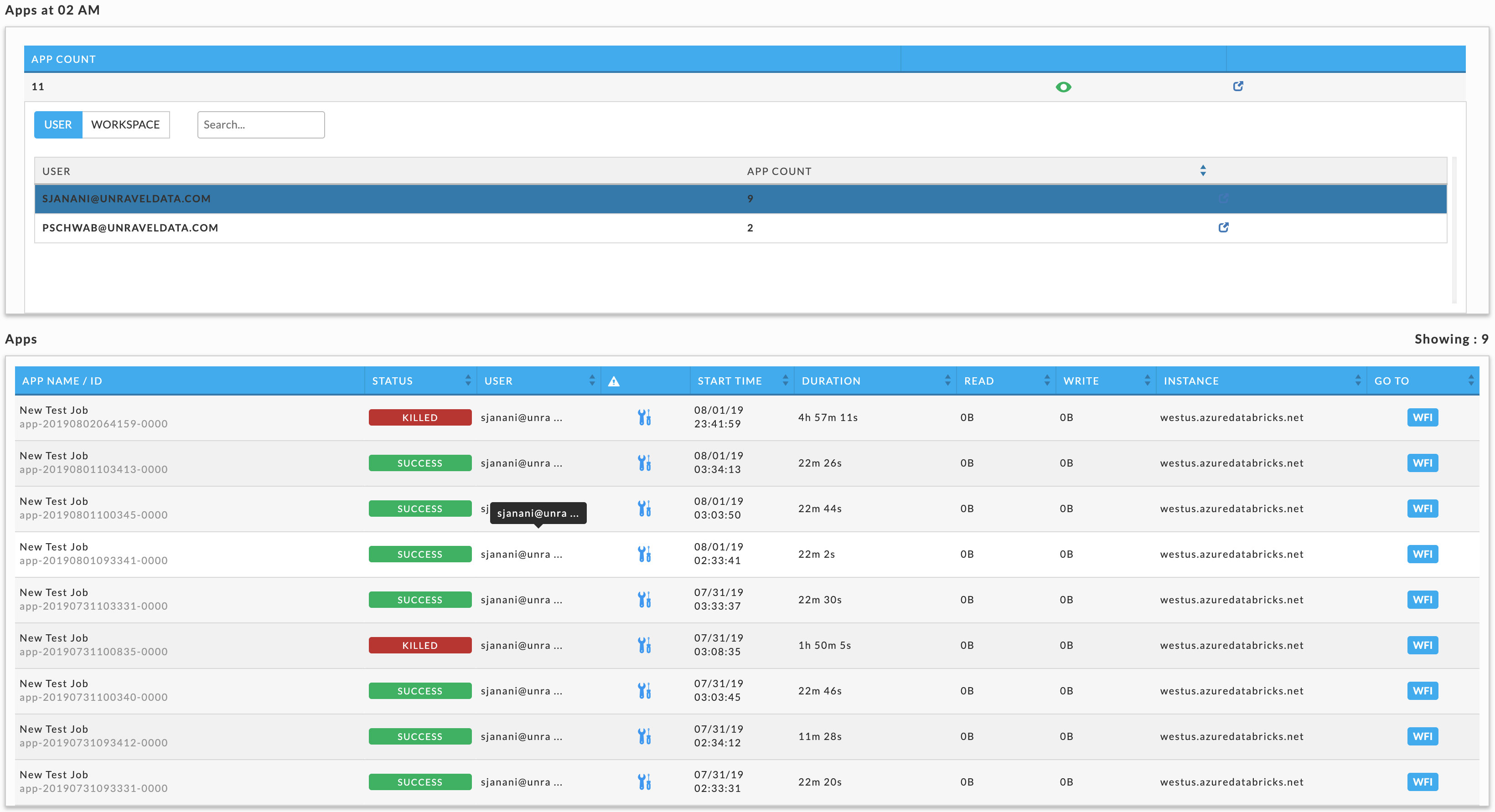
Click to display User and Queue details. By default, User is displayed, click Queue to see all the queues. In this case there are two users, HDFS (910 jobs) and ROOT (11 jobs). Click on  (job details) to see the running applications for that row. When there are multiple choices shown, Unravel notes which detail is being displayed by highlighting the row. Below there are three options:
App Type: MR
User: HDFS
User: ROOT
We selected the user ROOT so its row is highlighted. Immediately above table is noted what's being displayed. See Applications > Applications for more information on the table. Click on an application to bring it up in its APM. When you change the metric (App Count, vCores Hour and Memory Hour) the window reverts to displaying the graph.
Top X
Note
The OnDemand package must be installed to use this report.
This report lists the top X apps, by app type, for the following categories
Longest Duration: Time to completion.
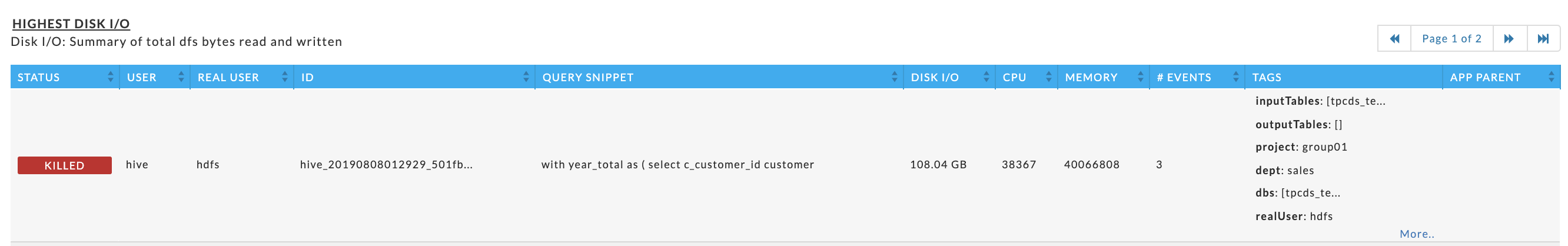
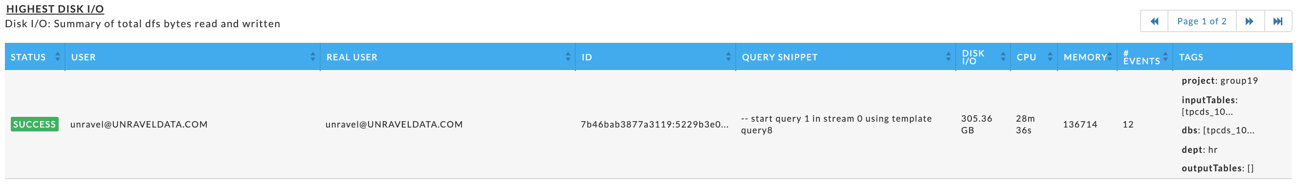
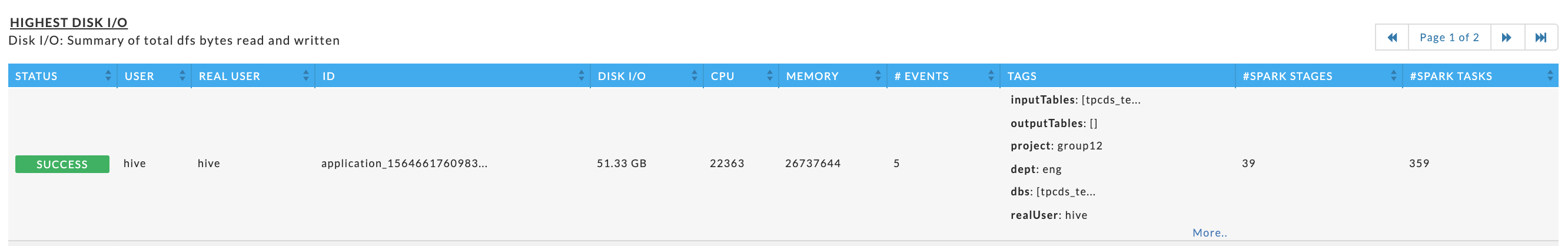
Highest Disk I/O: Summary of total dfs bytes read and written.
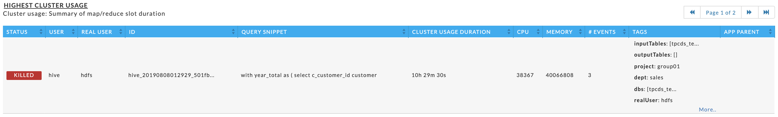
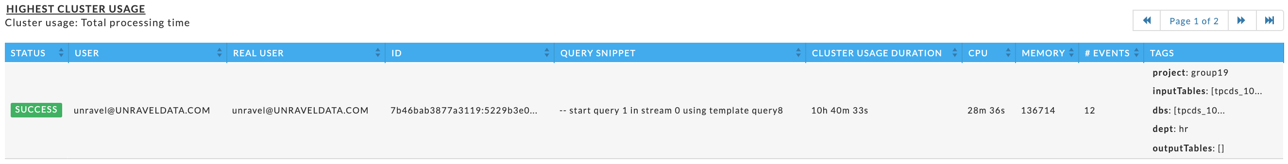
Highest Cluster Usage: Summary of map/reduce slot duration.
Highest CPU Usage: vCore seconds (Hive on Tez not supported)
Highest Memory Usage: Memory seconds (Hive on Tez not supported)
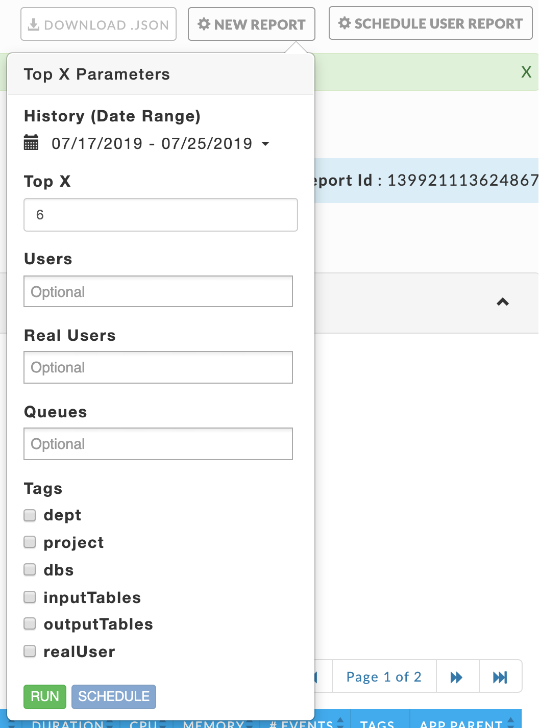
Click NEW REPORT to generate the report. Select your History (Date Range) and the number of apps (Top X) to include in the report. You can filter your reports by Users, Queues, and Tags (when available). Click on the selection box for the available options. You can select zero or more options. Below, two (2) users and one tag with (2) values are selected.
 |
Click RUN. RUNNING replaces RUN and a countdown is displayed until Unravel starts collecting the data. A dark green banner is briefly displayed noting that "Top X Started". NEW REPORT pulsates blue while the report is being generated. When Unravel is unable to start the report, a red banner containing an error message is displayed.
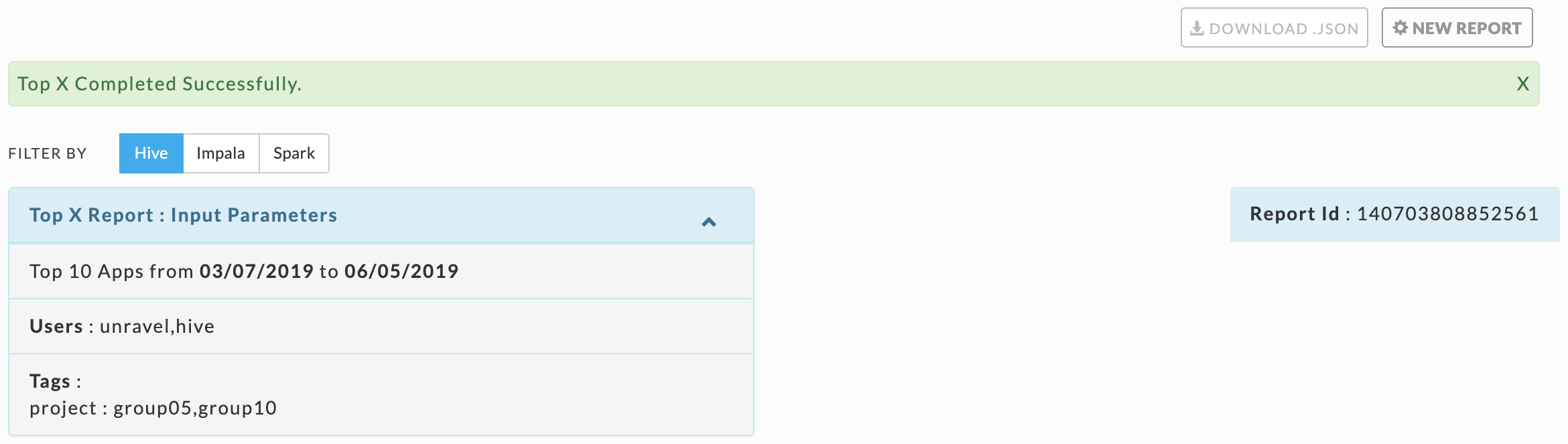
When the report is successfully completed, a light green bar appears noting "Top X Completed Successfully". The report displays the top X apps per app type (when available). The number of apps can vary by app type. It opens filtered on Hive apps. You can download the report by clicking the DOWNLOAD .JSON button. The downloaded report is unfiltered and contains the information for Hive, Impala, and Spark.
If Unravel was unable to generate the report, a error message in a light red bar is light red bar is displayed and the NEW REPORT becomes orange.
Click the FILTER BY option to switch between the app type. The report's header lists the report's parameter. The number of Apps (Top X) and Date Range are always listed since they are required. If you have selected optional parameters,TGhe they are also listed. The example below shows the parameters selected above. On the right-hand side is the Report Id the report is archived under.
The display is composed of three (3) tiles and the information varies both by app type. The report generated using the above parameters is examined below.
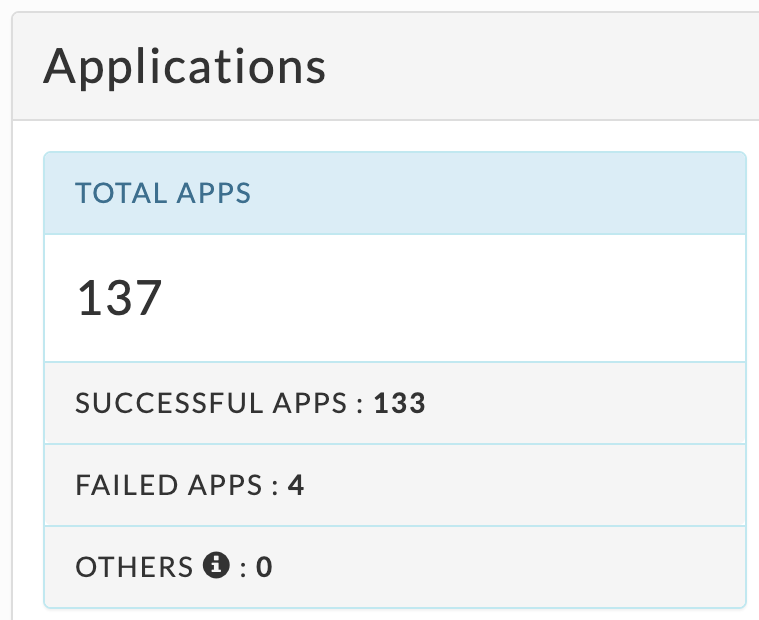
The Applications tile lists, by app type:
TOTAL APPS : The number of apps on the cluster.
SUCCESSFUL APPS: The number of apps that have successfully completed.
FAILED APPS: The number of apps that have failed to complete.
OTHERS: The number of apps that were killed, or are in a pending, running, waiting, and unknown state.
 |
Immediately below the Application Summary are five tables showing the top X applications for each category Specific applications can be listed in multiple tables. If there are less than X apps, each table contains all the apps sorted on the metric. Each table
STATUS: The status of the app: success, failed, killed, or running.
USER: The app's owner.
ID: The app's ID, hover over it for the full id.
CPU: The app's CPU usage over the lifetime of the app.
MEMORY: the app's memory usage.
# EVENTS: the total events the app had.
TAGS: tags used to filter the apps. This column is empty when no tags were selected.
Each app type also has additional app specific columns:
Hive: QUERY SNIPPET and APP PARENT (links to the app's parent when applicable)
Impala: QUERY SNIPPET.
Spark: # SPARK STAGES and # SPARK TASKS.
No Data Found is listed in when there is no information for the available.
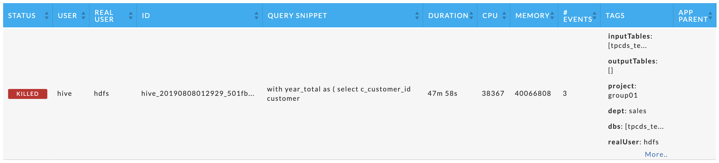
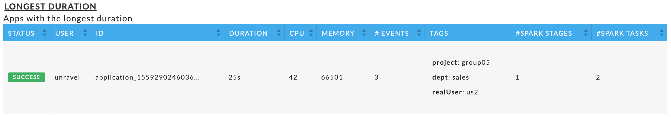
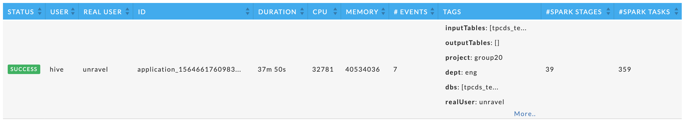
The longest duration, highest CPU usage, and highest memory usage tables
These tables vary by app type, but within the app type they are the same. Each table displays the top X applications for the metric.
Examples:
Hive:
Impala
Spark
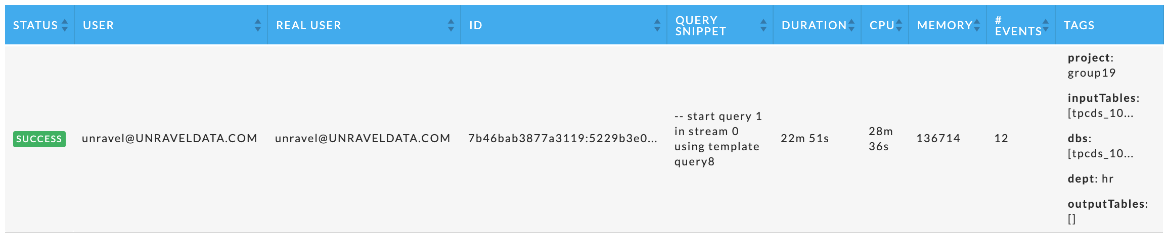
The highest disks I/O usage and highest cluster usage tables
These tables are similar to those above except the DURATION column is replaced by the metric.
Examples:
Hive:
Impala
Spark
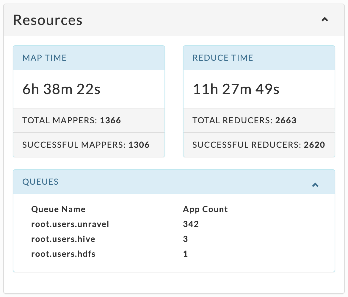
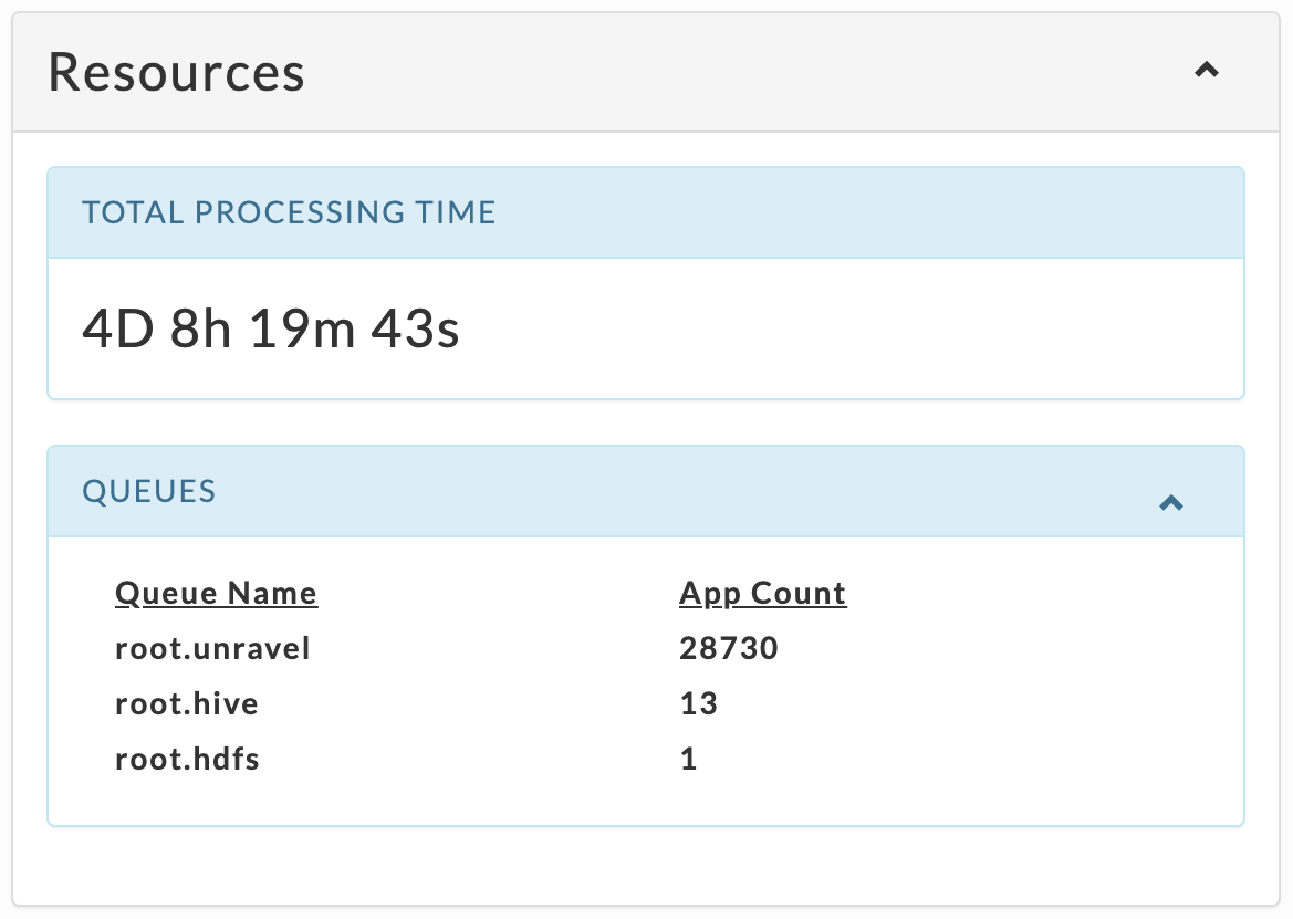
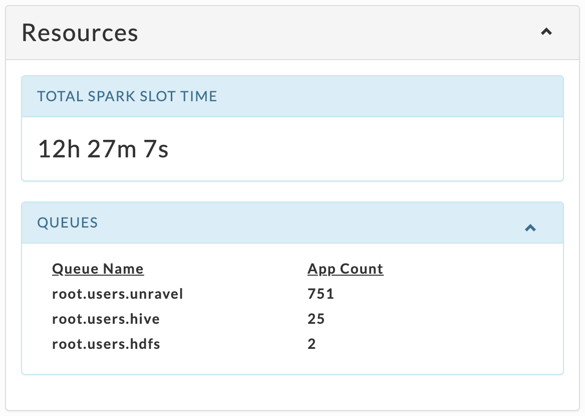
Resources
This tile varies by app type, but always has up to top ten (10) Queues sorted by App Count.
Examples:
Hive
 |
Impala
 |
Spark
 |
Data
Lists the TOTAL READ I/O and TOTAL WRITE I/O across all apps for the app type.