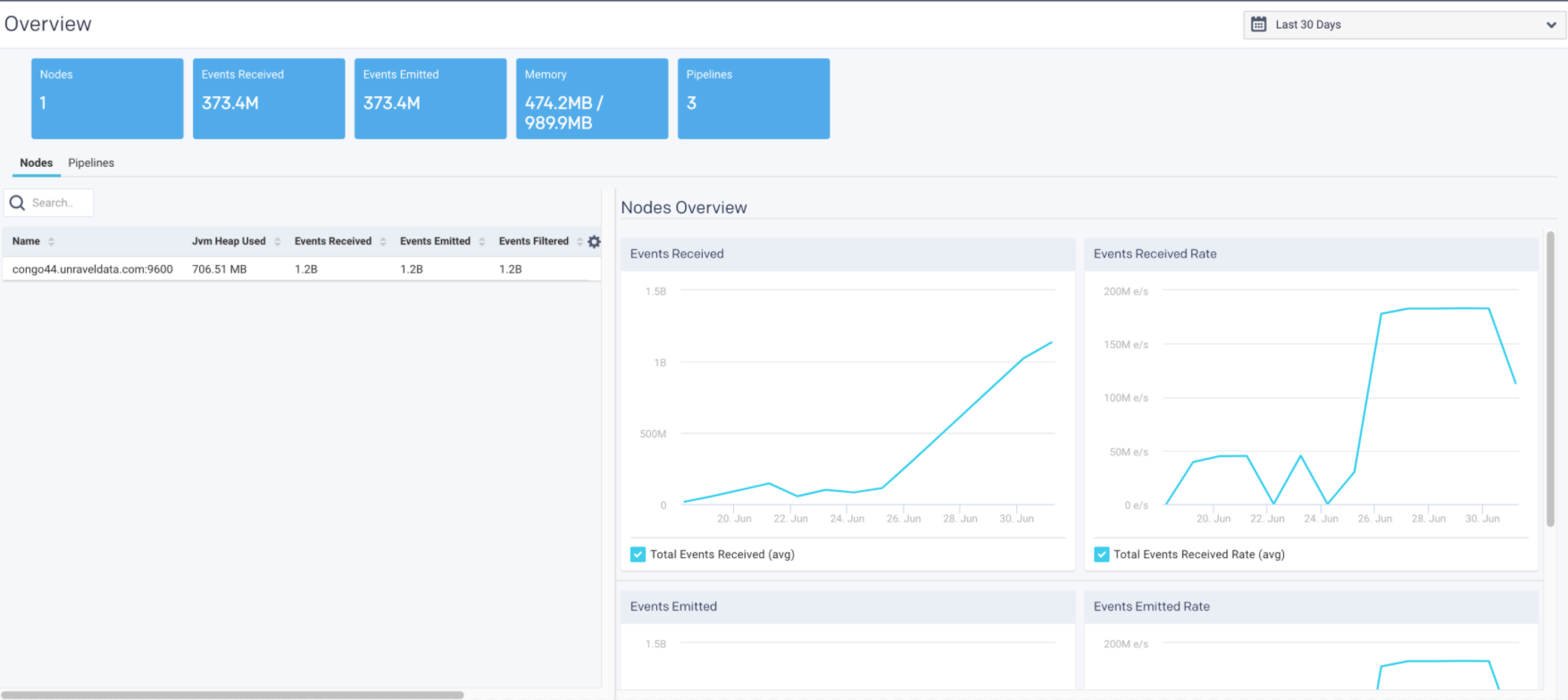
Clusters

You can monitor all aspects of your clusters from this page, including generating various reports. The following tabs are included on the Clusters page:
By default, the page opens showing the Overview tab.
The data displayed is aggregated across all clusters, unless you select a specific cluster. For example, the Overview Jobs charts display the jobs for all clusters.
Overview
By default, the page opens showing the Overview tab. This tab displays an overview of the selected cluster with various KPIs and graphs. You can view the aggregated details for a single cluster. You can select a cluster and the time period to get an overview of the clusters in that specified time period.
The graphs plot the KPIs and other metrics for the selected cluster, over the selected time range. If there are multiple items plotted in a graph, you can select the corresponding checkboxes to hide or show the item.
The Overview page displays the following tiles:
Cluster
The KPIs in Cluster tile shows the current value and changes based on the selected time range. The following KPIs and graphs are shown in this tile:
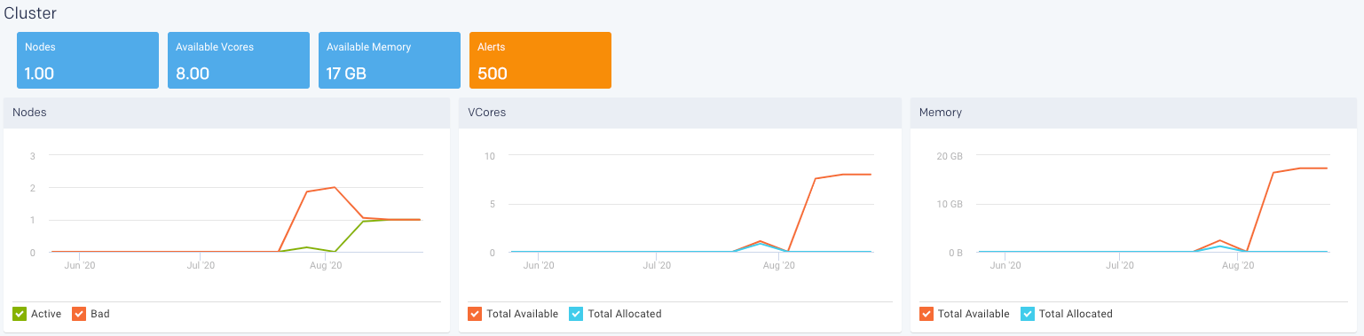
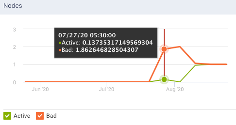
Nodes: Shows the total count of the current number of active nodes plus the number of bad nodes in the selected clusters. From the Nodes graph, you can plot the active and bad nodes in a cluster, over a specified period.
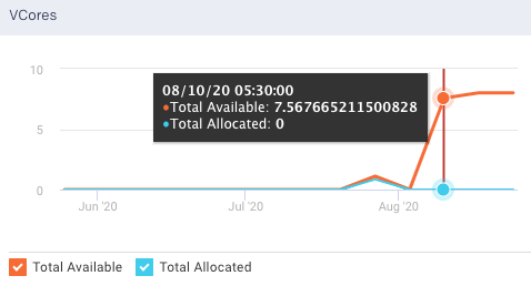
Available Vcores: Shows the current number of available VCores in the selected clusters. From the VCores graph, you can plot the available VCores and the allocated VCores in a cluster, over a specified period.
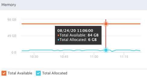
Available Memory: Shows the current amount of the available memory in the selected cluster. From the Memory graph, you can plot the available memory and allocated memory in a cluster, over a specified period.
Alerts: Shows the count of alert notifications. The list of the alert notifications are displayed in the right panel.
Note
Alerts KPI is displayed only if the count is more than zero.
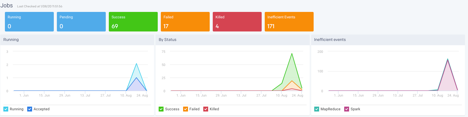
Jobs
This displays the KPIs pertaining to the jobs run by various application types in the selected cluster, over a period of time.
The following KPIs and graphs are shown in this section.
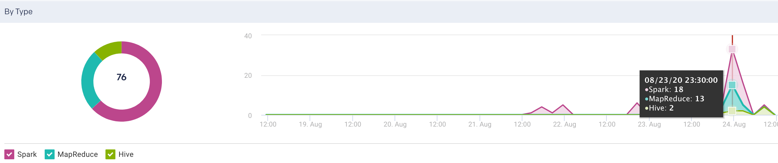
Running: The current number of running jobs (apps). The Running Jobs chart graphs the running and accepted (pending jobs) over the period selected.
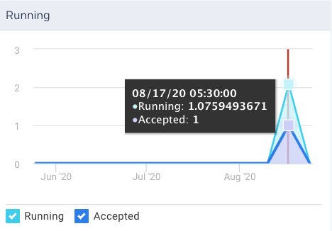
Pending: The current number of pending jobs. The Running Jobs chart graphs this metric.
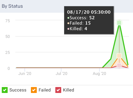
Success/Failed/Killed: Displays the number of successful, failed, or killed jobs for the selected period. The By Status graph plots all these statuses.
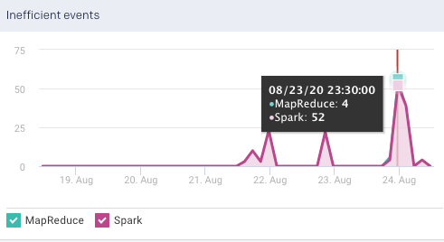
Inefficient Events: Shows the number of events that have occurred, in a cluster, due to some inefficiencies in the job run, during the specified period. Check Jobs > Inefficient Apps for the list of jobs (apps) experiencing these events.
Note
Jobs can experience multiple events; therefore, the number of jobs listed in the Jobs > Inefficient Apps tab is typically less than the number of events.
By Type: Display the count of jobs run in the specified time period by various application types. This is shown in pie chart segments as well as plotted in a graph
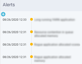
Alerts
Lists all the alerts and events triggered by jobs for the selected time range. Click  to create a new AutoAction.
Resources
The Resources tab displays the usage of resources by the clusters, for a specific period. The resources usage can be grouped by any of the following filters:
Application Type
User
Queue
User-defined tag key (see What is tagging)
Input/output tables
Unravel polls the Resource Manager every 90 seconds to get the resources (VCores, Memory, and running containers) for all the running and pending apps. Applications that run for less than 90 seconds are not captured. Unless the application is running at the exact moment the Resource Manager is polled, the application data is not captured. Therefore, for any specific point in time, the total number of applications running may not match the number of applications in Jobs > All Applications if you filter at the same time.
Viewing resources usage
To view the resources usage, do the following:
Go to the Clusters > Resources tab.
From the Cluster drop-down, select a cluster.
From the Group By drop-down, select an option. You can filter the Group By options further from the Filter options box. Click the
 next to an option to deselect it.
For example, if you select Application Type as a Group By option, then all the application types are listed in the Filter options box. You can then drill down to a specific application type such as Spark.
Select the period range from the date picker drop-down. You can also provide a custom period range. The graphs corresponding to the selected filters are displayed.
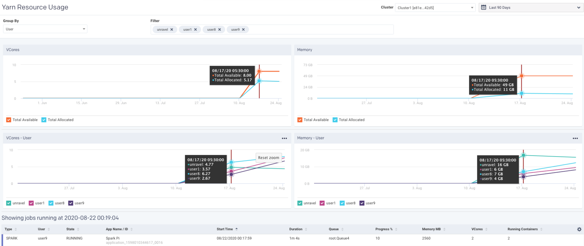
Click any point in the graph. The details of the resources used for the running jobs are displayed in a table.
Graphs (Resources)
The following graphs plot the resource usage for a selected filter in the specified period range. You can hover the mouse pointer over the graph to view the corresponding values on the trend line. You can select a section of the graph and drag the pointer to zoom in. Click Reset Zoom to zoom out.
VCores
The Vcores graph plots the total available and total allocated VCores in your cluster for the specified period. Select or deselect the checkboxes to hide or show the available and allocated VCores.
Memory
The Memory graph plots the total available and total allocated memory in your clusters for the specified period. Select or deselect the checkboxes to hide or show the total available and total allocated memory.
VCores (Group By, Filter) and Memory (Group By, Filter)
This graph plots the VCores and memory resources usage by any of the following options in a cluster for the specified period.
Application type
User
Queue
User-defined tag key (see What is tagging)
Input/output tables
Further Filter options can be determined based on the selected Group By option.
You can click  in the graph to export the graph and the table data to any of the following formats:
PDF
PNG
JPEG
SVG
CSV
XLS
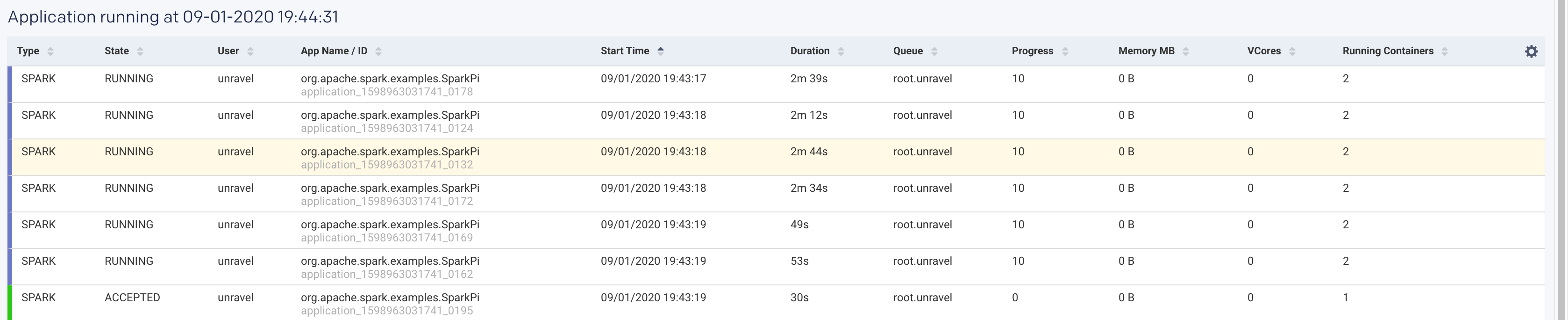
When you click any point in the graph, the following details of the resources used for a job run are displayed. Click a row in this table and the APM page of the corresponding application is displayed. Click  columns in the table to select the columns that must be displayed.
Items | Description |
|---|---|
Type | The type of application where the job is running. |
User | Name of the user running the job. |
State | Status of the job. |
App Name/ID | Name or ID of the application where the job is running. |
Start Time | The time when the job was started. |
Duration | Period till when the job has been running. |
Queue | Queue |
Progress | Percentage of the progress of the running job. |
Memory MB | Memory in MB that is used by the job. |
VCores | No of VCores that are used by the job. |
Running Containers | No of running containers. |
Clusters > Jobs
The Clusters > Jobs tab shows all the jobs running in a cluster, for a specific period, which can be grouped by any of the following options:
State
Application type
User
Queue
You can further filter the Group by options. The Clusters > Jobs tab has the following two sections:
The graph plots the trend of the job count over a specified period which can be grouped by options and further filtered. The filter checkboxes can be selected or deselected to enable the corresponding trendline in the graph.
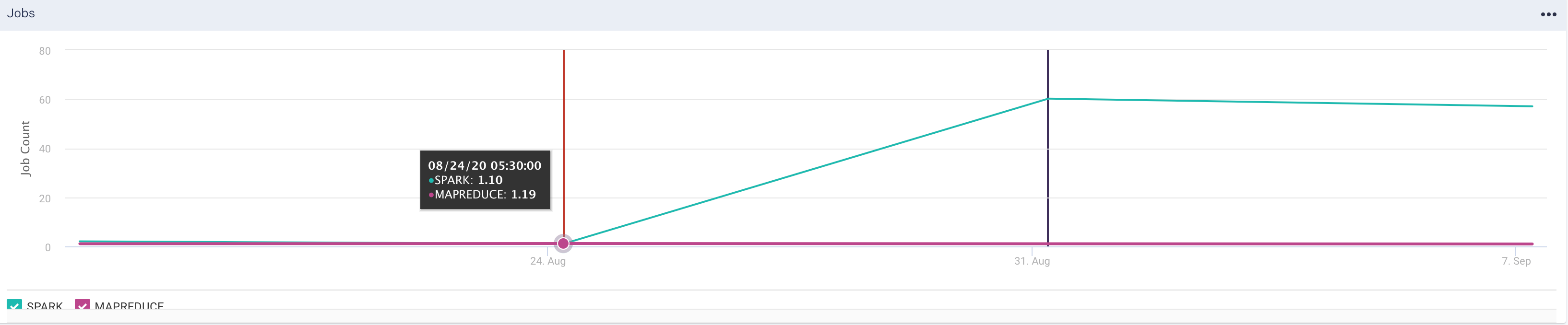
The list of the running applications with the following details is displayed for the specified period.
Items
Description
Type
The type of application where the job is running.
State
Status of the job.
User
Name of the user running the job.
App Name/ID
Name or ID of the application where the job is running.
Start Time
The time when the job was started.
Duration
Period till when the job has been running.
Queue
Queue
Progress
Percentage of the progress of the running job.
Memory MB
Memory in MB that is used by the job.
VCores
No of VCores that are used by the job.
Running Containers
No of running containers.
Viewing Jobs
To view the resources usage, do the following:
Go to the Clusters > Jobs tab.
From the Cluster drop-down, select a cluster.
From the Group By drop-down, select an option. You can filter the Group By options further from the Filter options box. Click the
next to an option to deselect it.For example, if you select Application Type as a Group By option, then all the application types are listed in the Filter options box. You can then drill down to a specific application type such as Spark.
Select the period range from the date picker drop-down. You can also provide a custom period range. The graphs corresponding to the selected filters are displayed.
Click any point in the graph. The details of the resources used for the running jobs are displayed in a table.
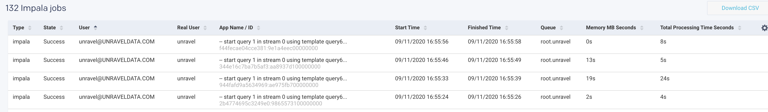
Impala
From this tab, you can monitor the details of the running Impala queries. These details are plotted into graphs based on the selected cluster, period, group by options, and filters.
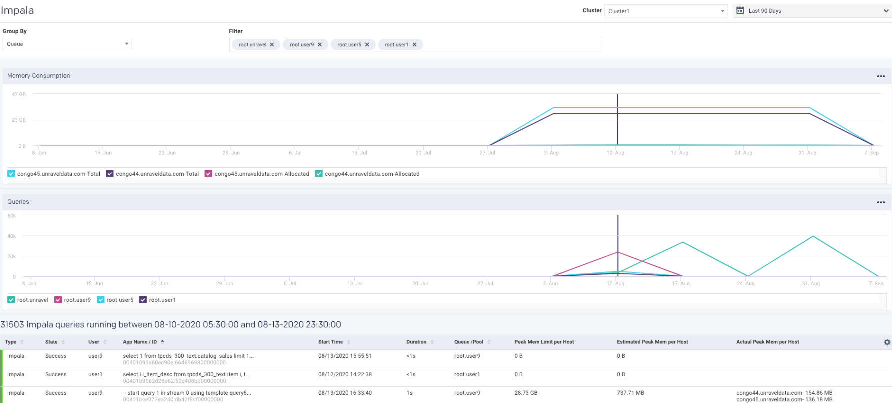
Monitoring Impala queries
Go to the Clusters > Impala tab.
From the Cluster drop-down, select a specific cluster. All the nodes in the cluster are displayed in the Memory Consumption graph.
Select the period range from the date picker drop-down. You can also provide a custom period range. The graphs corresponding to the selected filters are displayed.
From the Group By drop-down, select an option. All the items corresponding to the selected option are listed in the Filter box.
You can further edit the Group By options from the Filter box. Click the
next to any option to deselect it. The following graphs are displayed:Memory Consumption graph
The Memory Consumption graph plots the memory consumed for the Impala queries, by each node in the selected cluster, for the specified period range. You can select or deselect the nodes displayed below the graph to view the corresponding details on the graph. Hover over any point in the Memory Consumption graph to view the details of the memory consumption for each of the selected node in the selected cluster, at a specific period.
Queries graph
The Queries graph displays the number of queries that are run based on the specified Group by options. You can select or deselect the filters corresponding to the Group by option that you have selected to view the corresponding details on the graph. Hover over any point in the Queries graph to view the number of queries run by each of the specified Group by filters, in the selected cluster, at a specific period.
Click any point in the graph. The details of the running Impala queries are displayed in a table below. Click
to set the columns for display in the table.Items
Description
Type
Type of query.
State
Status of the query.
User
Name of the user running the query.
App Name / ID
Query string.
Start Time
Time when the query was run.
Duration
Duration of the query.
Queue/pool
Queue or pool.
Peak Mem Limit per Host
The limit of peak memory for each host.
Estimated Peak Mem Limit per Host
The estimated threshold of peak memory for each host.
Actual Peak Mem per Host
Actual peak memory attained for each host while running the Impala queries.
Kafka
From this tab, you can monitor various metrics of Kafka streaming, in multiple clusters, from a single Unravel installation. Before using Unravel to monitor Kafka, you must connect the Unravel server to a Kafka cluster. Refer to Connecting to the Kafka cluster. You can also improve the Kafka cluster security by having Kafka authenticate connections to brokers from clients using either SSL or SASL. Refer to Kafka security.
The following KPIs are displayed on the top of the Kafka page. The first three ( Under Replicated Partitions, Offline Partitions, Controller) are color-coded as follows:
Green - Indicates that the streaming process is healthy.
Red - Indicates that the streaming process is unhealthy. This is an alert for further investigations.
The remaining metrics are data input and output metrics and are always displayed in blue
Metrics | Description |
|---|---|
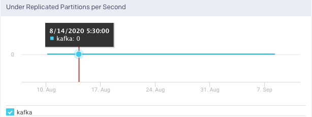
Under Replicated Partitions | Total number of under-replicated partitions. This metric indicates if the partitions are not replicating as configured. If under-replicated partitions are shown then you can drill down further in the Broker tab for further investigation. |
Offline Partitions | Total number of offline partitions. If this is metric is greater than 0 then there are broker-level issues to be addressed. |
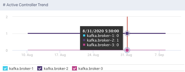
Controller | Shows the number of brokers in the cluster that delegate the function of a controller. If this metric is showing as 0, it indicates that there are no active controllers. |
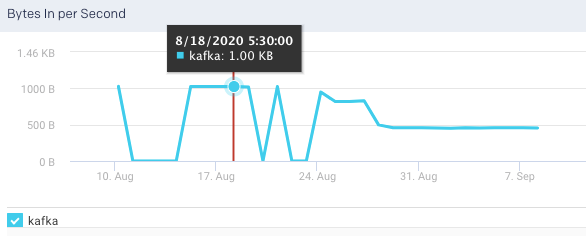
Bytes in per Sec | The total number of incoming bytes received per second from all servers. |
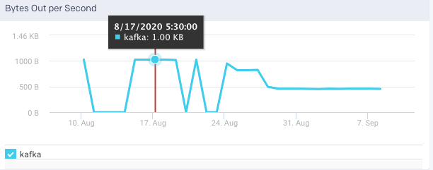
Bytes Out per Sec | The total number of outgoing bytes sent per second to all servers. |
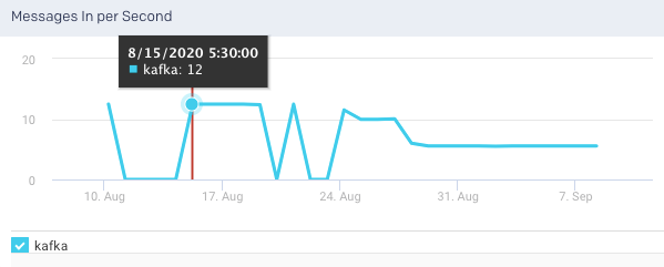
Messages in per Sec | Total rate of the incoming messages. A unit of data is called a message. The messages are written into Kafka in batches. |
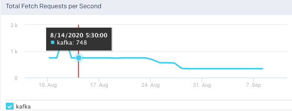
Total Fetch Requests per Sec | Rate of the fetch request. |
See Kafka Metrics Reference and Analysis for a complete list of Kafka metrics that are monitored by Unravel.
Metrics
You can monitor all the metrics associated with your Kafka clusters from the Kafka > Metrics tab. The following graphs plot the various Kafka metrics for a selected cluster, in the specified time range:
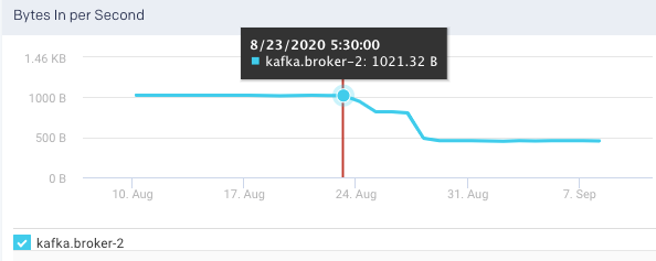
Bytes In per Second: This graph plots the total number of bytes received per second from all topics and broker, over a specified time range.
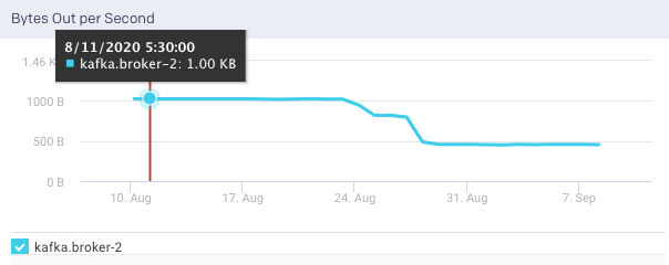
Bytes Out per Sec: This graph plots the total number of outgoing bytes sent per second to all Kafka consumers, over a specified time range.
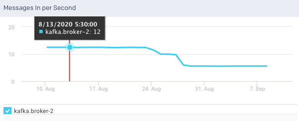
Messages in per Sec: This graph plots the messages produced in the cluster across all topics and brokers, over a specified time range.
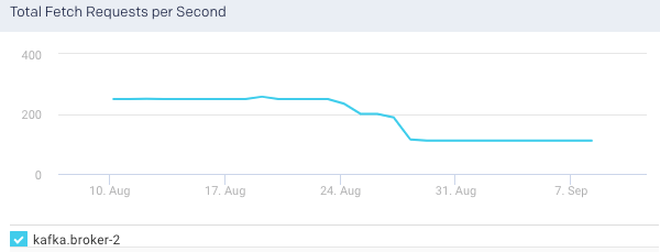
Total Fetch Requests per Sec: This graph plots the total rate of fetch requests within the cluster, over a specified time.
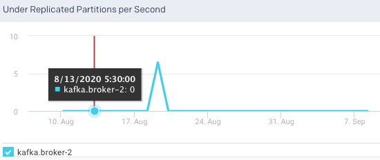
Under Replicated Partitions: This graph plots the number of under replicated partitions per second, within a cluster, over a specified period.
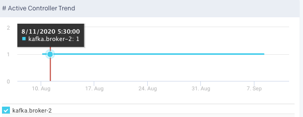
Active Controller Trend: This graph plots the trend of the brokers in the cluster that delegate the function of a controller, over a specified period. You can select or deselect the brokers to view the corresponding trend.
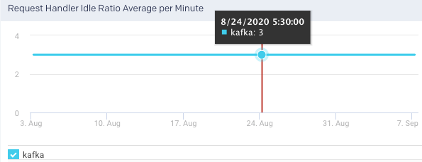
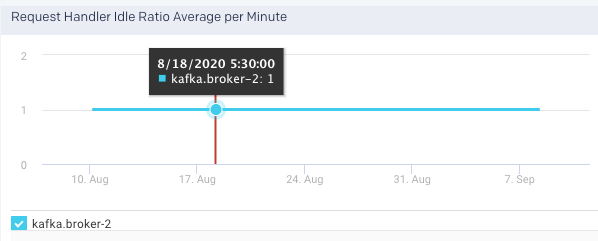
Request Handler Idle Ratio Average per Minute: It indicates the percentage of the time the request handlers are not in use. This graph plots the average ratio per minute that the request handler threads are idle in a specified time range.
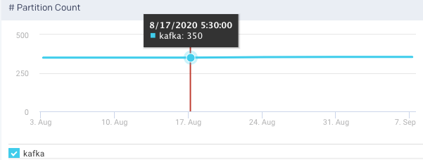
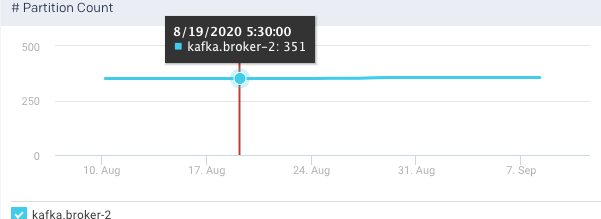
Partition Count: The number of partitions. The count includes both leader and follower replica. This graph plots the total number of partitions across all brokers in a cluster, in a specified time range. The trend line indicates the metric's value across the entire cluster averaged over all brokers.
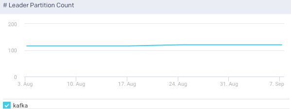
Leader Partition Count:t This graph plots the total number of leader partitions across all brokers in a cluster, in a specified time range.
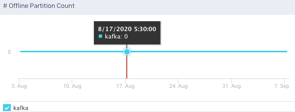
Offline Partition Count: This graph plots the total number of partitions that do not have an active leader, in the specified time range, . Such partitions are neither writable or readable. If the count is more than 0, more investigation is required to resolve broker level issues.
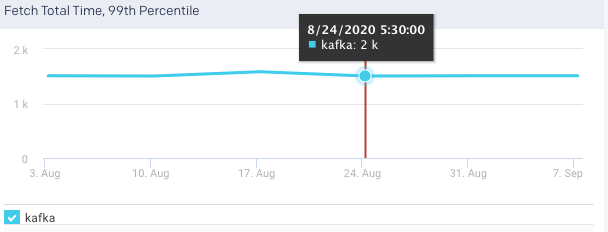
Fetch Total Time, 99 Percentile: This graph plots the time value for the entire cluster averaged across all brokers.
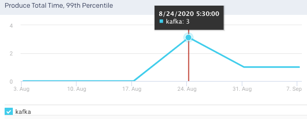
Produce Total Time, 99 Percentile
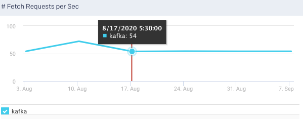
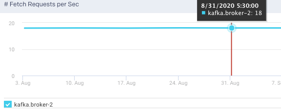
Fetch Requests per Sec: This graph plots the rate of fetch requests in a specified time range.
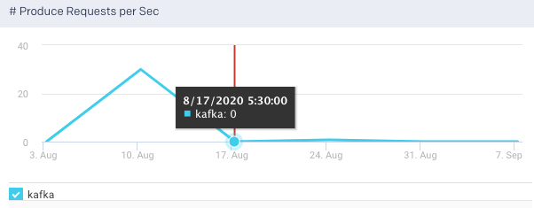
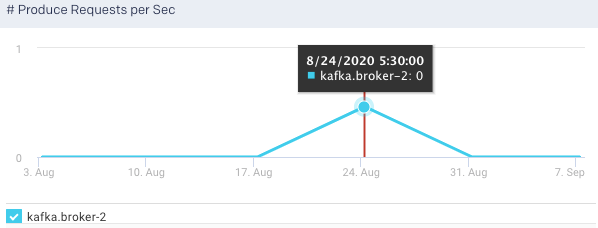
Produce Request per Sec:Shows the summation of the produce requests being processed across all brokers per second. This graph plots the rate of produce requests in a specified time range.
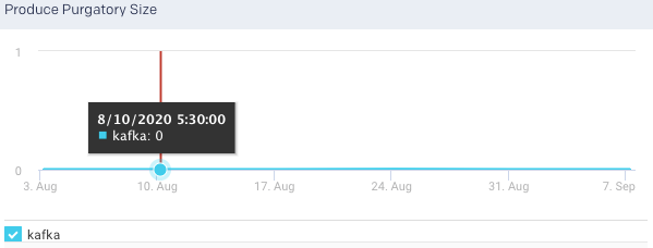
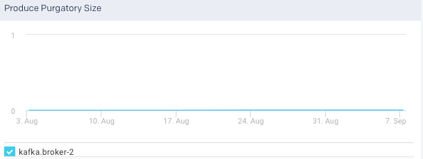
Product Purgatory Size: TThis graph plots the product purgatory size over a specified time range. Purgatory holds a request that has not yet succeeded neither has it resulted in an error.
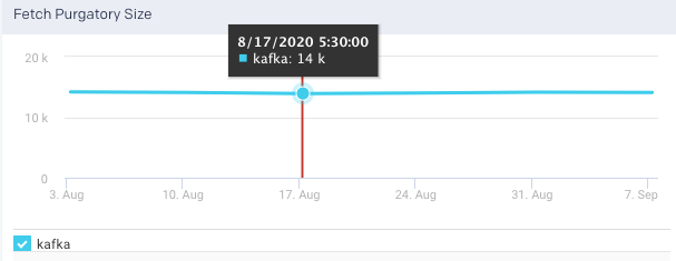
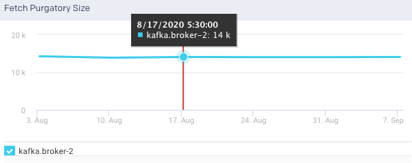
Fetch Purgatory Size: he number of Fetch requests sitting in the Fetch Request Purgatory. It is a holding pen for requests waiting to be satisfied (Delayed). Of all Kafka request types, it is used only for Fetch requests. It tracks the number of requests sitting in purgatory (including both watchers map and expiration. This graph plots the fetch purgatory size over a specified time range.
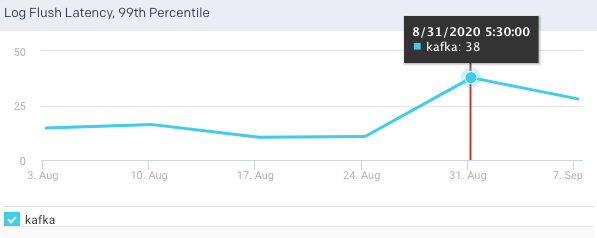
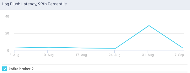
Log Flush Latency, 99th Percentile:The 99th percentile value of the latency incurred by a log flush, that is, write to disk in milliseconds. 99% of all values in the group are less than the value of the metric. This graph plots the time taken for the brokers to flush logs to disk over a specified time range.
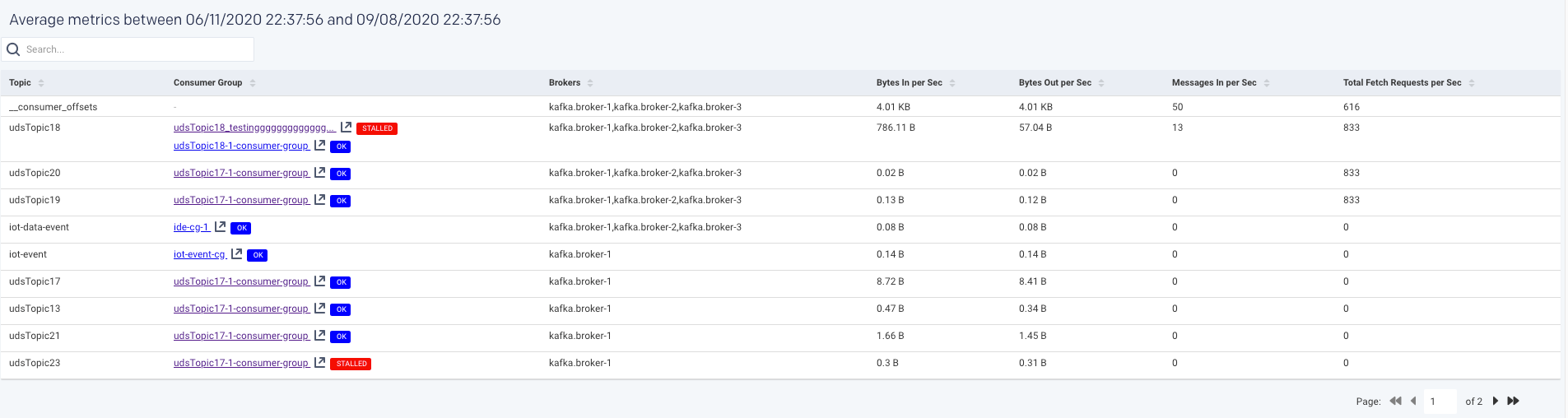
An average of the following metrics are displayed in a table below:
Items | Description |
|---|---|
Topic | Name of the Kafka topic. |
Consumer Group | The name of the consumer group that work together to consume a topic. Consumers read messages. The consumer subscribes to one or more topics and reads the messages in the order in which they were produced. |
Brokers | The name of the Kafka broker. A single Kafka server is called as a broker. The broker receives messages from producers, assigns offsets to them, and commits the messages to storage on disk. |
Bytes in per Sec | The total number of incoming bytes received per second from all servers. |
Bytes Out per Sec | The total number of outgoing bytes sent per second to all servers. |
Messages in per Sec | Total rate of the incoming messages. |
Total Fetch Requests per Sec | Rate of the fetch request. |
You can click a row in the average metrics table to view the corresponding Topic summary page.
Broker
A single Kafka server is called a broker. Kafka brokers are designed to operate as part of a cluster. Within a cluster of brokers, one broker can function as the cluster controller. The broker receives messages from producers, assigns offsets to them, and commits the messages to storage on disk. It also services consumers, responding to fetch requests for partitions and responding with the messages that have been committed to disk.
You can monitor all the metrics associated with each Kafka broker in your cluster, from the Kafka > Broker tab.
The latest metrics of the Kafka brokers for the specified time range are displayed in a table as shown:

The following graphs plot the various Kafka metrics for a selected broker, in the selected cluster, for the specified time range:
Bytes In per Second: This graph plots the total number of bytes received per second for the selected broker, over a specified time range.
Bytes Out per Sec: This graph plots the total number of outgoing bytes sent per second by the selected broker, over a specified time range.
Messages in per Sec: This graph plots the total rate of the incoming messages received by the broker, over a specified time range.
Total Fetch Requests per Sec: This graph plots the total rate of fetch requests made by the broker, over a specified time.
Under Replicated Partitions: This graph plots the number of under replicated partitions per second in the selected broker, over a specified time range.
Active Controller Trend: This graph plots the trend of the selected broker to delegate the function of a controller, over a specified period.
Request Handler Idle Ratio Average per Minute: This graph plots the average ratio per minute that the request handler threads are idle, in the selected broker, for the specified time range.
Partition Count: This graph plots the total number of partitions in the selected broker, for the specified time range.
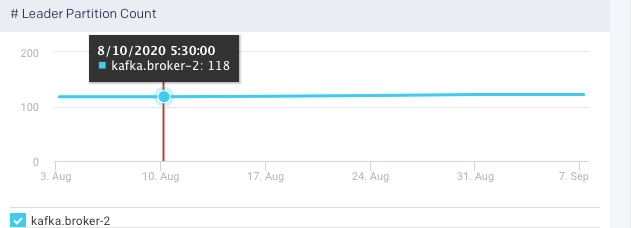
Leader Partition Count:This graph plots the total number of leader partitions in the selected broker, for the specified time range.
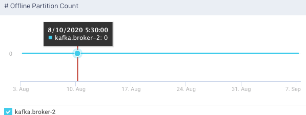
Offline Partition Count: This graph plots the total number of partitions, that do not have an active leader in the selected broker, for the specified time range. Such partitions are neither writable or readable. If the count is more than 0, more investigation is required to resolve the broker level issues.
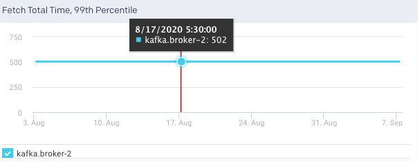
Fetch Total Time, 99 Percentile:
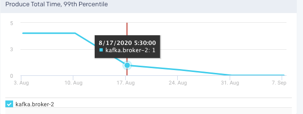
Produce Total Time, 99 Percentile
Fetch Requests per Sec: This graph plots the rate of fetch requests made by the selected broker, in a specified time range.
Produce Request per Sec:This graph plots the rate of produce requests in a specified time range.
Product Purgatory Size: This graph plots the product purgatory size, for the selected broker, over a specified time range. Purgatory holds a request that has not yet succeeded neither has it resulted in an error.
Fetch Purgatory Size: This graph plots the fetch purgatory size for the selected broker, over a specified time range.
Log Flush Latency, 99th Percentile:This graph plots the time taken for the selected broker to flush logs to disk over a specified time range.
An average of the following metrics are displayed in a table below:
You can click a row in the average metrics table to view the corresponding Topic summary page.
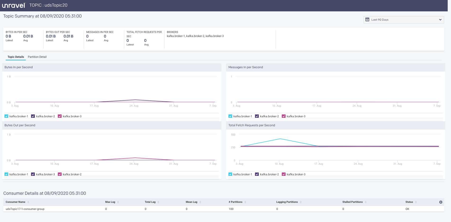
Topic
A Topic is a category into which the Kafka records are organized. Topics are additionally divided into several partitions. From the Clusters > Topic tab, you can monitor all the metrics associated with a topic.
The latest metrics of topics are displayed in a table as shown.
Items | Description |
|---|---|
Topic | Name of the Kafka topic. |
Brokers | The name of the Kafka broker. A single Kafka server is called as a broker. The broker receives messages from producers, assigns offsets to them, and commits the messages to storage on disk. |
Bytes in per Sec | The total number of incoming bytes received per second for the topic. |
Bytes Out per Sec | The total number of bytes received per second for the selected topic, over a specified time range. |
Messages in per Sec | The total rate of the incoming messages received by the topic, over a specified time range. |
Total Fetch Requests per Sec | The total rate of fetch requests made by the topic, over a specified time. |
The corresponding graphs are plotted for the topic metrics:
Bytes In per Second: This graph plots the total number of bytes received per second for the selected topic, over a specified time range.
Bytes Out per Second: This graph plots the total number of bytes received per second for the selected topic, over a specified time range.
Messages In per Second: This graph plots the total rate of the incoming messages received by the topic, over a specified time range.
Total Fetch Request per Second: This graph plots the total rate of fetch requests made by the topic, over a specified time.
Under Replicated Partitions per Second: This graph plots the number of under replicated partitions per second, within a cluster, over a specified period.
The average metrics of the topics, in the specified period, are displayed in a table. If you click a topic, the corresponding topic summary page is displayed.
Topic Summary page
The Topic summary page displays the latest and average values of the topic metrics along with the corresponding graphs.
Consumer Summary page
Consumers read messages. They are also called as subscribers or readers. The consumer subscribes to one or more topics and reads the messages in the order in which they were produced. Consumer tracks which of the messages it has already consumed by keeping track of the offset of messages.
The following latest metrics of the topics are displayed in the Consumer Summary page.
Items | Description |
|---|---|
Consumer Name | Name of the Consumer. |
Max Lag | Number of messages the consumer lags behind the producer by. |
Total Lag | The total number of incoming bytes received per second from all servers. |
Mean Lag | The total number of outgoing bytes sent per second to all servers. |
Partitions | Total rate of the incoming messages. |
Lagging Partitions | If the Consumer lag for the topic partition is increasing consistently, and an increase in lag from the start of the window to the last value is greater than the lag threshold |
Stalled Partitions | If the Consumer commit offset for the topic partition is not increasing and lag is greater than zero |
Status | Status |
The following metrics are tracked in this page:
Number of Topics
Number of Partitions
The Topic list displays the KPIs; when details are available a more info icon is displayed. Click it to bring up the Kafka view for the topic. Below the list are two tabs that display graphs of the Topic and Partition details. By default, the window opens with the Topic Detail graph displayed.
You can choose both the Partition and the Metric for the display. By default, the 0th partition is displayed using the metric offset. The Partition Details' list is populated if the details are available.
Unravel insights for Kafka
Unravel provides auto-detection of lagging/stalled Consumer Groups. It lets you drill down into your cluster and determine which consumers, topics, partitions are lagging or stalled. See Kafka Insights for a use case example of drilling down into lagging or stalled Consumer Groups.
Unravel determines Consumer status by evaluating the consumer's behavior over a sliding window. For example, we use an average lag trend for 10 intervals (of 5 minutes duration each), covering a 50-minute period. Consumer Status is evaluated on several factors during the window for each partition it is consuming.
For a topic partition, Consumer status is:
Stalled: If the Consumer commits offset for the topic partition is not increasing and lag is greater than zero.
Lagging: If the Consumer lag for the topic partition is increasing consistently, and an increase in lag from the start of the window to the last value is greater than the lag threshold.
The information is distilled down into a status for each partition, and then into a single status for the consumer. A consumer is either in one of the following states:
OK: The consumer is working and is current.
Warning: The consumer is working, but falling behind.
Error: The consumer has stopped or stalled.
Kafka Metrics Reference and Analysis
HBase
Running real-time data injection and multiple concurrent workloads on HBase clusters in production are always challenging. There are multiple factors that affect a cluster's performance or health and dealing with them isn't easy. Timely, up-to-date, and detailed data is crucial to locating and fixing issues to maintain a cluster's health and performance.
Most cluster managers provide high-level metrics, which while helpful, aren't enough for understanding cluster and performance issues. Unravel provides detailed data and metrics to help you identify the root causes of cluster and performance issues specifically hot-spotting. This tutorial examines how you can use Unravel's HBase's (APM) to debug issues in your HBase cluster and improve its performance.
Cluster health
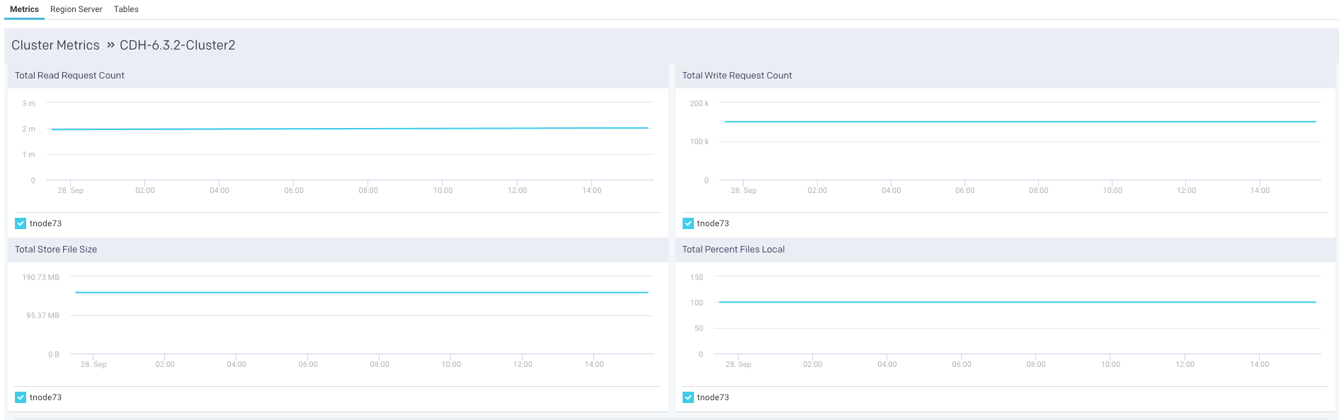
Unravel provides cluster metrics per cluster which provide an overview of HBase clusters in the Cluster > HBase tab where all the HBase clusters are listed. Click a cluster name to bring up the cluster's detailed information.
The metrics are color-coded so you can quickly ascertain your cluster's health and in case of issues you can drill-down further into them.
Green = Healthy
Red = Unhealthy, alert for metrics and investigation required
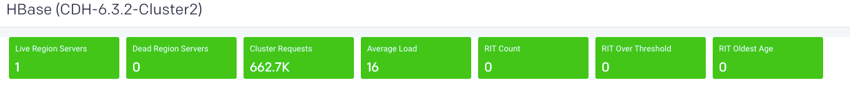
Live Region Servers: the number of running region servers.
Dead Region Servers: the number of dead region servers.
This metric gives you insight into the health of the region servers. In a healthy cluster this should be zero. When the number of dead region servers is one or greater you know something is wrong in the cluster.
Dead region servers can cause an imbalance in the cluster. When the server has stopped its regions are then distributed across the running region servers. This consolidation means some region servers handle a larger number of regions and consequently have a corresponding higher number of read, write and store operations. This can result in some servers processing a huge number of operations and while others are idle, causing hot-spotting.
Cluster Requests: the number of read and write requests aggregated across the entire cluster.
Average Load: the average number of regions per region server across all Servers
This metric is the average number of regions on each region server. Like Dead Region Servers, this metric helps you to triage imbalances on cluster and optimize the cluster's performance.
Rit Count: the number of regions in transition.
RitOver Threshold: the number of regions that have been in transition longer than a threshold time (default: 60 seconds).
RitOldestAge: the age, in milliseconds, of the longest region in transition.
Note
Region Server refers to the servers (hosts) while region refers to the specific regions on the servers.
Metrics
The following graphs are plotted in the Metrics tab:
Region server
Unravel provides a list of region servers, their metrics, and Unravel's insight into the server's health for all region servers across the cluster for a specific point of time.
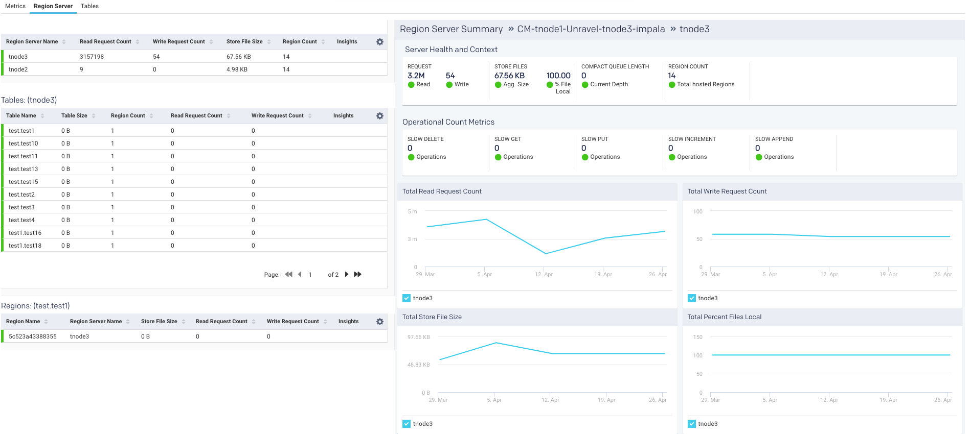
For each region server, the table lists the Region Server Name and the server metrics Read Request Count, Write Request Count, Store File Size, Percent Files Local, Compaction Queue Length, Region Count, and Insights for each server. These metrics and insights are helpful in monitoring activity in your HBase cluster.
An icon is displayed in the Insights column and you can quickly find if the server is in trouble. Hover over the icon to see a tooltip listing the hot-spotting notifications with their associated threshold (Average value * 1.2). If any value is above the threshold the region server is hot-spotting.
Further Server Health and Context and Operational count metrics are provided on the right:
Region server metric graphs
Beneath the table are four graphs Total Read Request Count, Total Write Request Count, Total Store File Size, and Total Percent Files Local. These graphs are for all metrics across the entire cluster. The time period the metrics are graphed is noted above the graphs.
Tables
The last item in the Cluster tab is a list of tables. This list is for all the tables across all the region servers across the entire cluster. Unravel then uses these metrics to attempt to detect an imbalance. Averages are calculated within each category and alerts are raised accordingly. Just like with the region servers you can tell at glance the Health of the table.
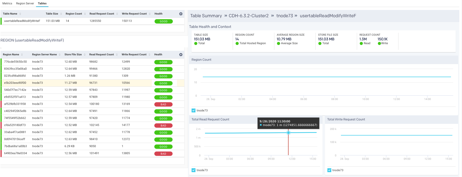
The list is searchable and displays the Table Name, Table Size, Region Count, Average Region Size, Store File Size, Read Request Count, Write Request Count, and finally Health. Hover over the health status to see a tooltip listing the hot-spotting. Bad health indicates that a large number of store operations from different sources are redirected to this table. In this example, the Store File Size is more than 20% of the threshold.
You can use this list to drill down into the tables and get its details which can be useful to monitor your cluster.
Click a table to view its details, which include graphs of metrics overtime for the region, a list of the regions using the table, and the apps accessing the table. The following is an example of the graphed metrics, Region Count, Total Read Request Count, and Total Write Request Count.
Region
Once in the Table view, click the Region tab to see the list of regions accessing the table.
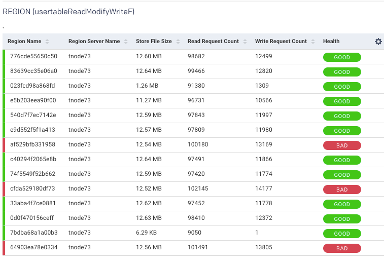
The table list shows the Region Name, Region Server Name, and the region metrics Store File Size, Read Request Count, Write Request Count, and Health. These metrics are useful in gauging activity and load in the region. The region health is important in deciding whether the region is functioning properly. In case any metric value is crossing the threshold, the status is listed as bad. A bad status indicates you should start investigating to locate and fix hot-spotting.
Elasticsearch
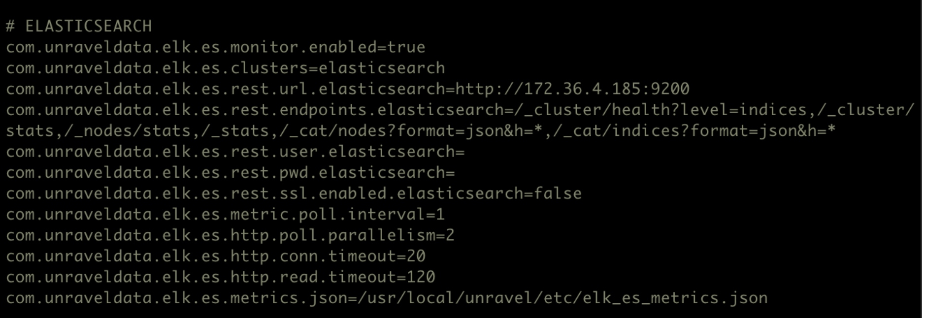
This tab lets you monitor various metrics in the Elasticsearch clusters. You can select a cluster and the period range to monitor the metrics for each cluster, each node in the cluster, as well as for the corresponding indices. The monitoring of the Elasticsearch clusters can be enabled by configuring the Elasticsearch properties in the unravel.properties file.
Enable monitoring for Elasticsearch clusters
To enable monitoring for Elasticsearch clusters in Unravel:
Go to
/usr/local/unravel/etc/cd /usr/local/unravel/etc/Edit
unravel.propertiesfile.vi unravel.propertiesSet the com.unraveldata.elk.es.monitor.enabled property to true.
Configure the clusters for Elasticsearch monitoring in the com.unraveldata.elk.es.clusters property.
Set other properties for Elasticsearch. Refer to ELK properties for more details.
View Elasticsearch cluster metrics
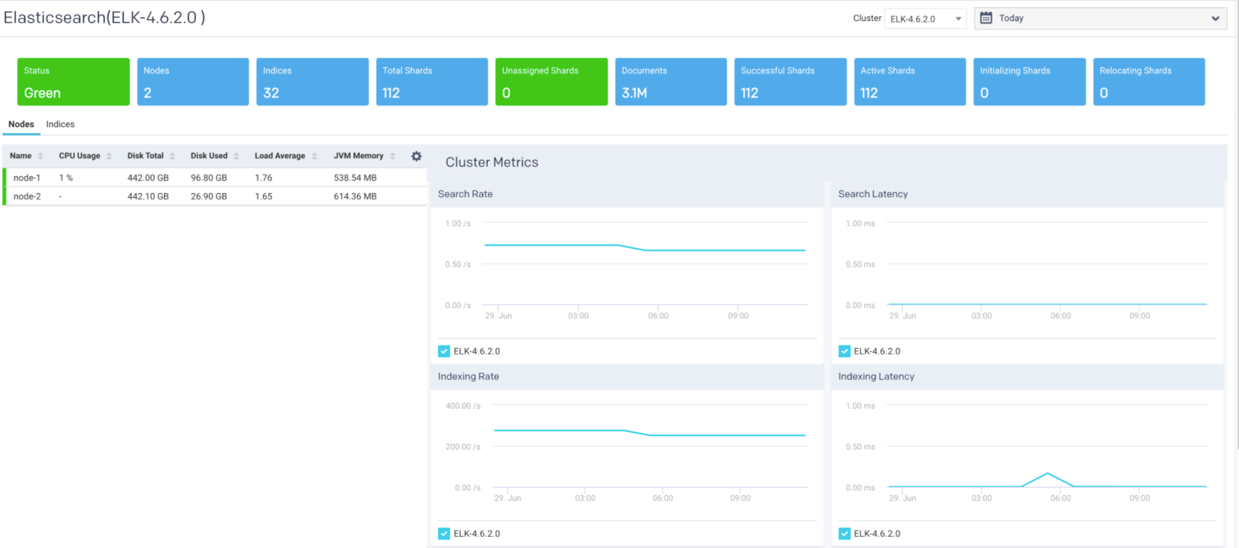
By default, the cluster metrics are summarized and shown for all the nodes in the cluster for the past one hour. To view the Elasticsearch cluster KPIs for a specific time period:
Go to Clusters > Elasticsearch.
Select a cluster from the Cluster drop-down.
Optionally select a period range.
The following Elasticsearch KPIs of a cluster are displayed on top of the page:
Cluster Metrics Metrics
Description
Status
Status of the cluster.
Nodes
Total number of nodes in the cluster.
Indices
Total count of indices in the cluster.
Total Shards
Total number of shards in the cluster.
Unassigned Shards
Total number of unassigned shards in the cluster.
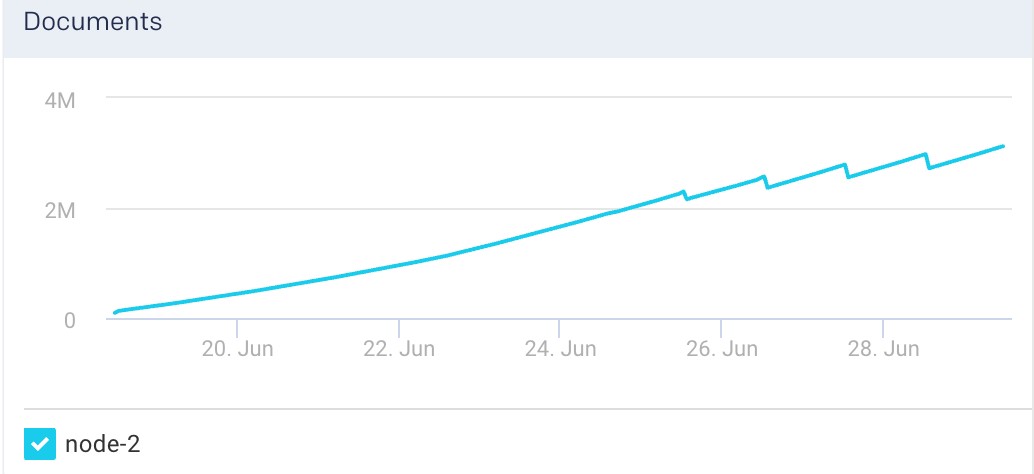
Documents
Total count of indexed documents in the cluster.
Successful Shards
Total number of successful shards in the cluster.
Active Shards
Total number of active shards in the cluster.
Initializing Shards
Number of initializing shards in the cluster.
Relocating Shards
Number of relocating shards in the cluster.
Cluster Graphs The following graphs plot various Elasticsearch KPIs for a selected cluster in a specified time range:
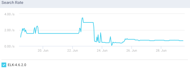
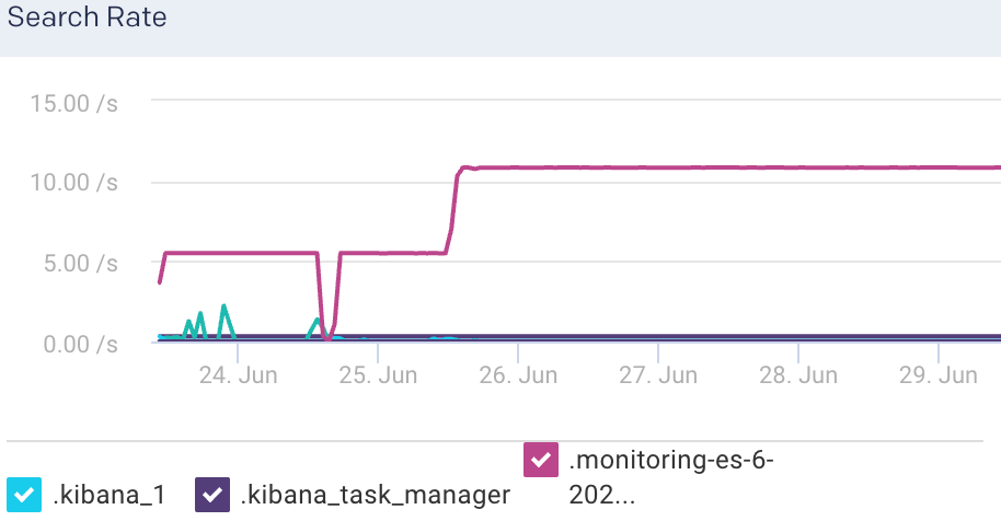
Search Rate: This graph plots the rate at which documents are queried in Elasticsearch for the selected cluster.
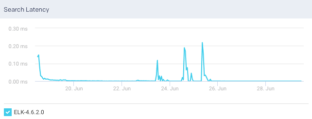
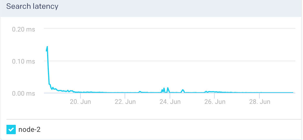
Search Latency: This graph plots the time taken to execute the search request for the selected cluster.
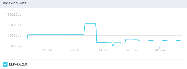
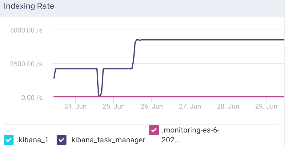
Indexing Rate: This graph plots the rate at which documents are indexed in the selected cluster.
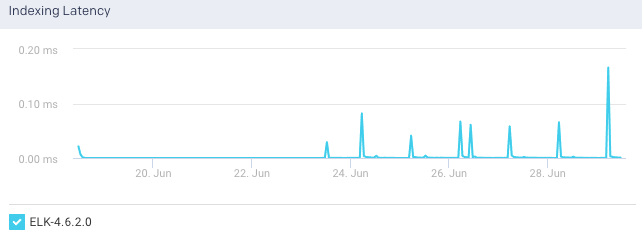
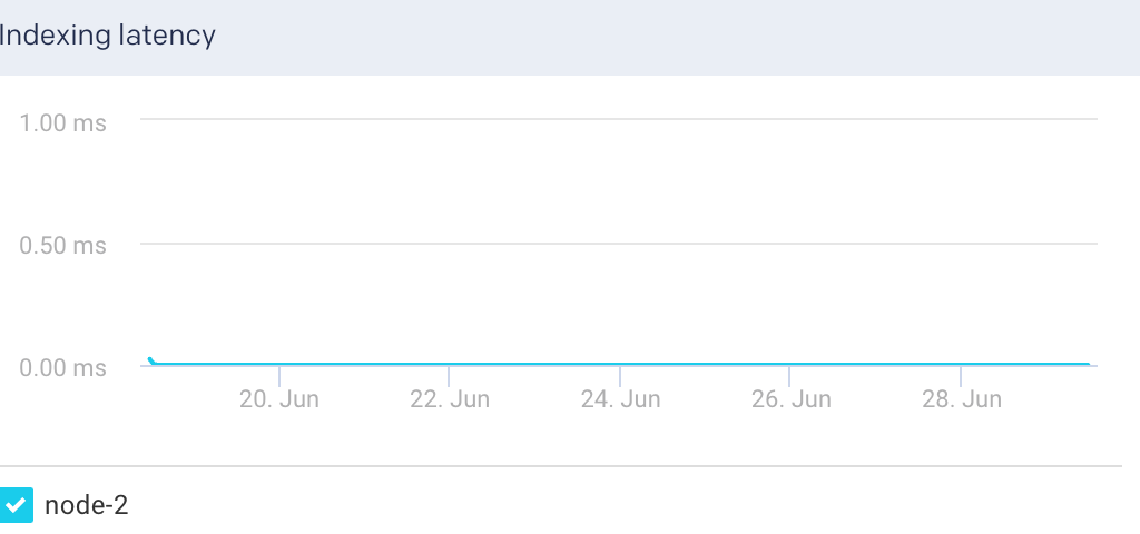
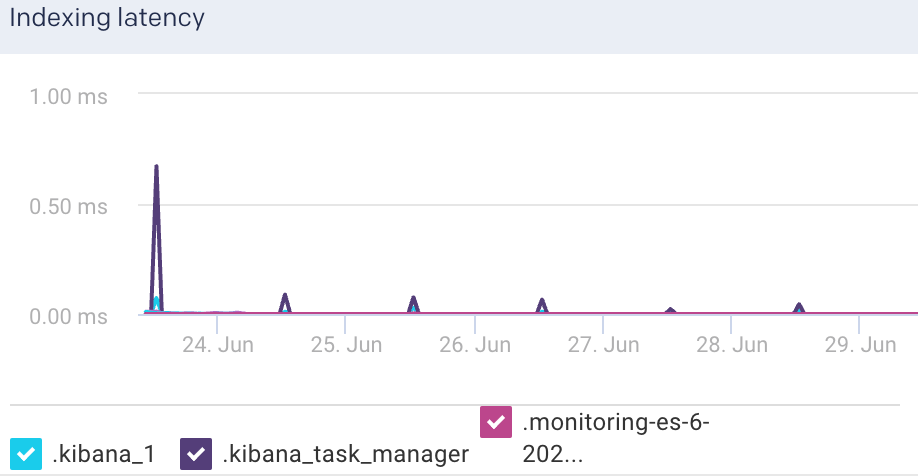
Indexing Latency: This graph plots the time taken to index the documents in the selected cluster.
View Elasticsearch node metrics
You can monitor the Elasticsearch metrics at the node level. To view the metric details of a specific node in an Elasticsearch cluster:
Go to Clusters > Elasticsearch.
Select a cluster from the Cluster drop-down.
Optionally select a period range.
Click the Nodes tab. All the nodes in the cluster and the corresponding details are listed in the Nodes tab.
Select a node. The node details are displayed in a table. The node metrics are displayed on the upper right side.
You can use the toggle button
 to sort the columns, of the node details table, in an ascending and descending order. You can also click the icon to set the columns to be displayed in the Nodes tab.
Node Details The following details are displayed for each node:
Column
Description
Name
Name of the node.
CPU usage
Total CPU usage for the node.
Disk Total
Total disk space available for the Elasticsearch node.
Disk Used
Total disk space used by the Elasticsearch node.
Load Average
The load average of a CPU in an operating system.
Jvm Memory
JVM heap memory used.
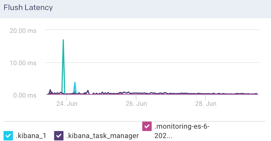
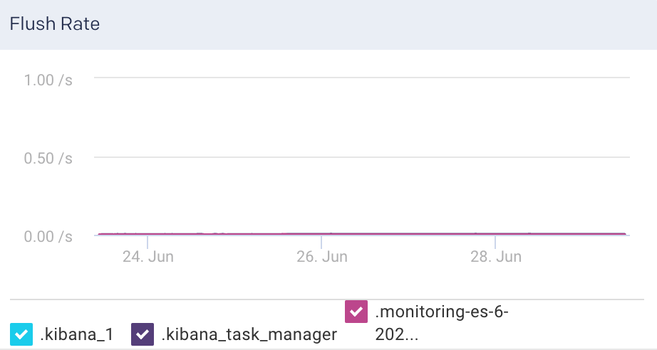
Node Metrics The following node metrics are displayed for the selected node:
Metrics
Description
Documents
The total number of indexed documents in the node.
Free Disk Space
The available disk space in the node.
Heap Percent
Percentage of heap memory used.
Flush Latency
Time taken to flush the indices in a node.
Flush Rate
The rate at which the indices are flushed.
CPU
The CPU utilization by the operating system in percentage.
RAM
RAM utilization in percentage.
Total Read Operations
Total amount of read operations processed.
Total write Operations
Total amount of write operations processed.
Uptime
Time since the node is up and active.
Node Graphs The following graphs plot various Elasticsearch KPIs for a selected node in a specified time range:
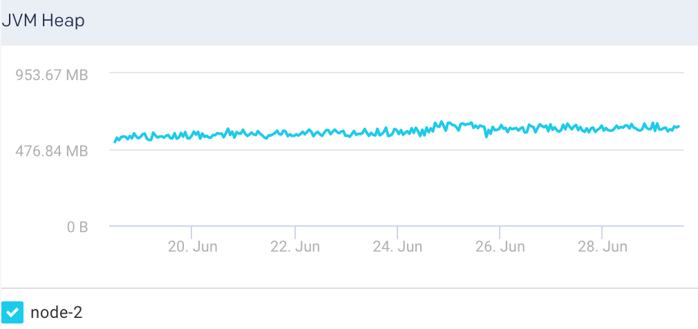
JVM Heap: This graph plots the total heap used by Elasticsearch in the JVM for a selected node.
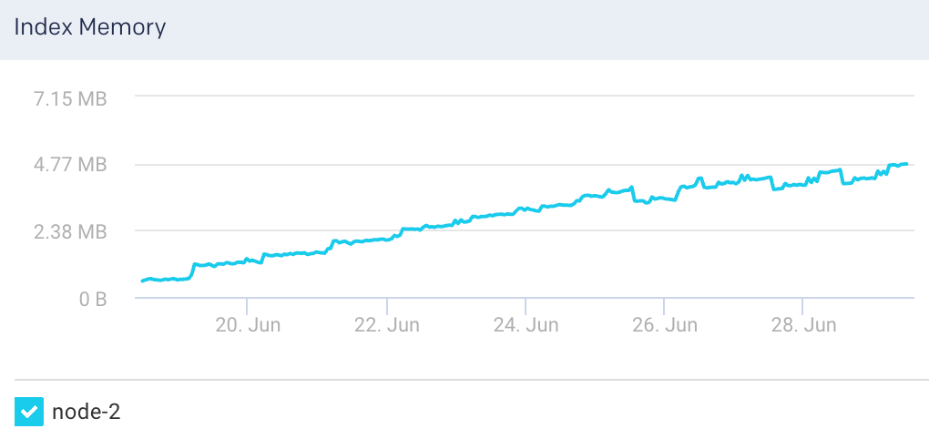
Index Memory: This graph plots the heap memory used for indexing in a selected node.
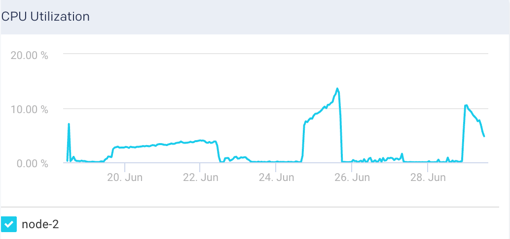
CPU Utilization: This graph plots the percentage of CPU usage for the Elasticsearch process in the selected node.
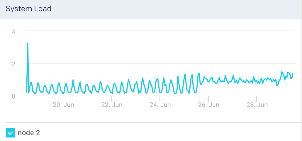
System Load: The graph plots the load average per minute for the selected node.
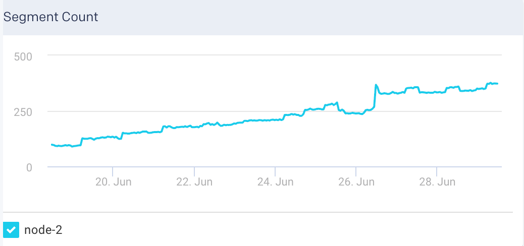
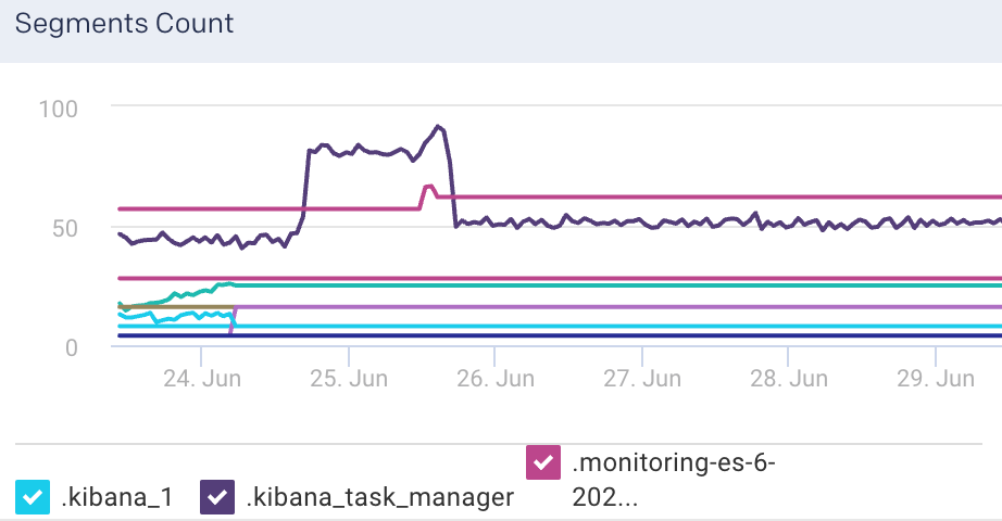
Segment Count: This graph plots the maximum segment count for the selected node.
Search Latency: This graph plots the average search latency for the selected node.
Indexing Latency: This graph plots the average latency for indexing documents in the selected node.
Documents: This graph plots the count of indexed documents for the selected node.
View Elasticsearch indices metrics
To view the metric details of an index in an Elasticsearch cluster:
Go to Clusters > Elasticsearch.
Select a cluster from the Cluster drop-down.
Select a period range.
Click the Indices tab. All the indices in the cluster are listed in the Indices tab.
Select an index. The index details are displayed in a table. The index metrics are displayed on the upper right side.
You can use the toggle button
to sort the columns, of the index details table, in an ascending and descending order. You can also click the icon to set the columns to be displayed in the Indices tab.Indices Details The following details are displayed for each of the indices:
Column
Description
Name
Name of the index.
Docs
Number of indexed documents.
Store Size
Storage size of the indexed documents.
Search Rate
Number of search requests being executed.
Active Shards
Total number of active shards in an index.
Unassigned Shards
Total number of unassigned shards in an index.
Index Metrics The following metrics are displayed for the selected index:
Metrics
Description
Flush Total
Total number of flushed indices.
Flushed Latency
Time taken to flush an index.
Flush Rate
The rate at which indices are flushed.
Segments count
Count of segments.
The following graphs represent various Elasticsearch KPIs for a selected index in a specified time range. By default, all the indices are checked in the graphs. You can select single or multiple indices in the graph.
Indices Graphs The following graphs plots various metrics for the selected indices in a specified time range:
Search Rate: This graph plots the number of search requests that are being executed in Elasticsearch.
Indexing Latency: This graph plots the time taken to index the documents in Elasticsearch.
Indexing Rate: This graph plots the rate at which documents are indexed in Elasticsearch
Segments Count: This graph plots the count of indexing segments operation.
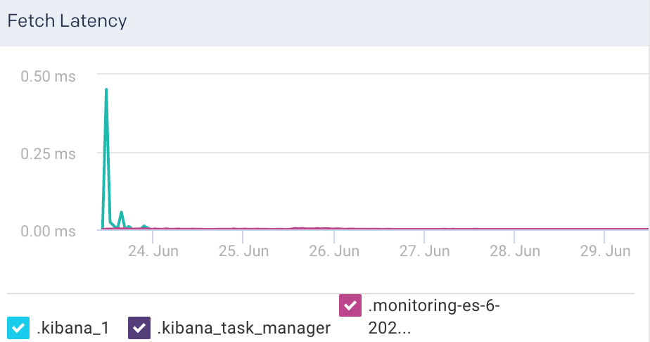
Fetch Latency: This graph plots the fetch latency for the indices.
Fetch Rate: This graph plots the time taken to fetch the query results.
Flush Latency: This graph plots the time taken to flush indices.
Flush Rate: This graph plots the rate at which indices are flushed.
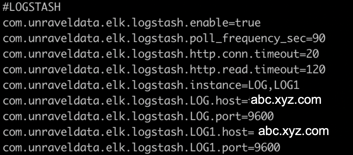
Logstash
This tab lets you monitor various metrics for Logstash. You can select a period to monitor the metrics for each Logstash instance and pipeline. The Logstash monitoring can be enabled by configuring the Logstash properties in the unravel.properties file.
Enable Logstash monitoring
To enable monitoring for Logstash in Unravel:
Go to
/usr/local/unravel/etc/cd /usr/local/unravel/etc/Edit
unravel.propertiesfile.vi unravel.propertiesSet the com.unraveldata.elk.logstash.enable property to true.
Set other properties for Logstash. Refer to ELK properties for more details.
View Logstash metrics
By default, the cluster metrics are summarized and shown for all the nodes in the cluster for the past one hour. To view the Logstash cluster KPIs for a specific time period:
Go to Clusters > Logstash.
Select a period range.
The following Logstash KPIs are displayed on top of the page:
Cluster metrics Metric
Description
Nodes
Total number of nodes in the cluster.
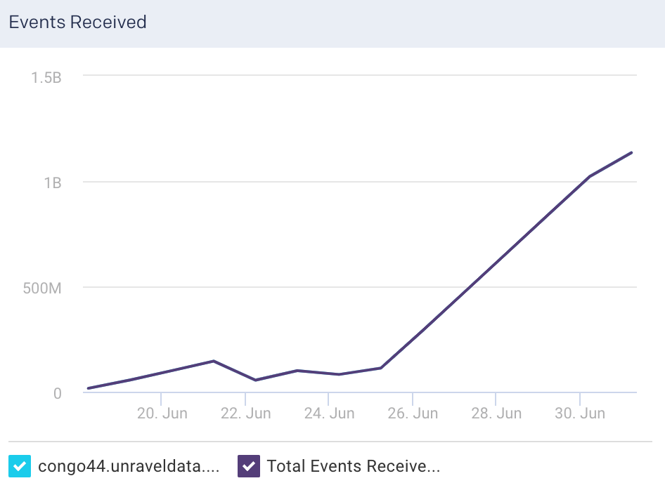
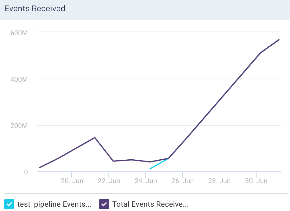
Events Received
Average of the number of events flowing into all the nodes, in a selected time period.
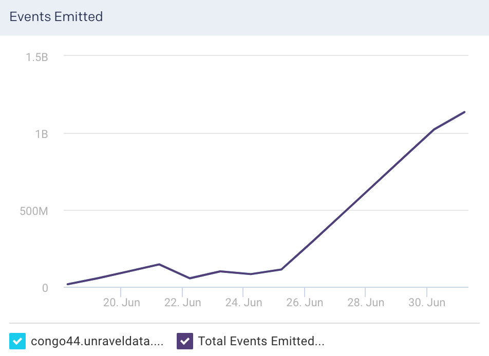
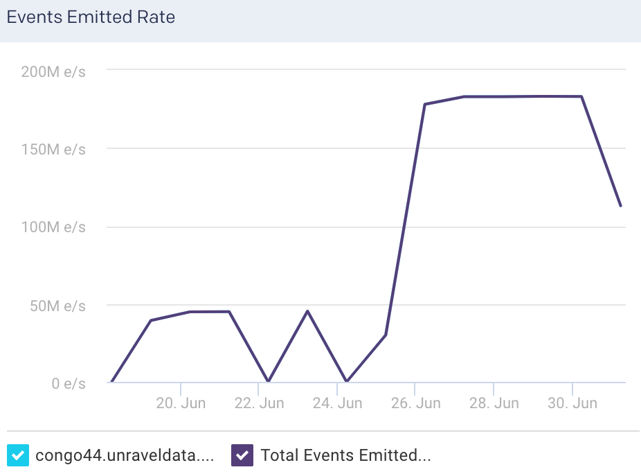
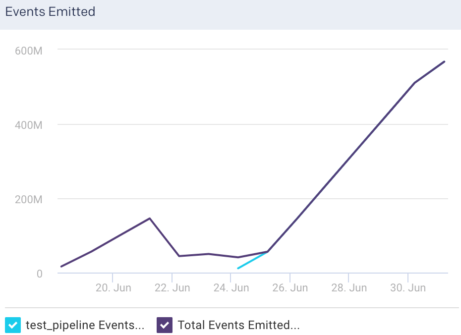
Events Emitted
Average of the number of events flowing out of all the nodes, in a selected time period.
Memory
The total heap memory used versus total heap memory available. (Heap memory used/Total heap memory available)
Pipelines
Total number of logical pipelines.
View Logstash node metrics
You can monitor the Logstash metrics at the node level. To view the metric details of a specific node in a Logstash cluster:
Go to Clusters > Logstash.
Select a period range.
Click the Nodes tab. All the nodes in the cluster and the corresponding details are listed in the Nodes tab.
Select a node. The node details are displayed in a table. The node metrics are displayed on the upper right side.
You can use the toggle button
to sort the columns, of the node details table, in an ascending and descending order. You can also click the icon to set the columns to be displayed in the Nodes tab.Node details The following details are displayed for each node:
Column
Description
Name
Name of the node.
Jvm Heap Used
JVM heap memory used.
Events Received
Current number of events flowing into the selected node.
Events Emitted
Current number of events flowing out of the selected node.
Events Filtered
Current number of events that are filtered for the selected node.
Node metrics The following node metrics are displayed for the selected node:
Node Metrics
Description
Version
Logstash version.
CPU Usage
Average CPU usage for the selected period of time.
Uptime
Time since the node has been up and active.
Reloads
Successful reloads versus the total number of reloads.
Node graphs The following graphs plot various Logstash KPIs for a selected node in a specified time range:
Events Received: This graph plots the average of the total events flowing into the selected node, for the specified time period.
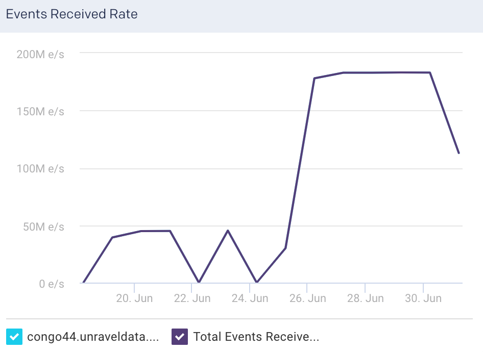
Events Received Rate: This graph plots the average rate at which events flow into the selected node, for the specified time period.
Events Emitted: This graph plots the average of the total events flowing out of the selected node, for the specified time period.
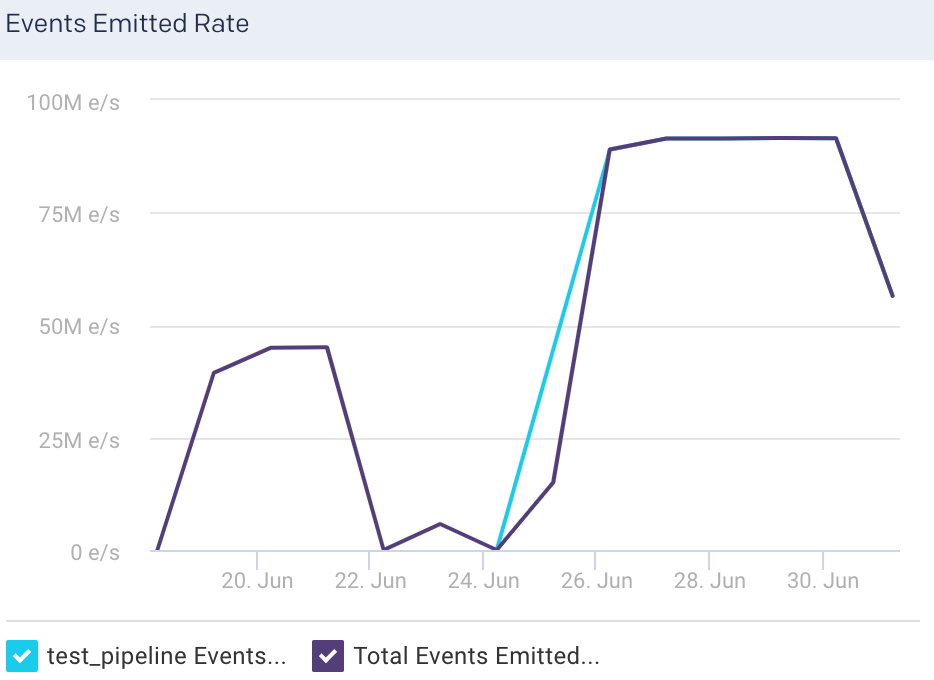
Events Emitted Rate: This graph plots the average rate at which events flow out of the selected node, for the specified time period.
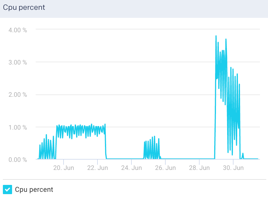
Cpu Percent: This graph plots the percentage of CPU usage for the Logstash process in the selected node.
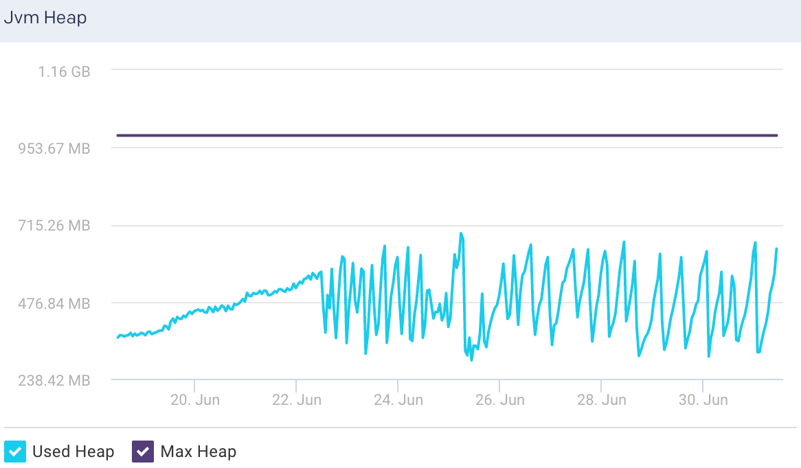
Jvm Heap: This graph plots the total heap used by Elasticsearch in the JVM for a selected node.
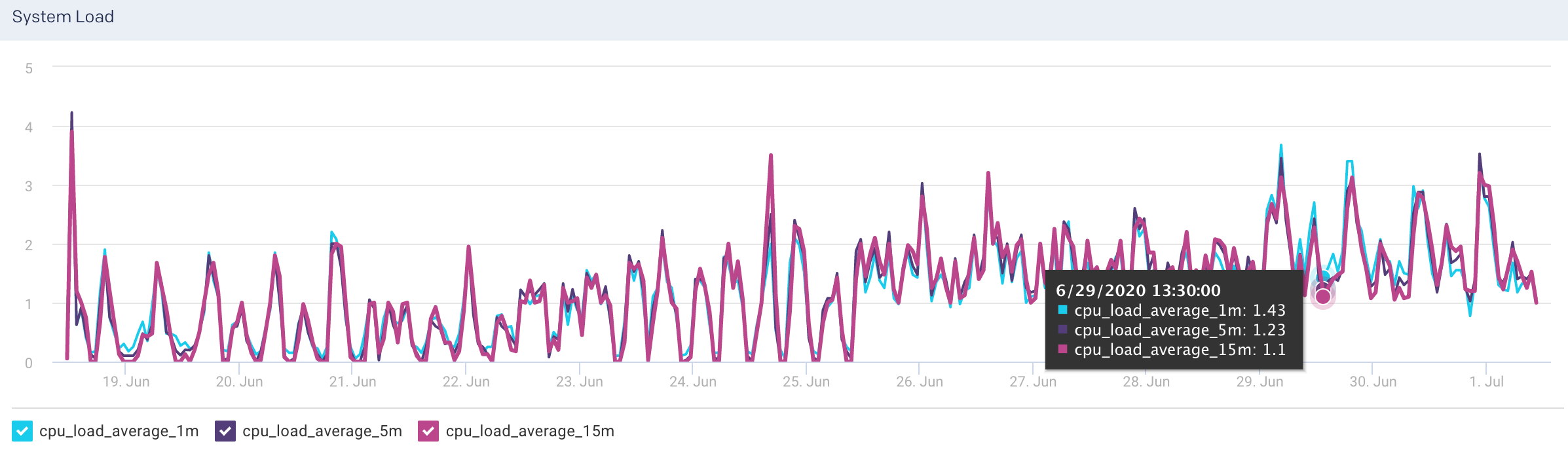
System Load: The graph plots the load average per minute for the selected node.
View Logstash pipeline metrics
To view the metric details of a pipeline in a Logstash cluster:
Go to Clusters > Logstash.
Select a period range.
Click the Pipelines tab. All the pipelines in the cluster are listed in the Pipelines tab.
Select a pipeline. The pipeline details are displayed in a table. The pipeline metrics are displayed on the upper right side.
You can use the toggle button
to sort the columns, of the pipeline details table, in an ascending and descending order. You can also click the icon to set the columns to be displayed in the Pipelines tab.Pipelines details The following details are displayed for the corresponding pipelines:
Column
Description
Name
Name of the node.
Events Received
Current number of events flowing into the selected pipeline.
Events Emitted
Current number of events flowing out of the selected pipeline.
Events Filtered
Current number of events that are filtered for the selected pipeline.
Number of Nodes
Total number of nodes in the pipeline.
Pipelines metrics The following metrics are displayed for the selected pipelines:
Pipelines Metrics
Description
Reload Interval
Time interval that specifies how often Logstash checks the config files for changes in the pipeline (in seconds).
Batch size
Maximum number events that an individual worker thread collects before executing filters and outputs
Reloads
Successful reloads versus total number of reloads
Workers
Number of threads to run for filter and output processing.
Pipelines graphs The following graphs plots various metrics for the selected pipelines in a specified time range:
Events Received: This graph plots the average of the total events flowing into the selected pipeline, for the specified time period.
Events Received Rate: This graph plots the average rate at which events flow into the selected pipeline, for the specified time period.
Events Emitted: This graph plots the average of the total events flowing out of the selected pipeline, for the specified time period.
Events Emitted Rate: This graph plots the average rate at which events flow out of the selected pipeline, for the specified time period.
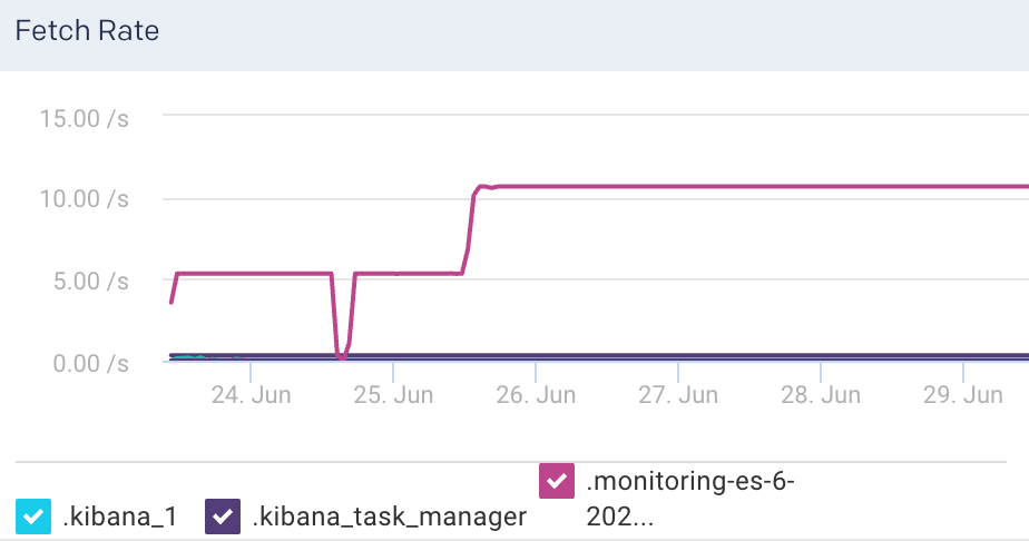
Kibana
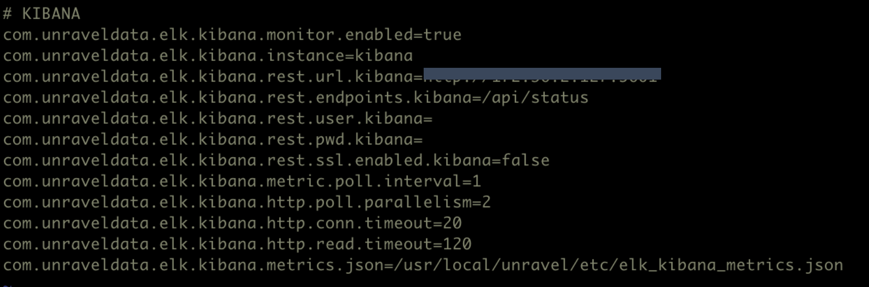
This tab lets you monitor various metrics for Kibana. You can select a period to monitor the metrics for the Kibana instances in a cluster. You can enable Kibana monitoring by configuring the Kibana properties in the unravel.properties file.
Enable Kibana monitoring
To enable monitoring for Kibana in Unravel:
Go to
/usr/local/unravel/etc/cd /usr/local/unravel/etc/Edit
unravel.propertiesfile.vi unravel.propertiesSet the com.unraveldata.elk.kibana.monitor.enabled property to true.
Set other properties for Kibana. Refer to ELK properties for more details.
View Kibana metrics
By default, the Kibana metrics are shown for all the cluster for the past one hour. To view the Kibana cluster KPIs for a specific time period:
Go to Clusters > Kibana.
Select a cluster from the Cluster drop-down
Select a period range. The following Kibana KPIs are displayed on top of the page:
Cluster KPIs Metric
Description
Status
Status of the cluster.
Heap Total
Total heap memory available.
Heap Used
Total heap memory used.
Requests Disconnects
Number of disconnected client requests.
Request Total
Total number of client requests received by the Kibana instance.
Response Time Max
Maximum time taken to respond to the client requests received by the Kibana instance.
Concurrent Connections
Total number of concurrent connections to the Kibana instance.
Collection Interval
Time period between data sampling for the metrics.
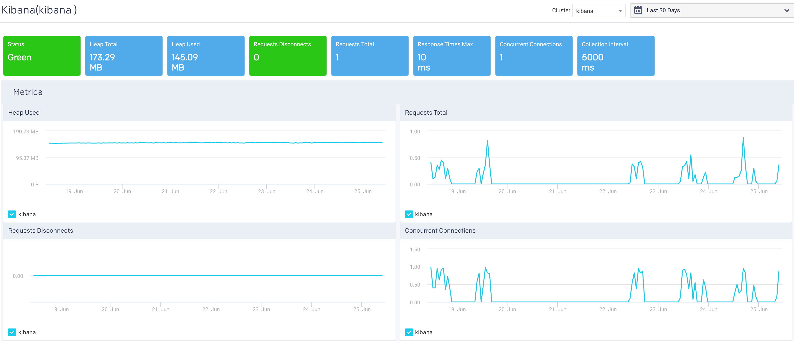
The following graphs plot the Kibana KPIs for a selected cluster in a specified time range:
Heap Used: This graph plots the total heap memory used by Kibana, in a cluster, for the specified period.
Request Total: This graph plots the total number of client requests received by the Kibana instance in the specified period.
Request Disconnects: This graph plots the totals no of disconnected requests in a specified period.
Concurrent Connections: This graph plots the concurrent connections to the Kibana instance in a specified period.
Chargeback
This tab allows you to generate chargeback reports for your clusters' usage costs for Yarn and Impala jobs. Multi-cluster feature is supported for Chargeback reports. However, you can view the report of a single cluster at a time.
In case there are no Yarn jobs or Impala jobs running on the selected cluster at the specified time, then chargeback reports are not shown.
Generate chargeback report
From the Chargeback drop-down on the upper left corner, select either Yarn or Impala.
Use the Cluster and date picker pull-down menus to select a specific cluster or change the date range.
Click in the Group By box and select an option. Select a maximum of two Group By options at a time. You can click
next to the option to deselect an option if you have selected more than one option.The chargeback report is generated. If you have selected two Group By options, the combined results are displayed in the donut charts (Jobs, CPU hours, Memory hours) and also in the table below the donut charts. Refer to Drilling down the Chargeback results for more details.
Example: In the following image, the report is grouped by two tags, dept and project. (See What is tagging, if you are unfamiliar with the concept.)
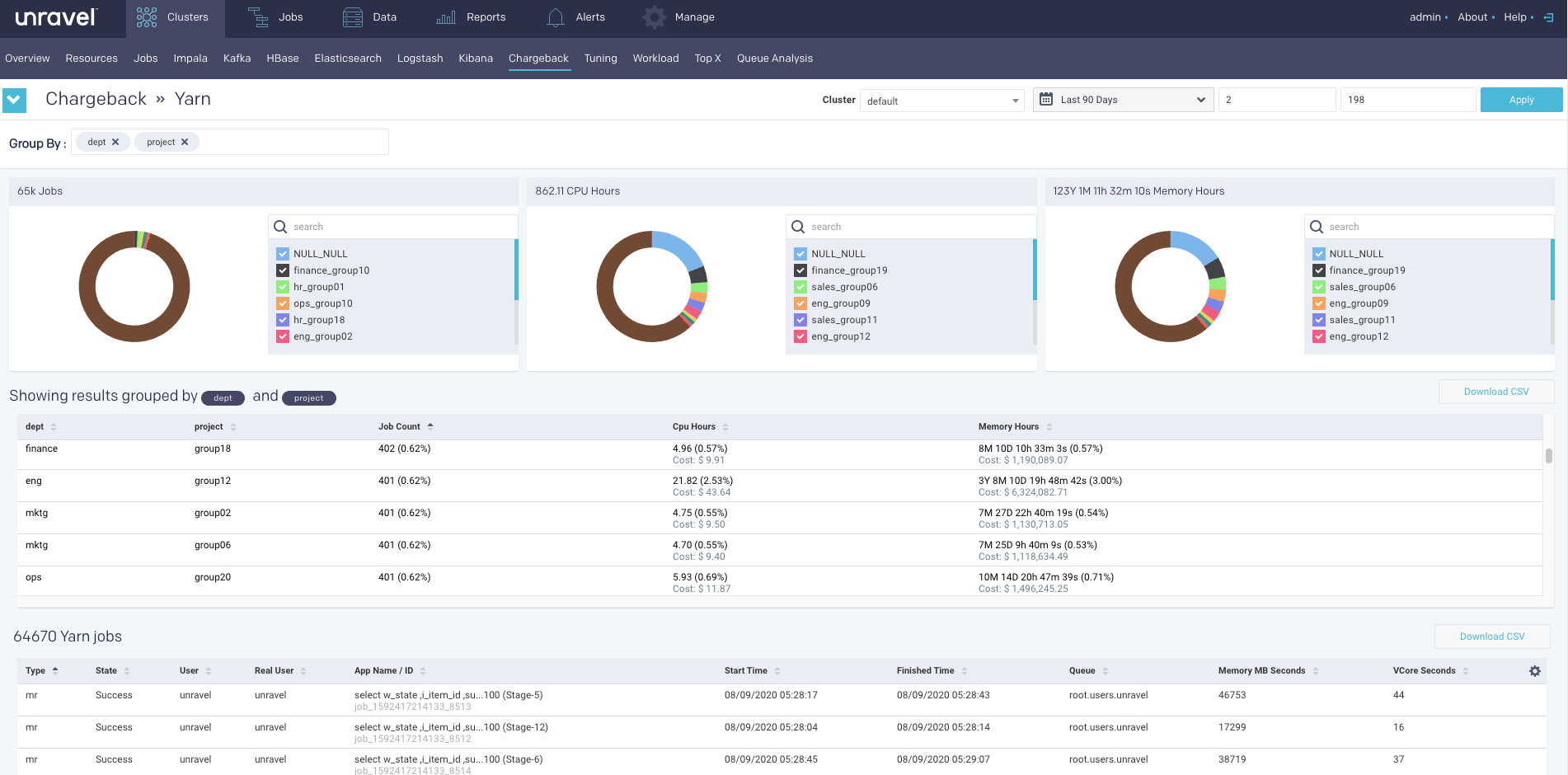
There are times when a job cannot be grouped by the selected option.In such cases NULL is listed in the Group By option column. In this case, there are jobs that have neither a dept or project tag.
Hover over a donut section to see the slice name, the value, and percentage of the whole. Click Download CSV to download the chargeback report.
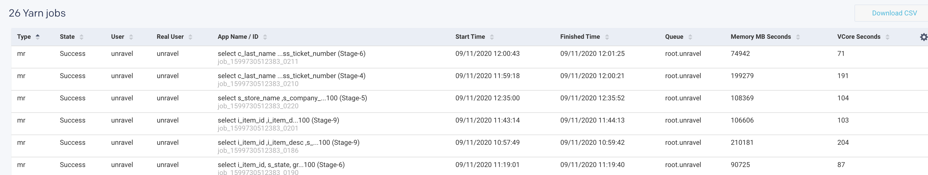
The list of all the Yarn jobs/Impala jobs is provided in the tables as shown. You can view 15 records at a time and download the list in a CSV format.
Drilling down the Chargeback results
The chargeback results are displayed in the table as shown in the following image:
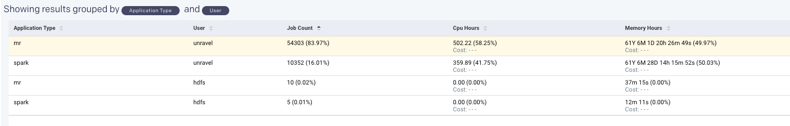
Click any row to drill down to the next Group By option.
if you click the row again, you can drill down further till all the associated Group By options are exhausted for the Application type option in Yarn jobs and User option in Impala jobs.
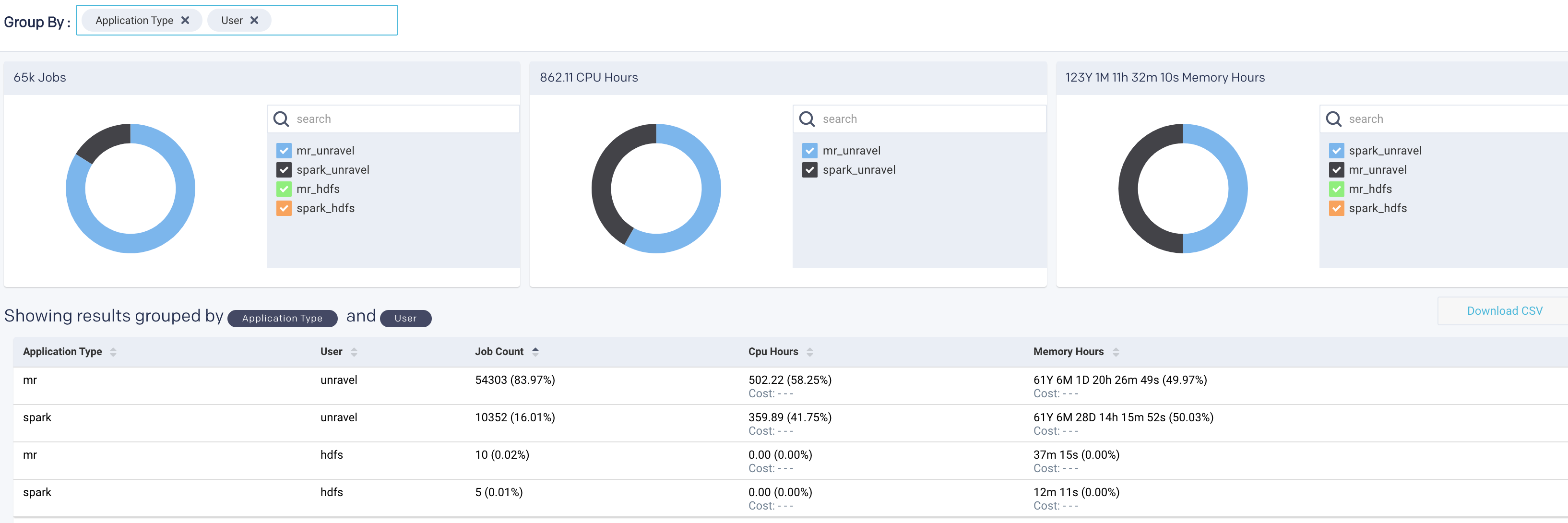
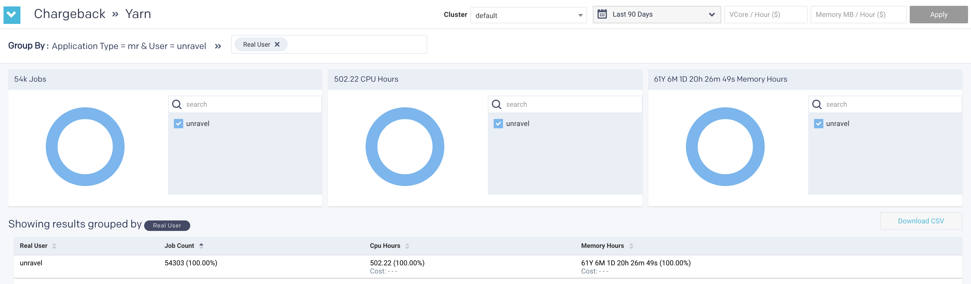
Use the navigation path corresponding to the Group by to move back to a previous option.
Estimating chargeback cost
From the Chargeback drop-down on the upper right corner, select one of the following options:
Yarn
Impala
Use the Cluster and date picker pull-down menus to select a specific cluster or change the date range.
Click in the Group By box and select an option. You can select a maximum of two Group By options only at a time. The Chargeback report is displayed.
The chargeback report is generated.
Enter the vCore/Hour or Memory MB/Hour and click Apply. A quick estimation is displayed in the results table, in the CPU hours or Memory hours column.
Top X report
This topic provides information about the Top X applications. The TopX reports are enabled by default.
Generating TopX report
Click the
 button to generate a new report. The parameters are:
History (Date Range): Use the date picker drop-down to specify the date range.
Top X: Enter a number for the top Hive, Spark, Impala apps that you want to view.
Cluster: Select a cluster from where you want to generate the report.
Users: Users who submitted the app.
Real User: Users who actually submitted the app. For instance, the user might be a hive, but the real user is joan@mycompany.com.
Queue: Select queues.
Tags: Select tags.
Click Run to generate the report.
The progress of the report generation is shown on the top of the page and you are notified about the successful creation of the report. The latest successful report is shown in the Clusters > Top X page.
All reports (successful or failed attempts) are in the Reports Archive.
Scheduling TopX report
Click
 to generate the report regularly and provide the following details:
History (Date Range): Use the date picker drop-down to specify the date range.
Top X: Enter a number for the top Hive, Spark, Impala apps that you want to view.
Cluster: Select a cluster from where you want to generate the report.
Users: Users who submitted the app.
Real User: Users who actually submitted the app. For instance, the user might be a hive, but the real user is joan@mycompany.com.
Queue: Select queues.
Tags: Select tags.
Schedule to Run: Select any of the following schedule options from the drop-down and set the time from the hours and minutes drop-down:
Daily
Select a day in the week. (Sun, Mon, Tue, Wed, Thu, Fri, Sat)
Every two weeks
Every month
Notification: Provide either a single or multiple email IDs to receive the notification of the reports generated.
Click Schedule.
Viewing TopX report
The following sections are included in the TopX reports which can be grouped by Hive, Spark, or Impala.
Input Parameters
This section provides the basic information about the report, that is the date range selected, the number of top results included in the TopX report, and the cluster from where the report is generated.
Applications
The Applications section shows the following app metrics for the generated TopX report:
Total Apps: Number of apps on the cluster.
Successful Apps: Number of apps that are completed successfully.
Failed Apps: Number of apps that have failed to complete.
Others: Number of apps that were killed, or those that are in a pending, running, waiting, or unknown state.
Further, the detailed TopX report for applications are generated which are grouped based on the following categories:
Longest Duration: The Top N number of applications that ran for the longest duration.
Highest Disk I/O: The Top N number of applications that have the highest disk input/output operations.
Highest Cluster Usage: The Top N number of applications that have the highest cluster usage.
Highest CPU Usage: The Top N number of applications that have the highest CPU usage.
Highest Memory Usage: The Top N number of applications that have the highest memory usage.
Click any of the tabs, to view further TopX details of the selected app.
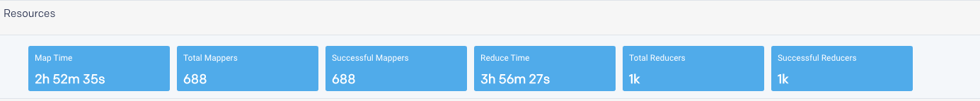
Resources
Resources breakdown the Map/reduce time for Hive apps. The information about total mappers, successful mappers, total reducers, and successful reducers is shown.
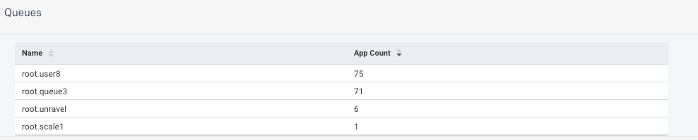
Queues
The Queues section shows the app count for the selected queue plus the other criteria, which were selected for generating the report.
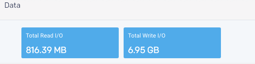
Data
The Data tile displays the cumulative total by Read and Write I/O
Tuning
This report is an OnDemand report which analyzes your cluster workload over a specified period. It provides insights and configuration recommendations to optimize throughput, resources, and performance. Currently, this feature only supports Hive on MapReduce.
You can use these reports to:
Fine-tune your cluster to maximize its performance and minimize your costs.
Compare your cluster's performance between two time periods.
Reports are generated on an ad hoc or scheduled basis. All reports are archived and can be accessed via the Reports Archive tab. The tab opens displaying the last report, if any, generated.
Generating Tuning report
Click the
button to generate a new report. The parameters are:Date Range: Select a period from the date picker.
Cluster: In a multi-cluster setup, you can select the cluster from where you want to generate the report.
Click Run to generate the report.
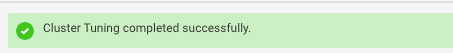
The progress of the report generation is shown on the top of the page and you are notified about the successful creation of the report.

All reports (successful or failed attempts) are in the Reports Archive.
Scheduling Tuning report
Click Schedule to generate the report regularly and provide the following details:
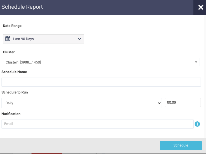
Date Range: Select a period from the date picker.
Cluster: In a multi-cluster setup, you can select the cluster from where you want to generate the report.
Schedule Name: Name of the schedule.
Schedule to Run: Select any of the following schedule option from drop-down and set the time from the hours and minutes drop-down:
Daily
Weekdays (Sun-Sat)
Every two weeks
Every month
Notification: Provide an email ID to receive the notification of the reports generated.
Click Schedule.
Tuning report
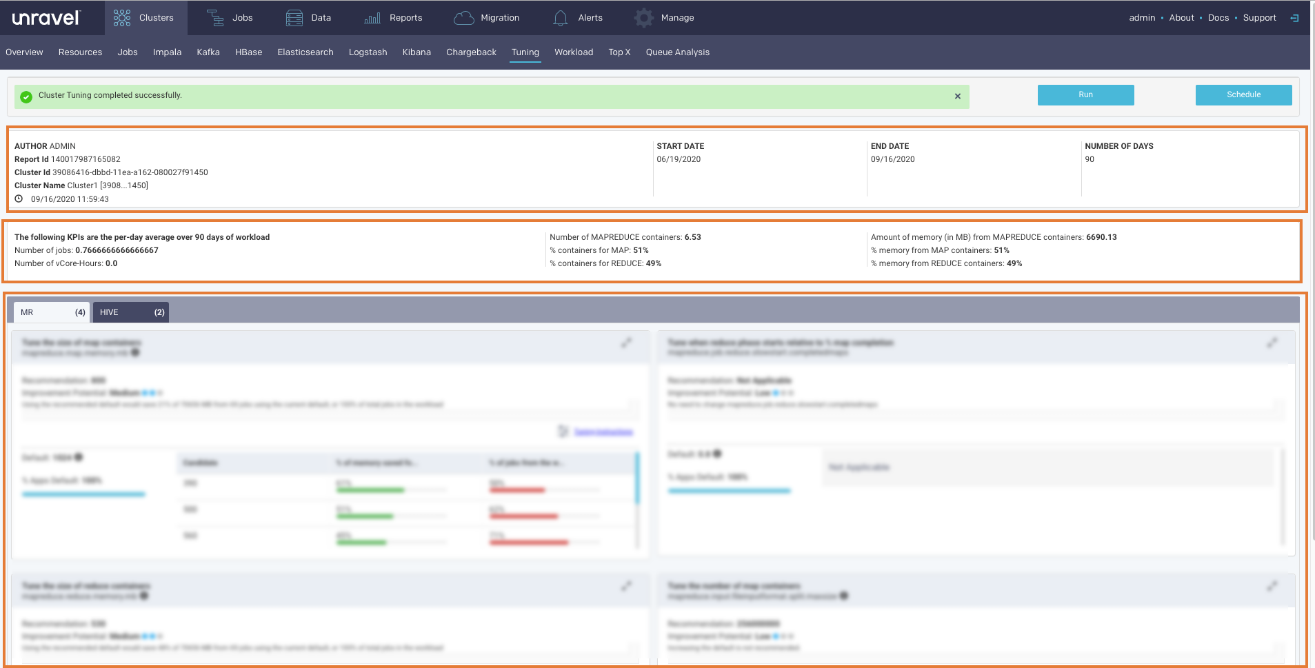
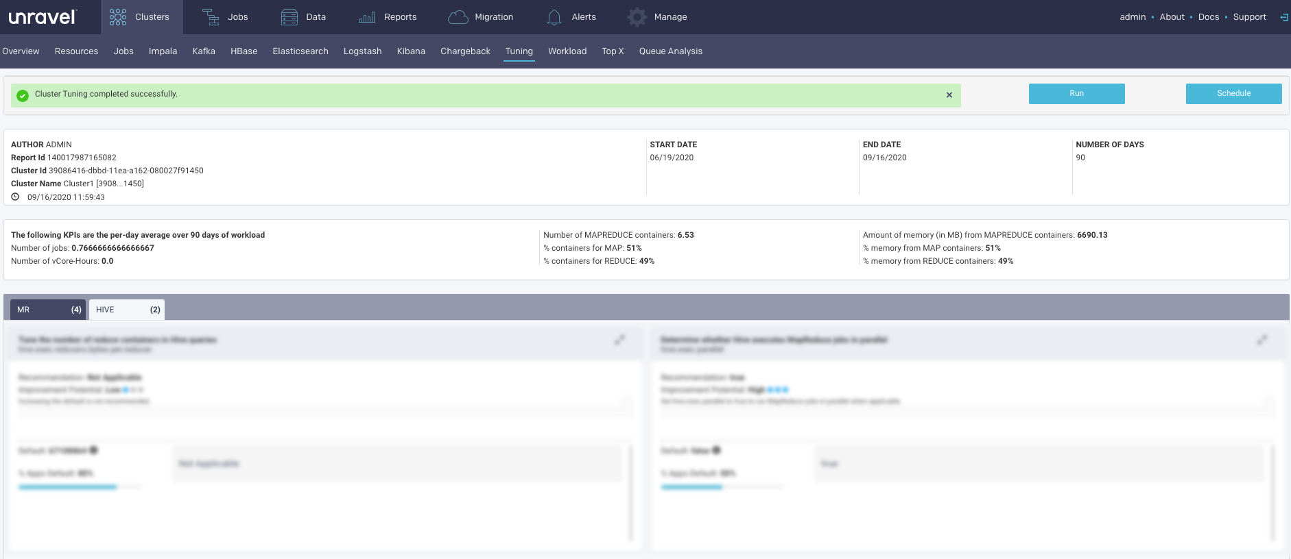
The Report has three sections.
Header: This section contains the following basic information about the report:
Item
Description
Author
Unravel user who has generated the report.
Report Id
Unique identification of the report.
Cluster Id
Unique identification of the cluster from where the report is generated.
Cluster Name
Name of the cluster from where the report is generated.
Time stamp
The date and time when the report was generated.
Start Date
Start date in the selected time range for the report.
End Date
End date in the selected time range for the report.
Number of Days
Select time range for the report in days.
KPIs: This section provides the following KPI information. The KPIs are calculated as per-day average of the workload in the selected time range.
Number of Jobs
Number of vCore Hours
Number of MapReduce Containers
% containers for Map
% containers for Reduce
Amount of memory (in MB) from MapReduce containers
% containers from Map containers
% containers from Reduce containers
Insights/Recommendations
This section provides tuning instructions, recommendations, and insights. Click
 to tuning instructions. Click
  for viewing the related properties. Click to close any information box. Click
  to expand or collapse any of the sub-sections.
Top X
Top X is an On-Demand report, which presents the details of the Top N number of applications. From this page, you can either generate the TopX reports instantly or you can schedule the report. The same TopX reports can be also generated using customized configurations for multiple users. This is known as the User Report, which is a scheduled report that can be mailed to multiple recipients.
Top X is generated for Hive, Spark, and Impala apps in the following categories:
Longest Duration: Total duration of the app.
Highest Disk I/O: Total DFS bytes read and written.
Highest Cluster Usage: Map/reduce time for Hive apps or Slot duration for Spark apps or Total processing time for Impala apps.
Highest CPU Usage: vCore seconds (Hive on Tez not supported)
Highest Memory Usage: Memory seconds (Hive on Tez not supported)
Top X report
This topic provides information about the Top X applications. The TopX reports are enabled by default.
Generating TopX report
Click the
button to generate a new report. The parameters are:History (Date Range): Use the date picker drop-down to specify the date range.
Top X: Enter a number for the top Hive, Spark, Impala apps that you want to view.
Cluster: Select a cluster from where you want to generate the report.
Users: Users who submitted the app.
Real User: Users who actually submitted the app. For instance, the user might be a hive, but the real user is joan@mycompany.com.
Queue: Select queues.
Tags: Select tags.
Click Run to generate the report.
The progress of the report generation is shown on the top of the page and you are notified about the successful creation of the report. The latest successful report is shown in the Clusters > Top X page.
All reports (successful or failed attempts) are in the Reports Archive.
Scheduling TopX report
Click
to generate the report regularly and provide the following details:History (Date Range): Use the date picker drop-down to specify the date range.
Top X: Enter a number for the top Hive, Spark, Impala apps that you want to view.
Cluster: Select a cluster from where you want to generate the report.
Users: Users who submitted the app.
Real User: Users who actually submitted the app. For instance, the user might be a hive, but the real user is joan@mycompany.com.
Queue: Select queues.
Tags: Select tags.
Schedule to Run: Select any of the following schedule options from the drop-down and set the time from the hours and minutes drop-down:
Daily
Select a day in the week. (Sun, Mon, Tue, Wed, Thu, Fri, Sat)
Every two weeks
Every month
Notification: Provide either a single or multiple email IDs to receive the notification of the reports generated.
Click Schedule.
Viewing TopX report
The following sections are included in the TopX reports which can be grouped by Hive, Spark, or Impala.
This section provides the basic information about the report, that is the date range selected, the number of top results included in the TopX report, and the cluster from where the report is generated.
The Applications section shows the following app metrics for the generated TopX report:
Total Apps: Number of apps on the cluster.
Successful Apps: Number of apps that are completed successfully.
Failed Apps: Number of apps that have failed to complete.
Others: Number of apps that were killed, or those that are in a pending, running, waiting, or unknown state.
Further, the detailed TopX report for applications are generated which are grouped based on the following categories:
Longest Duration: The Top N number of applications that ran for the longest duration.
Highest Disk I/O: The Top N number of applications that have the highest disk input/output operations.
Highest Cluster Usage: The Top N number of applications that have the highest cluster usage.
Highest CPU Usage: The Top N number of applications that have the highest CPU usage.
Highest Memory Usage: The Top N number of applications that have the highest memory usage.
Click any of the tabs, to view further TopX details of the selected app.
Resources breakdown the Map/reduce time for Hive apps. The information about total mappers, successful mappers, total reducers, and successful reducers is shown.
The Queues section shows the app count for the selected queue plus the other criteria, which were selected for generating the report.
The Data tile displays the cumulative total by Read and Write I/O
User report
User report is a scheduled Top X report that can be generated using customized configurations for multiple users. This report is scheduled on a regular basis, for example, every Thursday, or every two weeks, and is designed for a variety of end-users, such as :
App developers who can use it to determine what apps need attention to improve duration, resource usage, etc.
Team leaders or managers who can use it to track how the team uses resources and identify user's who overuse resources (rogue users).
It provides a concise and clear view of:
How apps are performing on the platform.
The resources the apps are using.
The number of recommendations or insights Unravel has for the app.
You can schedule a report and either add the configurations manually or import the configurations via a CSV file. The report is sent to the specified email ID.
Scheduling User report
Go to Clusters > TopX.
Click the
 button, on the upper right side of the page, to schedule a new user report. The following page is displayed:
Enter the following details:
Schedule Name: Name of the schedule.
Schedule to Run: Select any of the following schedule option from drop-down and set the time from the hours and minutes drop-down:
Daily
A weekday (Sun, Mon, Tue, Wed, Thu, Fri, Sat)
Every two weeks
Every month
Click
 to add the following parameters to manually create a user report.
History (Date Range): Use the date picker drop-down to specify the date range.
Top X: Enter a number for the top Hive, Spark, Impala apps that you want to view.
Cluster: Select a cluster from where you want to generate the report.
Users: Users who submitted the app.
Real User: Users who actually submitted the app. For instance, the user might be a hive, but the real user is joan@mycompany.com.
Queue: Select queues.
Tags: Select tags.
Email: Provide either a single or multiple email IDs to post the generated reports.
Click Save schedule.
Importing configurations to generate User report
Go to Clusters > TopX.
Click the
button to schedule a new user report. The following page is displayed:Enter the following details:
Schedule Name: Name of the schedule.
Schedule to Run: Select any of the following schedule option from drop-down and set the time from the hours and minutes drop-down:
Daily
Weekdays (Sun-Sat)
Every two weeks
Every month
Click
 to import the configurations from a CSV file to generate the User report.
Import Configurations lets you upload a CSV file containing configurations for multiple users.
Here is the format to create the CSV file for the Top X User report.
Col header1,Col header2,Col header3, ... // up to the number of possible options
entry1, entry2, entry3, ...              // up to the number of columns defined
Following is a sample of the configuration created in CSV.
"email","topx","users","realusers","queues"
xyz@unraveldata.com,56,[hdfs],hive,default
abc@unraveldata.com,8,[hdfs],hive,default
You can create the CSV based on the headers shown here. You need not include (define) all the column headers or order them in the same sequence. However, whatever columns/tags you include must be defined for all entries in the order you chose. You must mandatorily define an email column. In this image, there are eleven possible columns that can be included in the CS

Any column/tag which is not added to the CSV, or left undefined for a configuration is unfiltered. For instance, if Users are undefined, the report is generated across all users.
CSV Format:
In the following example, the CSV file only defines five columns Email (required), Top X, Users, RealUsers, and Dept. Therefore, the reports are not filtered by Queue, Project, DBS, Inputtables, or Outputtables.
topx,email,Users,realUsers,dept

6,a@unraveldata.com,hdfs,hdfs,eng
#all columns are defined, entry is accepted

10,b@unraveldata.com,root,,eng
#realUsers is defined as empty, entry is accepted

7,b@unraveldata.com,root,,eng
#duplicate email, the entry is rejected

7,z@unraveldata.com,,,test,root,fin
#two extra columns were added, the entry is rejected

7,y@unraveldata.com,root,,eng
#realUsers is defined as empty, entry is accepted
The UI lists the results of the CSV import. In this case only lines 1, 2, and 5 were loaded. See above for the explanation. Once you have loaded the configuration you can click
 to edit it a configuration manually or
  to delete it.
Click Save schedule.
Workload
This report presents the workload of your cluster's YARN apps, in the selected cluster, for the specified date range, in one of the following views:
Month - by date, for example, October 10.
Hour - by hour, regardless of date, for example, 10.00 - 11.00.
Day - by weekday, regardless of date, for example, Tuesday.
Hour/Day - by hour for a given weekday, for example, 10.00 -11.00 on Tuesday.
You can filter each view by Jobs, vCores Hour, and Memory Hour.
See Drilling Down in a Workload view for information on how to retrieve the detailed information within each view.
Note
To measure the vCores or Memory Hour usage is straightforward; at any given point the Memory or vCore is being used or not.
The App Count isn't a count of unique app instances because apps can span boundaries, i.e., begin and end in different hours/days.
Jobs reflect the apps that were running within that interval up to and including the boundary, i.e., date, hour, day. Therefore, an app can be counted multiple times in time slice.
On multiple dates, for example, October 11 and 12.
In multiple hours, for example, 10 PM, 11 PM, and 12 AM.
On multiple days, Thursday and Friday.
In multiple hour/day slots.
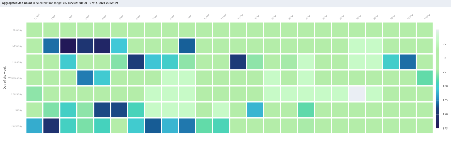
This results in anomalies where the Sum(24 hours in Hour/Day App Count) > Sum(App Counts for dates representing the day). For instance, in the below example:
App Count for Wednesdays (October 10, 17, and 24) = 2492, and
App Count across Hour/Day intervals for Wednesday = 2526.
This is pointed out only to inform you about the existence of such variations.
The tab opens in the Month view filtered on App Count for the past 24 hours.
Go to the Clusters > Workload tab.
From the Cluster drop-down, select a cluster.
Select the period range from the date picker drop-down. You can also provide a custom period range. It is recommended to use a short-range, as the longer the range the more processing time is consumed.
Note
The maximum date range that you can select is 60 days. It can vary in Day, Hour, Hour/Day view based on the cluster load.
From the Cluster Workload drop-down on the upper left corner, select any one option from Jobs, vCore Hours, Memory Hours to change the display metric. The metric you select is used for all subsequent views until changed.
From the View By drop-down, select one of the following options:
Month
Day
Hour
Hour/Day
You can toggle within these View by options. When the date range is greater than one day the Hour, Day, and Hour/Day views allow you to display the data by either as an Average or Sum.

Month view
Displays the monthly view that is run for a specific period range. The color indicates how the day's workload is in comparison with the other days within the selected date range. The day with the least jobs/hours is  , while the days with the highest load are
  . The color legend is provided on the right side of the view for reference. Use Previous and Next in the month's title bar to navigate between months.
Hour, day and hour/day view
These graphs do not link jobs to any specific date at the graph level. For instance, the Hour graph shows that 856 jobs ran at 2 AM (between 2 AM and 3 AM); the Day graph that 2,492 jobs ran on Wednesday, and the Hour/Day that 68 jobs ran at 2 am on a Wednesday. But none of these graphs directly indicate the date these jobs ran on. Only the Month view visually links job counts to a specific date.
Each view opens using the metric selected for the prior view. For instance, if vCores Hour is used to display Month and you switch to Day it is filtered using vCores Hour.
When the DATE RANGE spans multiple days, you have the choice to display the data as either the:
Sum - aggregated sum of job count, vCore, or memory hour during the time range (default view).
Average - Sum / (# of Days in Date Range).
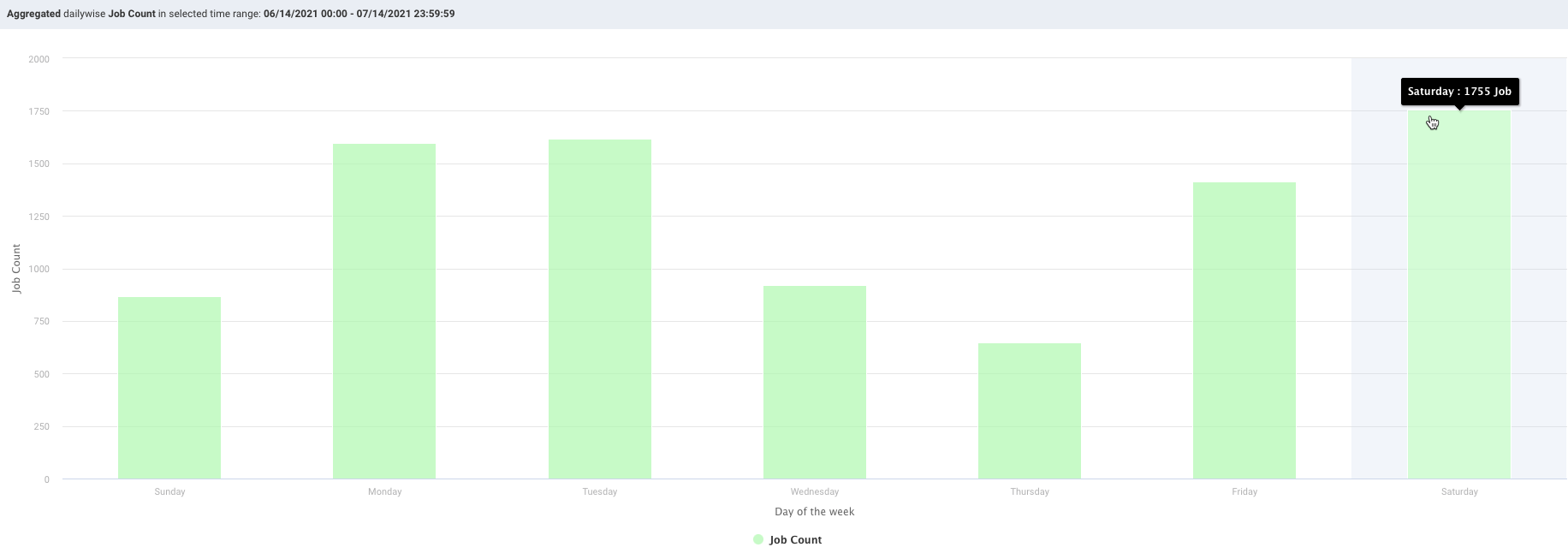
Day view
Displays the jobs run on a specific weekday. Hover over an interval for its details. Click the interval to drill down into it.
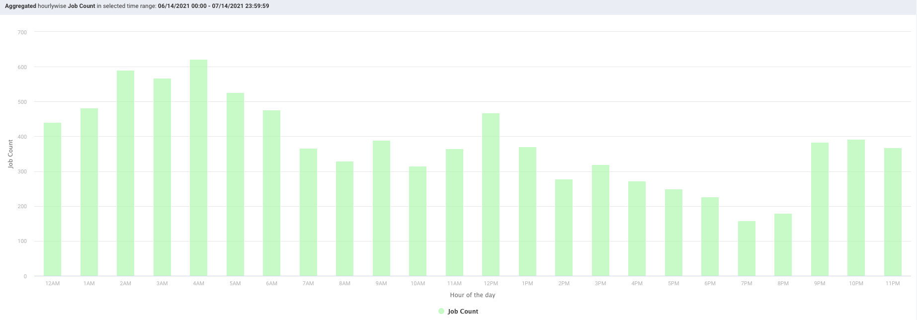
Hour view
Plots the information by hour. The interval label indicates the start, i.e., 2 AM is 2 AM - 3 AM. Hover over an interval for its details. Click the interval to drill down into it.
Hour/Day view
This view shows the intersection of Hour and Day graphs. The Hour graph showed 856 jobs ran between at 2 AM - 3 AM while the Day graph (immediately above) that 2,492 jobs ran on Wednesday. Below we see that 68 of Wednesday's jobs (2.7%) were running between 2 AM - 3 AM.
Drilling down in a workload view
In the View By charts, click on a date, day, or hour. The Jobs list for that specific date, day, or hour is displayed. The table provides the following details:

Job Type: The type of job that was run on the selected date, day, or hour.
Job Count: The number of jobs that were run on the selected date, day, or hour.
Group By: Click the link to view the details of the jobs based on any one of the following group by options:
User
Queue
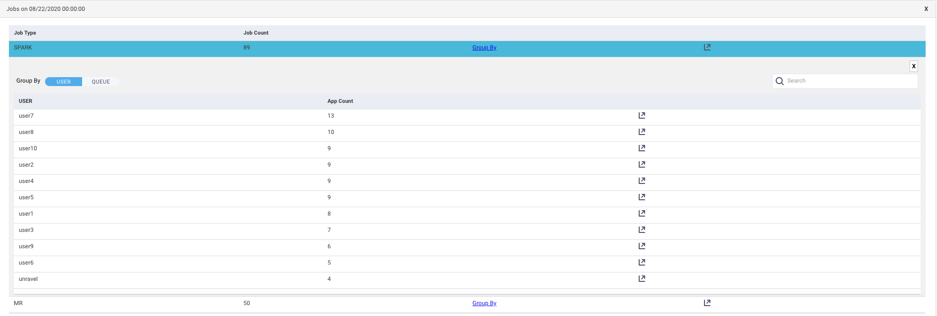
Get Jobs
 : Click this icon to view the list of Jobs based on the application types. Refer Jobs > Applications. Click this icon in the Group by list corresponding to a user or a queue, the list of jobs run is shown based on the application type and specifically sorted for the selected user or queue.
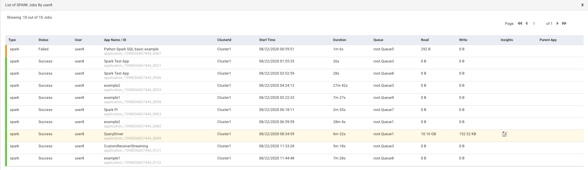
Queue Analysis
From this tab, you can generate a report of active queues for a specified cluster. The report analyzes queue activity by jobs and vCores, memory. As with all reports, it can be generated instantly or can be scheduled. The tab opens displaying the last successfully generated report if any. Reports are archived and can be accessed via the Reports Archive tab.
Configuring the Queue Analysis report
To enable and configure the Queue Analysis report, You must set the Queue Analysis report properties as follows:
Stop Unravel
<Unravel installation directory>/unravel/manager stop
Set the Queue Analysis report properties as follows:
<Installation directory>/manager config properties set
<KEY><VALUES>##For example: <Unravel installation directory>/manager config properties set com.unraveldata.report.queue.http.retries 2 <Unravel installation directory>/manager config properties set com.unraveldata.report.queue.http.timeout.msec 15000Refer to Queue Analysis properties for the complete list of properties.
Apply the changes.
<Unravel installation directory>/unravel/manager config apply
Start Unravel
<Unravel installation directory>/unravel/manager start
Generating Queue Analysis report
Click the
button to generate a new report. The parameters are:Date Range: Select a period from the date picker.
Cluster: In a multi-cluster setup, you can select the cluster from where you want to generate the report.
Click Run to generate the report.
The progress of the report generation is shown on the top of the page and you are notified about the successful creation of the report.
All reports (successful or failed attempts) are in the Reports Archive.
Scheduling Queue Analysis report
Click Schedule to generate the report regularly and provide the following details:
Date Range: Select a period from the date picker.
Cluster: In a multi-cluster setup, you can select the cluster from where you want to generate the report.
Schedule Name: Name of the schedule.
Schedule to Run: Select any of the following schedule option from drop-down and set the time from the hours and minutes drop-down:
Daily
(Sun, Mon, Tue, Wed, Thu, Fri, Sat)
Every two weeks
Every month
Notification: Provide either a single or multiple email IDs to receive the notification of the reports generated.
Click Schedule.
Queue Analysis report
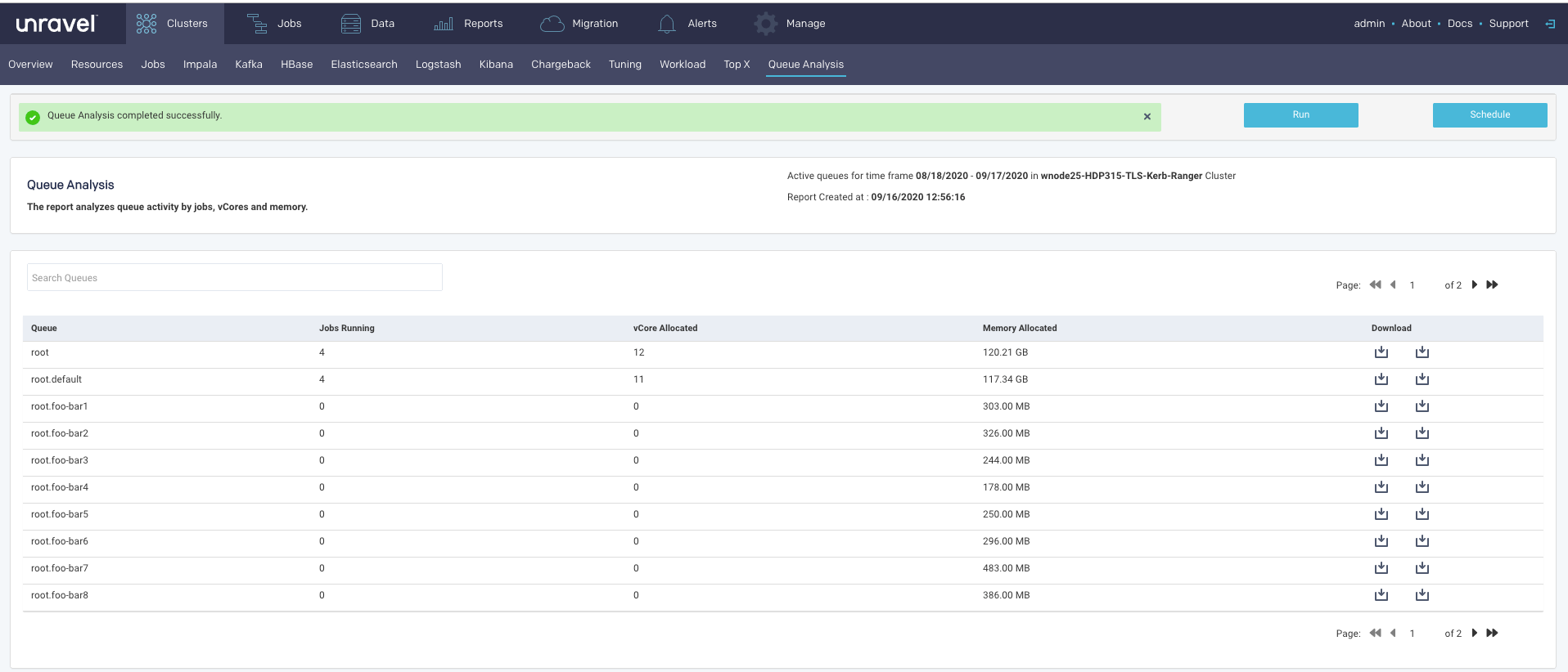
The active queues along with the following details are listed:
Column | Description |
|---|---|
Queue | Name of the queue. |
Jobs running | Number of jobs running in the queue. These are average values. |
vCore Allocated | Number of vCores allocated for the queue. These are average values. |
Memory Allocated | Memory allocated for the queue. These are average values. |
Click  to download the complete report of the selected queue in a CSV or JSON format.
Drilling down in a Queue Analysis report
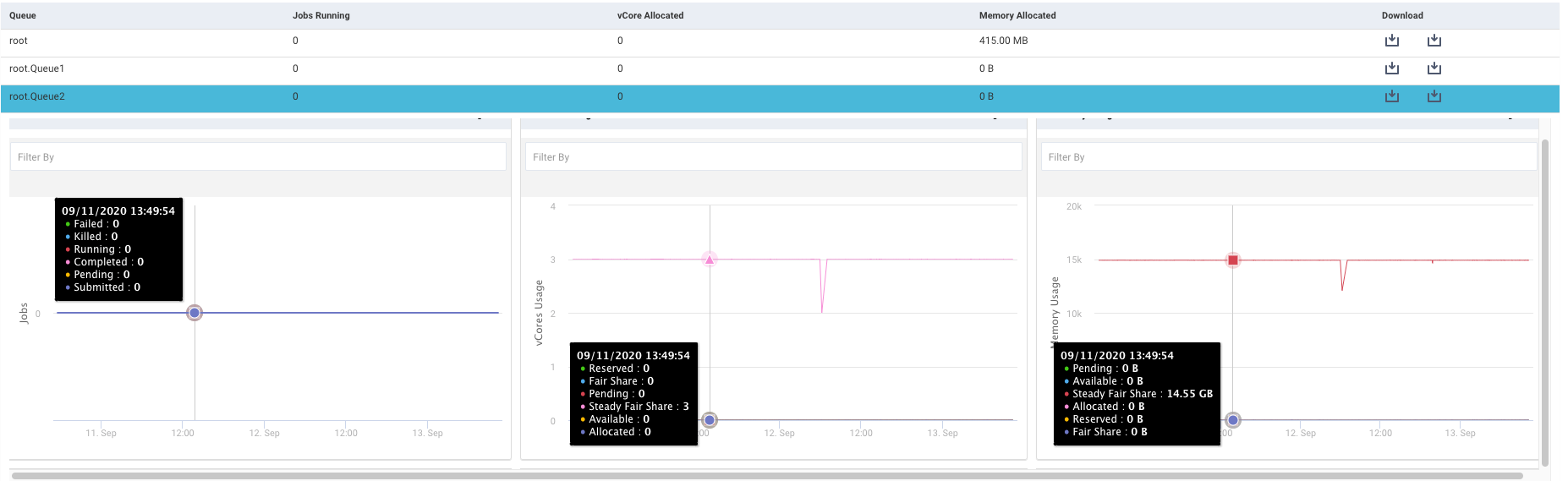
Click a row in the active queue list, the details of the running jobs, vCores usage, and memory usage are displayed in the following graphs:
Click to expand a graph. Each of the graphs can be filtered further.
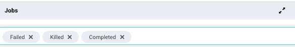
Jobs: This graph plots the number of jobs running along with their status, in the specified period. The status is shown in color-coded lines. The status can be any of the following which can be used to filter and change the trends shown in the graph.
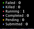
vCore: This graph plots the usage of the allocated vCore along with the following metrics, for the selected queue, in the specified period. The metrics can be used to further filter the graph:
Reserved
Fair Share
Pending
Steady Fair Share
Available
Allocated
Memory Usage: This graph plots the memory usage along with the following metrics, for the selected queue, in the specified period. The metrics can be used to further filter the graph:
Reserved
Fair Share
Pending
Steady Fair Share
Available
Allocated
Click any point in the graph, the Resources page corresponding to the point of time clicked in the graph, for that queue is displayed.