Migration planning
 |
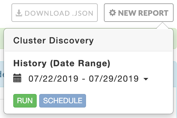
Cluster discovery
Report generation takes approximately 25 seconds when analyzing 90 days of data.
The dashboard provides overall information about your cluster and has six tiles.
On-Prem Cluster Identity contains the cluster configuration details and host information.
Overall cluster usage graphs of
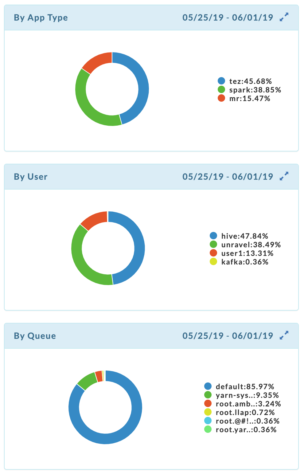
Applications submitted By App Type, By user, and By queue.
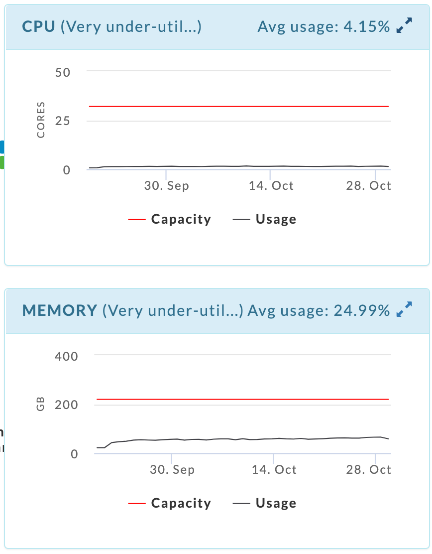
CPU
Memory
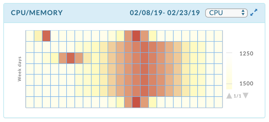
A CPU/Memory heat-map that aggregates usage by weekday, and then hour within the day.
Click New Report to generate the report. Select a History (Date Range). Before the initial report generation, the default is a seven day history. Click Run; Running replaces Run and a countdown is displayed until Unravel starts collecting the data. A dark green bar banner is briefly displayed noting the report has started. New Report pulsates blue until the report is completed.
 |
If the report has been generated New Report remains blue, a light green bar notes the success, and the page is populated with the new data. If the report generation was unsuccessful, a red bar containing an error message is displayed. The New Report button becomes orange and remains so until a report is successfully generated. The tab continues to show the last successfully generated report. All successful reports are archived. Click Download JSON to download the report.
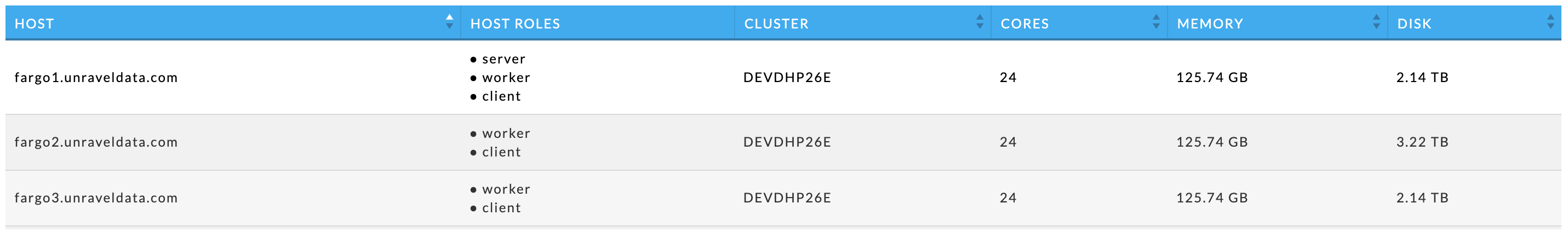
This tile contains information about your cluster, including the hosts. The Host Summary section shows the cluster's capacity across all hosts.
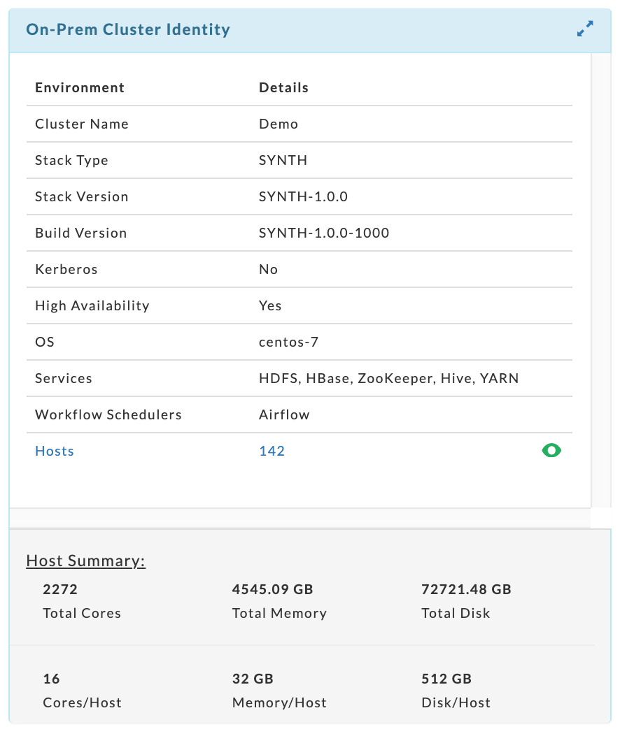 |
To see each host's hardware specifications and the host's roles click  . The table can be searched on hostname. The potential roles are:
Server: Has at least one server component, such as Zookeeper Server, HDFS.
Worker: Has at least one daemon component such as HDFS DataNode, YARN NodeManager, or HBase RegionServer.
Client: Has at least one client component, such as Zookeeper Client, Hadoop Client, Hive Client, etc.
The donut graphs display the top 10 for each category. This example has three app types, four users, and six queues over the period analyzed.
 |
The first two graphs display the cluster's CPU and memory utilization over the time period. The average usage is listed on the right-hand side of the title bar. Hover over the parenthetical text next to the resource's name to see Unravel's analysis of your cluster's usage for that resource. Here, the CPU and Memory are both "Very under-utilized and over-provisioned".
 |
The heat-map is a map of the CPU/Memory usage and capacity by a weekday and hour, e.g., Monday between 5 and 6 a.m. Each time slot is color coded to show how relatively hot the time slot is relative to the rest of the map. You can quickly see the load distribution across your cluster.age. You can filter the heatmap by CPU or memory. It opens displaying CPU. The CPU graph above noted the CPU is under-utilized and the heatmap graphically supports that analysis.
 |
Workload Fit
Report generation takes approximately 50 seconds for a slice that has approximately one million apps. The number of apps is dependent on both the slice's parameters and the selected time period.
This analyzes your cluster workload based upon your selected criteria. It enables you to map your workload (or a portion of it) onto a cloud service/product and see the costs associated with migrating the slice.
First, examine your cluster by
App Count
Memory Hours
CPU Hours
Then you select a slice by
Users
App Types
Queues
Tags
For instance, you can evaluate your workload grouped by App Count and generate the migration costs on a slice selected by Application Type, Users, Queues, or Tags.
Step 0: Select the time period for the report.
We recommend you have and use at least seven days of metrics to generate a meaningful report.
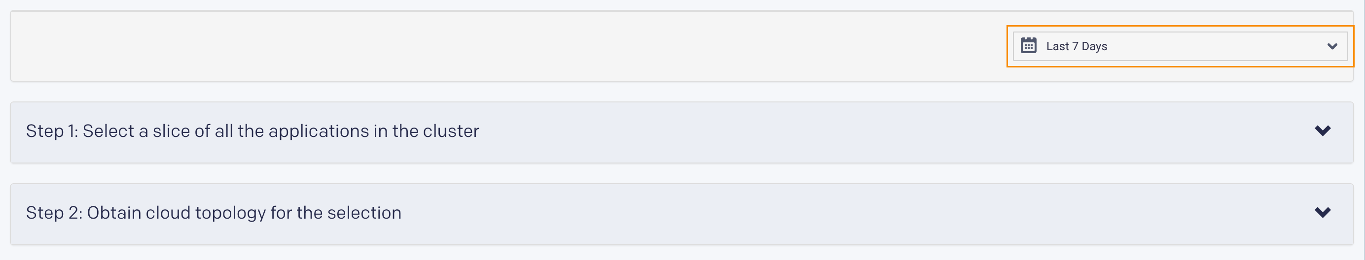
Step 1: Select a slice of the clusters' applications.
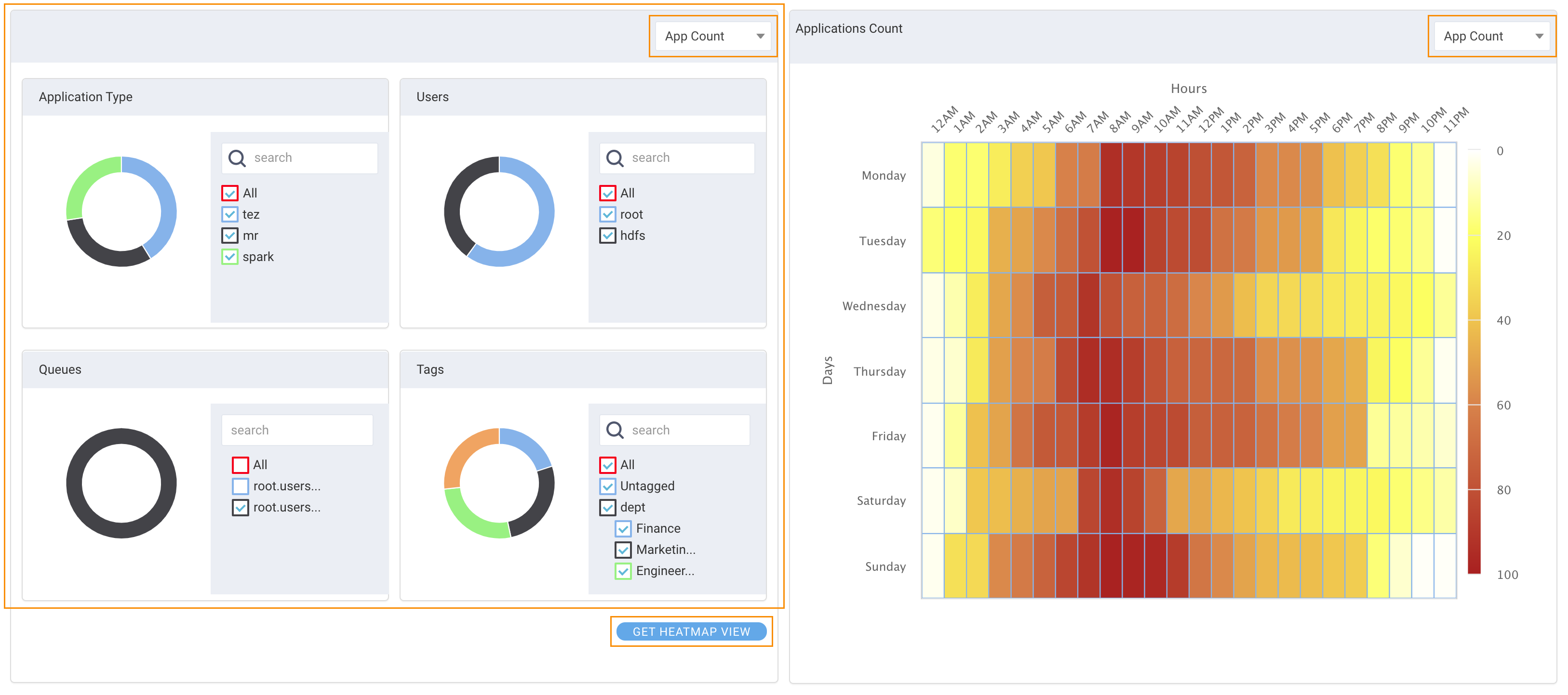
Select the metric to use when analyzing your clusters' overall usage: App Count, Memory Hours, or CPU Hours.
Select the criteria to use for analyzing the migration costs. You can select all or a subset of Application Type, User, Queue, or Tags. All available options for each type are listed.
Note
It is these selections that determine the slice of your cluster that is analyzed.
In this example are three Application Types, two Users, two Queues , and multiple Tags. The donut chart displays the relationship between the available values, for instance, the Application Types, Tez, Spark, and MR.
Hover over a chart section to see the name and absolute number for that section. For instance, under Application Type there are 21 Tez jobs, 16 MR jobs, and 14 Spark jobs.
Tags
Tip
Tags are comprised of a (tag key:tag value); a tag key can have multiple values. The following images display the tag key
Projectwhich has fivevalues.If you are unfamiliar with tagging see What is tagging.
The Tags chart behaves differently than the other charts. Hovering over a donut slice notes the number of apps that have a specific tag key regardless of whether you have deselected a specific tag value. Hovering over the
Projectsection shows there are 24 apps tagged with aProject:value. Note the valueAdvertisingis deselected. If allProject:valuesare deselectedProjectis not included in the donut.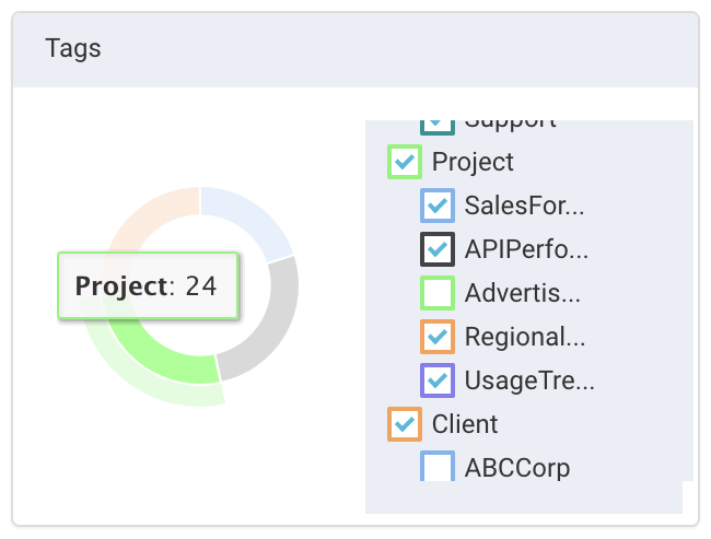
Click on the
Projectsection to bring up the distribution of the tag values.Advertisingis deselected yet it is shown in the donut. Click Back to Tags to return to the tag key view.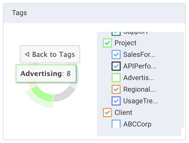
Important
Regardless of how the tags are displayed the migration cost analysis only uses the selected values.
Example workload slices
All Tez applications.
Select Tez under Application Type.
Select All for User, Queues, or Tags.
All Spark applications on the
root.users.root queuefor all tag values forProject.Select Spark for Application Type.
Select the
root.users.root queuefor Queues.Deselect all tag keys except
Projectunder Tags.Select All for Users.
Heatmap
Click Get Heatmap View to view the heatmap for your slice. You can view the heatmap grouped by App Count, Memory, or vCores. The heatmap typically changes based upon your selection. The current view is noted in the title bar. In the above example the heatmap is grouped by App Count. The heatmap is not automatically updated when you change your slice. Click it again to update the map.
Note
The heatmap is irrelevant for the migration cost analysis.
Step 2: Obtain cloud topology for the selection
You first must select your VM preferences for the cost analysis. Click Edit. (See Set VM Parameters below.) Click Run to generate the report. A green bar appears below Run if the report was completed successfully.
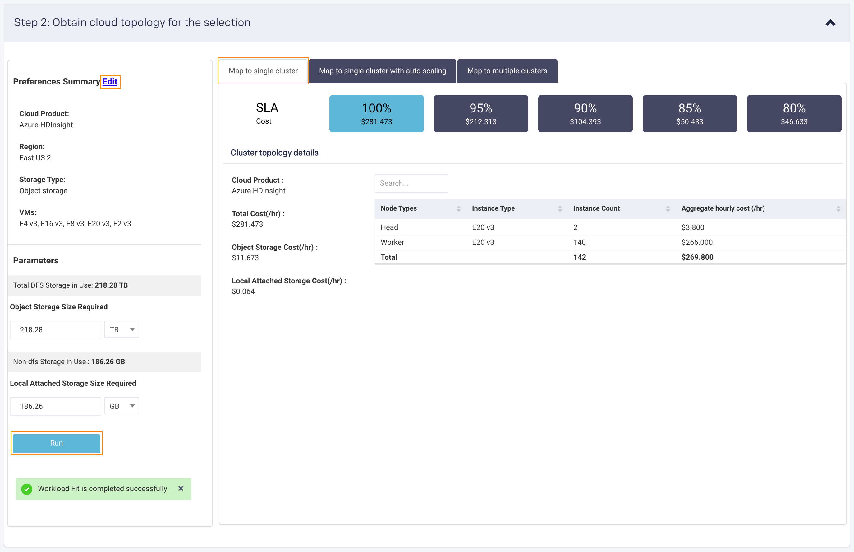
In the report window the left tile lists your VM settings. The Storage Type is always Object Storage. At least two and at most three tabs/reports are generated; Map to Multiple Clusters is not necessarily created.
Map to Single Cluster: Maps your workload slice the best cluster from your selected VMs. In the example above two clusters were selected, and Unravel determined the E2 V3 type was the best fit.
The top row, lists the SLA Cost based upon percentage of jobs which would meet the SLA, from 80% to 100%. The cost to meet your SLA 80% of the time is 16% of the cost to meet your SLA 100% of the time.
Cluster topology details lists the Total Cost (/hr) of the VM and Storage Costs. The table has a row for each of your Node Type and the number of VM instances used for the mapping them plus the associated cost.
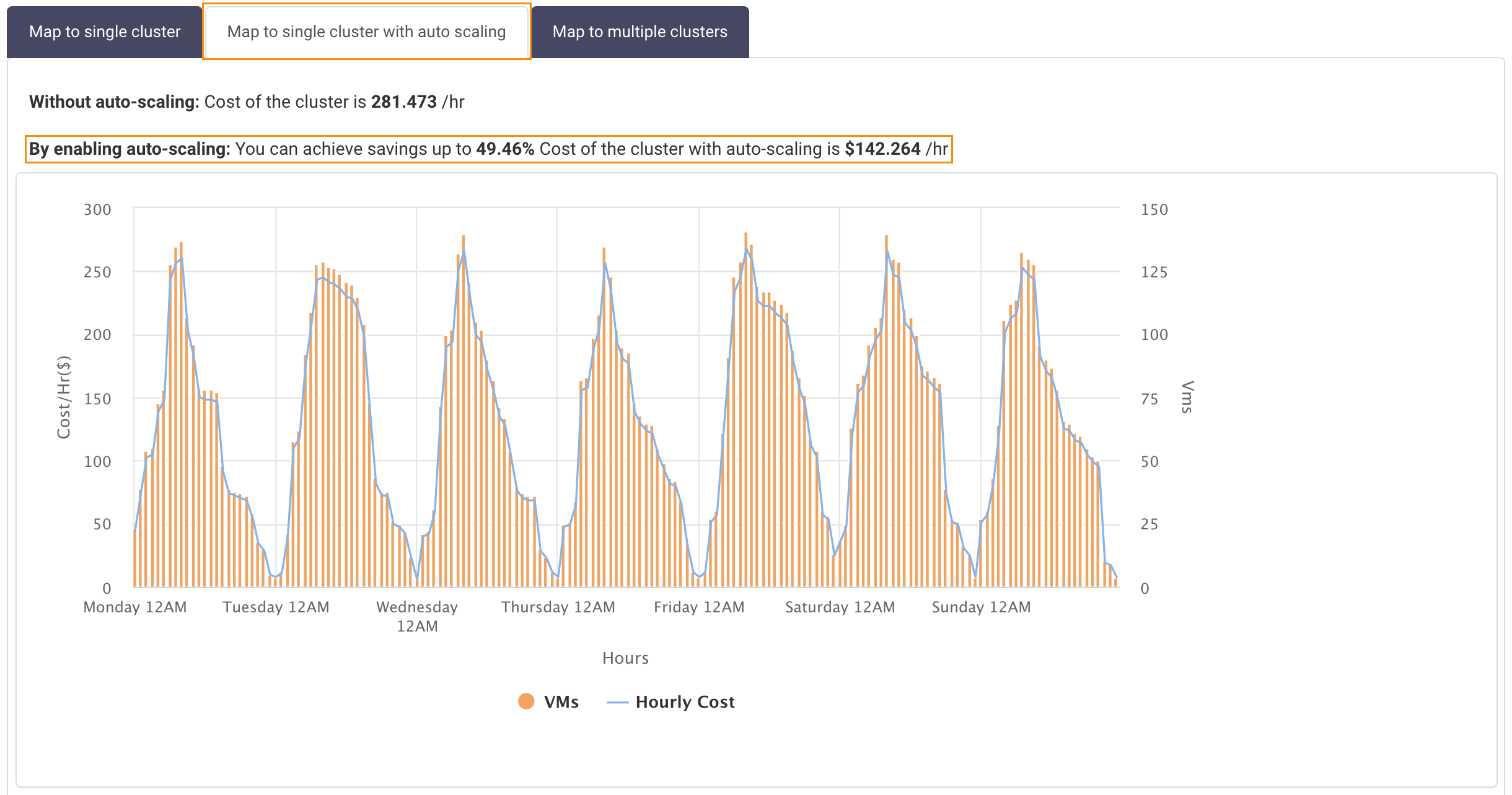
Map to Single Cluster with Auto Scaling: Compares the cost of migration if you use auto-scaling with a single cluster. The same VM user in Map to Single Cluster is used for the analysis. The chart graphs the number of VMs and their cost by weekday and hour.
In this example, you save 49.46% using auto-scaling.
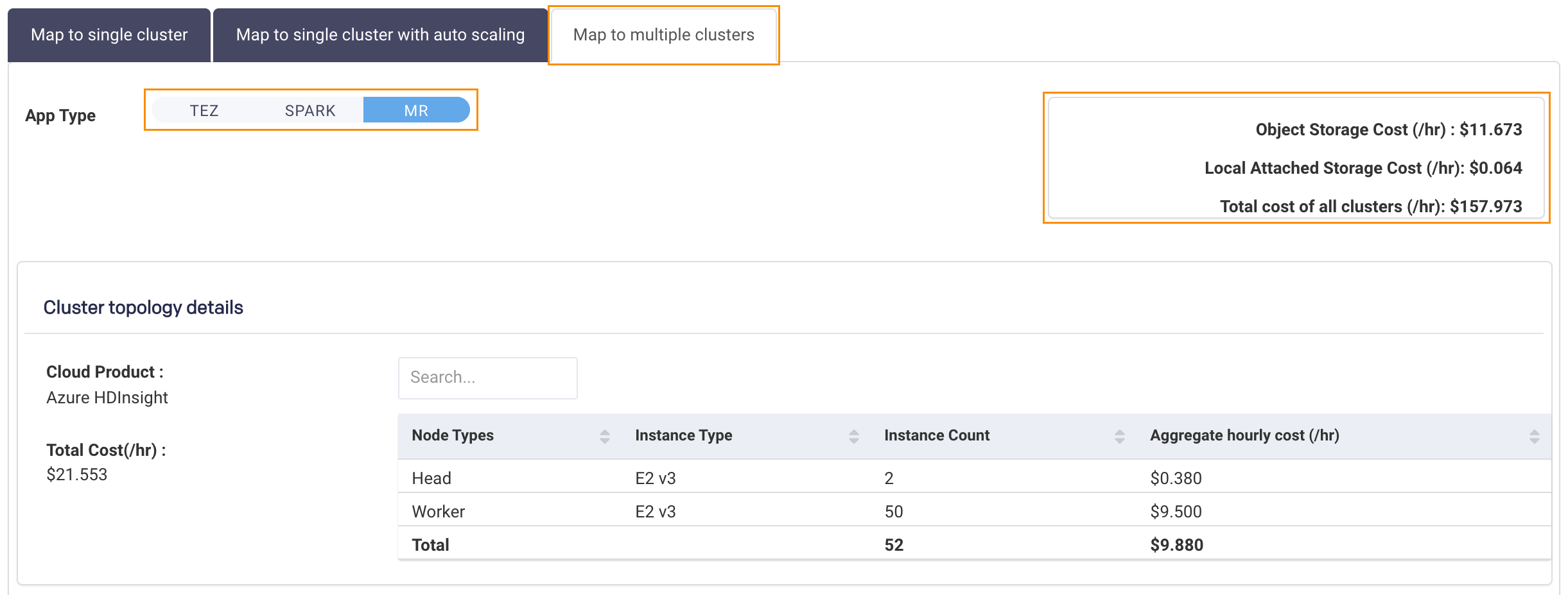
Map to Multiple Clusters: Unravel maps your clusters to multiple VMs. If you have selected multiple App Types there is a Cluster Topology Details section for each type. Click the App Type to see the type's details. The aggregated VM and storage types for all apps are listed above the table on the right side.
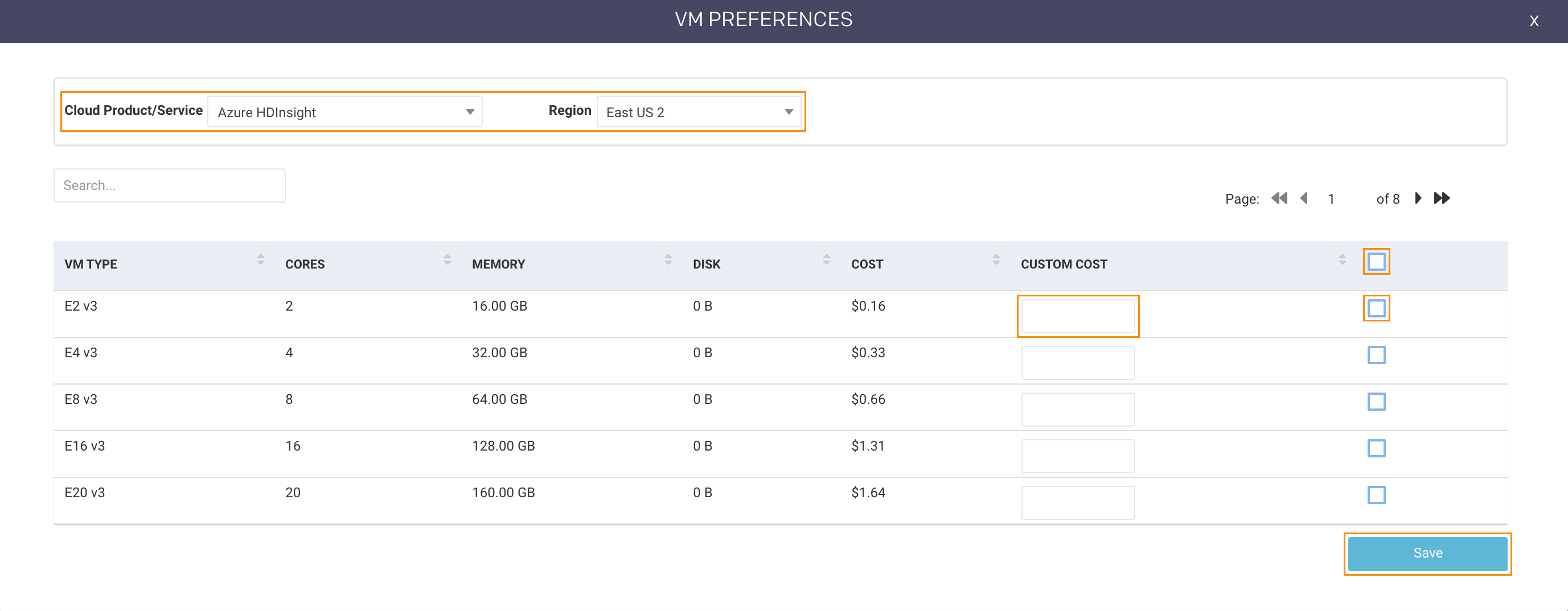
If you have already run a report, the modal opens populated for the last report. Click the X in the title bar to quit the modal without saving your changes.
Use the pulldown menus to
Select the Cloud Product/Service. Unravel supports the following products/services.
Google Compute Engine (IaaS)
Google DataProc
Amazon EC2 (IaaS)
Amazon EMR
AWS Databricks (Data Analytics)
Azure Databricks (Data Analytics) (Standard Tier)
Azure (IaaS)
Azure HDInsight
Select the Region. The available regions are based on the Cloud Product/Service selected.
The VM Type list is generated based on the options selected in step 1. To select all VMs check the box in the table header. To select a subset, check the box in the VM type row. You can search to find a particular VM. If you have a custom cost for a specific VM enter it in the Custom Cost box.
Click Save to save and close the modal. Click Run to generate the report.
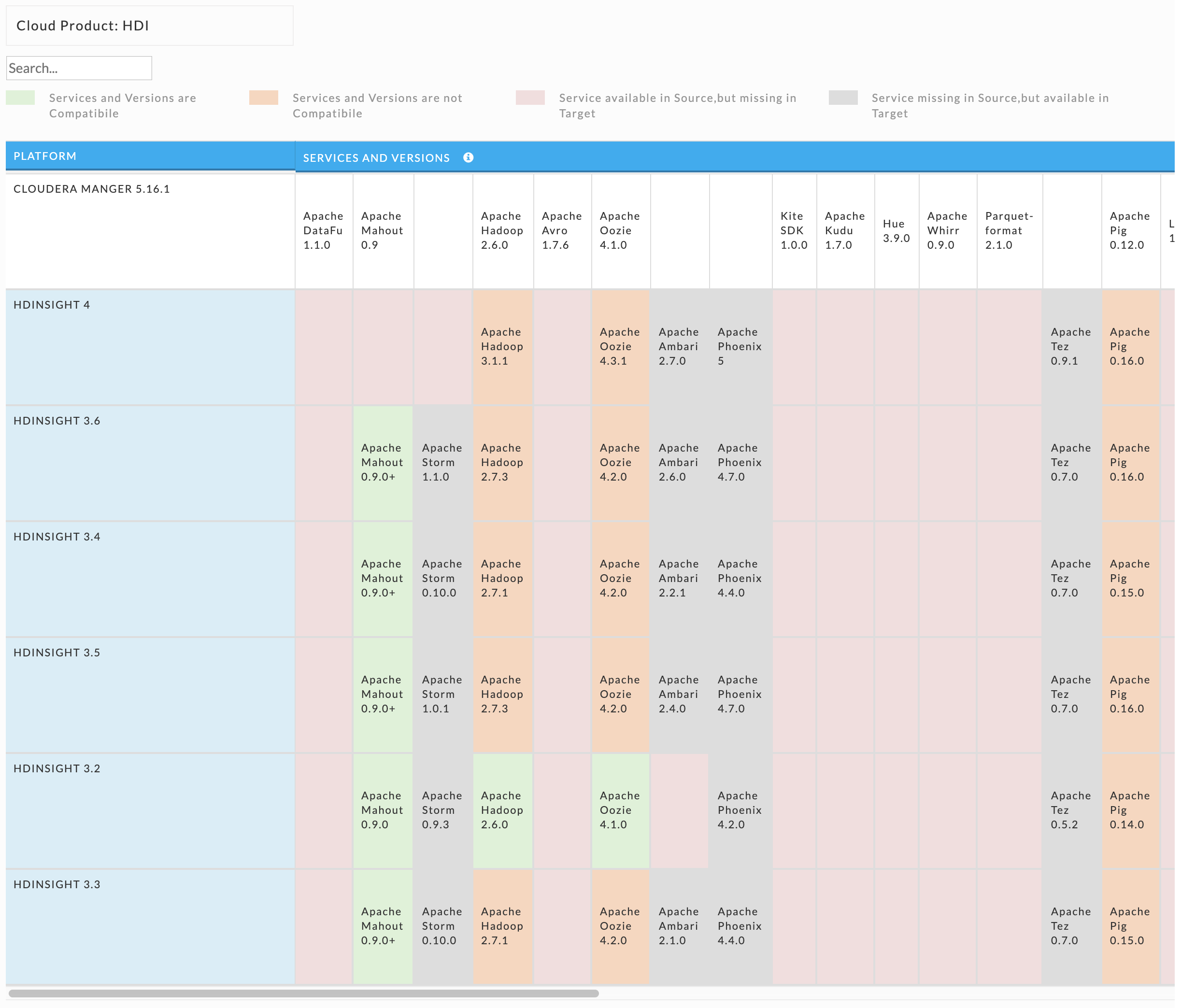
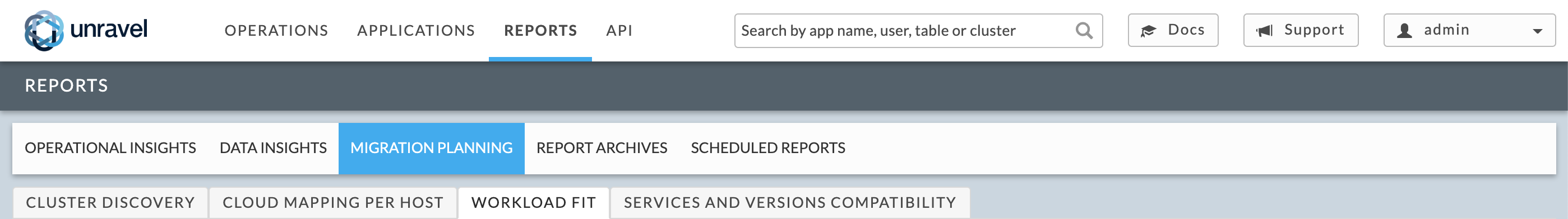
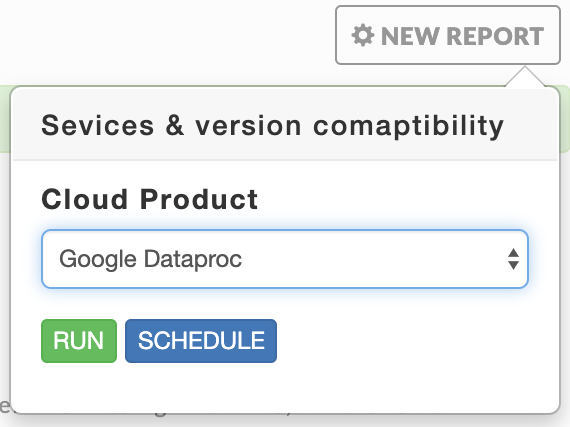
Services and versions compatibility
Report generation takes approximately 20 seconds. This report is only available in 4.5.3.0 and later.
The report is a matrix mapping on-prem platforms to the service which are available and compatible on a cloud provider. To generate a report select New Report. Select the Cloud Product (Google DataProc, Amazon EMR, Azure HDInsight) you want to use for the report for.
 |
The matrix maps :
Services and Versions are Compatible: The service is on your cluster, the cloud product and are compatible. (
 )
)Services and Versions are not Compatible: The service is on your cluster and the cloud product, but they aren't compatible. (
 )
)Service available in Source, but missing in Target: The service is on your cluster but not on the cloud product. (
 )
)Service missing in Source, but available in Target: The service is missing in your cluster but available on the cloud product. (
 )
)