Databricks cost anomaly detection app
This app detects and notifies you about cost anomalies, which are abnormal rise or fall in the cost. These anomalies are showcased in trend graphs, from where you can view more insights into the cost anomaly, such as the cost breakdown based on user, workspace, or tag.
You can set the app to view the trends on a daily basis or on a weekly basis. You can also set the notification channels to receive alerts when a cost anomaly is detected.
Installing and opening Databricks cost anomaly detection app
After installing, you can open the Databricks cost anomaly detection app and add the following settings:
Adding notification channels to receive alerts of cost anomaly detection
Set Azure container configurations, in case you have Azure environment.
Choose whether to suppress negative anomalies and specify tolerance values to suppress negative anomalies. Negative anomalies indicate points where the cost is abnormally low.
On the Unravel UI, from the upper-right corner, click
 . The App Store page is displayed.
 Click the Dbx Cost Anomaly image to open the app and then click the Setting tab.
In the Trend intervals section, select either the Daily or Weekly option. Accordingly, the trend graphs will display the data on a daily or weekly basis.
Click Save. You can view the corresponding changed settings from the Analysis tab.
Daily and Weekly time series
On the Unravel UI, from the upper-right corner, click
. The App Store page is displayed. Click the Dbx Cost Anomaly image to open the app and then click the Setting tab.
In the Notifications settings section, select the channels where you want to send alerts when a cost anomaly is detected. The notifications that were created earlier are available for selection.
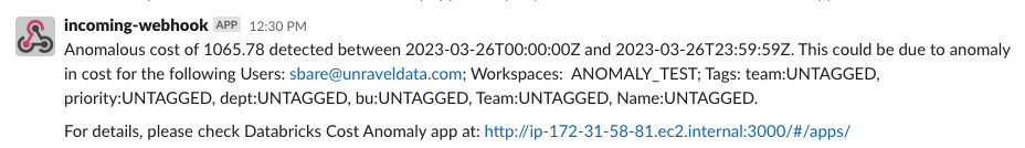
Click Save. Alerts are sent to the specified notification channels whenever a cost anomaly is detected. Following is a notification of the cost anomaly detection sent to a slack channel.
On the Unravel UI, from the upper-right corner, click
. The App Store page is displayed. Click the Dbx Cost Anomaly image to open the app and then click the Setting tab.
In the Microsoft Azure container configurations section, specify the following configurations:
Azure Subscription Type: Choose either Pay As You Go Account or Enterprise Agreement Account.
Azure Account: Specify the Azure Accounts that must be considered for cost anomaly detection.
Azure Container Blob Path: Specify the path to Azure Blob storage to fetch the latest CSV files for processing.
Click Save.
Negative anomalies indicate points where the cost is abnormally low. By default, the option to suppress negative anomalies is selected. You can specify the tolerance level for suppressing the negative cost anomalies.
On the Unravel UI, from the upper-right corner, click
. The App Store page is displayed. Click the Dbx Cost Anomaly image to open the app, and then click the Setting tab.
In the Anomaly settings section, do the following:
Check the Suppress negative anomalies option if it is not checked already.
Use the Tolerance slider to adjust the tolerance level to suppress negative anomalies. This can be a value between 0 to 1.
0.95 is the recommended value.
Click Save.
On the Unravel UI, from the upper-right corner, click
. The App Store page is displayed. Click the Dbx Cost Anomaly image to open the app, and then click the Job Cluster Analysis tab.
From the Date Range calendars, select a period. Click on any two dates to select the range.
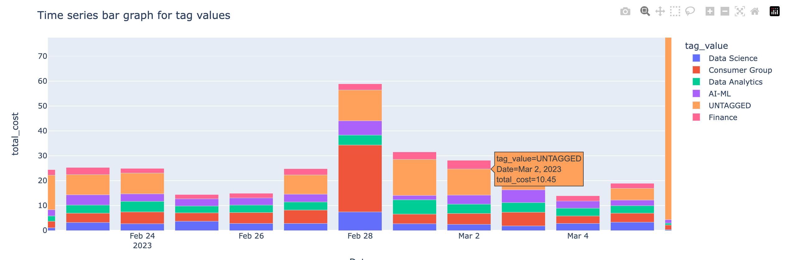
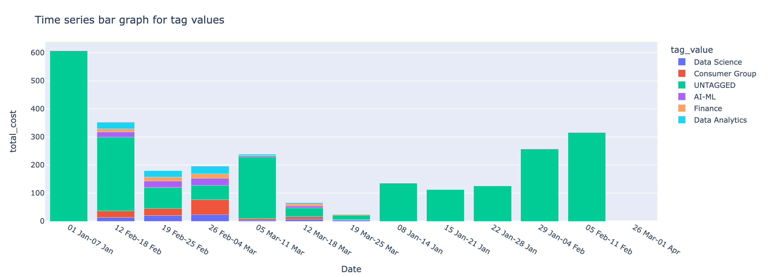
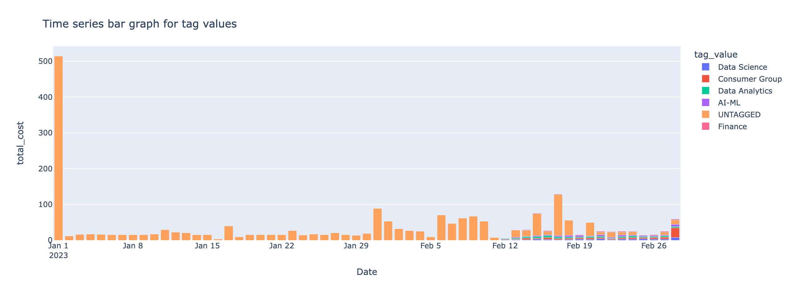
From the Group by tag, select a tag to view the breakdown in the time series charts.
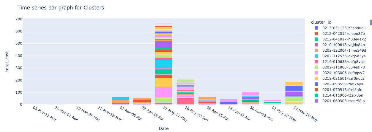
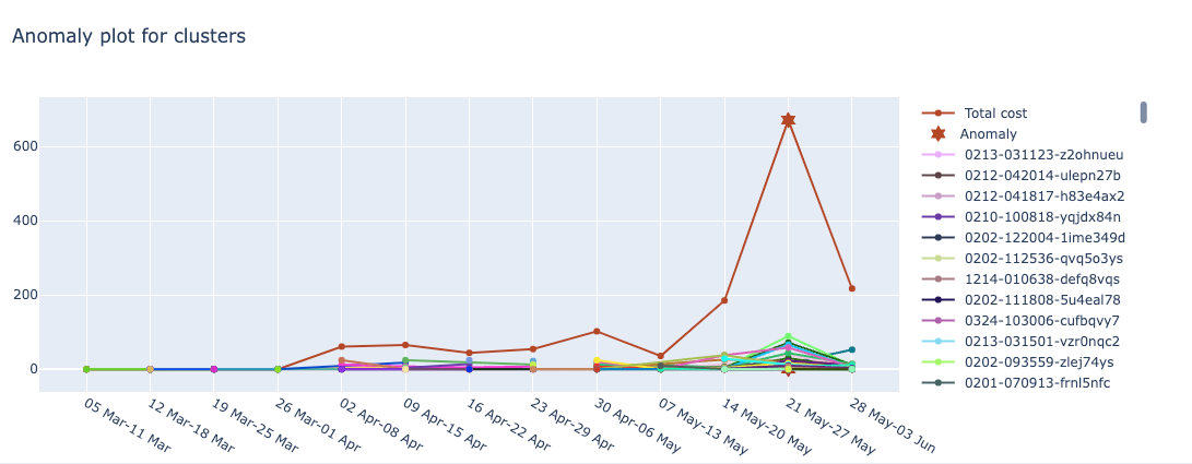
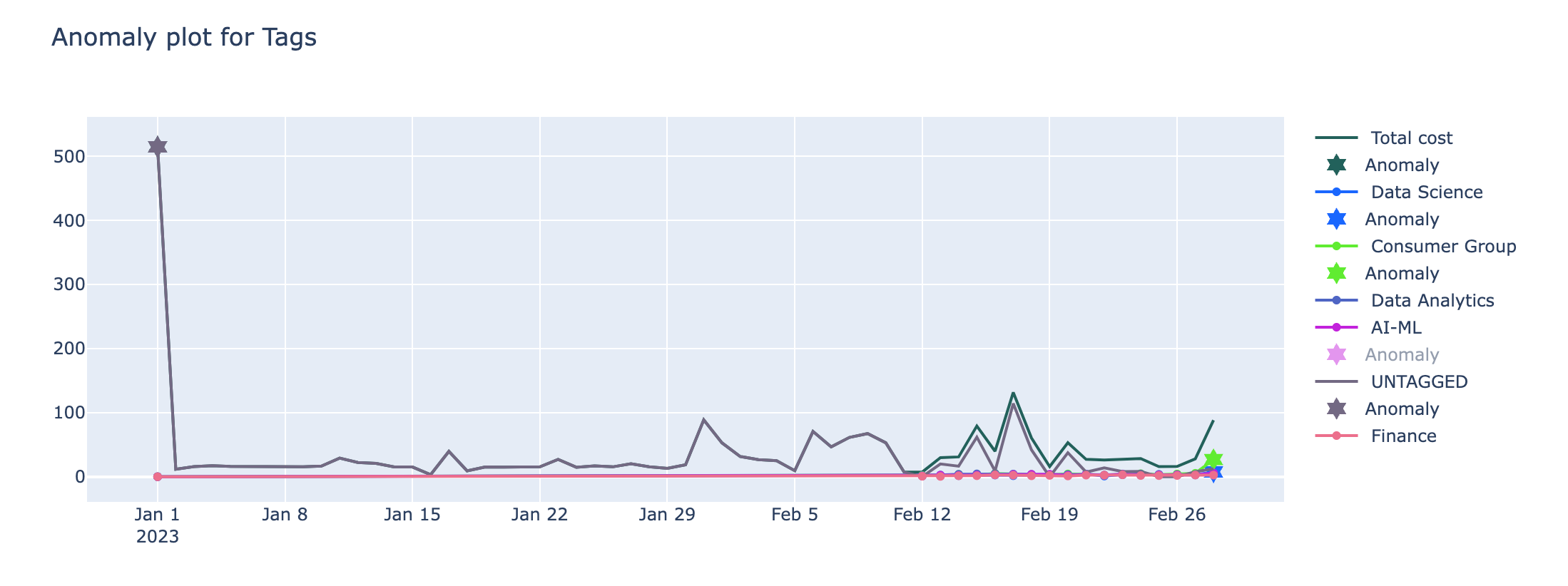
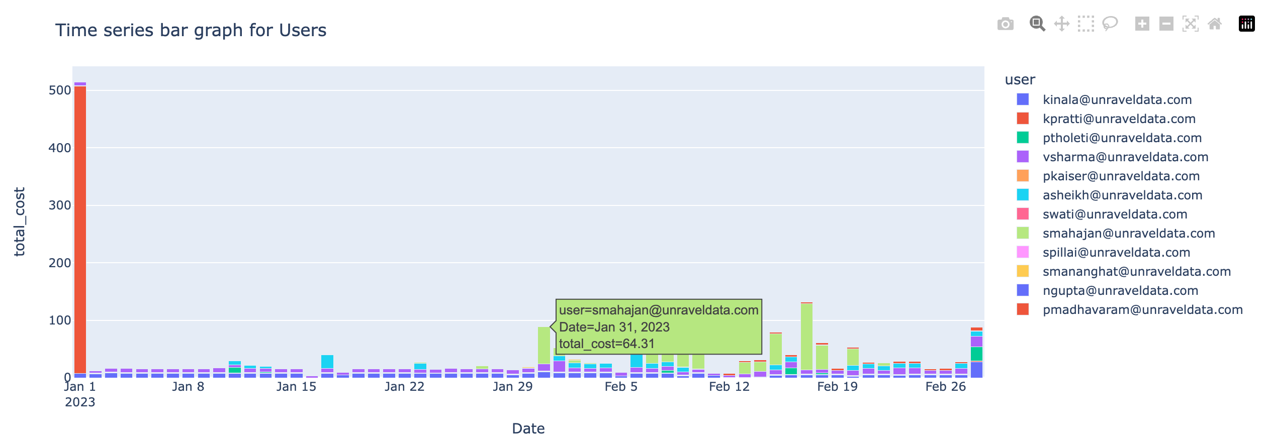
Click Submit. The following cost and anomaly charts are shown along with the Anomaly insight.
anomaly
Anomaly insight

Tags
Time series graphs with the cost incurred by the selected tag values and the anomaly detected for the selected tags
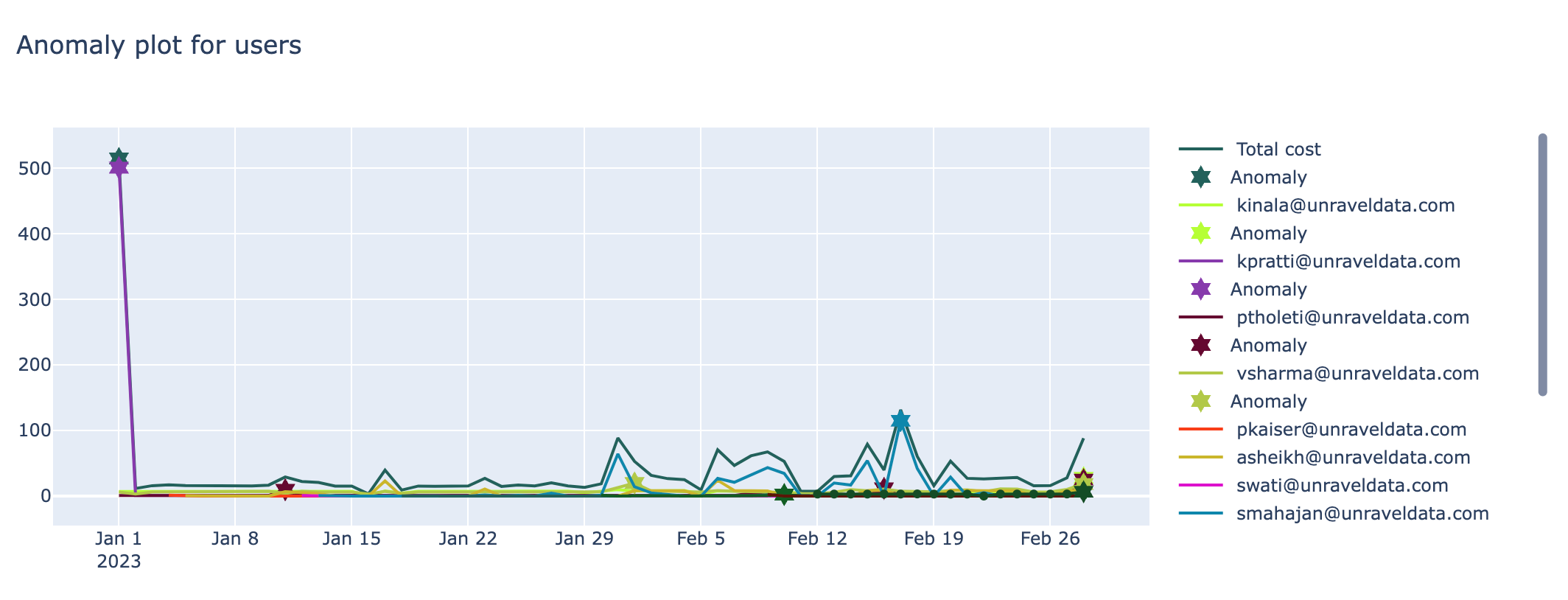
User
Time series graphs with the cost incurred by the users and the anomaly detected for the users
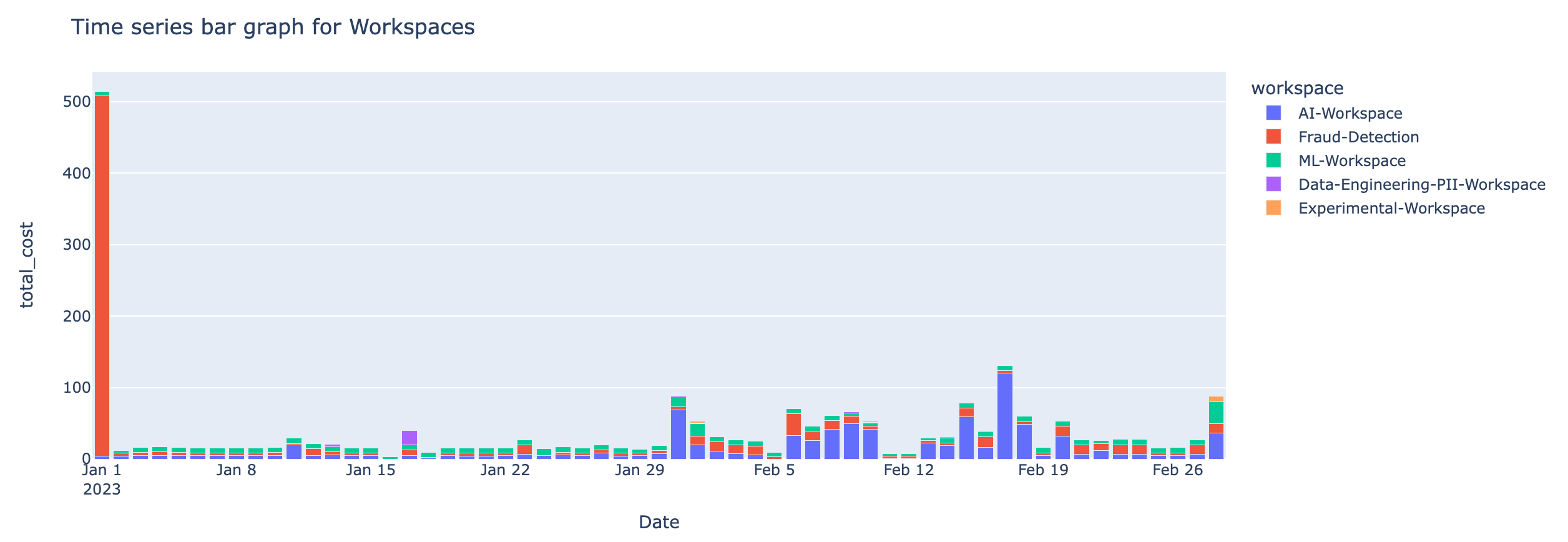
Workspaces
Time series graphs with the cost incurred by the workspaces and the anomaly detected for the workspaces
On the Unravel UI, from the upper-right corner, click
. The App Store page is displayed. Click the Dbx Cost Anomaly image to open the app, and then click the All-purpose Cluster tab.
From the Date Range calendars, select a period. Click on any two dates to select the range.
Click Submit. The following cost and anomaly charts are shown along with the Anomaly insight for interactive clusters.
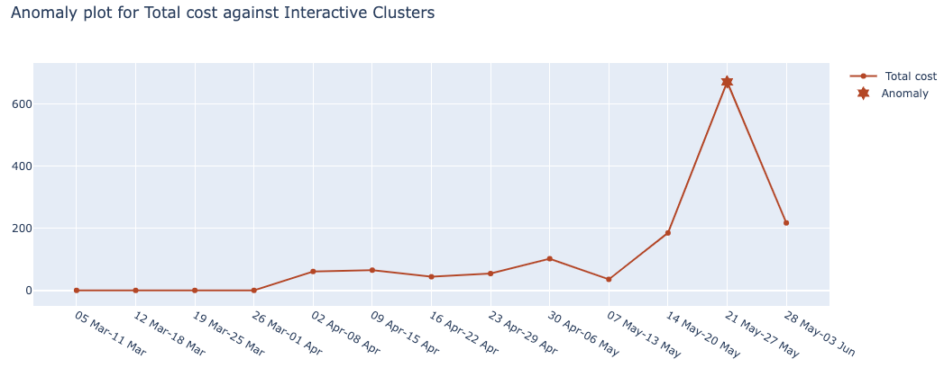
Anomaly insight
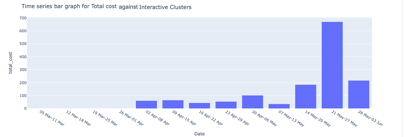
Interactive clusters total cost
Time series graphs with the cost incurred by the interactive clusters and the anomaly detected for the interactive clusters
From the Select Interactive Cluster list, select an interactive cluster, and the charts plotting the cost and anomalies for the selected interactive cluster are displayed.
Interactive cluster-specific cost
Time series graphs with the cost incurred for interactive clusters and the anomaly detected for the job clusters.