MapReduce APM
The MapReduce APM provides and easy way to understand the breakdown of the app. You can use this view to:
Drill down into MapReduce jobs that make up the app, and
Resolve inefficiencies, bottlenecks and reasons for failure within apps.
It contains similar sections to the Hive APM and additionally shows the timeline view of MapReduce job execution, logs and configuration.
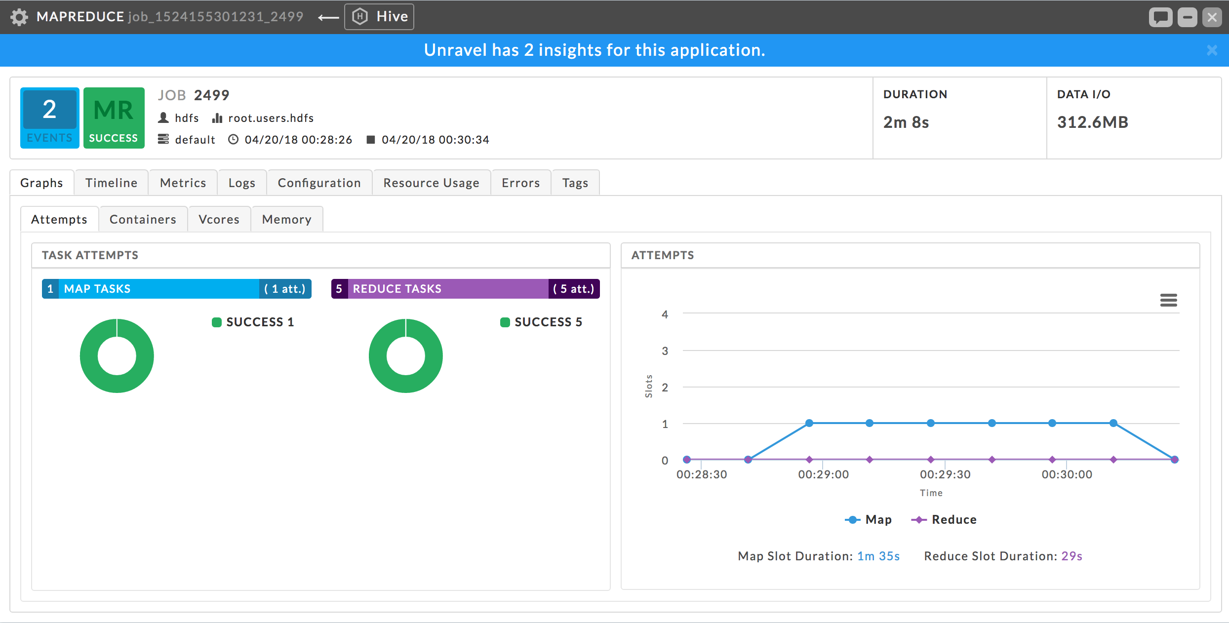 |
Key performance indicators
Events: The number, if any, of Unravel insights for this query. See Event Panel & Insights for more information.
Duration: Total time taken by the app to complete execution.
Data I/O: Total data read and written by the app.
Tabs
By default, the MapReduce APM opens in the Graphs > Attempts view.
Graphs: This tab is only displayed when there is available data. If a graph has less than four data points, it is converted to a bar graph. The graphs use wall clock time as opposed to computer usage time.
Unravel gather this data from the Resource Manager which it polls every 90 seconds while the app is running. If the app has a runtime less than 90 seconds there is likely no data.
It has four subtabs:
Attempts: Number of task attempts are charted in "wall-clock" time. The aggregated time of all tasks running in the Map/Reduce slot duration is listed under the graph.
Containers, vCores, and Memory: Graphs utilization of slot containers, vCores, and memory over time.
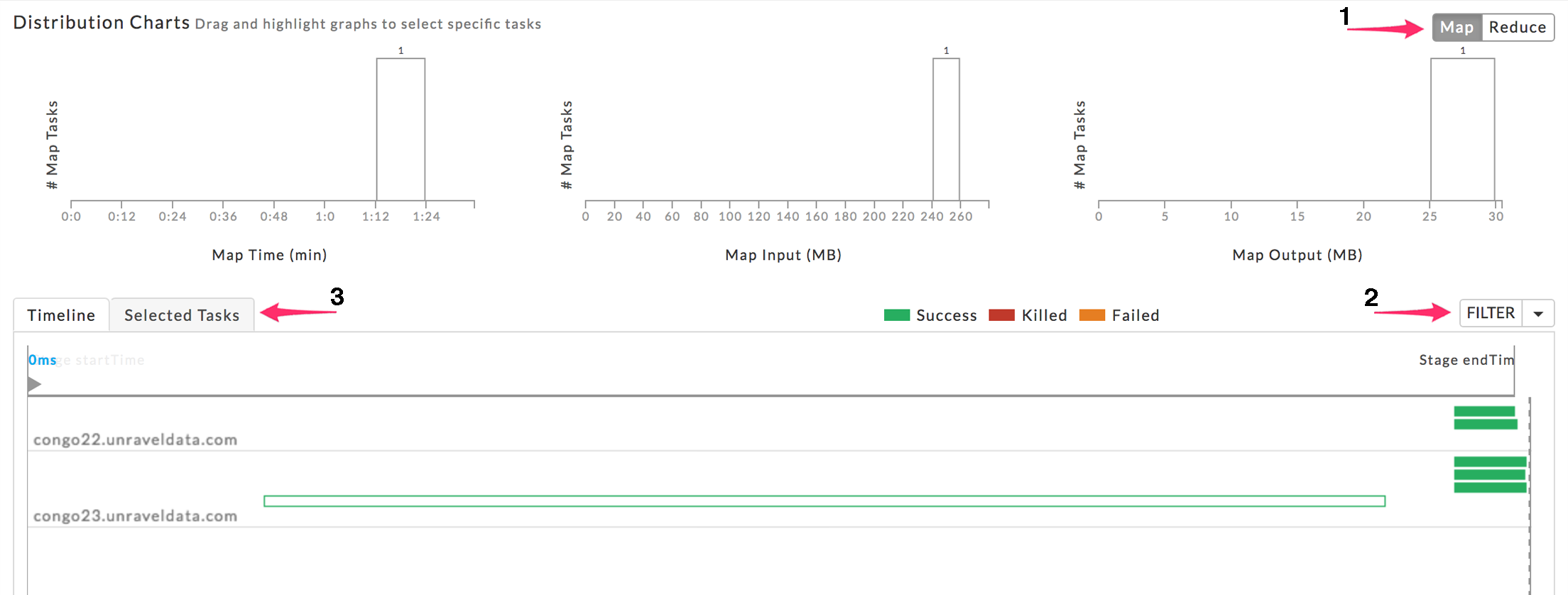
Timeline: Displays the details of each MapReduce job by showing the execution of each task on the machine it was executed on.
The Timeline tab is divided into two sections:
A Distribution chart (which displays either the Map or Reduce tasks)
A bottom table which lists either the tasks by stages on servers or the list of tasks and their associated KPIs.
The default displays the Map jobs and the timeline. You can change the Distribution Charts by selecting Map or Reduce (1). Whether to display the Timeline or Selected tasks (3). When displaying the timeline you can filter the display by Map, Reduce, Killed/Failed or All jobs (2). You can choose what timeline/tasks to display by dragging and highlighting a section of the distribution chart.
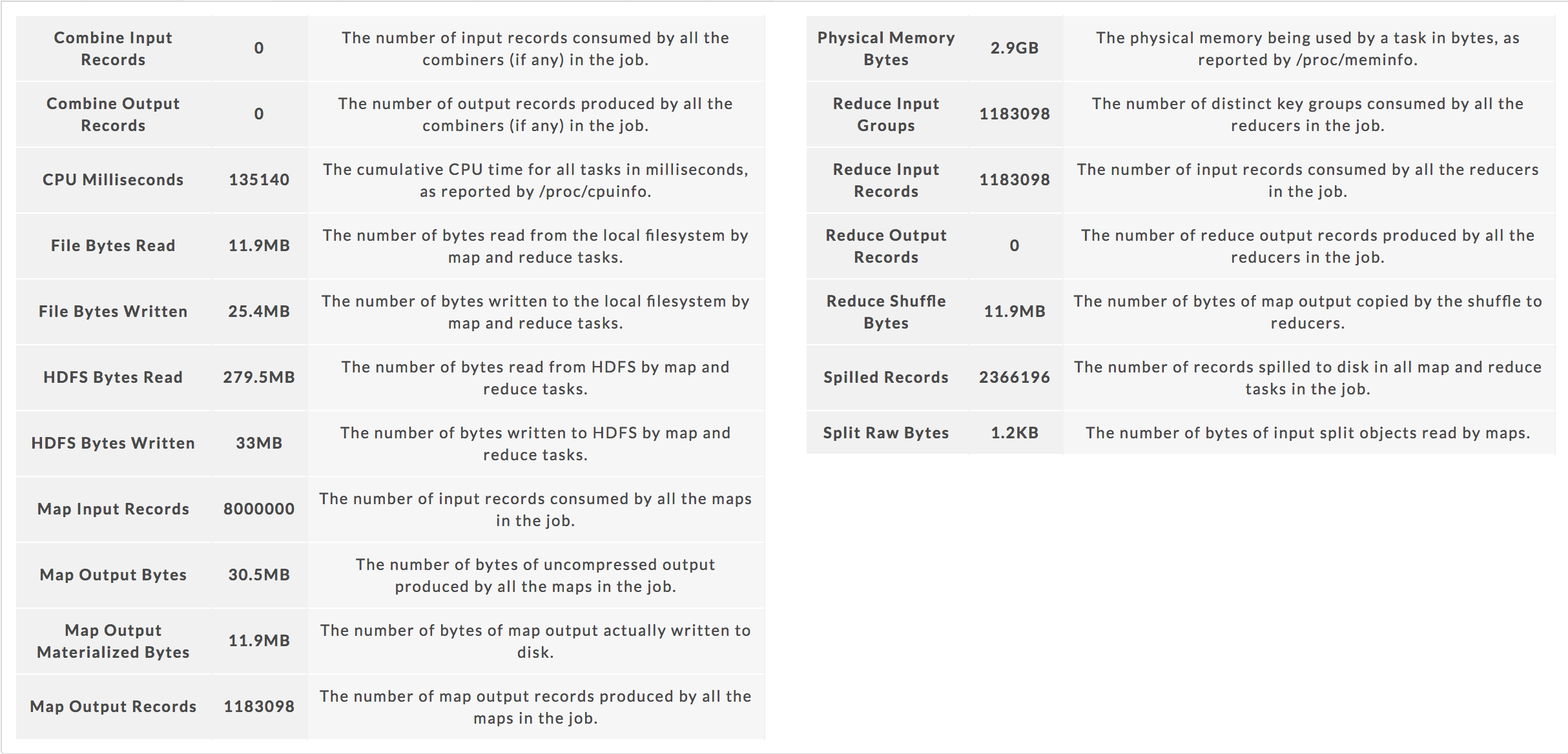
Metrics: The metrics, their definitions, and values.
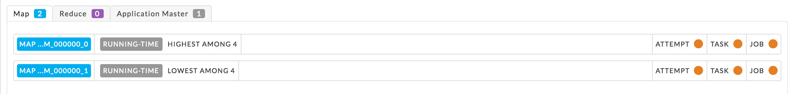
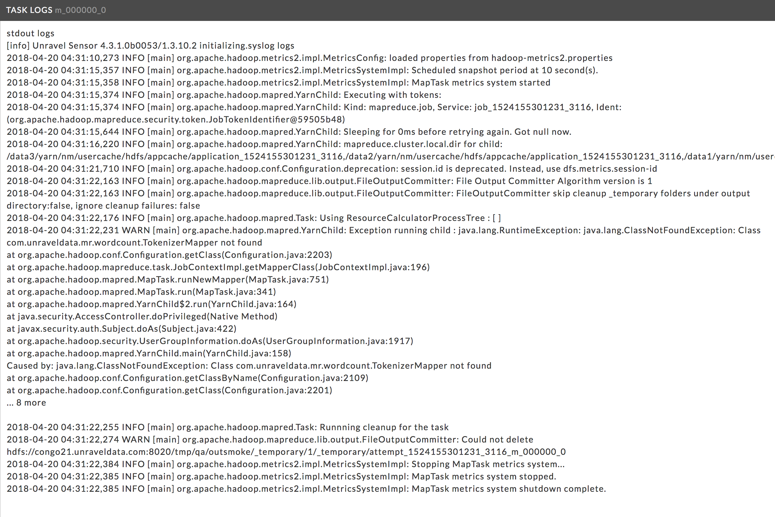
Logs: Lists the available logs by Map, Reduce and Application Master. Click the tab to see the listing for that type (Map, Reduce, or Application Master). Click an item to see the log.
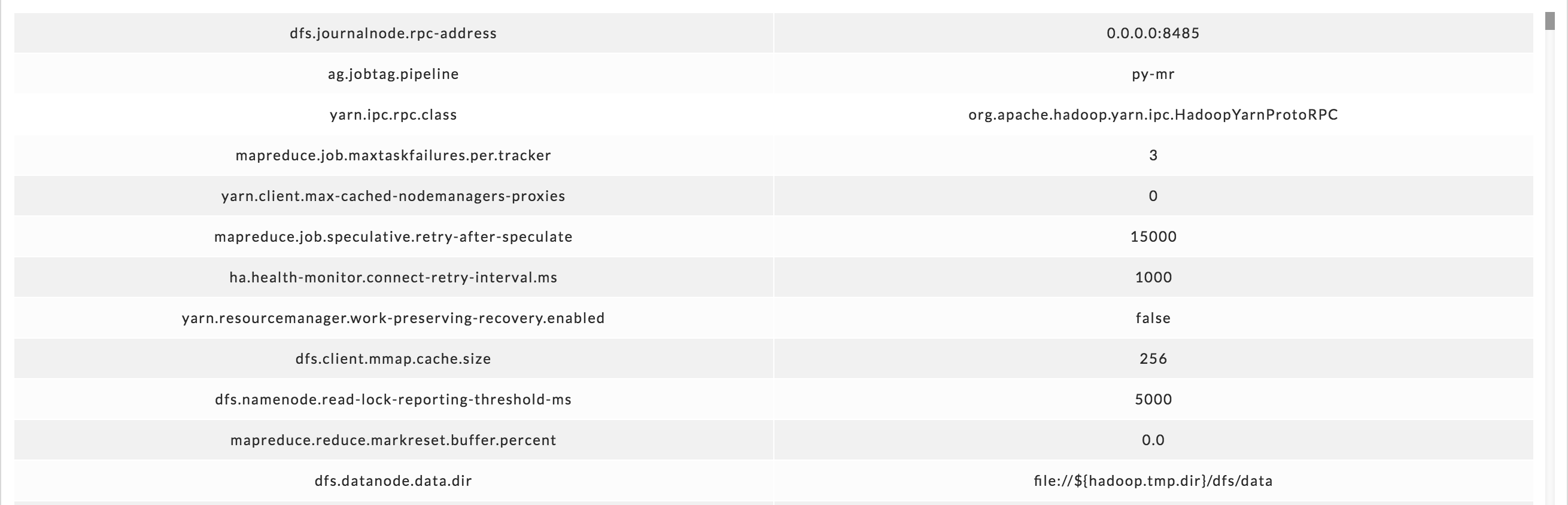
Configuration: The defined parameters and their values.
Resource Usage:
 Graphs the resources the app consumed. Unravel gathers this data from the Resource Manager which is polled every 90 seconds while the app is running. If the app's runtime is less than 90 seconds, there is likely to be no data collected.
Initially, all the executors are displayed using the Metric systemCpuLoad. You can choose a different metric to display from the Metric pull down menu. Hover over an executor to bring up the © option and click it to display just the information for that executor. To graph all executors, hover above the list for the Show All option and click it to display all.
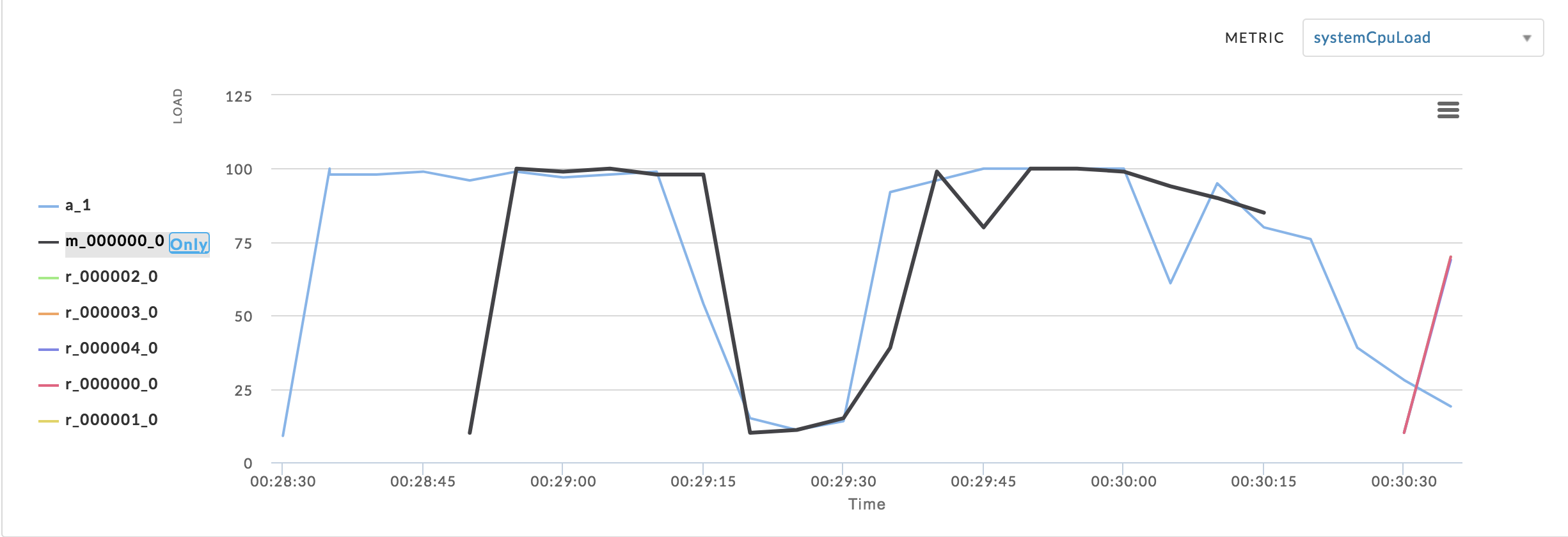
When no resource data is available the tab displays “No metrics found. Metrics are displayed after Unravel has processed the app completely and Unravel's application sensors are enabled.”
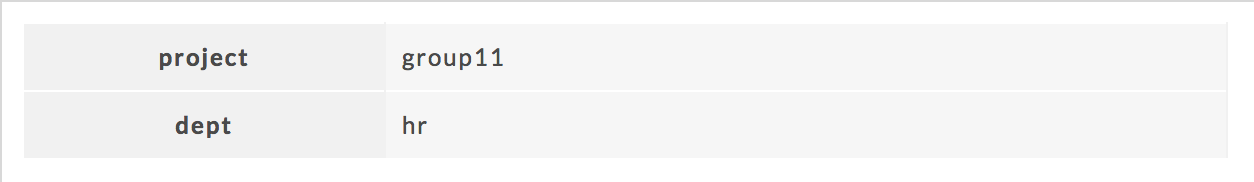
Tags: The defined tag keys and values for the app. This example has two tag keys, project and dept , with each having one value, group11 and hr , respectively.