Common UI features
Every page has the Unravel title bar. The pages available to you are listed on the left. The page you are viewing is underlined and listed in the black bar. To the right there is a search box, Docs Button, possibly a support button, and a pull-down menu.
If you are an end user restricted by Role Based Access Control, you can only view a subset of the UI's pages and the pull-down menu only has About and Logout options.

If you are an unrestricted end user or an admin, all the pages are available with possible read/write restrictions. The pull-down menu has Manage, About and Logout available.

If you can configure the date range, time period, or cluster these options will be available in the title bar. You set them using the pull-down menus on the banner.

When there are multiple tabs, click the tab to display its contents.
When detailed or further information is available
 is in the upper right-hand corner; click it for further information.
Click
 to expand a section to full tile width; click
  to close it.
Click an app name/id/workflow to bring up information on the app, fragment etc., for example, the Spark Application Manager, table information, etc.
When applicable, the Notifications column (
 ) notes if Unravel has tuning suggestions (
 ), an AutoAction alert (
 ) or both (
 ).
).When relevant there is an AutoActions/Events column (
 ). The number of AutoActions/events (0-n) triggered is noted.
If an app has a parent a link to it is in the GoTo column (
 ), its title bar, or a more info glyph (
 ). Click it to display the app's parent APM.
Click the block glyph (
 ) to open or close the row details. When open its details are shown in a tile below. Green indicates the block is currently being displayed; gray indicates it's closed.
Graphs
Hovering over a line in a graph causes the information to be displayed in a text box (
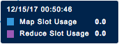 ).
)."Applications running at mm/dd/yy hh:mm:ss" is displayed below the graph with a list of relevant apps, if any, displayed. Clicking within the graph displays the relevant, if any, apps for that point in time.
Clicking
 expands the chart to the full width of your browser. Click on the close window on the right side of the title bar to return to the previous view.
When the graph can be displayed based upon Group By, Tags, Metric, etc., there is a pull-down (
 ) in the upper right-hand corner.
Click
 to print or download the information in the graph in various forms, i.e., JPG, PNG, CSV.
When you can zoom in/out of a diagram/execution graph there are magnifiers (
 ,
,  ) in the upper right-hand corner. Click
  to return to the initial view.