Operations page
The Operations page provides a synopsis of your cluster(s) and its activities. It displays the following tabs:
Dashboard
Usage Details
By default, the Operations > Dashboard tab is displayed.
Dashboard
The Dashboard provides an overview of the cluster activities with links to drill down into the following:
Job runs
Resource usage
Application inefficiencies
Events/alerts
By default, it is configured to display all clusters hourly for the past 24 hours.
Click the  button to refresh the data.
To view the Dashboard, click Operations > Dashboard.
The following tiles in the Dashboard page provides insightful information about the jobs, applications, and resources running in your clusters:
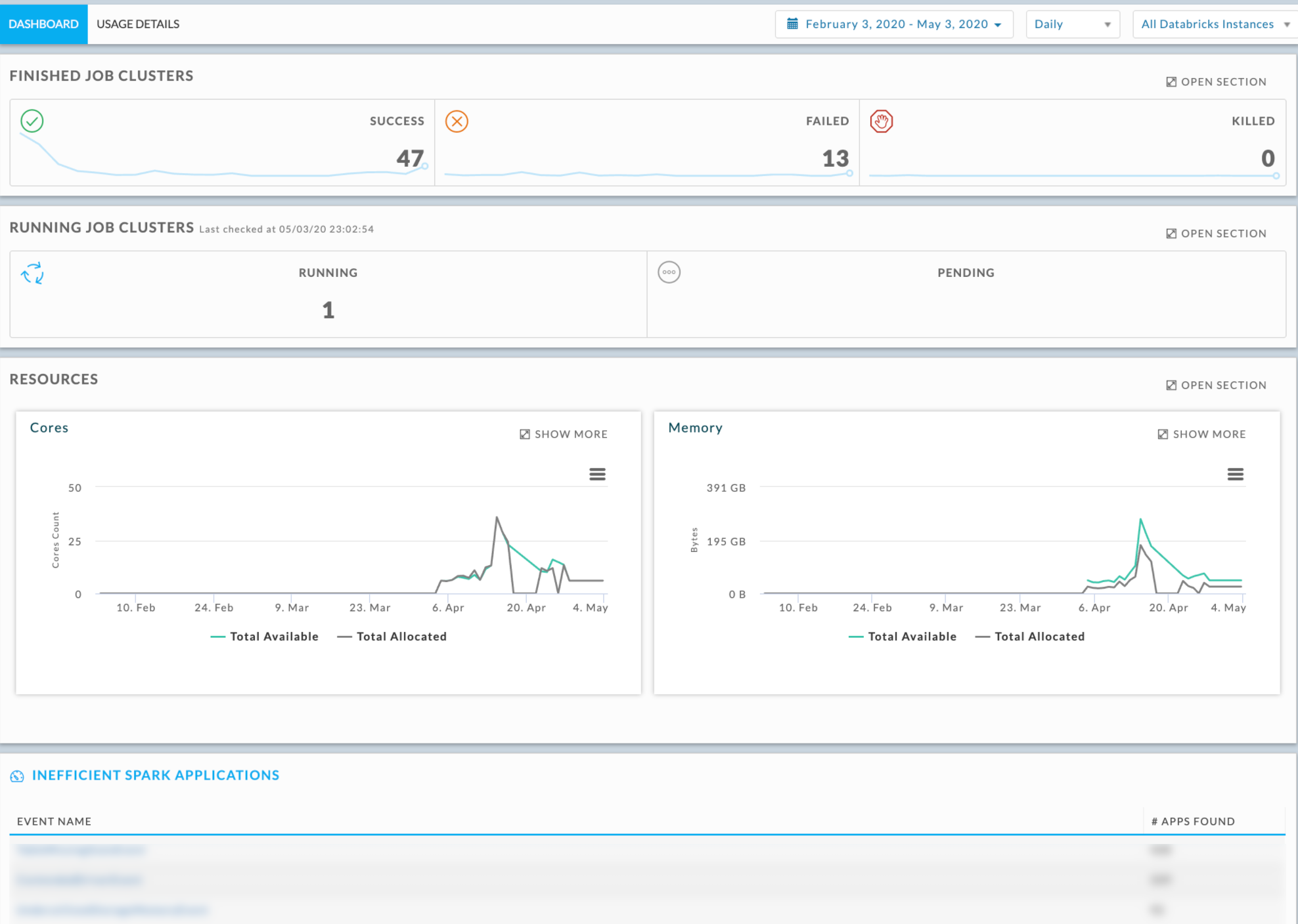
Finished job clusters
Running job clusters
Resources
Inefficient Spark applications
Finished job clusters
Displays in a line graph, the successful, failed, and killed jobs for the time period, using the time increment and instance(s) specified. The total number of applications over a time period is displayed textually.
Click Open Section to view all the applications. See Applications.

Running job clusters
Displays the running and pending jobs for the current time. The total number of running and pending jobs in the current time period is displayed textually.

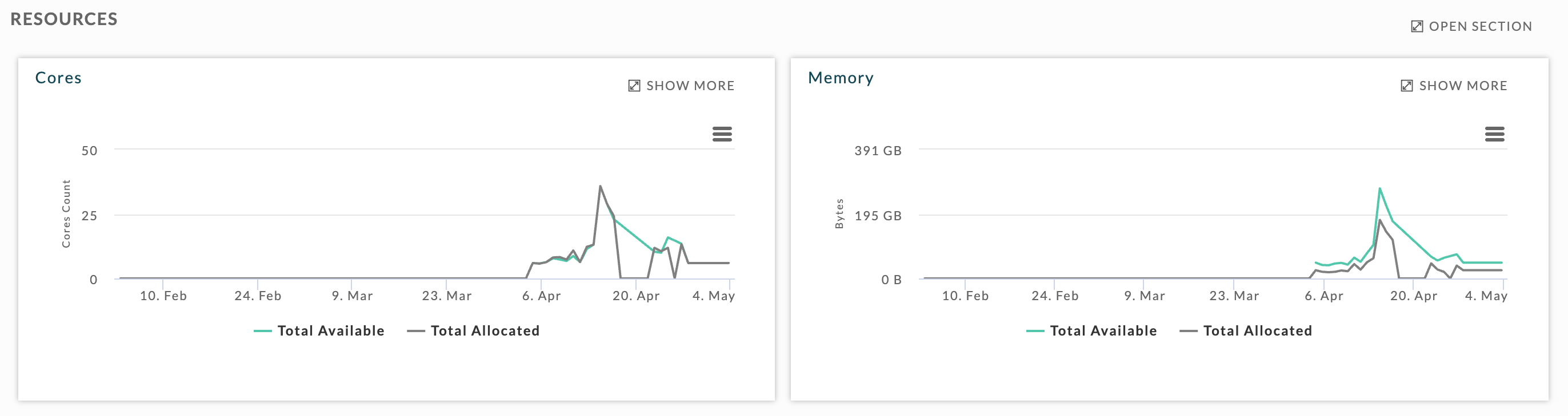
Resources
Displays a graphical view of the available and allocated cores and memory.
Inefficient Spark applications
The Inefficient Spark applications table lists all the events of inefficiency that has occurred during the Spark applications run. The Event Name column shows the type of event that has occurred. The # Apps Found column displays the number of applications for which this event has occurred.
Click any event to bring up a list of applications where these events have occurred. The event type is noted in the upper left corner. The applications list is the same as the Applications tab except that it only displays the Spark applications where an event of inefficiency has occurred.
Usage details
The Usage details tab provides a snapshot of the resource usage across all the Databricks instances.
Usage Detail displays the following tabs:
Infrastructure
Nodes
 Unravel can pinpoint applications that cause a sudden spike in core or memory usage. This lets you easily drill down into these applications and understand their behavior. In most of the cases, Unravel provides recommendations and insights to help improve the application run.

By default, the tab opens showing the Infrastructure tab.
Infrastructure
The Infrastructure tab provides a snapshot of all the resource usage in your Databricks instances. You can view the differences between the allocated and available cores and memory. You can also view the resource usage trending over time for users and workspaces.
This tab shows the following graphs:
The upper graphs list the available and allocated Cores and Memory.
The lower graph shows the Cores and Memory by User or Workspace.
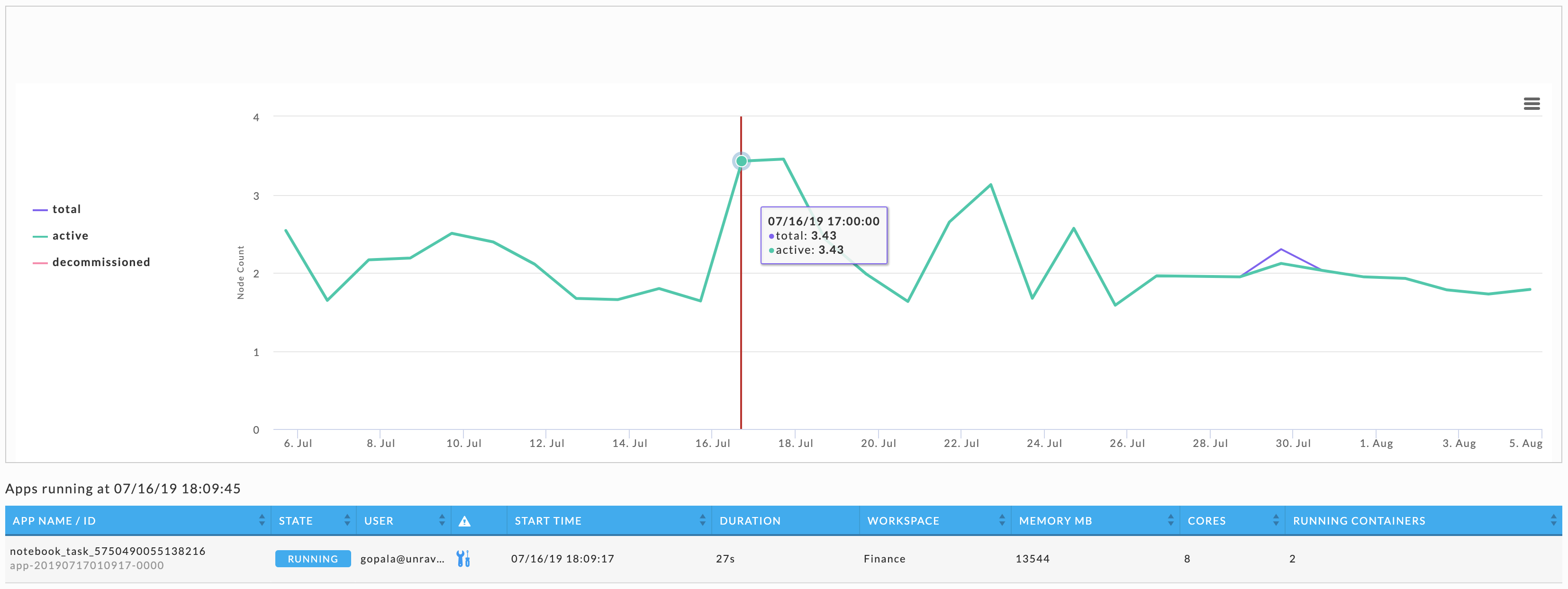
Click within a chart to display the applications that are running at that point in time.
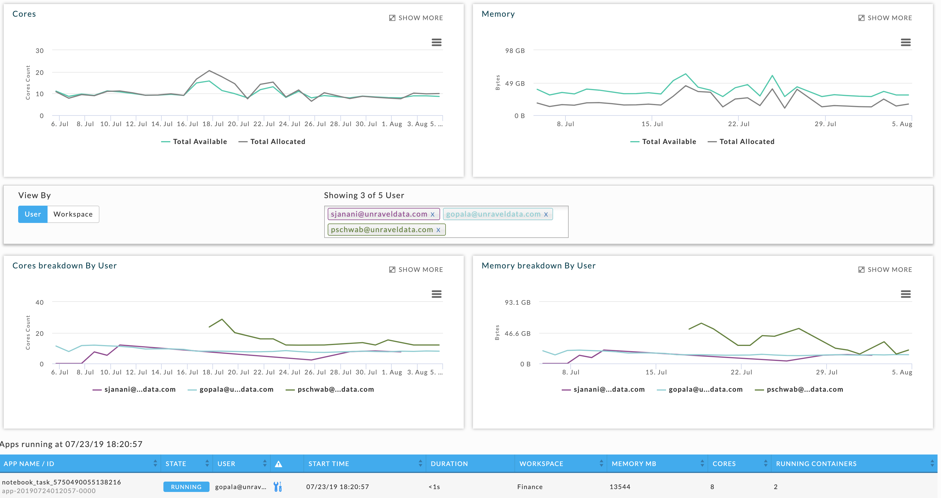
In the lower graphs, click User or Workspace buttons to modify the view. You can further filter the graph by a specific user or workspace. The users and workspaces can be seen from the View by tile. You can add as well as delete the users and workspaces to modify the view.
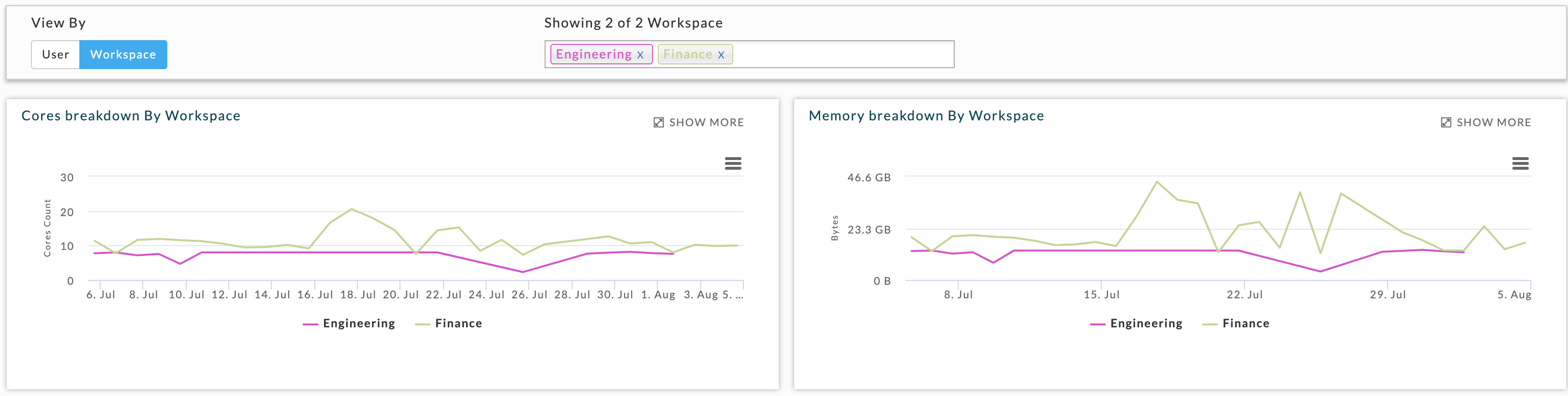
Click a graph to see all the applications running at that specific point in time. Click Show More to expand the chart. For a particular point in time, hover over the chart to see a tooltip with details. For all the charts, you can click the menu bars ( ) for print and download options, for example, CSV, JPEG.
All the charts and tables are automatically refreshed. However, the refresh is disabled when you interact within a page to alter its display, for example, change the date range or click a point within a graph. Whenever it is disabled, a button appears in the Usage Details title bar. You can click this Refresh button to resume the autorefresh.
Nodes
Provides a graphical view of the total, active, and decommissioned nodes trending over a period of time. Click within the graph to view the applications that were running at that point in time.