Operations page
The Operations page provides a synopsis of a cluster and its activities. It has two tabs:
Dashboard
Usage details
By default, it opens showing Operations > Dashboard tab.
You can change the date range using the date picker, or update the time period. Change the cluster by using the pull-downs on the far right. By default, all the clusters are used to populate the page.
When you interact with a page, for example, click inside a graph, Unravel stops updating the data. When that occurs, a  button appears in the Dashboard/Usage Details bar. Click the button so restart refreshing the page.
Note
See Common UI Features for general information and common features about Unravel's UI.
Dashboard
To view the Dashboard, click Operations > Dashboard.
The Dashboard provides an overview of cluster activities with links to drill down into YARN apps, resource usage, app inefficiencies, and events/alerts. By default, it is configured to display all clusters hourly for the past 24 hours.
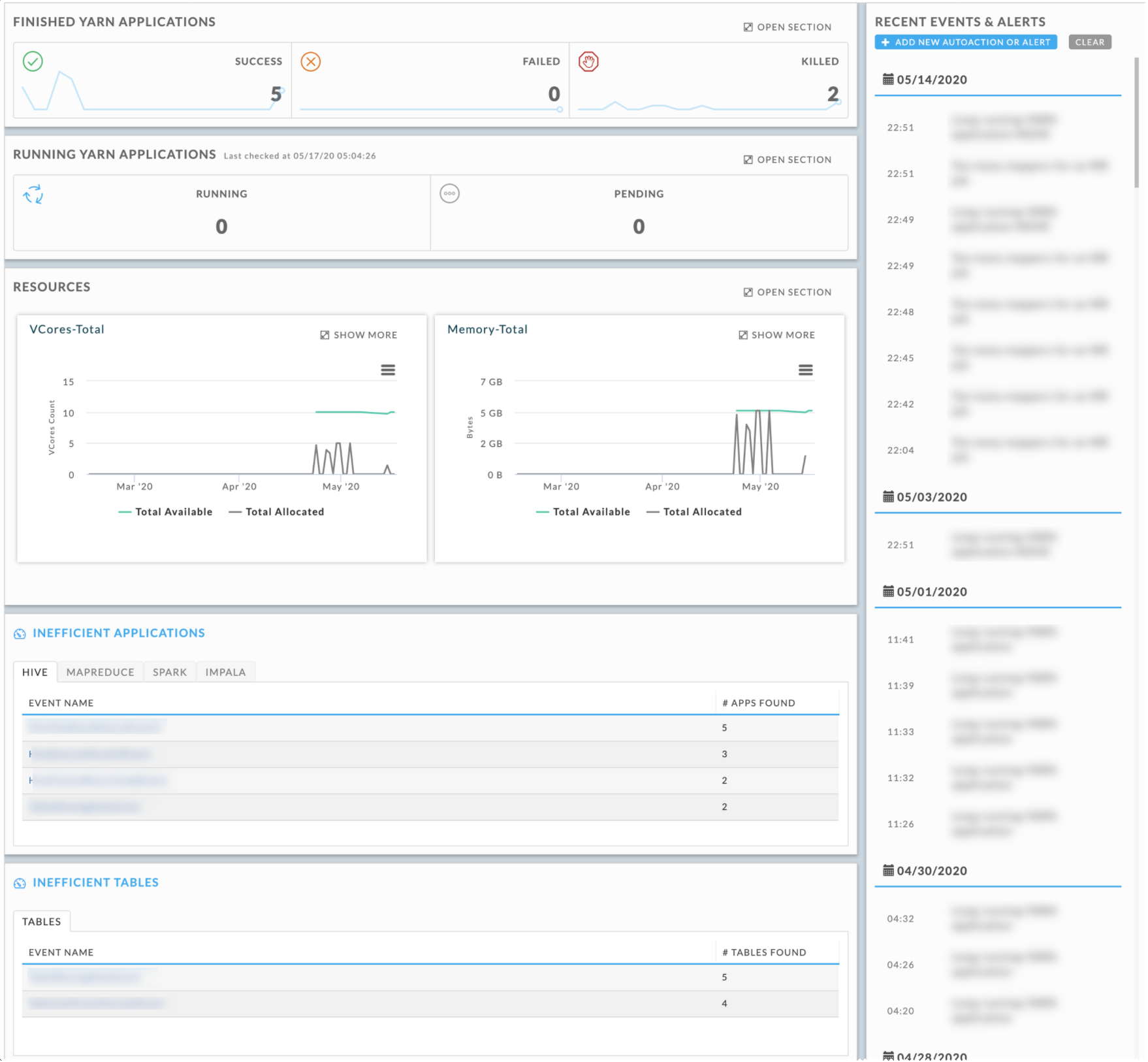
Finished YARN applications tile
The line graphs display the successful, failed, and killed jobs for the time period, using the time increment and cluster specified. It textually displays the total number for the time period.
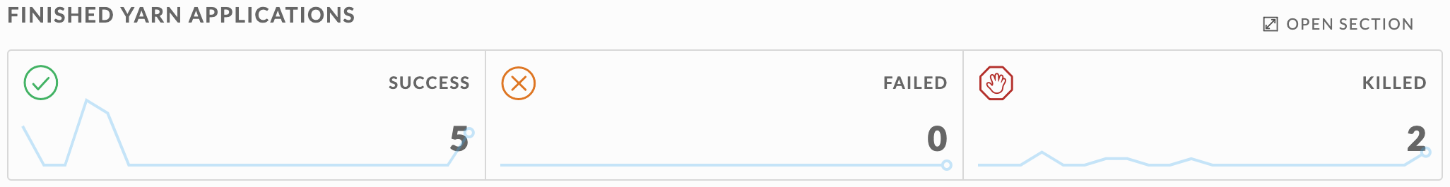
Clicking on Open Section brings up an apps window listing all apps. See All Applications.
Running YARN applications tile
The line graphs display the running and pending jobs for the current time. It textually displays the total number at the current time.
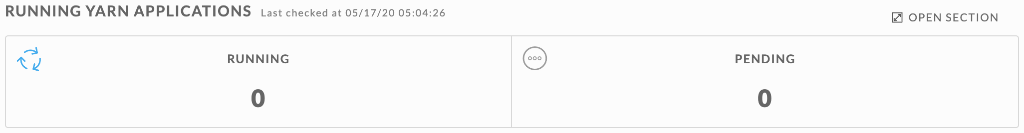
Clicking on  opens Operations > Usage Details > Jobs.
Resources tile
Displays the average available and allocated vCore and Memory for the entire cluster. Unravel polls the Resource Manager every 90 seconds to get the resources (vCores, Memory MB, and running containers) for all running and pending apps.
Apps that run less than 90 seconds are typically not captured, i.e., unless the application is running at the exact moment the Resource Manager is polled the application data isn't captured. Therefore for any specific moment, the total number of apps running won't match the number of apps in Applications > Applications if you filter on the same point in time.
In this tile the vCore-Total and Memory-Total. These totals are averages
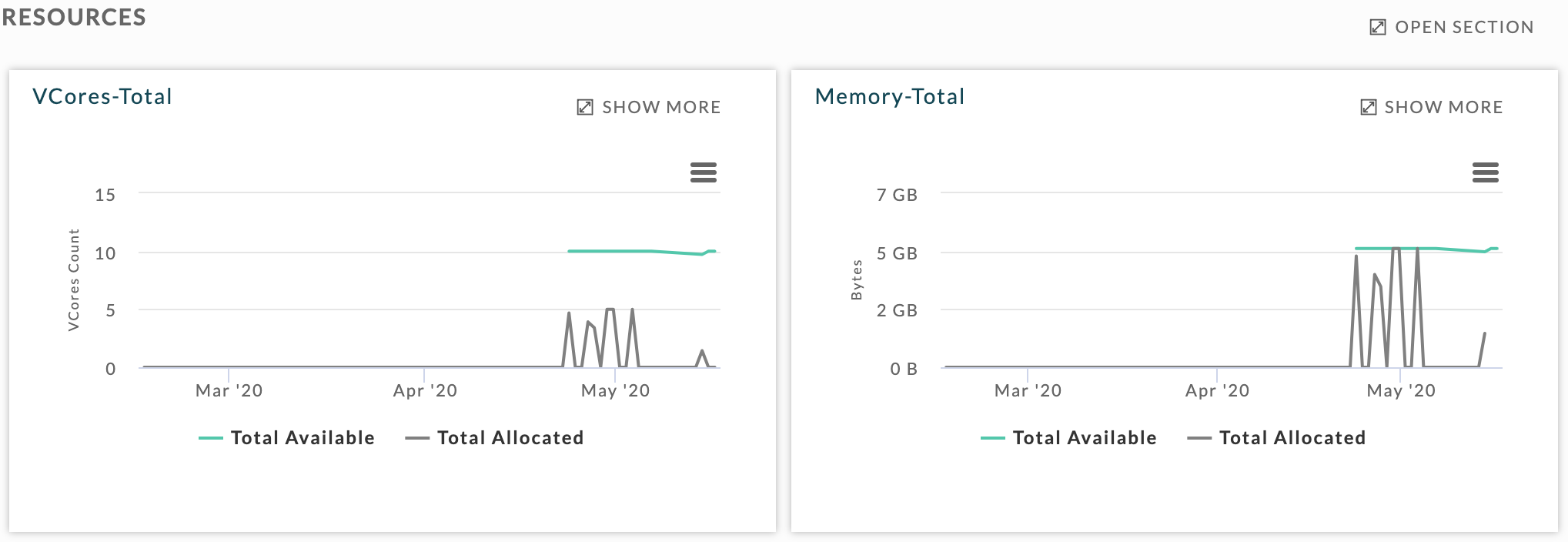
Clicking on  expands the graph to the full width of the window. Clicking opens the Operations > Usage Details > Infrastructure tab.
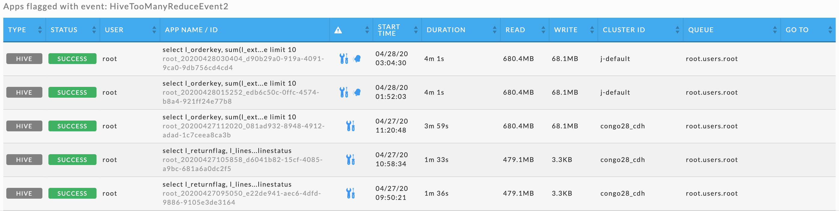
Inefficient applications tile
There are four tabs, Hive, MapReduce, Spark, and Impala each list the inefficiencies that apps of that job type have experienced and the number of apps that experienced the event. Click the sub-tab to change the app type.
Click the Event Name for a list of apps that have experienced the event. The inefficient apps list is equivalent to Applications > All Applications except it only displays apps that have experienced the event. The event type is noted in the upper left-hand corner.
Inefficient tables tile
List the inefficiencies that tables have experienced and the number of tables that experienced the event.
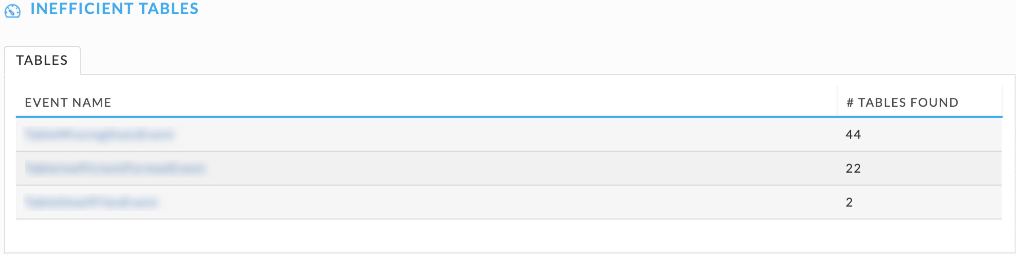
Click the Event Name for a list of tables that have experienced the event.
Recent events and alerts sidebar
Lists all events and alerts that have occurred during the period. They are listed in descending order by date then time within the date. A separate entry appears for each time a particular AutoAction was triggered. In the example below, the same AutoAction triggered at 10.54 and 11.54. Clicking an event/alert brings up a Cluster Resource view (Operations > Usage Detail > Infrastructure) displaying a 10-minute time slice (±5 minutes of the event) and a list of apps running at that time. See AutoActions Overview for more information. Click Add new AutoAction or Alert to create a new AutoAction. Click Clear to clear the list.
Usage details

Usage Detail contains six tabs:
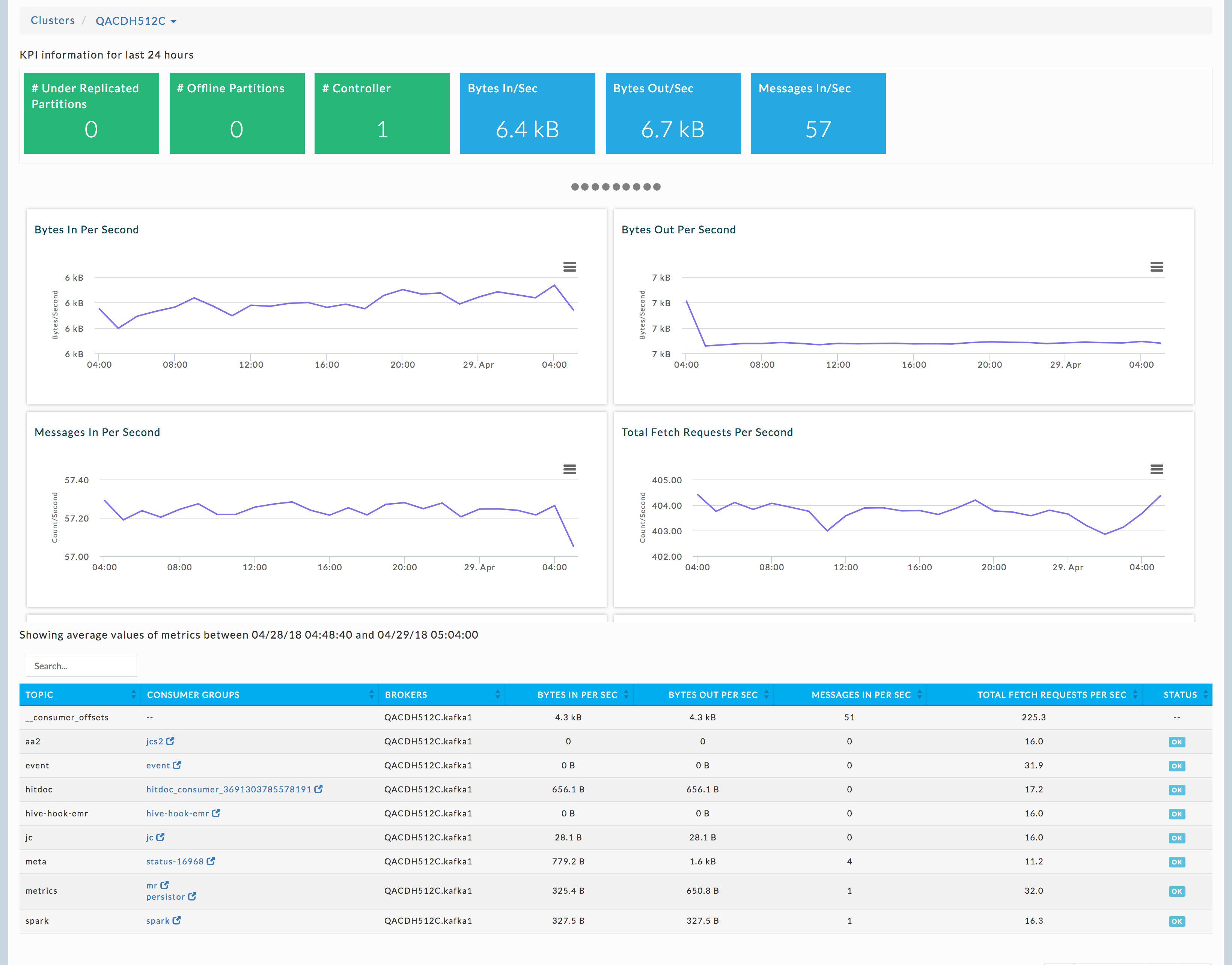
One of the most difficult challenges in managing multi-tenant Hadoop clusters is understanding how resources are being used by the apps running in the clusters. Through Usage Details, Unravel Web UI provides a unique forensic view into each cluster's key performance indicators (KPIs) over time and how they relate to the apps running in the cluster.
 For example, Unravel can pinpoint the apps causing a sudden spike in the total vCores or memory MB usage. This lets you easily drill down into the apps to understand their behavior. Whenever possible, Unravel provides recommendations and insights to help improve the app's run.
All the charts and tables are automatically refreshed; however refreshing is disabled when you interact within a page to alter its display, for example, click a point within a graph. When disabled, the button is displayed in Dashboard/Usage Details title bar. Click Refresh to resume automatic refreshes.

By default, the Usage Details tab opens showing the Infrastructure tab.
For all charts, click  , for print and download options, e.g. CSV, JPEG. Click to expand it. For a particular point in time, hover over chart to see a tooltip with details. Click the graph to see all apps running at that particular point. Once expanded, click the
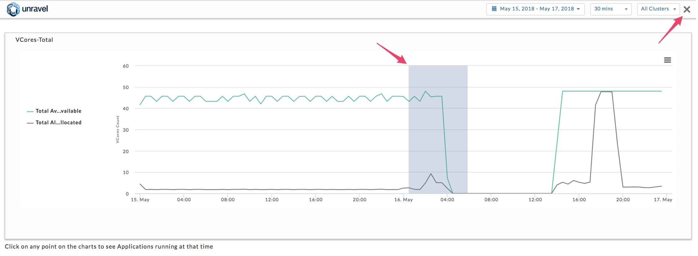
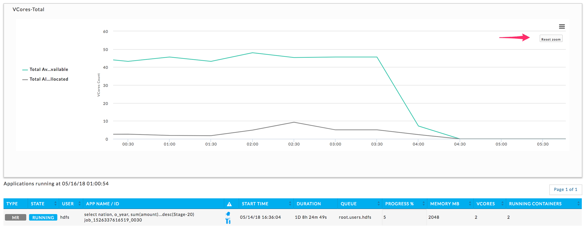
  to return to the initial view. To zoom in drag over a section of the graph; to return to the complete graph click Reset Graph. The examples below are showing the vCores-Total graph from the Infrastructure Tab expanded. The first graph shows the selection of an area to zoom in on, and the second result of the zooming in.
Infrastructure
This tab contains four graphs.
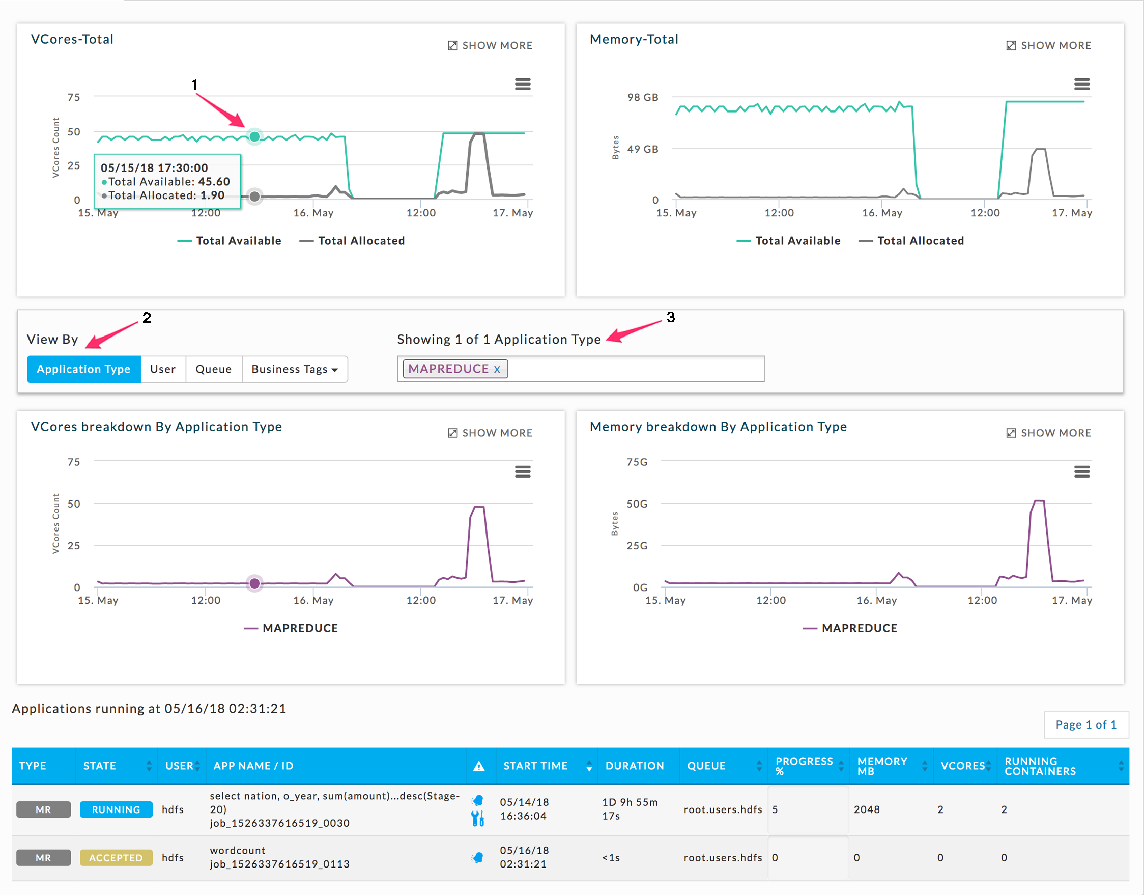
The upper two list available and allocated vCores and memory for the entire Cluster, and
The bottom two show the vCores and memory filtered by Application Type, User, Queue, and tags, if any.
Clicking within a chart displays the apps running for that point in time. See Resources above for an explanation of how this information is gathered and the app list is generated.
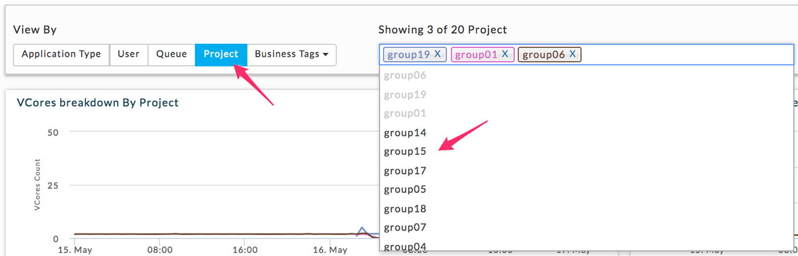
You can choose how to display the bottom two graphs by clicking on the View By type (2). Once you have chosen your view, the first three available values for that view are displayed in the Showing box (3). Above the box notes the number displayed of the total available values for the View type. Regardless of the total available values by View By choice, you may only graph up to four. Click within the Showing box to see all available values; to remove a value click the x next to it (3). By default, Infrastructure opens displaying Application Type. In the example below only vCores-Total was expanded (Show More) and then a section was zoomed in on.
To View By tags, use the Business Tags pull-down menu, listing all available tags. The tag you selected is displayed in blue and to the left of the Business Tags. To add a tag, click in the Showing box to show all available tags, click the tag to select it. You can only select up to four tag values. Delete a particular value by clicking the x next to remove the value.
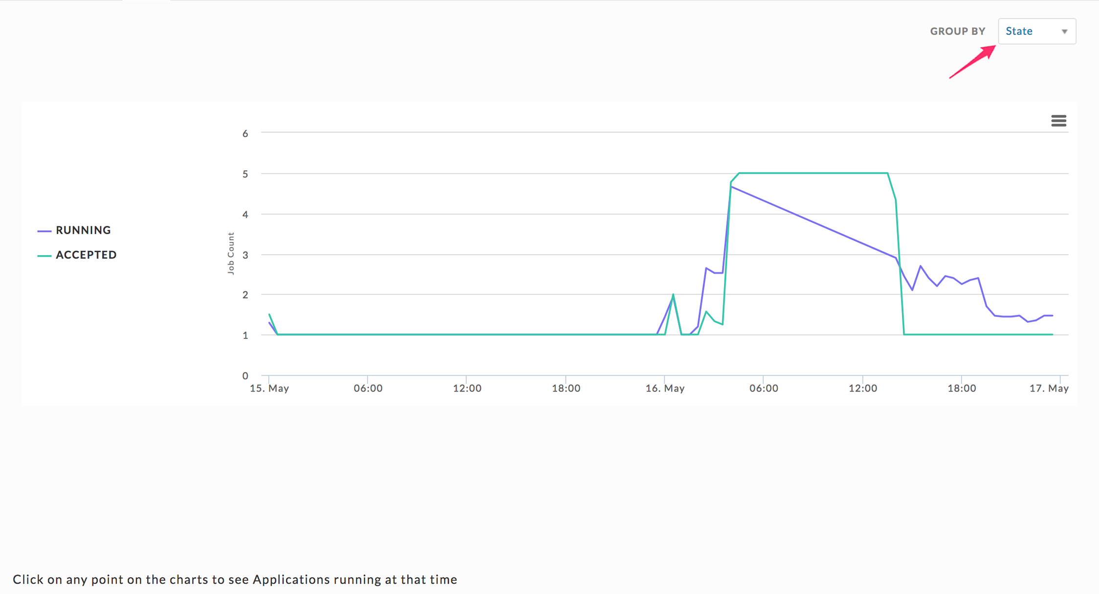
Jobs
Graphs the running and accepted jobs as applicable. You can Group by State, App Type, User, and Queue. By default, the chart uses State. You can change the display of an item via the Group By pull-down.
 |
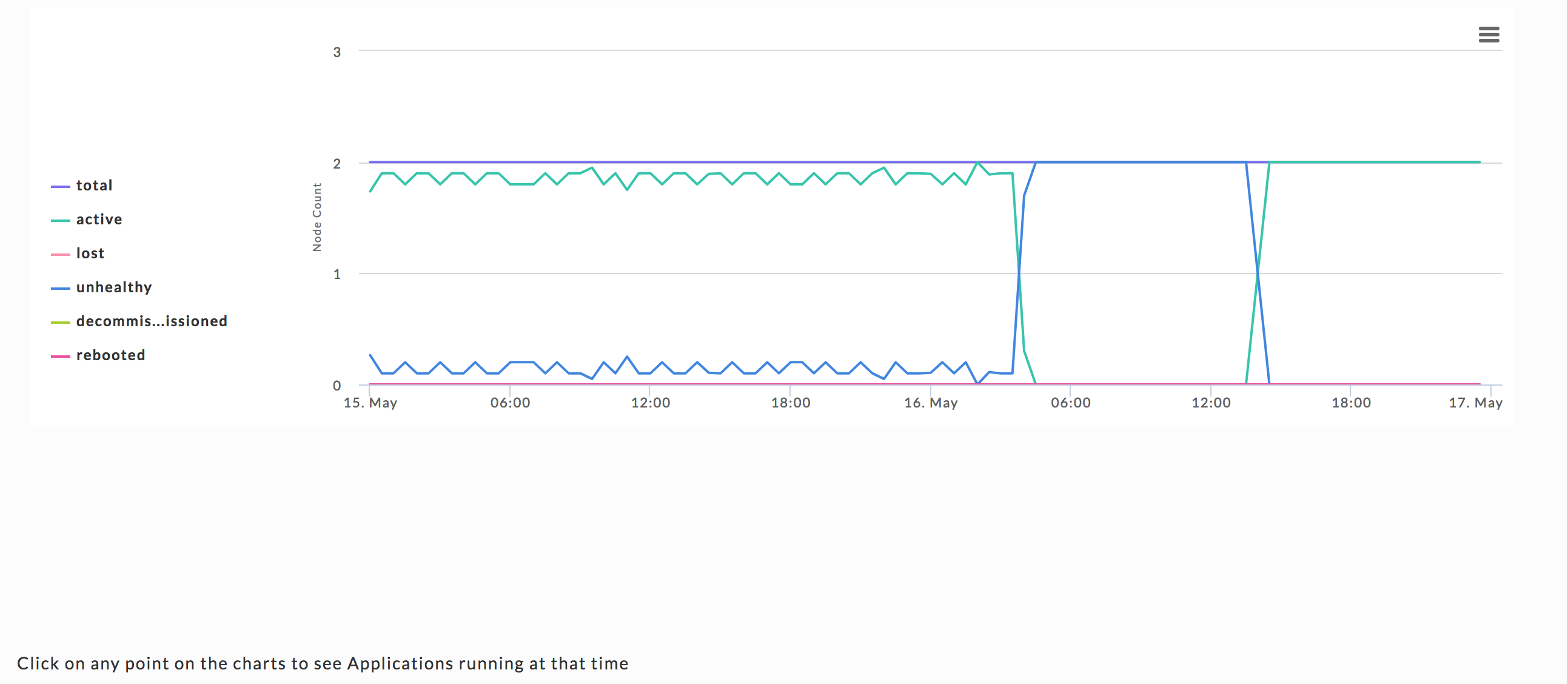
Nodes
This chart graphs the total number of Nodes by node status, active, lost, unhealthy, decommissioned, and rebooted.
| total = active + unhealthy |
Where:
active: currently running and healthy nodes.
unhealthy: currently running and unhealthy nodes.
You can toggle the display of an item by clicking on its name.
 |
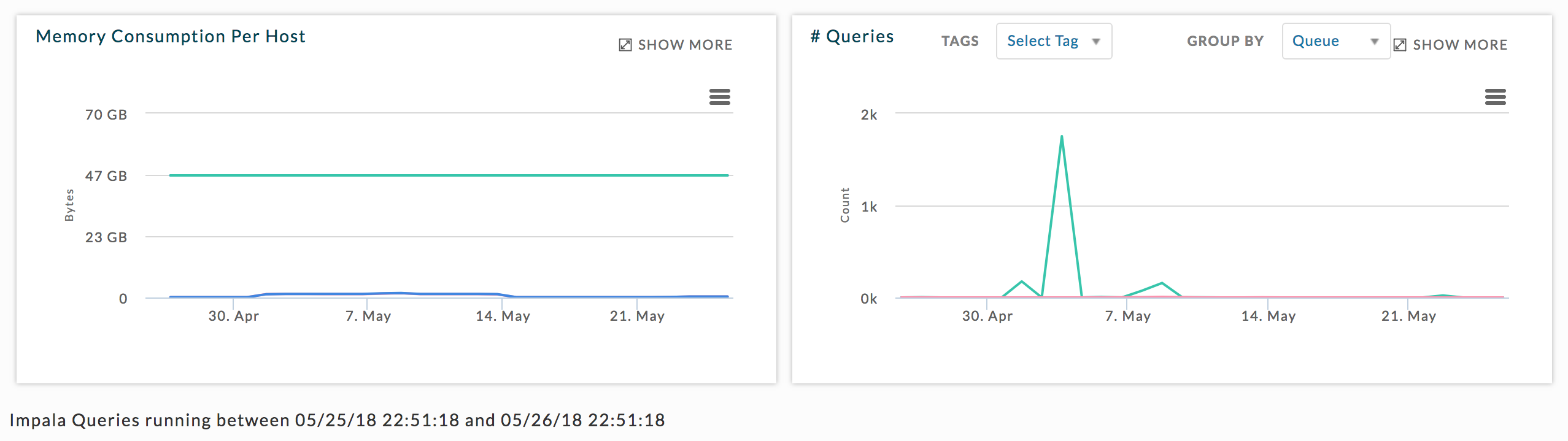
Impala usage
Graphs memory MB consumption and Query Number. The # Queries graph can be displayed by Tags and Group By (User or Queue).
Kafka
Lists all the configured Kafka clusters. See Kafka Application Manager for more information. See Kafka detecting lagging or stalled partitions for information on drilling down into a Cluster to locate lagging and stalled Topics/Partitions.
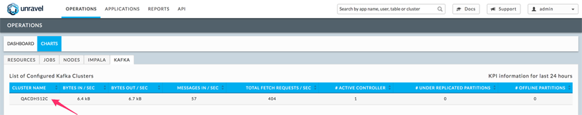
Clicking the cluster name brings detailed information about the Kafka Cluster
HBase
Note
Please see HBase Configuration for configuring Unravel's UIX for HBase clusters.
See HBase Alerts and Metrics for HBase metrics descriptions and list of alerts with suggested actions.
Clusters list
Clusters page lists all the available HBase clusters. Click a cluster name to bring up the cluster's information the HBase Cluster view.
Cluster view
This view is divided into four sections. When a component's health is noted, hovering over its health glyph brings up details, 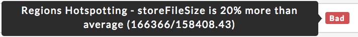 .
.
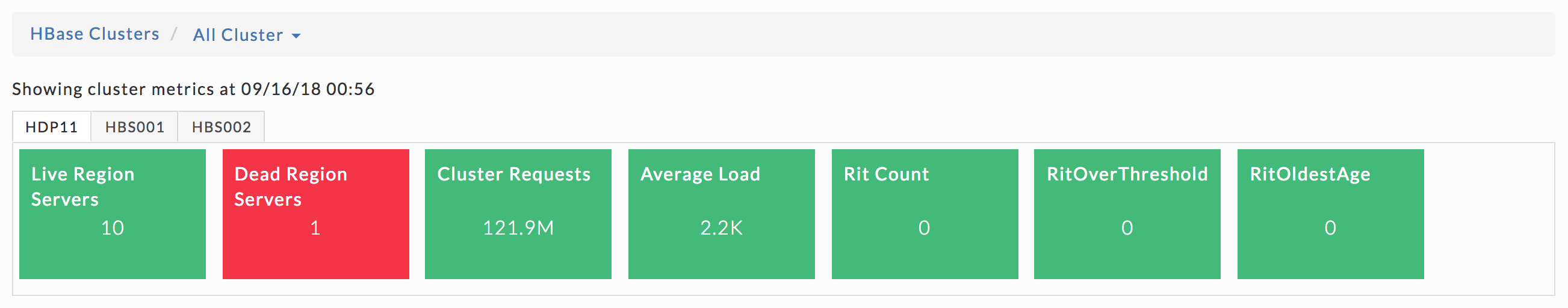
Cluster Information
A bar shows what cluster you are displaying with a pull-down which lets you switch between clusters. Listed immediately below are the cluster metrics. You can choose to tab between clusters by choosing all clusters. Shown below is the tabbed view.
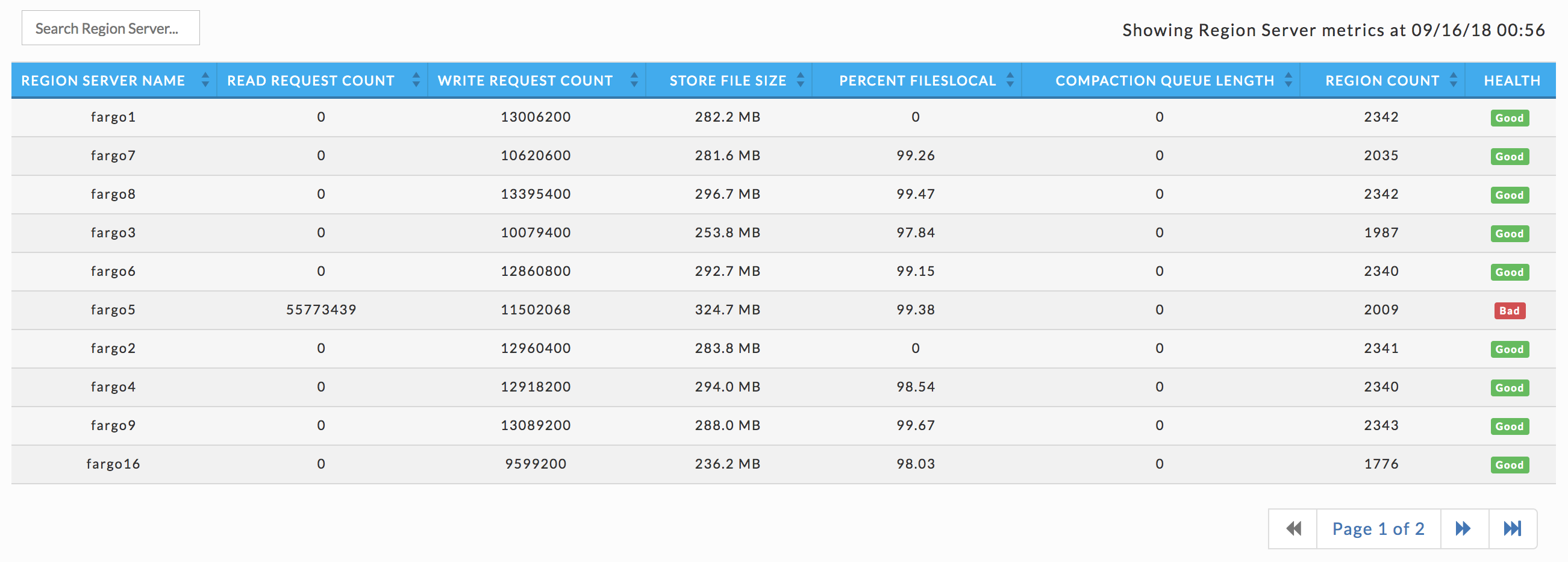
Region servers
Lists the cluster's region servers, with their KPIs and health. You can search on the region server by name. Click the server's name to bring up its details.
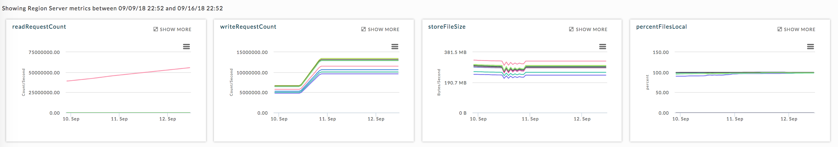
Region server's KPIs
Graphs the regional server metrics, the graphs are linked with the table list below them. Click within a graph to see its associated servers for that point in time. Hover over a point to bring up a tooltip displaying the information for that point in time. Click Show More to expand the graph to full window width and see a list of relevant applications.. Click to print or download the graph.
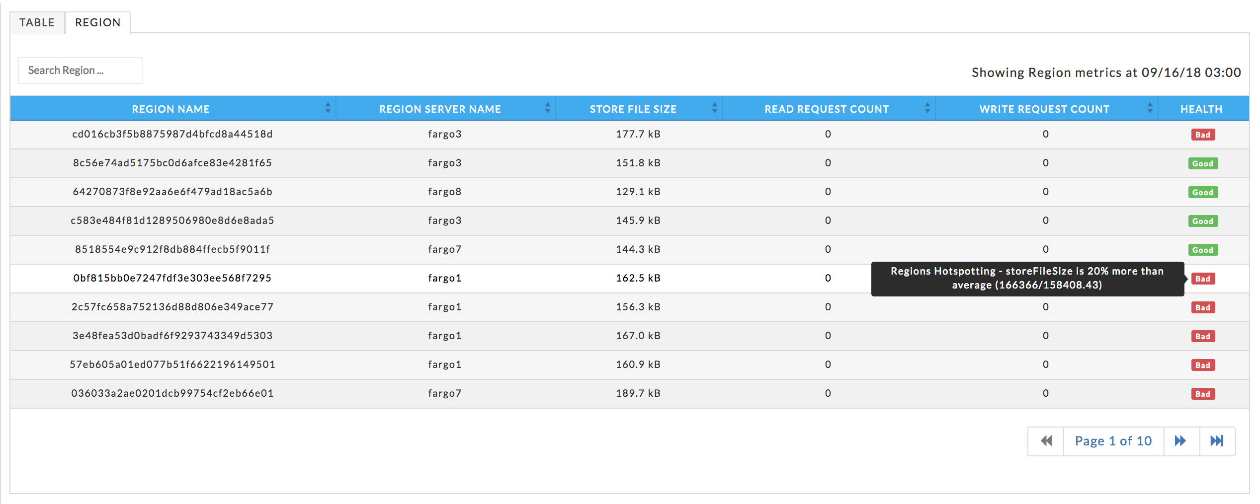
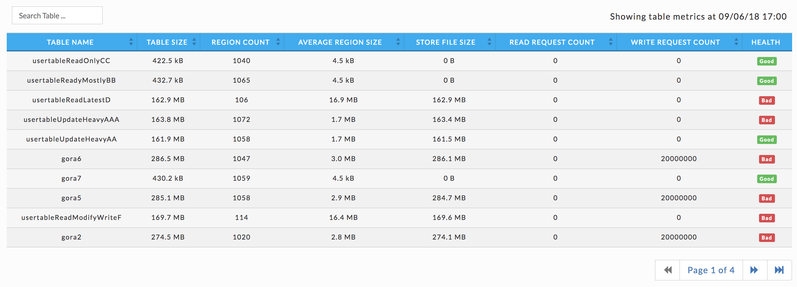
Tables
Lists all the tables associated with the cluster, their KPIs, and the table's health. Click the table name to bring up its information. You can search for a table by name; any table with a name matching or containing the string is displayed.
Region server view
Server, Operational, and OS Metrics are displayed. Hover over the metric for its description. For more information on the metrics see here. You can change the date range to display using the date picker. The first four regional server metrics are graphed using the daily view. Use the pull-down menu to switch to the weekly view. Click to print or download the graph. The table list contains all the tables that were accessed by this server. You can search the table list by name. Click the table name to bring up its details.
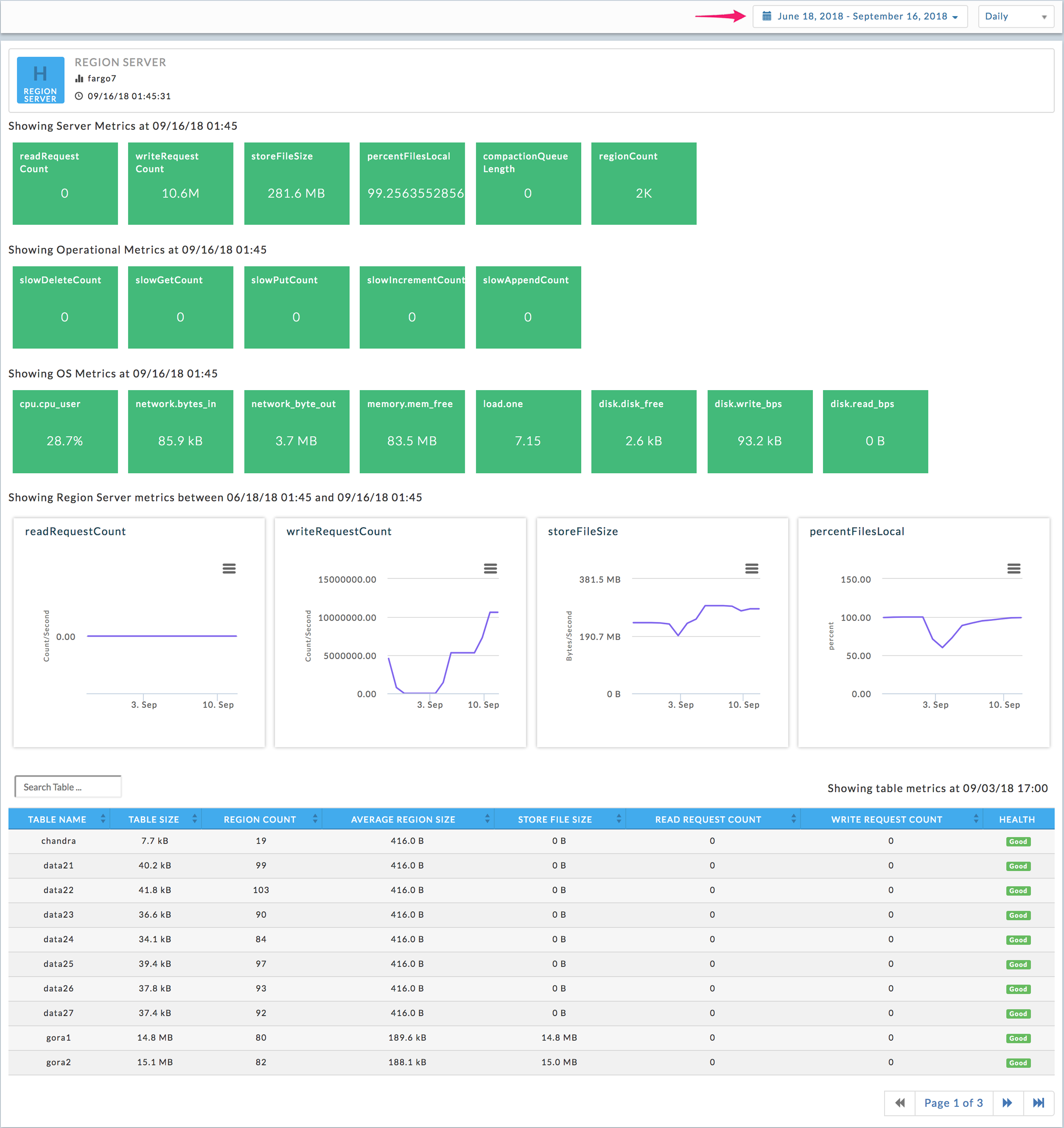
Table view
Table has two tabs, Table and Region. It opens in the Table view, which displays the Table's KPIs. Three of the KPIs, regionCount, readRequestCount, and writeRequestCount are graphed, click within the graph to see the apps for that point in time Click to print or download the graph. Hover over the graph to display the information for that point in time. Click within the graph to display the apps running at that point in time. Click the app's name to open it in its app manager.
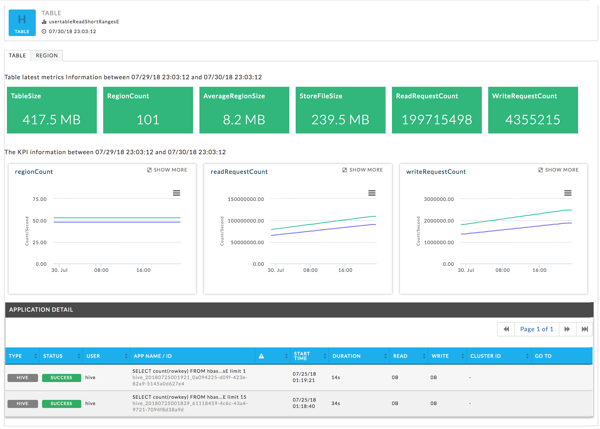
Table regions
Lists all the regions with their KPIs and health.