Workflow APM
The Workflow APM provides a comprehensive view to understand workflows and their patterns of execution. It is used by Workflow (Pipelines) owners to
Identify anomalies, inefficiencies, and bottlenecks in workflow instances.
The Workflow Manager helps pipeline owners easily maintain SLAs. (Apps that have a Workflow parent have a link to the workflow in the Goto column in Applications > Applications.)
Key performance indicators
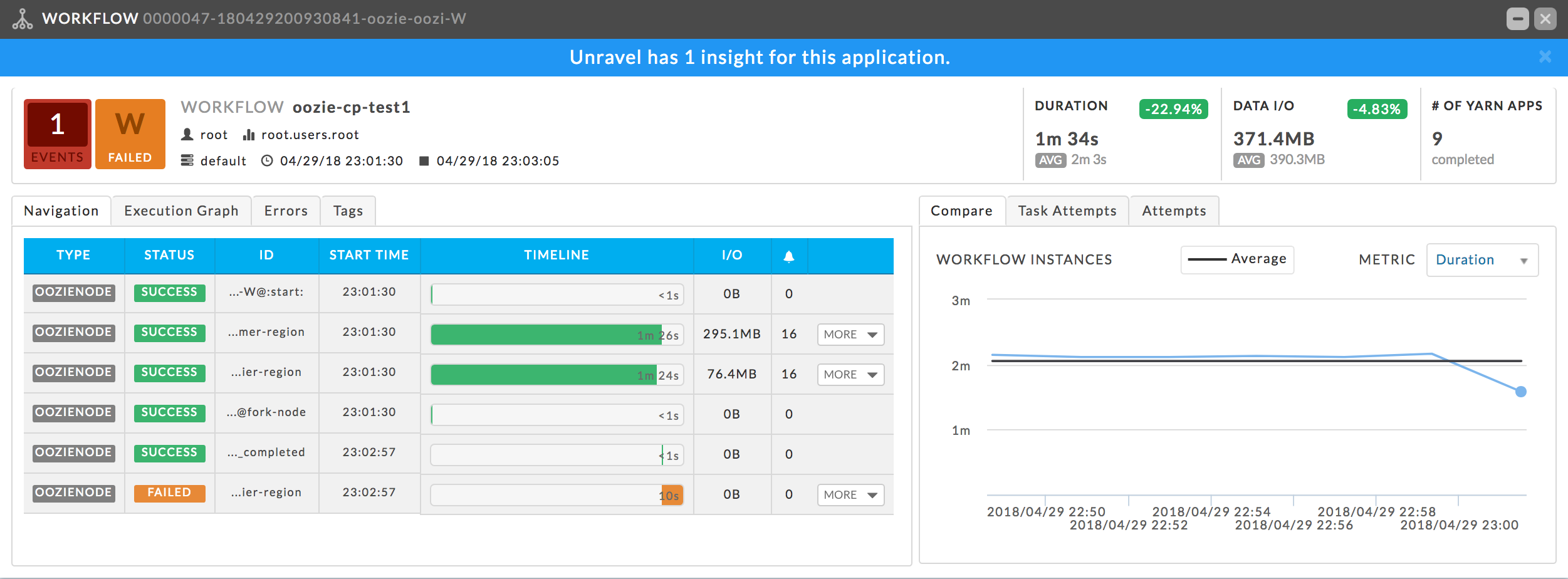
Events: The number, if any, of Unravel insights for this query.
Duration: Total time taken by the query.
Data I/O: Total data read and written by the query.
Number of Yarn Apps: The number of apps that make up the workflow.
The APM opens showing the Navigation and Compare tabs by default.
Left tabs
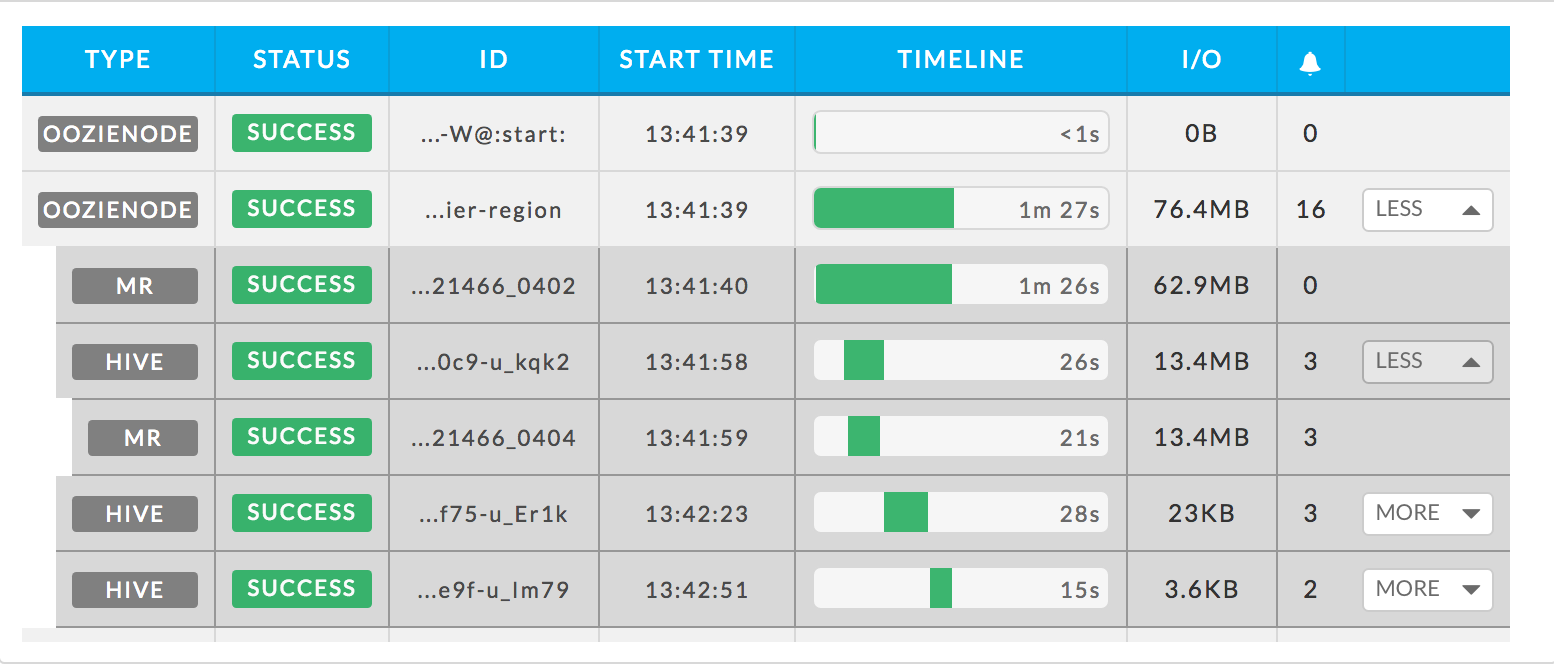
Navigation: Provides an easy way to understand the breakdown of the workflow the apps which comprise the Workflow, e.g., Hive, Spark, MapReduce, Oozie. Click More to display the jobs/apps which comprise the type.
This image shows the second Oozie node, which consists one MapReduce job and three Hive jobs. The Hive jobs comprise one or more tasks, so that too can be expanded. The second Oozie node has been expanded along with the first Hive job within it. You can click a job to see its app manage, for example, you can click the expanded Hive job to bring up the Hive APM. Similarly, you can click the mapreduce job within the Hive job to go directly to it. Click Less to close the list.
Execution: Displays the execution graph of the workflow. Click
 to zoom in, and
  to zoom in. Click
  to return to the initial display. Hover over a node within the graph to see a text box which information about the node task.
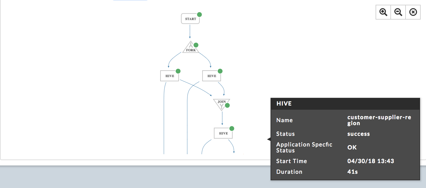
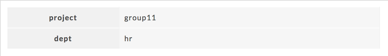
Tags:
Tags: The defined tag keys and values for the app. This example has two tag keys, project and dept , with each having one value, group11 and hr , respectively.
Right tabs
Compare: Provides a quick way to understand how well a workflow run compares to its other runs. Hovering your pointer graph displays instances top KPIs such as Duration, Data I/O, Resources, and the number of jobs in that instance. Clicking on the point in the chart brings up the Workflow APM for that instance. The graph Metrics choices are I/O, MR Jobs, Resource and Events. The Workflow APM above shows an example of the compare tab.
For Unravel for Azure Databricks
This tab compares workflow instances and the metrics available to you are Duration, Data I/O, Apps, and Events.
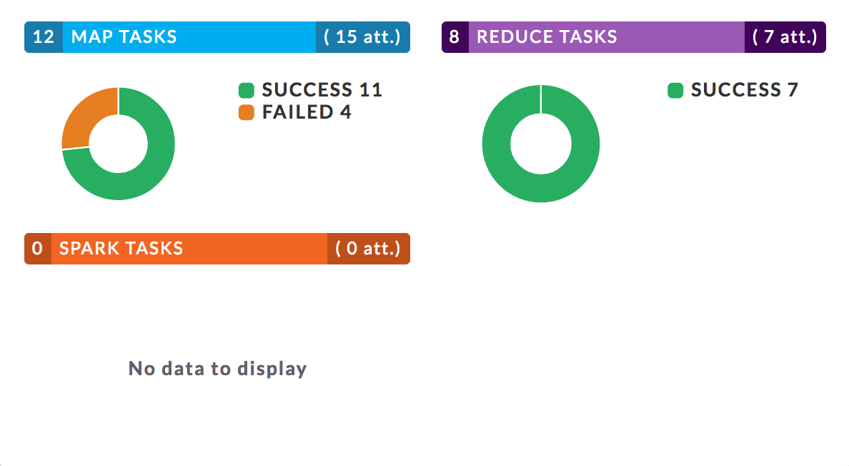
Task Attempts: Displays charts for Map Task, Reduce, and Spark Tasks, broken down by success, failed, and killed as appropriate.
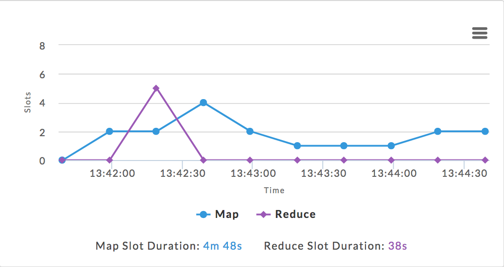
Attempts: Graphs the attempts over the time interval in Wall Clock time. The Map and Reduce Slot Duration in total computing time is listed beneath the line graph.