Operational Insights
The following reports are included in Operational Insights:
Usage Trending - a trend report by user and workspace.
Chargeback Cluster - chargeback report for clusters.
Chargeback Job Runs - chargeback report for job runs.
Workload - shows the aggregated workload for all clusters.
You can specify a date range or instance from the drop-down menu on the right side of the Operational Insights title bar. By default, it opens showing Chargeback Cluster tab grouped by Application Type, for all clusters over the last 24 hours.
Note
See Common UI Features for general information and common features about Unravel's UI.
Usage trending
This tab provides a graphical representation of the usage trending for the Databricks instances. You can sort it by the workspace as well as by the users. By default, the window opens showing all instances, workspaces, and users for the current day in 30-minute increments.
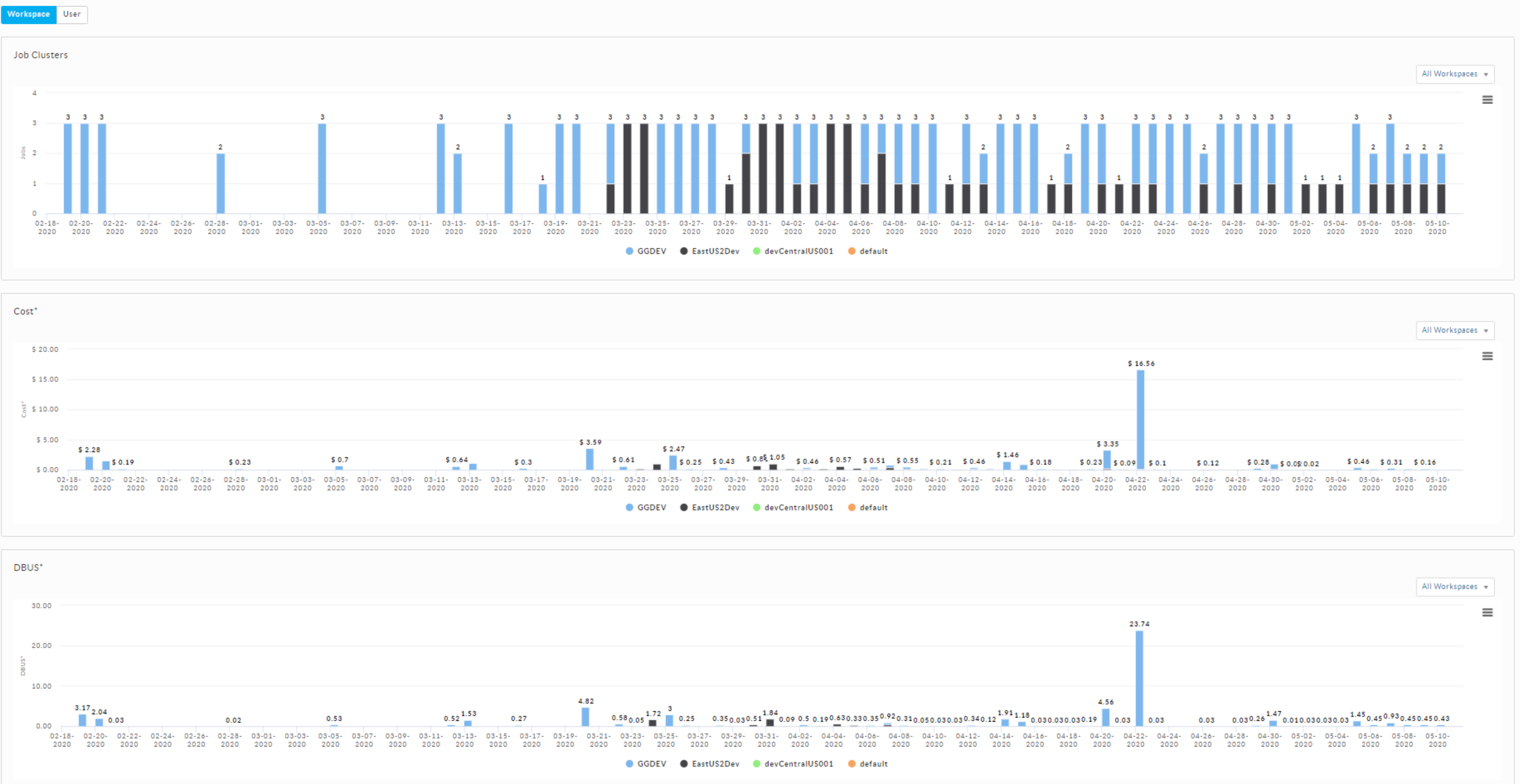
To view the usage trending:
Select the date range, time period, and instance from the upper-right of the page.
Click either Workspace or User. You can also select a specific user or workspace from the All Workspaces or All Users drop-down in the graph. The corresponding usage trending is displayed in the following charts:
Job Clusters - The clusters that are actively running jobs in a specified time.
Jobs - Jobs run by users in a specified time.
Cost - Cost incurred by workspaces and users in a specified time. The cost shown is the total cost of the DBU and VM.
DBUs - DBU usage trend in a specified time.
Chargeback cluster
From this tab, you can create and view the Chargeback reports for Databricks clusters. You can toggle between Workspace and User to group the reports accordingly.
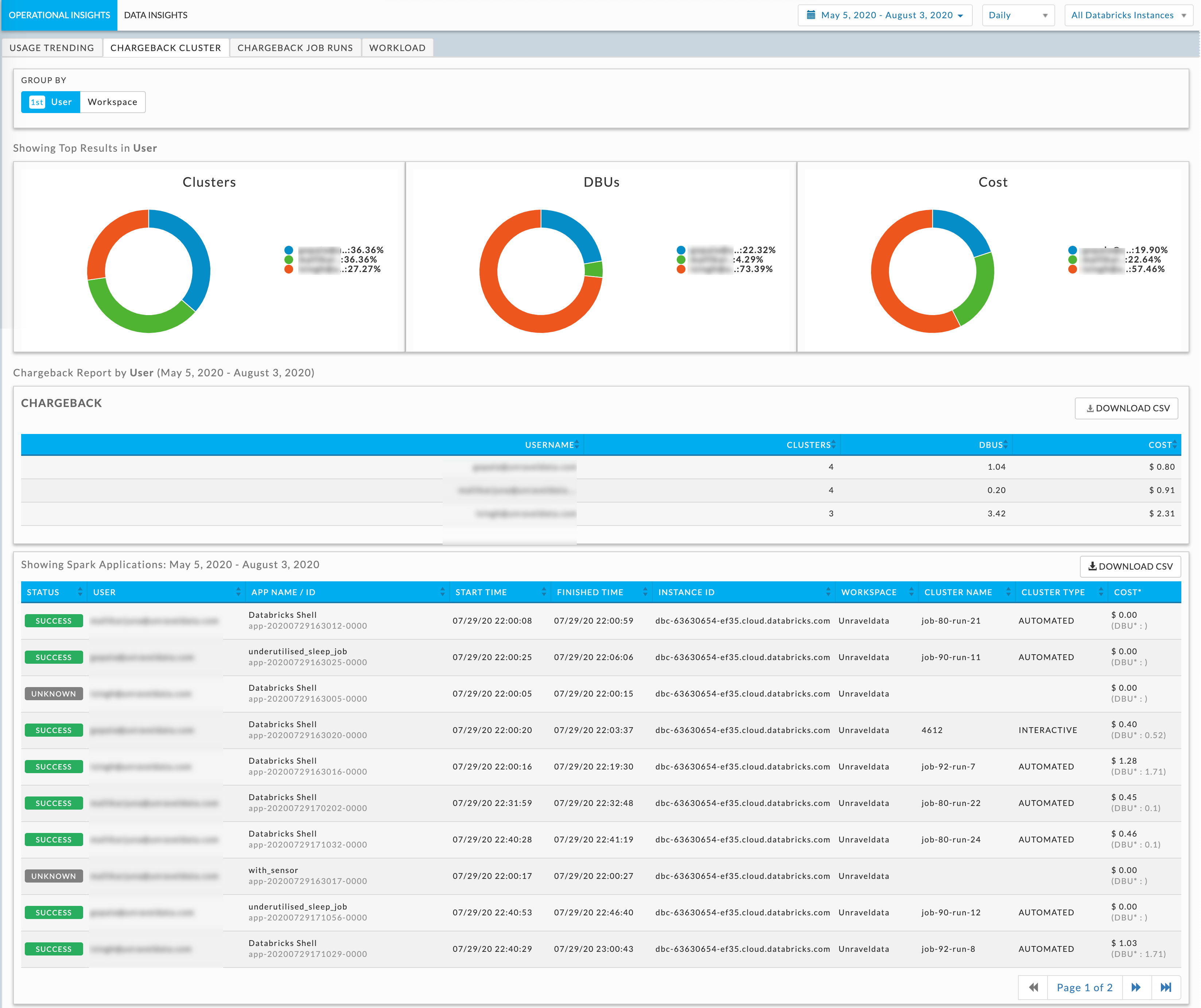
To generate a Chargeback Cluster report:
Select the date range, time period, and instance from the upper-right of the page.
Use the Group By to filter the information. By default, the User is selected. Click the Workspace option, it is also added to the Group By list. If two Group By options are selected, the sort priority is noted. Click an option to deselect it. The details of the chargeback report are displayed in the following:
Donut charts showing the top results of the users and workspaces for Job Runs, DBUs, and Cost.
The Chargeback Job Runs report is displayed with the list of the selected options; workspace or user. You can download the report in a CSV format. Click any user or workspace in the list and you can further drill-down into the details of the selected user or workspace in the Applications table. The following table provides a description of the columns in the applications table:
Columns
Description
Status
color coded status of the application.
User
The username that submitted the application.
Job Name
Name or ID of the app.
Start Time
Start time of the application.
Finished Time
End time of the application.
Instance ID
Name of the Databricks instance.
Workspace
Workspace of the app.
Cluster Name
Name of the cluster.
Cluster Type
Type of the cluster. Automated / Interactive
Cost
Cost calculated based on the estimated run durations of the underlying instances, DBUs, and VM price components only. Storage costs are not included. The actual cost may differ.
Chargeback Job Runs
From this tab, you can create and view the Chargeback report for Job Runs. You can toggle between Workspace and User to group the reports accordingly.
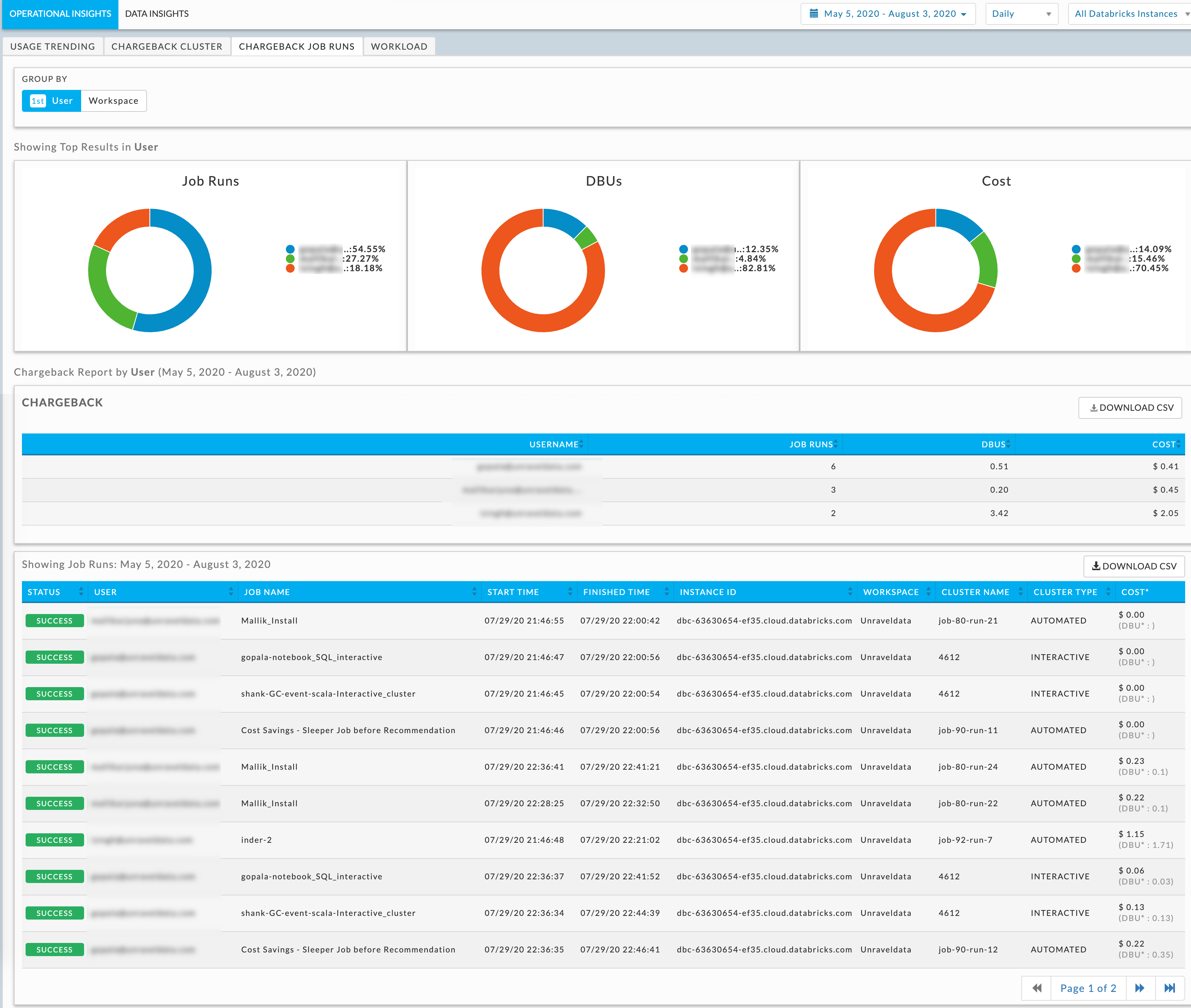
To generate a Chargeback Job Runs report:
Select the date range, time period, and instance from the upper-right of the page.
Use the Group By to filter the information. By default, the User is selected. Click the Workspace option, it is also added to the Group By list. If two Group By options are selected, the sort priority is noted. Click an option to deselect it. The details of the chargeback report is displayed in the following:
Donut charts showing the top results of the users and workspaces for Clusters, DBUs, and Cost.
The chargeback report is displayed with the list of the selected options; workspace or user. You can download the report in a CSV format. Click any user or workspace in the list and you can further drill-down into the details of the selected user or workspace in the Applications table. The following table provides a description of the columns in the applications table:
Columns
Description
Status
color coded status of the application.
User
Username that submitted the application.
App Name/ ID
Name or ID of the app.
Start Time
Start time of the application.
Finished Time
End time of the application.
Instance ID
Name of the Databricks instance.
Workspace
Workspace of the app.
Cluster Name
Name of the cluster.
Cluster Type
Type of the cluster. Automated / Interactive
Cost
Cost calculated based on the estimated run durations of the underlying instances, DBUs, and VM price components only. Storage costs are not included. The actual cost may differ.
Note
Chargeback Job Runs report is introduced in the 4.6.1.2 release version of Unravel.
Workload
This tab displays your instance workload, so you can see when your workload is heaviest, etc. It displays the workload by:
Month: By date, for example, July 30.
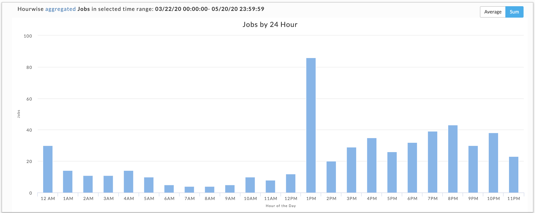
Hour: By hour regardless of date, for example, 10.00 - 11.00.
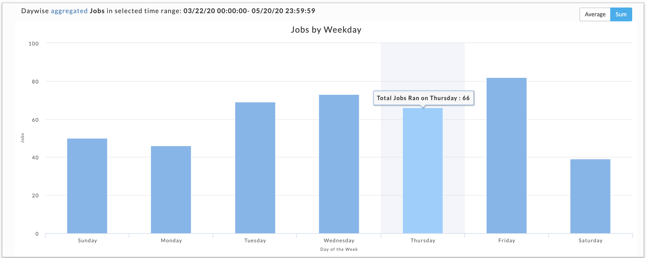
Day: By weekday regardless of date, e.g., Tuesday.
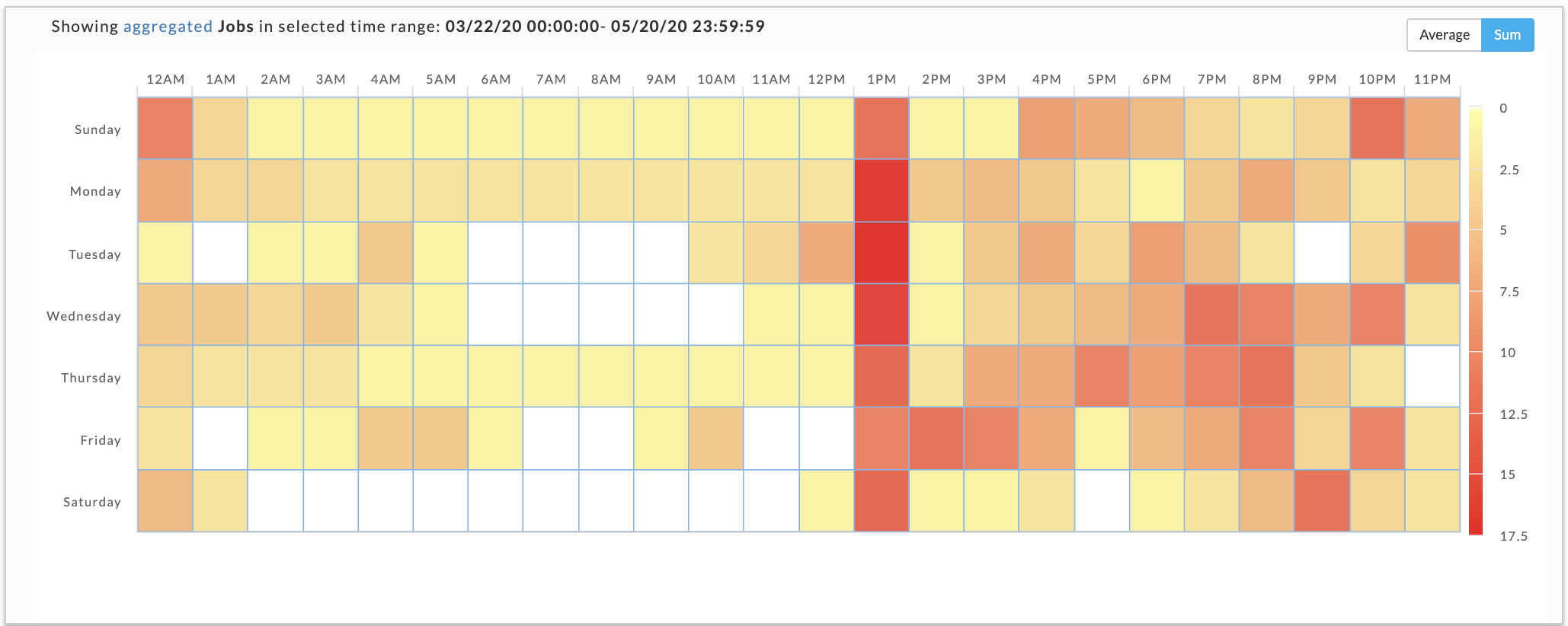
Hour/Day: By hour for a given weekday, e.g.,10.00 -11.00 on Tuesday (a heatmap).
Note
The app count is not a count of unique app instances because applications can span boundaries, i.e., begin and end in different hours/days.
The app count reflects the applications that were running within that interval up to and including the boundary, i.e., date, hour, day. Therefore, an app can be counted multiple times in any given time period.
On multiple dates, or example, July 30 and 31.
In multiple hours, for example, 2 AM and 3 AM.
On multiple days, Tuesday and Wednesday.
In multiple hour/day slots.
This results in anomalies where the Sum(24 hours in Hour/Day app count) > Sum(app counts for dates representing the day).
This is pointed out not because it necessarily has a significant impact on how you can use the data, but to inform you such variations exist.
When you can specify a date range or instance, the pull-down menus are on the right-hand side of the Operational Insights title bar. We recommend using a short date range, as bigger ranges take up more processing time. By default, it opens showing the Month tab for the past week across all instances.
Click the View By buttons to change between views. For the Hour, Day, and Hour/Day you can view the data as an Average or Sum.
See Drilling Down for information on how to retrieve the detailed information within each view.
Displays the jobs run by date. The color indicates how the day's load compares with the other days within the date range. The day with the least jobs/hours is  , while the days with the highest load are
  . Therefore, the color of any particular day varies in context to the other days being displayed. For example, when only one day is displayed it is colored . Use Previous and Next in the month's title bar to navigate between months.
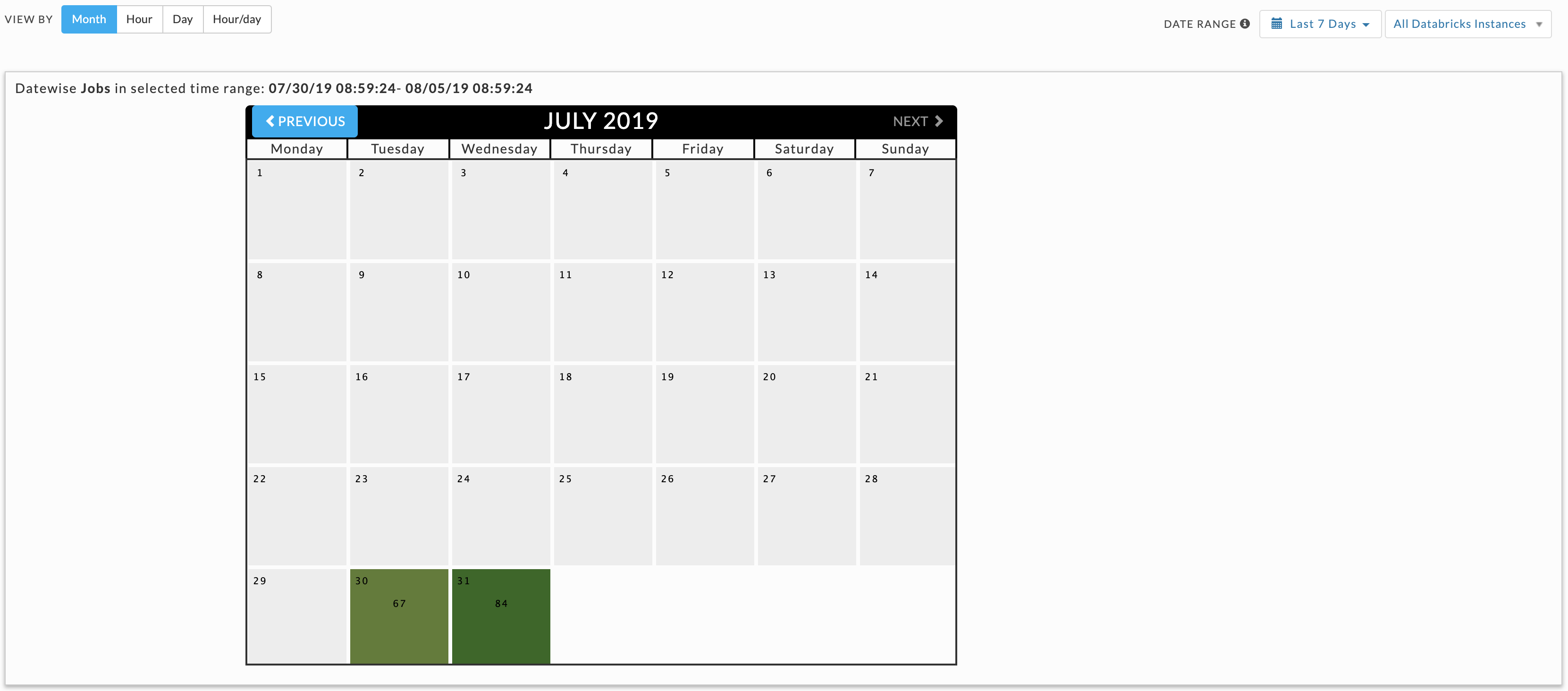
These graphs do not link jobs to any specific date. For instance, the Hour graph shows that 11 jobs ran at 2 AM (between 2 AM and 3 AM); the Day graph that 78 jobs ran on Wednesday, and the Hour/Day that five jobs ran at 2 am on a Wednesday. But none of these graphs indicate the date these jobs ran on. Only the Month view links the job counts to a specific date; above we see 22 July had an app count of 77.
You have the choice to display the data as either the:
Sum: The aggregated sum of job count during the time range (default view).
Average: The aggregated sum of job count average across the time slice, for instance (Sum of all jobs which ran on Wednesday)/(Number of Wednesday's in the Sample).
Breaks out information by hour. The interval label indicates the start, i.e., 2 AM is 2 AM -3 AM. Hover over an interval for its details. Click the interval to drill down into it.
Displays the jobs run on a specific weekday. Hover over an interval for its details. Click the interval to drill down into it.
This view shows the intersection of Hour and Day graphs, it's basically a heatmap. The Hour graph showed 11 jobs ran between at 2-3 AM while the Day graph (immediately above) shows that 78 jobs ran on Wednesday. In the following image, five of Wednesday's jobs ran between 2-3 AM.
The View By options provide a choice of intervals (Month, Day, Hour, Hour/Day) that you can select to view the corresponding details of the workload.
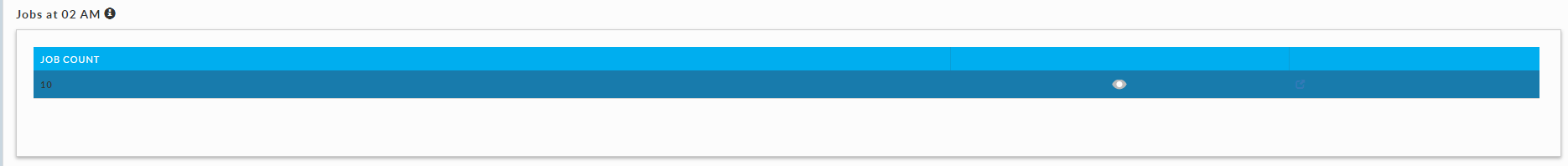
In this example, the Hour view is selected for 2 AM. The jobs running at the specified hour is displayed. In this case it is displayed under Jobs at 02 AM.
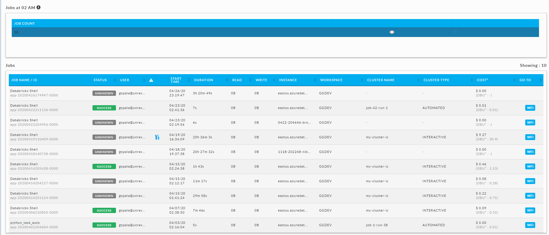
Click
 to display all the jobs that are running during the specified hour.
Click
 to display User or Workspace details. By default, the User is displayed.
Click Workspace to see the jobs distributed across the relevant workspaces.
Click
to see the jobs of a specific user or workspace. When there are multiple row, an expanded row has a green block  displayed.
Click a job and the corresponding Application Performance Management (APM) page is displayed.